Two methods of creating a jitter dodged slope plot in R with ggplot2 (CC429)
Watch on YouTubeVideo summary
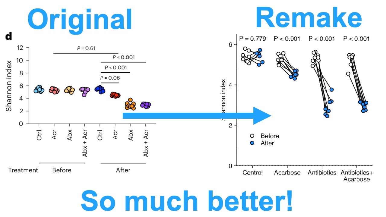
This video tutorial focuses on refactoring a specific panel from a scientific figure published in *Nature Microbiology* to better visualize Shannon diversity data derived from paired mouse samples. The original publication presented fecal microbiome data collected before and after four different experimental perturbations, including controls, antibiotics alone, carboxymethylcellulose (ACR) alone, and their combination. A key critique of the original visualization was that it failed to reflect the paired nature of the experiment, where the same eight mice were sampled at two time points for each treatment group. To address this, the presenter demonstrates how to restructure messy Excel data into a tidy format using R's `readxl` and `tidyr` packages, ensuring that "before" and "after" measurements are properly aligned by replicate ID before plotting.
The core of the tutorial involves creating two distinct methods for generating slope plots with jittered dodged points in ggplot2 to highlight changes over time within each treatment group. The first method employs a manual approach where the presenter programmatically calculates custom x-axis coordinates. By converting categorical variables into numeric indices, he applies specific dodge offsets and random jitter values using `runif` functions before plotting. This technique allows for precise control over point placement so that lines can be drawn connecting the "before" cloud to the "after" cloud within each treatment group, effectively visualizing individual animal trajectories while maintaining statistical rigor through paired t-tests or Wilcoxon tests.
The second method utilizes faceting as an alternative strategy to achieve a similar visual result without manually calculating jitter coordinates for every point. In this approach, each of the four treatment groups is placed in its own facet using `facet_wrap`, which simplifies the process of connecting points with lines by grouping data based on replicate IDs rather than relying solely on position aesthetics that often fail when combined with random jittering. The presenter refines both plots extensively to match the original publication's dimensions and style, adjusting axis limits, font sizes, legend positions, and color schemes (using white for pre-treatment and dodger blue for post-treatment) to ensure clarity and aesthetic consistency.
Ultimately, the video concludes that while both manual coordinate manipulation and faceting offer valid pathways to creating high-quality slope plots in R, each has its own trade-offs regarding flexibility versus ease of implementation. The presenter emphasizes that regardless of the chosen method, visualizing paired data by connecting pre- and post-treatment points provides a much clearer interpretation of experimental trends than unpaired scatterplots. By implementing these improvements, the refactored figures not only correct the original authors' visualization choices but also enable more powerful statistical comparisons to determine if changes in diversity are significant across different treatment groups, showcasing R's versatility in data visualization workflows.
Read the full video transcript
Hey folks, welcome back for another
episode of code club. In this episode, I
will be refactoring panel D from this
set of panels in a figure published
recently in the journal Nature
Microbiology. This panel describes
Shannon index Shannon diversity data for
the microbiome of mice that underwent an
experimental protocol where the
investigators were able to obtain fecal
samples from the mice before and after a
experimental pertabbation. There are
four different pertibbations. control
where the mice weren't perturbed. Um ACR
where the mice received a carbos, ABx
where the mice received antibiotics and
then ABX plus ACR which is the
combination of antibiotics and a carbos.
Again, they obtain the samples before
undergoing one of these four treatments
and then after these treatments. And so
the before we're on day 21 of the
protocol and the after we're on day 28.
And when I look at panel D, as I did in
a critique video that I posted a few
days ago, I'll put a link to that
critique video up here so you can go
check out what I talked about in there.
I mostly talked about panel F, but
towards the end I also talked about
panel D and some of the other panels.
The gist of that critique is that the
authors really did themselves a
disservice by not visualizing the data
in a manner that reflected the
experimental design. Again, the same
eight mice were sampled before and after
the experimental protocol. At a minimum,
the same mice should have been put next
to each other. So, these eight control
mice here on the left are the same as
these eight control mice here in the
saturated blue. And the same for the
purple and the purple and the yellow and
the orange and the pink and the red.
Right? Put them next to each other to
make them easier to see. But because the
same mice were sampled across the the
same treatment group, draw a line,
right? And so now if you draw a line
between the eight mice, it's easier for
your audience to see the overall trend,
the overall change. When you do a paired
analysis like this, you're looking at
the change. Not just the difference, but
the change. And that difference is
subtle, but it's important. And so what
I'm going to do is I'm going to take two
different approaches today to generating
a slope plot version of this panel D.
Again, this figure came from a paper
published a few weeks ago in Nature
Microbiology titled a carbos redirects
gut microbiome utilization of dietary
carbohydrates to suppress anoflaxis in
mice. What that means, don't worry about
it.
As always, if you've watched my other
videos where I do these types of
critiques and refactorings and
recreation videos, I always use plots
where they provide the source data. Over
here in R, I've already written the
download file function statement to
download that Excel workbook as the file
figure 3xlsx.
If you want to get any of the code that
I am generating today, by all means do
so. Down below in the description for
today's episode, you'll find a link
where you can get this code. Also down
there is a link to the paper so you can
go back and look at the paper, look up
the figures, do your own critiques, try
to recreate the data, recreate the
visuals on your own. Uh that would be
awesome. I love hearing how people are
doing the same process that I'm doing on
their own and then coming to see how I
did it, right? That's just so beautiful
and that's really just keeps me going
doing these types of videos. So by all
means, let me know how that works out
for you. Also down there you will find a
link to a sign up where you can sign up
for a 30 minute slot in my calendar to
let me know how I might be able to help
you on your own data visualization
journey. I'm happy to do coaching and
consultations with individuals or
research groups to help them design
better figures and then implement those
designs using R. All right, let's go
ahead and load our libraries and
download our Excel workbook that I'm
again I'm saving as figure 3 XLSX. The
data I'm interested in is in tab fig 3D.
This is not tidy by any means. It's
basically one row of data where they
have before and after and then they have
the four treatment groups. Within each
treatment group, again, they have eight
mice. They don't indicate the mouse
number or the replicate number. I'm
going to assume that this 5.074
value is paired with the control in the
after this 5.5177
value. So I'm going to assume the first
column corresponds to the first column
before and after and second through 8th
as well. All right. So we have a little
bit of work to do to get this all read
in. And so what I will do is I'm going
to read in C5
to BN5.
So before I forget, let's do C5 to BN5.
So we'll do read Excel and we're going
to do fig
3 XLS X. We're going to do sheet equals
fig 3D. And if we do just that, we see
we get a lot of ugliness and unhappiness
and parsing from read Excel. So what I
can do then is take this range and add
that as an argument. I can do range
equals that within quotes. Now what I
get is a table with zero rows and 64
columns with these different variables.
That's not what I want. I want to be
able to add in column names. So I'll do
call names, but I'm going to have to
create my own column names. Okay. So,
I'm going to call that variable call
names. Not very original, I know, but
hey, you got to come up with something.
Naming things is hard. So, we'll do call
names. Uh, let me hold on to that for a
minute because we're going to want the
replicates, we're going to want the
treatment, and we're going to want the
time, right? And so, uh, the replicates
is going to be we'll do rep one to 8,
and we're going to repeat eight times,
right? And so if I run this, I should
get 1 to 8 eight times as I do. And then
for treatment, we're again going to do a
rep on the vector CT RL AC
ab.
Then I'm going to repeat each eight
times. So I do I get control eight
times, but I also want to take this
vector and I want to duplicate it. So I
think what I can then do is times equals
2. And so that should take that set of
32 and duplicate it. And sure enough, I
now have these eight controls. And then
I also have these eight controls. Right?
And so it's duplicating it to make it 64
units long. And then the time I'll do
another rep where I will do before and
after. And we'll do each 32 times. So
now if I look at time, I've got 32
befores and 32 afters. Then I can pull
all that together. Call names with
paste. I'll do time treatment and
replicates. And I'm going to do a
separate by an underscore. And I'm going
to go ahead and make sure I've got
everything loaded. Now when I look at
call names, I've got these column names.
And now when I run read Excel, what I
find is that I have my column names with
my values. And this is not tidy. And I
would like to get it to be tidy. So to
get it tidy, I'm going to add a column
that I'll call index. And I'll say one,
right? And so we don't see it. It's at
the very end, but trust me, it's there.
If you want to see it, we could do
before equals everything. And so now
what you see is we've got that index
column, right? We need that value for
pivot longer because what I'll do in
pivot longer, I'm going to take all of
the columns except for the index column,
right? And so that then allows me to
pivot the table longer to get it to be
tidy. So now I have a column index,
name, and value. But I'd like to give
it, I don't know, more informative name.
So we'll do names 2 equals I'll I'll do
call name and put that in quotes and
values to equals Shannon. And so now we
have index, call name, and Shannon. I
would like to pull apart that call name
column. So we'll do separate wider delim
and we'll do calls call name delim
equals the underscore and then we'll do
names and we're going to do time
treatment and replicate. And so now what
you'll see is that we've got time
treatment replicate and Shannon going to
go ahead and put this on a separate line
so it doesn't scroll off the side of the
screen. And then let's go ahead and do a
select. And I'm going to drop the index
column. Okay. And so now we have time
treatment replicate and Shannon. And we
are good to go to go into making our
plot. I'm going to go ahead and save
this as D for data because I'm going to
use that data frame to make the same
slope plot by two different methods.
Let's go ahead and take our D and we'll
put that into ggplot. on the AES on the
X axis we're going to put the treatment
on the Y we're going to put Shannon and
then I'm going to do color by time and
let's stay there for a moment and we'll
then do geome point and I've also got a
gg save statement here that will save my
version of the figure to the same size
same aspect ratio as the original and so
there we go it's not much to look at at
this point but we're getting there let's
go ahead and think about how we can
dodge our points to have the before on
the left and the after on the right. And
so we could try that with geome point
doing position equals position dodge.
And we need to give it a width. So we'll
do width equals 0.3. So it's a little
bit hard to see in this case, but we got
a little bit of a dodge. You can see
over here clearly the red for after is
to the left of the teal for the before.
So that's the opposite order of what we
really want. Let's go ahead for now and
up this width to 0.5 so we can get a
better sense of that dodging. That looks
good. But again, I want the before to
come before the after on the left, not
the right. So, let's go ahead and fix
that. And so, what we could do, and this
is something I think I want to do in D,
is to go ahead and modify the time
column. So in here I'll do mutate
time equals factor on time and we'll do
levels equals and then we'll do before
and after. And so now we can see that we
have the before to the left and the
after on the right already.
I mean hopefully you can see where we're
going here and that we are doing a much
more direct comparison of the data,
right? Like this is the control and you
can see those right next to each other.
there's really no difference. And that
over here, like this antibiotics,
there's a huge drop, right? And there's
a pretty comparable drop for the
antibiotics plus the ACR and a smaller
drop for the ACR. Uh, interestingly,
when they looked at the ACR, this red to
this kind of pink, they gave a p value
of 61. So, not a significant difference.
So, we'll come back to that and do our
statistical analysis to see if these
changes are significant or not. But I
think at least from this perspective,
I'm wondering why this was not
significant. That that really surprises
me. So anyway, um we'll get there. So
let's go ahead and remove that legend.
Uh we might bring it back later, but for
now, let's go ahead and hide it. We'll
do false. And that gives us more space
left to right. One concern that yes,
we've dodged things, but there's eight
points here, and those might be hard to
see, right? So what we might like to do
instead would be jitter dodge. So we'll
do jitter dodge. And then here we don't
need the width argument. And so now what
we can see is that we've got jittering
to the points. And and that looks pretty
nice. One thing that um when I've got
jittered points like this, I like to
have kind of a black border so that I
can see where the points are. And so
maybe what we'll do instead of color
will be fill. And then in gome point
we'll do shape equals 21. My favorite
shape. And we can see then that that
gives us a black border and a colored
fill. So what I would like to do next is
to draw the line connecting the two
clouds of points on the left and right
for each of the treatment groups. To do
that, what I would do would be like gome
line, right? But if I do GM line, I get
a unfortunate result where I'm basically
connecting the points within the color.
It's not what I want, right? I want it
to go across the colors. And so, um,
what we might think about would be like,
uh, position
position jitter dodge.
And that also is weird, right? that's
basically connecting all the points
within the group. Um, and that's again
not what we want. There's other things
we might try with kind of defining the
grouping of the data and things like
that, but ultimately those aren't going
to work. The first approach that I'm
going to take to connecting the points
within a treatment group is I'm going to
basically do my own jittering and
dodging. Okay. So to do that, I'm going
to create a variable jitter.
And let's say the jitter for now is 0.1.
Our dodge, let's make that 0.3.
What I'm going to do within D is I'm
going to create a column that I'll call
X. So really what jitter dodge is doing
is it's adding a value plus or minus a
consistent value for the two treatment
groups, right? That is dodging. And then
within each of the dodges, jitter dodge
is then randomizing the position of the
points within this pipeline. What I
could do would be to mutate X and I will
then take X and make that as numeric on
treatment. We get a warning because I
had forgotten that I haven't made
treatment a factor yet. So let me go
ahead and comment that line out. And
this is good anyway because it would be
helpful to get things in the right order
on the x-axis. So we'll come back up
here to where I've got this mutate
statement where I defined time as a
factor. And let's do treatment as a
factor and we'll do treatment and we'll
do levels. And now I want things in the
order I want them or the order that they
had them in the original perhaps. So,
we'll do C TR RL AC R AB X AB X + ACR.
And then I'm going to go ahead and put
this levels on a separate line. And just
to prove to ourselves that that worked,
we now see that we've got our control
going all the way across matching the
ordering that they had in in their
panel. Okay. Now I can come back to my
pipeline and do D piped into the mutate
X as numeric and we can then see we've
got this X column right and so the
control is one ACR is 2. If we did like
last value pipe that to tail we'll see
that we have X= 4 at the very end. Okay
so we've got that X. What I want to do
is to modify my X to dodge it and jitter
it. So, I'm going to create another line
in this mutate statement. Maybe I'll
give myself a little bit of room here. X
equals if else time equals equals
before, then I'm going to do X minus my
dodge. Otherwise, I'm going to do X plus
my dodge. And we can then pipe that into
our ggplot statement. And instead of
mapping treatment to X, I'm now going to
be mapping X to X. So I need to make
sure I've got my jitter and my dodge
loaded. And then I also want to take out
this position statement. And let's
remove it from here as well from the GM
line. And so now what I see is that I've
got my dodging perhaps a bit more of a
dodging than I want. And I see that all
of the before points are connected and
all the after points are connected.
Let's not worry about that just yet. So
maybe because that's a little
distracting, I'll go ahead and turn that
off. And let's go ahead and reduce the
dodge to 0.2. And that's that's a good
place to start. Okay. So now we've got
our points dodged. And now we want to
add the noise. We want to add the
jitter. So let's come in here and we'll
do x equals. And then we're going to use
runif. And so runif takes three
arguments. the n that you want, the
number of random numbers you want, and
then the range. So if I do run 10, I get
10 numbers between 0 and 1. If I do run
f10 -1 to 1, I get 10 numbers
betweengative - 1 and 1. And if I do run
f10 minus jitter to jitter, I'm going to
get 10 numbers between my negative
jitter and my positive jitter. And then
I can add that to my x. And so what I'd
like to do is to generate this vector of
numbers again between negative jitter
and jitter. And I'm tempted to do like
one because I want to get one value at a
time. But what that will do is that will
turn x to basically be uh the same
random number. And I think what I'd
rather do is to use n that which will
give me the number of rows in x. Not
sure if this is going to work. So, let's
try that out. And sure enough, we now
have our jittered values, but I want to
add this to X. So, now when we look at
this, we then get our jittered values.
And we can then bring that into the rest
of our pipeline. And now we've got our
jittered and dodged points, right? And
so that looks pretty nice. I think maybe
the dodging we could reduce a little bit
to say like 0.15. And so that brings
those a little bit closer. We we can
fuss with things later as we change the
sizes of things, but this is looking
pretty good. The next thing we want to
do is to add the line. So we'll again
come back to GM line. We also have this
plus sign commented out. So we'll run
that again. And as we saw before, our
grouping is by color. And so I want to
change the grouping to be by the
replicate and by the treatment. So then
back up here within ggplot I can add
group and I'll do paste treatment
and replicate. Okay. And so this will
create a dummy variable effectively
telling geome line what points to
connect. And there we go. We now have
connected our points. Right? And so
again we couldn't use position jitter
dodge with geome line. we couldn't get
the the points to connect, right? And
here we've rolled our own jitter dodge
effectively. Right? And so now we have
those lines connecting the points. But
uh we need to make this look a little
bit nicer. Right? So first of all, I'm
going to put the points on top of the
lines. And so to do that, we can take go
line and run that right up here. I'm
also going to remove this position
argument and get rid of this final plus
sign. And so that then puts those on
top. Let's go ahead and make our line a
little bit thinner. We'll do line width
equals 0.4. And so again, um, that might
go a little bit thinner. Let's try 0.3.
I think that looks pretty nice. In the
process of making our jitter dodge
function, um, we kind of screwed up our
x-axis labels. So let's go ahead and fix
that. To do that, we can come in here
and we can do scale x continuous. And
again, we have our breaks from one to
four. And we're going to want labels.
And I think what I could do would be
like levels d sign treatment. And then
that gets us those labels going across.
So one thing I'm not a fan of is these
abbreviations for the names. We can
change that by changing the label of the
treatment factor back up here when we
defined D. Right? So back up here, I can
then do labels and I can do control a
carbos
anti-biotics
and then I can do antibiotics
plus a carbos.
And I already know that I'm going to
probably want a line break here to put
that over two lines. And so now we've
got our spelled out names. Okay, now
let's go about trying to improve the
appearance of this. And the first thing
I'll do is put this into theme classic.
And that gets rid of the background and
those grid lines. Let's go ahead and
change our yaxis. I'll go ahead then and
do a scale y continuous. And we'll do
limits from zero. Let's take that up to
say like 6.5. And I forgot a plus sign
here. So now we have our limits from 0
to 6.5. I like the look of having the
zero run straight into the xaxis. So to
do that here in scale y continuous I can
do expand equals expansion. Uh and so by
default if I use expansion without any
arguments it will turn off the
expansion. And so there we see now our
zero is right at the xaxis. Uh let's go
ahead and shrink our font sizes. We can
do theme access.ext
equals element text. Let's do size
equals 7. And then let's do axis.title
equals element text size equals 7. And
again, that shrinks that down. And then
that actually makes this twoline label
here fit within the screen. Let's go
ahead and change our titles from our X
and Y axis. I don't think I need a title
on the X-axis because I think it's
obvious what those are. So we'll do x
equals null, y equals shannon index. Add
that in. Let's go ahead and thin the
axis line. It's pretty thick. So to do
that, we'll do axis.line equals element
line. And we'll do line width equals
0.2.
And then axis.tix
element line width equals 0.2. And then
that of course snazzies that up a bit.
All right. Now, let's think about that
fill color on our points. Part of me is
thinking, let's use arrows. I just made
a video changing in ordination with
paired points using arrows. But let's
not use arrows in this case. Let's use
an open circle for before and a closed
circle for the after. We could easily do
this with like white and black, but
that's kind of boring. So, let's come
back up here to our scales and I'll do
scale fill manual. Get a plus sign in
there. And then we'll do values
before and let's make that white. And
then after. And let's make that dodger
blue. And there we go. We now have our
before and after. Our white before, our
blue after for these four different
treatment groups. I think that looks
pretty nice. Let's go ahead and bring
that legend back in. And I think I
turned that off up here with geome
point.
And so there again is my legend. Um I
would prefer to have this probably in
the lower left corner. So I also don't
want that title. So let's come into labs
and do fill equals null. And then within
theme
let's do legend position equals inside.
And then legend position inside. And
again, we're going to give it a two
value vector for the X and Y position.
Let's start with 0.2 and 0.2. And I
think that's a great place. Um, but we
want our text to be smaller and the
spacing between our lines of that legend
to be smaller as well. Let's go ahead
and do legend.ext
equals element text. And we'll do size
equals 7. Everything else has been
seven. So that's seven. Um, I think that
works pretty well, but again, the
spacing is pretty big. So, we'll do
legend.key
dos size. Let's do unit 8 pt. And so,
that shrinks that down and makes that
look pretty nice. I'm actually pretty
happy with how that looks. U, maybe we
should think about increasing the dodge
between the treatment groups. So, back
up here again, we had this dodge. Let's
maybe take this to 0 2. And something
else I should do is set seed because
we're using this run if function to
jitter our data. So I'm going to use my
favorite uh seed, my birthday. And so
yeah, I think that looks pretty good. So
the final thing I want to do on this
version of the plot is to add the p
value. So you'll notice they have their
p values up on top. And again, hopefully
you can already see that mine is easier
to interpret than theirs. Um I don't
think there's really any argument there.
I think it's obvious that by putting
things next to each other, by connecting
the dots, so to speak, of the same
animal before and after, you can see the
downward trajectory for these three
groups, whereas the control uh is moving
up and down, right? There's no
consistent direction where there's a
very consistent direction for these
three other groups. So then let's add
the p value. Now, in the original, what
they did, I think, was to take the eight
treatment groups as separate groups, and
they ran it through a one-way ANOVA and
then did pair-wise comparisons to see
which comparisons were significantly
different using a post hawk test. I'm
not going to do that. What I'm going to
do instead is a paired test. And I'm
going to assume that these Shannon
values are normally distributed. If
they're not, we could use like a Will
Coxin test. um if they are normally
distributed we could use a t test
regardless if we're doing willox or t
and maybe we'll do both um we can do a
paired test so let's go ahead and try
that so I'm going to move all the way
back up here so we have d so to do the
paired analysis I'm going to need
separate columns for the before and the
after so let's go ahead and pivot wider
and we'll do names from equals time
values from equals Shannon and again now
we can see that for control replicate
one we have a before and an after mouse
2 before and after okay and now what I
can do is I can nest the data so I'll do
data equals everything but the treatment
and again you can now see that we have a
table with two columns one for the
treatment the other for the data and I
can then feed this into a mutate and
create a column I'll call test and we'll
use the map function to iterate over the
data column and we'll do t.est test and
then I'll dox dollar sign before comma x
dollar sign after and so that x is the
argument that data is representing and
then what I can do is say paired equals
true and this creates our column test uh
but that is coming out as a list of h
test objects and what I'd like to do
then is pipe that into tidy and the tidy
function comes to us from the broom
package. So I'll do library broom. Get
that loaded. And now if we come back to
this, we now see that that changed from
an h test object to a tibble that's one
row and eight columns wide. I can get a
look at that by doing unst on test. And
then we see that we have our estimate,
our statistic, and our p values. So the
estimate is the change. And I think if I
want it to be the negative, then we're
going to want the after followed by the
before, right? And so now we can see the
amount of decrease from the before to
the after for each of the treatment
groups. And that's an average decrease.
And again, that is a paired analysis.
And we see these p values. So let's go
ahead and clean this up a bit. So we'll
do select treatment
and p value gets us that I'd like to
correct those p values for the multiple
comparisons. So we'll go ahead and do a
mutate on p value equals p.adjust adjust
and I will then do we'll adjust the p
value column and we'll do method equals
BH for Benjamin Hutchburg and that gets
us those p values which doesn't really
change much in terms of what's
significant or not. And what I notice is
that except for the control they're all
much less than 0.05.
So now what I'd like to do is make a
pretty version of the p value. So in
here I'll do pretty p and let's do an if
else and I'll say p value less than
0.001
then I'm going to return p less than
0.001 001
otherwise what we'll do is I'm going to
say like p equals p value right um and I
think what I'll do in here is the glue
function and so let's do glue on that
and I need to load library glue and
again coming back down here to glue this
p value then will need to be in curly
braces
And I think I'm missing a parenthesis
here. Okay, so we run that. And so now
we see our pretty P is this, which is
not pretty. That's a long number. So
let's go ahead and round this. So we'll
do round that. And we'll do to three
digits. And so now we see that's 779.
And I think that looks pretty good. And
so now what I'm going to do is I'm going
to save this as P. Okay. Now what I can
do is I can come back into my plot and I
can do gome text. I'll say data equals p
aes and so on the xaxis we're going to
put the treatment right because our p
looks like this. So we have treatment
and then our y um I'm going to put at
say 6.1.
We'll see how that does. And then our
label
will be pretty p. And I'm sure there are
things like color that I'm not using. So
I'll say inherit aes equals false cuz I
always seem to get I get r to bark at me
when I don't do that. So it's still
barking at me. And it's saying discrete
values are supplied to a continuous
scale. Yes. Yes. Yes. So, back up here
where I had treatment, I need to say
asnumeric on that treatment. And so,
there we go. There's our p values.
They're much too large. Let's go ahead
and shrink that size down a bit. And so,
I'll do that by doing size equals, let's
say, 7 and size.unit equals pt to get to
be a sevenpoint font. We now have those
p values. Maybe we want to move them up
a little bit. And so I put it at 6.1 I
believe. Let me make it 6.3. And there
we go. Okay. So again, there's on the
left, mine on the right. Which is easier
to interpret? Also, which gives the
results that are more powerful? The one
on the right because we used a paired t
test. Now I could try it again, but with
a will coxin test. And let's see what
that does. So again, um, I could take
this line. I'm going to comment it out
for now. And I'll do tilda willox test.
And it's going to be, I think, the same
as everything else that we've got in
here. Right now, when I look at this and
I do P, I get these pretty p values are
all 0.01. Right? And so we basically get
the same result in terms of
significance. And so if you're
comfortable assuming that your data are
normally distributed, I would use the
paired t test. And if you're not, then
you'd use the willox test. In this case,
the result is the same, right? We're
going to get small p values for the a
carbos, the antibiotics, the antibiotics
plus the a carbos. This was method one.
I am going to rename this and I'll call
this manual because I did this manually.
I made my own jitter dodge. So now I
want to try this by a different approach
and instead of manual I'll go ahead and
call this facet because one way to think
about this would be as four separate
facets. And this way then I wouldn't
have to worry so much about the jitter
dodge. I could jitter and that actually
might work with the line. Right? And so
now let's try it using facets again. We
have D. So we'll pipe D into ggplot AES.
On the X axis we'll put the time. On the
Y we'll put the Shannon.
The fill we'll make the time also. And
that's good. And then we'll go ahead and
do gome point. And I'm going to go ahead
and facet wrap by the treatment. Right?
So each treatment is its own facet. And
then I've got this saved. So, we've got
our four facets. Again, we want them on
one row. So, let's go ahead and here and
we'll do n row equals 1. And that gets
those right next to each other. I'm
going to go ahead and turn off the
legend as we did before. So, I'll do
show.leend equals false. And also in
here, I want to do shape equals 21. And
so, there we go. We have our four
treatment groups which we can kind of
see those labels up here in those
strips. We also have our before and
after on the Xaxis. What we've got the
dodge. Now we want to add the jitter and
we want to add the lines, right? And so
maybe instead of geome point, we could
do geome jitter. And so then that gets
us a jitter to our data, right? And then
perhaps what we could do would be geome
line. We could then do position equals
position jitter.
Add that in. And so now what we see, of
course, is that we have kind of the same
effect that we saw earlier when we tried
to draw the line. And that we're
basically connecting all of the dots,
except they don't connect to the dots we
had because we have a different seed for
our jittering. So that's something we'll
have to come back to. But we want those
lines to go across like we had up above.
So to do that, we're going to need to
add a group argument. And so we saw this
before with the previous version,
instead of pasting two things together
here, I should be able to do replicate.
And so we're going to group by replicate
to draw lines between the two
replicates. And so there we go. We now
have our lines, but as I mentioned, they
don't really connect to the points
because we've got a different jitter for
the line as we have for the points,
right? This line here should be on that
teal point. So to deal with that, we can
use the seed argument within position
jitter. And I'll give it again my
favorite seed 197620.
Um to set the seed for gome jitter, I
need to also set the position position
jitter within geome jitter. Geome jitter
is the same as geome point except the
position is position jitter instead of
position identity. So this now should
get us to have our lines connecting our
points. So I'm a little surprised that
that didn't solve the problem. Um and so
I wonder if geome line here should
actually be g path. And there we go. So
I'm not entirely clear why that makes a
difference. The difference between geome
path and gline is that geome line will
sort the data frame by the column
getting mapped to the x aesthetic before
plotting it whereas geome path leaves
the data as it is. And so maybe there's
just something weird happening so to
speak under the hood um between geome
path and geome line when you are using
position jitter. Regardless this works
our points line up with the lines and
now we are ready to make this look
better. So, as we did before, let's go
ahead and put geome path before gome
jitter. And so, now our lines fall
behind the points. So, the next thing
that we're going to want to do is we're
going to want to get rid of these xaxis
labels. And we want these strip titles
to actually be the x-axis text. So, to
do that, let's go ahead and modify our
x-axis so that we only have the single
tick like we have here, right? And so we
can do that with scale x continuous and
I'll do breaks equals 1.5
and I'll do labels equals nothing a
quote right and so this is going to
complain because I'm giving it a numeric
value when our x is a factor. And so
here what we'll want to do for x is as
we did before as dotn numeric on time.
And let's go ahead and put this over a
line. And so now what we see is we've
got our tick mark and no label there.
And we've got this title. So let's go
ahead and clean up our labels real
quick. So we'll do labs
x equals null y equals shannon index.
And while I'm at it, I'll also do fill
equals null. Okay. And so now we've got
our ticks, but we want these strips to
be down here. So to do that, then up in
facet wrap, we'll do strip.position
equals bottom. And so that then puts our
strips at the bottom, but it's between
the tick mark and the plot. And so to
get that on the outside, we'll come in
and I'll go ahead and do theme classic
to get the solid axes and a white
background. And then we'll also do theme
strip.placement
equals outside. And so now we can see
that our strip is on the outside of the
tick. But uh we still have a space here
for basically that empty string for our
axis text. So we can go ahead and do
axis.ext.x
equals element blank. That brings that
in closer. We can also now modify our
strip. So we'll do strip.background
equals element blank. That gets rid of
the border. Um, and we still have quite
a bit of space there, though. So what we
also could do would be strip.ext
equals element text
margin equals margin. And that brings
that up rather nicely. All of the axis
text up in the this version was size
seven, as was the title. So, let's go
ahead and make those all seven as well.
And we'll want to do the same thing in
strip text. Again, this is not axis text
or an axis title. Uh, it's a strip,
right? So, we'll come in and do
axis.ext.yals
element text size= 7. And then we'll
also do axis.title equals element text
size= 7. We don't have a title on the
bottom. So, we don't need to say x ory.
We can just say access title. Now, my
antibiotic plus a carbos is getting
clipped a little bit on the sides. Not
going to worry about that just yet
because ultimately we're going to be
drawing these together. So, before we
get there, let's go ahead and clean up
our yaxis. You'll recall that we had
some styling up here that maybe we
should just go ahead and borrow. And
I'll grab these lines that go from axis
line ticks and the legend and copy that.
And we'll paste that in here. And let's
see if we did any damage. So that thins
up our lines. And good. Now let's go
ahead and worry about our yaxis, which
again from the previous we had these
scales. So we had scale Y continuous and
scale fill manual. I'll go ahead and
grab all of that and bring that down
because that's that's not new. Um, so
paste that in. Cool. It's coming
together. It's starting to look a lot
like what we had previously again with
our yaxis scale. Let's thin our line.
And so I think before we had line width
of.3.
So let's do that here in scale in geome
path. We'll do line width.3.
That thins that up. And now what I want
to do is again we have these four
facets. Let's pull them together. And so
we could come in here and we can do
panel.spacing.x.
We'll do unit zero pt. And so now we can
see we have a solid x-axis. And no one
would be the wiser that we actually have
four different facets here except we are
getting a little bit of clipping and
that is because we don't have enough
space on the edges of our plots. So
let's go ahead and in our scale x
continuous let me move this labs up out
of the way. In here, I'll do expand
equals expansion. And let's do add
equals 0.5. I don't really know what it
should be. So, we'll start there and
adjust. I think we got it. I think that
is pretty much the same thing. Um I I
guessed at 0.5 and and that got us
pretty close. There's no clipping on
these titles. The points are pulled in.
The only thing left to do is go ahead
and bring in those p values, which
you'll recall we had a geome text call
in here. And I will copy that and bring
it down here. Maybe put that after my
geome jitter. Clean this up. Run it. Ah,
so close. So close. And I think the
problem is that the P is centered at one
rather than 1.5. So we need to adjust.
You can't always copy and paste your way
to success. So X here will make uh 1.5.
And voila, we got it. So the final thing
we need to do is bring in that legend.
Again, I did show legend equals false
down here for geome jitter. Get this out
of the way. And there we go. And like I
said, I think that is like bangon
identical except for like the difference
of the random seed. Maybe the the dodge
could be a little bit larger in our
faceted version. Or I guess that would
be effectively the jitter could be less.
So let's try that. So the jitter and
geome jitter. Let's go ahead and bring
this down. And we'll then do width
equals 0.2. I think that looks like a
pretty good jitter. We need to connect
the lines by doing a width equals 0.2
for the geome path. So we'll do width
equals 0.2 for that as well. Okay, I'm
happy with that. I think this looks
pretty pretty similar. So again, there's
two approaches that I took here to
making the same exact plot. The first,
which I would be hardressed to tell you
which was which without looking at the
titles. The first which was over here, I
manually did my own jittering and
dodging of the points. Okay? And that
way I could connect the points with a
line with the ends of the lines being
dodged and jittered. I'm not able to
jitter and dodge the ends of the lines
with these multiple treatment groups.
And so again, I had to create my own
xaxis coordinate value by taking the
numeric value of the factor, adding a
dodging factor, and then adding a random
value to jitter the x position. And so
that's what we get here. This one
actually is the faceted version. And
instead of dodging the points, I
effectively put each treatment group in
its own facet. And then I fudged the
X-axis. And actually, you can tell
because these strip titles are
horizontally justified. And if I wanted
to deal with that, I could come back up
here to strip text and I could do VJ
just equals 1. And there you go. It's
now vertically justified. But again, I
treated each treatment group as its own
facet. And then I didn't have to do
jitter dodge and I could jitter the ends
of the lines. And that way then I didn't
have to basically roll my own jittering
and dodging. So I think both of these
approaches that I took have their
challenges to them and I wouldn't say
one is necessarily easier than the
other. I think the faceting is perhaps a
little bit easier because you don't have
to really think about like how do I
dodge, how do I jitter, how do I use run
if and all that stuff, right? If you're
in a situation where you want to facet
on other parameters, then you don't want
to burn your facets this way. And so
that that then means that you'd probably
have to roll your own like I did up
here. I mean, I'm pointing to things
that look the same, I know, but um it's
a matter of whether you're going to be
faceting on other things if you want to
perhaps take the facet approach versus
manual approach. I don't know which I
prefer. I think they're both pretty
good. Um and I'm really happy with how
they turned out. Most important,
however, I think is the difference to
the original. And I really do feel like
my version
is much superior. it's much easier to
make the comparisons between the pre and
post treatment samples. There's an
additional set of questions that the
authors did not ask and that I'm not
following up on which is is the change
significantly different between the four
different groups right so or between
these three groups right so the a carbos
the antibiotics the antibiotics plus a
carbos they all had a significant change
in diversity because of the treatment is
the level of change different right and
and so kind of eyeballing these I don't
know that the antibiotics and the
antibiotics plus a carbos
that that change was significantly
different between those two groups. Yes,
I think it was different than a carbos
alone. But antibiotics plus or minus a
carbos, is there a difference? I don't
think so. Of course, you could run that
statistical test. That would require a
repeated measures analysis of variance
design that models that paired analysis.
That's beyond what I want to get into
today. It's beyond what the authors were
interested in describing at least in
their text. But that's certainly
something that you could do. Again, the
beauty of R is that there isn't just one
way to do things, but there are multiple
ways to get to the same exact path. Um,
and so, thank you for indulging me in
this video. All right. Well, thanks for
watching. Please tell your friends what
we are doing and I will see you next
time for another episode of Code