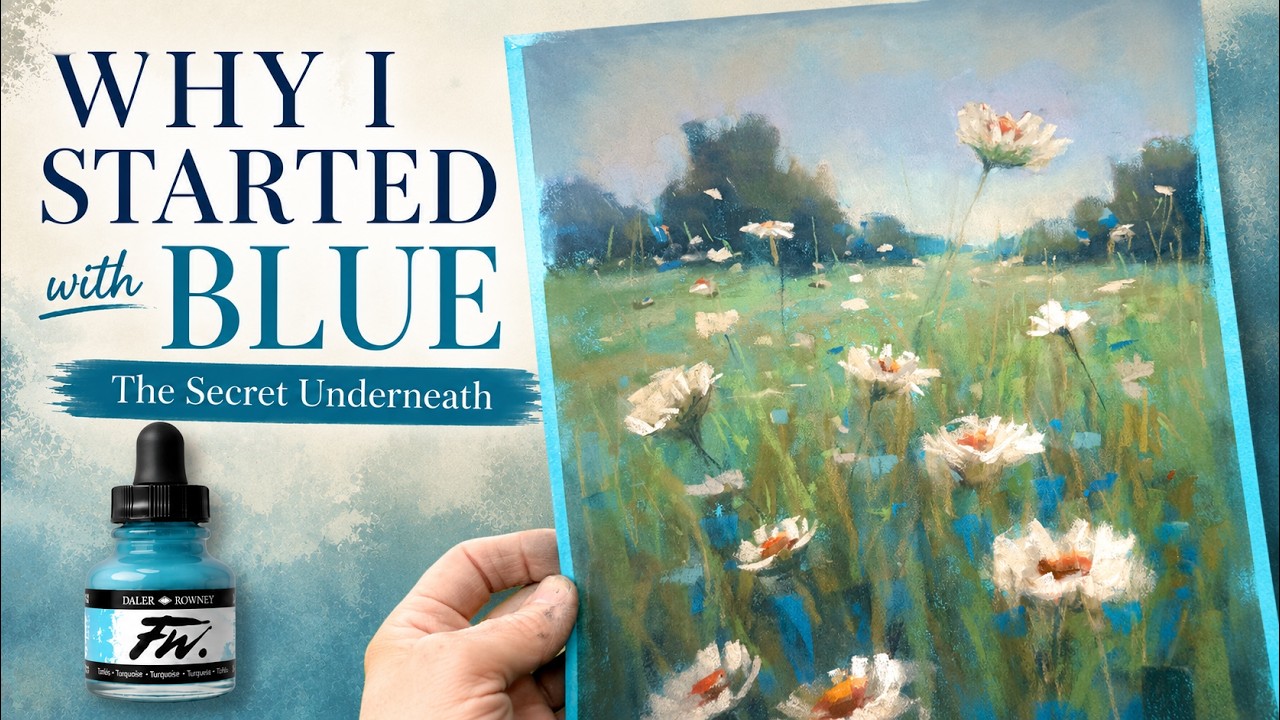
The Blue Underpainting Technique Every Pastel Artist Should Try!
Watch on YouTubeVideo summary
In this tutorial, the artist revisits a forgotten technique from six years ago that involved using a blue or turquoise underpainting to create a calming and beautiful foundation for pastel landscapes. While she often prefers warm complementary underlayers, she rediscovered how applying acrylic ink in shades of turquoise at the very beginning could significantly influence the final mood of the artwork. The process begins with selecting specific materials, notably Pastel Mat paper which is praised for its ability to handle extensive layering and its water-friendly nature, allowing the artist to dilute her medium effectively. She also emphasizes the importance of creating a value study, or notan, using simple grayscale markers like Tombow to capture the gesture and composition before adding color, ensuring that even spontaneous paintings have strong structural integrity.
The demonstration proceeds with the application of diluted turquoise acrylic ink across the entire surface, establishing a cool tonal base that unifies the subsequent layers. After blocking in major shapes such as trees and distant fields using dark values for foreground elements and lighter tones for background areas to create depth, she introduces neutral greens and lavenders while carefully blending sections with chamois cloths to maintain texture without overworking the piece. A key distinction made between this session and her original video is a deliberate shift in style; whereas the earlier work was heavily scrubbed and worked to death, this version aims for a fresher, more gestural approach where flowers are kept larger and less detailed to preserve vitality.
As the painting develops, the artist focuses on adding life through specific mark-making techniques rather than excessive blending or detail. She uses thin Prismacolor pastels to add stems and small shapes in the grasses, ensuring that focal points like sweet wildflowers stand out without appearing flatly pasted onto the surface. Throughout this stage, she balances warm accents added to flower centers and tree trunks against the persistent coolness of the blue underlayer visible beneath the textured background. The final result is a vibrant landscape where real-world grasses placed on the sides contrast with the cool tones of the canvas, proving that even when using many neutrals, a strong colored foundation can bring significant life and sparkle to the finished piece.
Read the full video transcript
Sometimes [music] revisiting an old
painting reminds us why something
worked. [music]
Join me in this lesson where I not only
revisit an old reference image, but also
rediscover a forgotten technique that I
really loved. This tutorial was from 6
years [music] ago and I had forgotten
about the beautiful impact of a blue
under painting. If [music] you followed
many of my lessons, you probably know I
often like to begin with a complimentary
or warm under [music] painting. But this
older lesson of mine reminded me the
amazing, calming, [music] and beautiful
influence of applying a blue or
turquoise in this case under painting at
the start. I'm glad you've joined me
today in the studio and [music] here we
go.
Let me share with you the products that
I'll be using for this tutorial. They're
very similar to the ones that I used in
the other lesson. I'm going to be using
a surface called Pastel Mat. I like this
pastel painting surface for many
reasons. One is that it takes a lot of
layering. If you've gotten familiar with
pastel painting, you know layering is
pretty important if you want to build
those colors the way that I like to with
my style of painting. Another thing I
love about Pastel Mat is it's water
friendly and that was important for me
because I'm going to be using a wet
medium for an under painting. This is
acrylic ink. It's the same color that I
used in the first video. It's turquoise.
It's made by Daler-Rowney and I think
that's one of the reasons I liked the
final painting. I hardly ever use a blue
or cooler tone like this for an under
painting. I think another reason I was
happy with the final painting from the
previous painting I did is because I
used my own reference image. This is
back when I was living in a temporary
house that ended up being a long-term
house, but I just loved the field behind
my house and some of these lovely
flowers. So I decided with this one to
do it in a vertical format rather than
horizontal.
Another thing I'll be repeating from the
former lesson is creating a value study,
a little sketch. It's often called a
notan. And I was reminded of the
importance of this. I preach about it
all the time, but sometimes I forget or
I'm too busy and I don't do this little
value study sketch. So, I'm going to be
resharing that in this video as well.
I'd like to show you how I save my
little sketches. I just have a little I
think this is like a 3x5 little folder
for these cards and I have them
categorized inside. I have these little
tabs with just some general descriptions
of different compositions, landscapes,
water, mountains, flowers. And I find
these often inspire me. I go back
through them sometimes and use them just
to create a spontaneous painting. Here's
one with the road theme. I used this for
a previous tutorial. Uh this is one that
was water. It was a marsh uh area behind
my parents' home. Uh this one was a
beautiful like Monet-esque uh kind of
marshy scene. And I just use grayscale
markers. I typically use markers called
Tombow markers. Those are my favorites.
So, I'll share that link in the
description of this tutorial. And we're
basically just going to choose three
values, a dark, a middle, and a light
value. You could even do this with
different mediums. I've even done it
with a charcoal pencil just kind of
varying my pressure. So, all I'm trying
to do is capture the gesture of this.
Now, this video is sped up substantially
from my Patreon version of this video.
I'll tell you guys about how to get the
real-time video. Uh it's really easy and
really affordable. I'll talk about that
later. So, a value study, again, it's
just three values or four if you count
the white of the paper, but all we're
doing is capturing a value sketch. And
you can't believe how much this will
help you if you do this before beginning
a painting. And I will provide a link in
this video of my video from 6 years ago
where I did the same technique. So
again, I was reminded how great this
worked and I'm showing you here a little
plastic tray that I just used to put my
acrylic ink in. It's obviously very
used. I typically put some ink into one
of the wells if I'm just using one color
and water in another one of the wells.
I'm going to be diluting this. I love to
have some paper towels handy. And this
brush is so tattered and crazy. Someone
told me it looks kind of like a basting
brush for turkey. It might be. I didn't
use it for turkey though.
Um but I just love that it's wide and
it's textural. So here I am just dipping
it into the acrylic ink. You'll see how
when you first put it on, it was rather
thick. So you can see now how I'm adding
water to it. You could also
um just coat the whole surface with
water and then it would blend a lot
easier than you're seeing me doing here.
But I'm just toning the whole thing with
this turquoise color. You know, often
I'll do kind of a value study
underpainting and this one is easy.
You're just toning the surface. And this
month's theme has been about reflecting
and rediscovering some things we may
have tried before and this one painting
that I've been talking about just keeps
popping up and I I often think, why do I
like this painting? And I really do
believe it was the calming influence of
this blue underpainting. So I'm just
getting in really the same kind of
little sketch, kind of like I did in the
value study and uh the gesture of it
capturing some of my
uh main focal point flowers. This field
obviously has a lot of flowers, but I
was just getting in the main flowers. I
wanted to show you a layout of some of
my pastels. I did not use all of these.
I just wanted to grab some colors to get
started. These are my darks up in the
top left corner. A lot of Terry Ludwigs
there. I love Terry Ludwigs. I wanted to
have some purple, but I actually ended
up not using much purple, maybe some
lavender in the sky. And even though the
background was turquoise, I end up
adding pops of brighter turquoise on the
top of the grasses. There you saw some
warm greens to the left and some
neutrals, and here we go.
Again, this is a speed version, not as
fast as some speed versions you see, but
I just got in some dark values for the
trees, some a little bit lighter values
for the distant trees. Now I'm getting
in some grays, and there's those kind of
lavenders and a little bit of warmth for
the sky, and I end up blending it with a
chamois cloth. I love using the chamois
cloths for blending when you're working
on a surface like Pastelmat. I added a
little warm green, typically just use a
little corner, and um it really blends
nicely. If you're working on a pastel
surface that's very gritty, I recommend
another blending tool.
Um but now I'm adding some warm green to
the trees, and this is the phase that's
often called the block-in phase. I'm not
focusing on detail individual things,
I'm blocking in big shapes and values. I
want to make those trees a little bit
closer to the viewer, that's why I
brought those down. And now I'm going to
just get in the value of the distant
field a little bit lighter and the dark
values down kind of carved around some
of my main focal point flowers. And what
you see me doing here is I'm working a
gradation of value from the from dark in
the foreground to middle value in the
middle ground to a little bit lighter
green in the background. Can you see
that transition? Sometimes a speed
version actually helps you see it faster
and better. And I did decide to blend
the trees in the distance. I wanted that
soft moody feel. I also wanted to point
out that I am not trying to recreate the
painting from my former tutorial from 6
years ago. I'm trying to remember and uh
something I liked, a technique I liked.
And again, I'm using the same reference,
but I'm changing this one up. Again, I
chose to do it vertically. I wanted this
one to be a bit more loose and fresh. Uh
the first tutorial, if you go back and
watch that one, I really worked that one
to death. It was 6 years ago. I've since
gotten to where my I think my style is a
bit more fresh. Um I loved the final
result, but I really I blended it, I
scrubbed out, and uh this one I wanted
to keep it um just really fresh with my
flowers a bit larger and gestural. Now,
we're going to get back to this, but I
want to take a quick little break and
let you guys know if you would like the
real-time version of this lesson and to
unlock hundreds of more lessons I have
over my Patreon page. It's real easy to
become part of my Patreon family. It's
only $5 a month, and one of my favorite
parts is it's a family. I get to see
your work. We [music] have contests,
games, and so much more. And right now,
it's only $5 a month, but I have a
coupon code that if you choose to do the
annual membership, still very
affordable, it's 20% [music] off if you
use that coupon code only during the
month of August until August [music]
31st. And I'll have all of that
information, including the link, down in
the description below. And I set this
little clip to real-time just so you can
see what it's like when I do the
real-time footage. I just go over very
uh meticulously my mark making often
talking about the types of pastels I'm
using and so much more. But I love it
when my patrons recreate from my
tutorials and I get to see your work and
we have homework album reviews and it's
so much fun. All right, so I added a
little bit of warmth to the center.
These flowers were actually pretty much
just weeds, and I loved them though.
They were sweet and they did have a
little bit of yellow to their centers.
Notice I'm using a lot of neutral colors
in this. I'm finally now adding some of
my lightest mark making to the flower
petals. I've also started to add some of
the smaller flowers in the distant
field, a few grasses here, and now you
can see I'm using a very neutral green
to bring a little bit of warmth to these
trees that are closest to the viewer.
Now, the background still was pretty
textural showing a lot of that blue
underpainting. I liked it, uh but I
decided to go ahead and blend it some
with the chamois cloth. I'm not over
blending it. You still feel the coolness
underneath. And this is where I'm
working on the grasses, and I'm going to
be burying some of these flowers. I
don't want them all to feel like they're
just pasted on top. So, I'll be adding
grass strokes on the tops of the
flowers, and adding a little bit more
warmth to the centers, and bringing in
some of those pretty little cool colors.
I love that blue cool color I just
added. Even a pop of
uh more saturated turquoise. I mentioned
that beginning of the video. Lightening
up some of the grasses, little tidbits
of shapes and marks that make this feel
alive, adding a bit of light in the
distant field. And this is the fun
stage. I mean, everything is really
developed, so I have to decide what is
going to bring
um pizzazz and life and gesture and
sparkle to this painting. And of course,
I needed to add some stems. I just used
a Prismacolor new pastel. Those are the
thin pastels. I'm using uh more of them
in the grasses, and uh just giving a few
more of these flower shapes to bring
focal point attention, and making it a
goal to not overwork this one like I did
the first painting 6 years ago. So, let
me show you the final. Like I said, it
was not a reproduction of my first
painting, but I did want to capture that
coolness underneath. Here's the
reference image. Even though I used
quite a few neutrals, I did bring more
life [music] and color to this painting.
I took it outside and I want you to
notice the grass, the real grass on the
sides of the painting, how warm it is,
>> [music]
>> and how cool the painting is. And I
think it's because of that turquoise
under painting. So, I liked this one. It
was happy, [music] fun, full of life. I
hope you liked it, too. And I hope
you'll give this video a thumbs up.
[music] You can't imagine how much that
helps YouTube to share my video. I'm so
happy you were part of this painting
[music] experience with me. And as
always, God bless and happy painting.
>> [music]
[music]