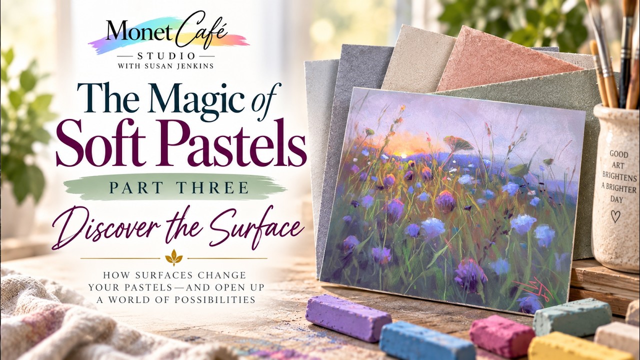
Stop Muddy Pastels! The Secret to Vibrant Color on Any Surface 🎨 🎨
Watch on YouTubeVideo summary
This lesson from the "Magic of Soft Pastels" mini-course focuses on selecting the right pastel surfaces to achieve vibrant colors without muddying results, categorizing options into unsanded, sanded, and do-it-yourself (DIY) types. Unsanded papers, such as Canson Mi-Teintes and Strathmore, offer a smooth texture similar to drawing paper but struggle with layering because pigments sit on top rather than adhering deeply, causing colors to blend into neutral muds quickly once the surface is saturated. In contrast, sanded surfaces feature a grit that allows for extensive layering while maintaining color brilliance; popular choices include affordable options like U Art and Color Fix, as well as professional-grade water-friendly papers such as Canson Mi-Teintes Velvet, Pastel Matte, Sennelier L'Art Pastel Card, and Mazuli Art Pad. A side-by-side demonstration highlights that sanded textures enable distinct marks and vibrant layers to coexist, whereas unsanded surfaces limit artistic depth by encouraging premature color saturation.
For those seeking cost-effective solutions or specific textures, the instructor advocates creating custom DIY surfaces using bases like matte board or watercolor paper enhanced with clear gesso or fine pumice gel to add necessary grit without obscuring underpainting colors. This approach allows artists to convert standard journals into professional-grade pastel pads while maintaining control over texture and color vibrancy. When it comes to protecting finished works, the advice is to avoid sealing paintings with fixatives like Sennelier L'Art, as these can alter or darken the colors; instead, protection should be achieved through proper storage methods using clear protective closure bags sized slightly larger than the artwork to accommodate foam core boards for safe shipping and handling.
Effective long-term inventory management is also crucial for artists, particularly those selling on platforms like Etsy, where a systematic approach helps track painting status and prevent damage. The recommended system involves using sketchpads in various sizes labeled with codes to monitor which pieces are sold versus available, often utilizing Post-it notes that are turned sideways to indicate open space. Spiral-bound pads are preferred for their ability to lay flat, though binder clips can secure non-spiral options like tracing paper pads to keep pages tight and facilitate easy insertion of new finished pieces. Additionally, labeling the back of paintings with specific surface details and brands aids in future reference and organization, ensuring that even affordable or homemade surfaces yield vibrant results when managed correctly.
The video concludes by emphasizing that while technical skills regarding surface selection and storage are vital, the creative process itself holds significant value beyond just the final product. As viewers prepare for Part Four, "Beyond the Reference," which will cover composition, making the first mark, and integrating previous concepts, it is important to remember that mastering these foundational elements sets the stage for more advanced artistic exploration. By understanding the nuances between different paper types—from the affordable options available in pads with glassine pages to specialized archival cards—artists can confidently choose the medium that best suits their style and budget, ultimately unlocking the full potential of soft pastels on any surface.
Read the full video transcript
Welcome artists to the [music] four-part
miniourse called The Magic of Soft
Pastels. We are now in part three called
Discover the Surface. [music]
I'm excited to unlock some of the
mysteries of many of the different
pastel surfaces [music] and help to
guide you into this beautiful journey of
soft pastel painting. Welcome artists to
Monaet Cafe Studio and part three of the
miniourse I call the magic of soft
pastels. Here's a general table of
contents, so to speak, of what we'll be
learning in this lesson. You'll be
learning three different categories for
soft pastel painting. I'll share many of
the different brands and options for
unsanded surfaces, describe why I love
them, and what some of the advantages
and disadvantages are along with so many
of the different brands of sanded pastel
surfaces. There's lots to choose from,
but I think I break it down in a helpful
way, and I couldn't resist. I just had
to do a side-by-side comparison of the
layering qualities of an unsanded
surface versus a sanded surface. I think
you'll find this fascinating. The last
category is do-it-yourself surfaces. Not
only are these great for saving money,
but I actually prefer them often because
of the flexibility, the control that I
have over color choices, and I really
love the painterly results. Just as with
[music] the previous two parts of this
course, if you have purchased this
lesson or you're one of my patrons on my
Patreon page, [music]
you'll also be receiving my companion
guide. It's a PDF document with so much
supplemental information that goes along
with this course, including videos with
timestamps you can watch when I'm
talking about a particular product
[music] and so much more. As a special
bonus, be sure to stay tuned to the end
where I talk about one of my most asked
questions is, do I fix or seal my final
pastel paintings? I'll also share with
you some of my favorite ways to store
your little pastel beauties. I have a
couple of different systems I use. And
there's more. I'll bring you behind the
scenes to show you my inventory system
of how I store my pastel paintings that
I put in my Etsy shop. So, there's a lot
of content in this lesson. I'm ready to
dive in. How about you? I often like to
share that the birth of Monae Cafe was
literally me just sharing all of the
things that I did wrong when I was first
starting my pastel painting journey. And
oh boy, did I do lots wrong. From
choosing pastels to knowing how to make
marks to part three here, which is
choosing surfaces. And if you've even
started on that journey, you know there
are a lot of choices and it can get a
bit overwhelming. I think by the time
this portion of the course is complete,
you'll have a thorough understanding of
the different types of surfaces and
which ones might be right for you.
There's really not any wrong choices,
just more informed choices, and I think
you're going to learn a lot. Now, I'll
admit this looks like a lot of pastel
surfaces, but keep in mind that I have
had years to accumulate the bit that you
see here on the table, and you
definitely don't need that much to get
started. So, I think you'll be
encouraged, and you'll learn a lot, and
you'll discover which surfaces you might
want to try, and then you just add as
you go. Again, there's no right or
wrong. And I love a little bit about all
of these surfaces. So, let me change the
setup and we're going to get started.
[music]
The first category is unsanded surfaces.
Just think of these like um quality
drawing paper. And there's so many
different brands. Some of them are
specifically um designed or they market
it as for pastel painting. And some of
them are just nice drawing paper. And I
use a little bit of all of these. And
when I first got started, I if you go
back and see part one for more of my
story, I did not know what I was doing.
I kind of accidentally discovered soft
pastels when I was searching for uh art
supplies to get back into painting. And
I didn't know what to do with the
pastels. So, I literally I just had some
drawing paper at home. And oh my
goodness, I was very disappointed. I was
not getting the results that I saw other
pastel artists. I started looking at
other artists and what they were
achieving and I thought something's
wrong with me. [laughter] But little did
I know I wasn't even using papers that
were this good. So I'm really glad that
I stuck it out. I'm a little bit like
that. So I want to save you from those
challenges. Now I'm going to start with
one of the pastel unsanded surfaces
again that is marketed as for pastel
painting and it is called Canson is a a
huge company period with many different
brands of art supplies but they have
some wonderful surfaces um for various
pastel surfaces. And I'm going to share
this one which is called Meons. Now I
used to butcher this name. I thought it
was Spanish. I said mientes but it's
French. It's meons. And now that I know
a little bit more about what I'm doing
with pastel painting, I actually love
this surface and it's very affordable.
This is a great surface to get started
with, but don't get discouraged like I
did if you're not getting the layering.
You're going to learn more about that
when we get to the second category,
which is sanded surfaces. Pants and
Maons pastel paper comes in individual
sheets, but you can also buy them in
these pads. I kind of like buying the
pads in different sizes. There's so many
options. Uh, they have different color
families such as gray tones. I love this
one. They have earth colors and I love
that one, too. There's another earth
colors I have. And this is one I got.
Uh, I think someone gifted this to me.
I'm not even sure if they still have
this one available. I like the fact that
it's a spiral binding and it has
glassine pages almost like tracing paper
in between the pages and it would
protect your paintings if you decide to
leave them in this book. I also like to
share that the pages of the Canson
mitons pastel paper have different
textures on each side. The first side,
if you have a pad like this, you open it
up, the side that's facing you is kind
of a honeycomb pattern. And the side on
the back is more of a smooth pattern.
You get two different um textures when
you're painting on either of these
sides. This is one of my YouTube
tutorials where I painted this cute
little duckling on the unsanded Canson
mants surface. You can see the texture.
This is the honeycomb side of the paper.
And I will in the companion guide have
parts one and two to this lesson. So,
this is a great surface for beginner
artists to get started with. It's very
affordable, but keep in mind if you're
not seeing some of the rich color and
layering uh that you're seeing from
other pastel artists, it's probably
because they are using sanded surfaces
and this one is not sanded. And this to
me, I've gotten to where I like it a lot
more. I actually really like it. The
better I got as an artist. I I didn't
need as much layering because my art
skills just got better. This is another
unsanded surface that is marketed uh as
a pastel paper for pastel painting and
it's similar very similar to the Canson
mants pastel paper and this one is made
by Rimbrandt. By the way, someone
mentioned in part one of this tutorial
or this course that I didn't mention
Rimbrandt pastels and they were right.
[laughter] I I mentioned so many pastels
in part one, but Rimbrand are also a
great pastel uh brand to get started
with the actual pastels, and this is the
same company. Um they are more
affordable. Rembrandt pastels and the
surface uh but they're a little bit
harder. They definitely don't get the
brilliance and color that some of the
softer pastels get. Again, go back and
watch part one if you haven't seen it
already. But yes, the surface is very
similar to the Canson meant. And I think
I tend just me personally, I tend to
like the Canson meant surface a little
better than this one. Maybe I need to
try this one again, but uh but they're
both very good surfaces. And this is
another brand of an unsanded surface
that's marketed as a pastel surface.
It's made by Strathmore. Now, I have
many Strathmore brands that I really
like. I haven't actually used this one
that much. I think I tried it one time,
but it's again quite similar to the
Canson Me Taons. And it's probably
because often when I work on an unsanded
surface, I like to work on one that is
toned. I'm going to talk about that in a
little bit, too. They come in white.
They come in different tones like the uh
the earth tones that I showed you with
the Canson mants. And so many of these
brands have variety of color options
available, too. But uh I think this
one's probably equivalent to the uh the
Canson maons, too. And quite affordable.
One of my favorite surfaces for doing
some pastel sketching is one by
Strathmore that's not even really
marketed as a pastel surface. So, I want
you to keep that in mind. It doesn't
have to have the name pastel paper
written across it. Um, you can just
experiment. And a lot of these quality
drawing or sketching uh surfaces work
great. And this Strathmore pad that I've
been buying for years is one that I
really love. It comes in some different
colors, probably more than these, but uh
these are the ones I use the most. One
called toned gray. Uh another one called
toned tan. And like so many of them,
they come in different sizes, too. I
often use these pads for doing studies
or lessons for my YouTube channel. This
was an example of choosing different
color palettes using the color cube.
That's a fun product. Here's another
series of paintings exploring color with
these little road painting studies. I
also like to use these pads as a
sketchbook. This happened to be a lesson
on my YouTube channel about perspective,
but see how well the pastels apply for
sketching. I wanted to share a couple of
lessons that I think are great for the
very newbie, very beginner pastel
artist. Both of these lessons are on
Strathmore toned gray surface and using
very limited palettes. So, this should
be really good for beginner artists.
Another Canson product I like to use is
also not marketed as a pastel paper.
It's just Canson black drawing paper.
It's the XL Canson pad. And I really
love the effects of pastel on black
paper. It's just so brilliant and bold.
So I do like I typically do. I just
paint within the pages and uh add little
sheets of tracing paper to protect the
pages. You may recognize this one if you
saw part two of this miniourse. This is
the mark making sheet that I made to
show you so many of the different marks.
But as you can see, this uh black
drawing paper works great. And these are
nothing special. Usually I'll take these
uh on a trip with me and uh just do a
little bit of sketching. Carry some
tracing paper and uh just have some fun.
Often I will work with the Prismacolor
new pastels. That's uh an very
affordable pastel brand. Um and just do
some sketching. This is another black
surface I've used. It's for sale on
Amazon. And I like these pages are kind
of thick and they have a little bit of
texture to them. And this is very
similar to the other black surface I
mentioned that they're just fun. They're
good for sketching. And I also like the
fact that with this type of product, you
kind of feel like you have the license
to play. You're not as stressed because
the product's not that expensive. So, I
find I often have a lot of fun. Uh this
was just some pastel sketching with some
white Pusca acrylic markers. And uh this
one I played with creating some
jellyfish with some iridescent pastels.
You can't see the glim glitter here, but
it really is sparkly. So it's a great
way to just have some painting fun and
uh let your hair down and paint like a
kid again. This is another black
sketchbook that I really like. I shared
it in a video oh not long ago. You could
find it. And I used it to experiment
with Neocolor 2 wax pastels. And I
didn't go over those in the first part
of this course, but it's a lot of fun.
And you could you could do the same
thing with regular pastels, but I just
wanted to show you just how fun it is to
see all this color. The thing I love
about these wax pastels is this is this
video did so well just because I did
this with it. They don't smudge. Is that
amazing? This was from another painting
I just touched. Um, isn't that amazing?
They're kind of like uh coloring
crayons. They feel like it, but they're
a professional wax pastel. Um, but you
could use this pad for regular pastels,
too. I want to try using the Prismacolor
new pastels in the sketchbook. So, those
are examples of unsanded surfaces.
There's a lot more. Like I said, get
creative. You could use just about any
nice drawing paper. But now, I want to
show you some of the sanded surfaces.
But before I dive into the different
brands, I want to show you just an
[music] experiment with some of the
differences between an unsanded surface
and a sanded [music] surface with
respect to layering. As they say, a
picture is worth a thousand words. So,
this demonstration should really help
you to see a sideby-side comparison of
the differences when it comes to
layering. That's one of the main
differences between an unsanded surface
and a sanded surface. Unlike paint in a
liquid form, soft pastels are a dry
medium. And the pigment of soft pastels
in its dry form needs texture to hold on
to if you're going to layer on top of it
repetitively. And when you're using an
unsanded surface, there's no grit or
texture for the pastels to hold onto,
and thus you're only able to get limited
layers on top of each other. But the
sanded surface because of its texture
literally kind of like hardware store
sandpaper, but this is a professional
quality. It is archival, acidfree,
doesn't uh yellow or fade over time.
This type of pastel surface with the
texture gives you that ability for the
pastels to have something to hold on to
and thus get a lot of layers. I wish I
had these in the same color, but this is
kind of close. This pastel surface here
is the unsanded Canson mit tons pastel
surface and the surface on the right is
a very popular sanded pastel surface.
It's called UART and much again like
hardware store sandpaper. It comes in
different grits and or textures. This
one is a 400 grit. I'd say it's a
middle-of the road grit and it is a very
popular paper. Lots of artists love it.
I love it. I just don't love the fact
that it curls. In the humid climate I'm
in, I find it often curls uh on the
edges, but I do have a workaround to
that. I I have a video for almost
everything pastel related, but because
it's such a quality pastel surface, I
thought I'd use it for this
demonstration. Here I have a 40 half
stick set of Sellier pastels. I love
Sellier. They're very soft, and that's
why I chose it for this demonstration.
Uh the softer the pastel, usually the
less layers you're going to get
typically. And uh we're going to just do
that side to side comparison right now.
As I mentioned in part one of this
tutorial, it is best to layer lightly.
Uh that's one thing I did very wrong
when I first started painting with
pastels. I thought I had to get a solid
application of color to begin with. And
really with soft pastels, it's best to
let those colors peek through. And uh
that's where the uh optical color mixing
kind of comes in. So let's get started.
Let's see what color do I want to choose
here. Uh I think I'll start with a
pretty green. So let's layer this
beautiful green here. Oh, that's a nice
earthy green. And this I believe is the
honeycomb. Yeah. Can you see the
honeycomb pattern to that? Now uh let me
hold it up to the camera. This is what I
was mentioning that one side of the
Canson manton surface has a texture to
it and the other side is more smooth.
Now I'm going to add this pretty golden
color just gently on top of the surface
here. And look at that. Can you can see
the green? I'm keeping a very light
touch here and here. I'm going to layer
some of it here. I can already tell the
difference in uh just the way those
colors um visually mixed. and physically
mixed. Now, let me go with an even
brighter yellow. Let's go with this one
right here. This would be if I had a
field with some grasses in it and then
I'm layering some golden flowers on top.
I would start with my darker golden
color and then gradually add like um
some lighter values where the sun is
getting onto the flowers. I haven't
actually used this one yet. It's a
little jagged. Yeah, definitely was able
to layer with that one just fine. This
one's a little dirty, too. Already, I am
not. You see how I'm not really getting
any color here? I hope this is very
clear. You can see it is a really big
difference. And that's what happened to
me when I first started painting with
pastels. I was seeing artists with this
vibrant, gorgeous color, and I was like,
why is mine not as vibrant? And it
really has to do with the sanded surface
versus the unsanded. And yet, like I
said, there's no right or wrong. Now, I
actually love kind of that soft
impressionistic quality of the unsanded
surface, but if you're looking for
layering and getting lots of color, then
the sanded surfaces is going to work
better. All right, let's just take
something that's, you know, very
different so it'll show up. I'm going to
add some pink right on top of this. You
see, I'm still able to get that pink.
I'm just going to put a little few pink
marks on here. You see that? It
definitely still was vibrant on top.
Now, let's add some pink to this. It's
It's layering, but barely you're barely
seeing it. All right, let's get another
color here. Let me get this pretty uh
kind of magenta pink purple. And let me
add some of that. Look at that. I can
still add I'm adding on top of that pink
as if they were like little flowers.
We'll just keep going with that. All
right. How many layers is that? One,
two, three, four, five layers so far.
And I started marking harder there. Um
let's add Oh, did I didn't do that one
over here, did I? Let's do this one
here. Oh, yeah. That layered a little
bit. Oh, and that's I'm I'm glad I did
this because that uh leads me to
something else I want to mention. Often
your mark making and your layering
ability has to do with not only the
different pastel brands, but the
different color colors are made from
pigment and physical products from the
earth. And they have different qualities
to them. So, some of them layer better
than others just by nature of what
material they used to manufacture that
color. All right, let's try Oh my
goodness, look at this gorgeous color
here. You see how I'm still able to get
layers there? Look at that. And let's
layer them here. I'm able to get a
little bit there. Let me try this bright
orange here. I'm just going to glaze
kind of softly over this here. Let's see
if it layers. Yes. Look at that. Still
able to get some layers. And let's try
here. Sort of. Not really. Let me get
this bright green.
Let's just put some green in here. Oh,
yeah. Still getting layers. I don't even
know how many layers I've got in here
now.
Nope. There we go. We've reached the
layering ability. And what happens when
you you've reached maximum layering,
what happens is, oh, I'm going to show
you this, too. Watch the dust.
See all that dust? It's because the
pastels can't stick into the surface.
They're literally just kind of sitting
on top of the surface. But when you've
reached maximum layering um ability, the
colors start getting muddy. Have you
ever experienced like, why are my colors
not bright? Why are they muddy? And it's
because they can't layer on top of each
other. So, they literally just start
rubbing into each other and making kind
of a neutral color. So, let me hold up
these two examples for you to see. Here
you can see how the colors start
becoming muddy and you're not able to
add any more individual colors or
strokes. With the sanded surface, I
think you can clearly see you're able to
get multiple layers, but also add those
distinctive marks on top without them
muddying or blending the layers
underneath. And I hope that
demonstration gives you a nice visual of
some of the [music] differences between
these two types of surfaces. And now
that we know of some of the differences,
let's talk about some of the sanded
pastel [music] brands. I've tried to
kind of loosely arrange them by
affordability. Uh I may not have it
perfect, but uh this is a brand I
actually it's not my favorite, but it's
available on Amazon. It may be in other
places. It comes in different colors,
but it's it's quite affordable. uh my
muofen. I don't even know if I'm saying
it right, but a lot of artists have used
it and it's quite sanded. Um so it's
nice if you want to get started and try
a sanded surface and uh you want to save
some money and just kind of play, uh
that might be a good one to try. I was
able to find one of the little studies I
did on this surface and I remember now I
I liked it a little better than I
thought. So it's a great surface if
you're trying to save money and you just
want to practice and play. This is one
that I do recommend and I use it a lot.
I recommend it mostly uh well, two
reasons. It's a good quality and it's
it's quite affordable for pastel artists
who are branching out and want to try a
sanded surface. It's called Color Fix
and it's made by Art Spectrum and this
is available on Amazon. Dick Blick,
Dakota Pastels. And I like the variety.
You This is called the Rainbow Pack.
Talk about variety of colors. That's
awesome. I also love that this is water
friendly. That's something I haven't
been talking about yet. Uh most of the
unsanded surfaces that I spoke about
before. Artists do um play around with
some of the homemade wet media
techniques that I'll be talking about in
a minute, but usually I don't add wet
wetness to the unsanded surfaces that
are more paper um texture or quality or
material. But this is water friendly.
That's why it has the little uh um
different um mark making products up
here or brush and a pen and a pencil and
a pastel. So, it's a multimedia product
and it is water friendly and I love
that. Uh it comes in so many different
colors. I also like to point out I
didn't know this for a long time. The
color fix surface comes in two different
textures. This is what's called the
original and I think I have this right.
The original is the one that's more
textured. It has more grit. You get a
little more layering ability with this
one. There's another color fix that's
called their smooth surface and uh it's
uh it has its own reasons that the
smooth is a good surface, but I usually
prefer the original. This is a painting
that was created on color fix and I
believe this was a lesson where I only
used 12 pastels.
And this is one here that has kind of um
gotten so popular with soft pastel
artist. It's again by Canson just like
the Canson Me unsanded paper and the
Canson black paper, but it's called
Canson Mance Velvet and it's really
cool. It's I'm sharing this too because
it's it's really kind of for a
professional pastel paper. It's one of
the more affordable ones and I love that
it's also water friendly wet media. And
what's really neat about this one is it
is takes a lot of layers just like the
UART demonstration that I did. Um, but
it doesn't have the grit. It's like
magic. There's another pastel surface
that's the same that I'll share in just
a second. So, I'm always like, how does
it do it? It doesn't even have much
sanded surface. Um, but it really does
take a lot of layers and it does come in
some different colors. Um, but I
actually really like often working on
the cream or lighter surfaces when I'm
wanting to tone my own uh papers. I
often like to tone them a beautiful
underpainting color. And keep in mind,
underpaintings are not part of this
four-part miniourse, but these courses
are going to continue. Just so you know,
I'm going to have a course where it's
all about underpainting. So, that's on
the way. But, I love using a cream
surface because I can tone it. you know,
a vibrant color for an underpainting.
And I often buy this cream colored
canson. You don't have to buy a pad this
big. Um, it comes in smaller sizes, but
I like the large pages because you can
cut them. Um, it's sometimes more cost
effective and then you can cut them to
uh your own custom sizes. Here's a
tutorial where I created a painting on
Canson velvet for the first time, and I
was hooked. I loved the amount of
layering I could get. And you can kind
of see here how even though there are a
lot of layers, the individual marks
still show up unlike if I had done this
on an unsanded surface. And this is the
other surface that I mentioned is kind
of like the Canson velvet. It is Oh, I
love this color here. Uh it's called
Pastel Matte by Cla Fontaine. Again,
another water friendly surface. You
could use wet media uh like I often do.
And this one has the glassine sheets
between it, too. I usually with a pad
like this that doesn't have a spiral
binding. I usually tear the pages out.
Um, so the glassine sheets is, you know,
it's nice. Uh, but um, but I don't find
it that practical for me. And this
surface, like I said, is so much like
the Canson velvet in that it takes a lot
of layering. And yet, you can't hear the
grit here. You can literally hear the
grit with some of the more sanded
surfaces, but it takes a lot of
layering. I love pastel matte. I use it
often. Um, I love some of the different
colors in this pad. And I'm pretty sure
this one is a little bit more expensive
than the Canson velvet. I haven't done a
whole uh analysis on all of the costs,
but I I'm pretty certain that uh this
one's a little more expensive, but it's
such a great surface. Love pastel matte.
Here is one of my paintings created on
pastel matte. Kind of a taupey beige
color. I like how my mark making is a
bit more smooth on this surface versus
some of the other very sanded pastel
surfaces. This is another surface that I
really love and it was one of the first
sanded pastel surfaces that I discovered
once I knew there was such a thing. And
I can't even remember um how who
recommended it or why I got it. But I
learned very quickly by mistake of
course. I'm telling you, that's how
Monae Cafe got started. I shared with
you guys all the things I did wrong. I
learned very quickly. This is not a
water friendly product. And it's because
I tried applying some pastels and
blending them. And it the paper just
deteriorated. So, this is not a water
friendly surface. And it is a long name.
I always say it's a mouthful. It's made
by Selier, one of the pastel brands that
I love, love, love that you can see in
part one of this course. I love them.
Um, but it's called Senellier Lacart
Pastel Card and it's called pastel card
because it's kind of thick. It's like
card stock. It's kind of a thick
surface. It comes in individual sheets
or pads like so many of them. Again, not
water friendly. This one has um uh
different colors in the pad, but it is
it's quite sanded. Hear that? But it's a
softer sanded surface. It literally
feels kind of like a soft sandpaper. And
what I find with that uh quality is that
often the paintings I produce have a
soft kind of impressionistic effect. So
that's what I love about the surface and
uh it's it's really still one of my
favorites. Here is a painting created on
Sellier Lart pastel card and it was
actually using my Fields of Sunshine set
that I curated through earthberry
pastels. This was a fun bright and happy
painting and I love the soft effect of
this surface. Now, because it's not
water friendly, uh Senelier Pastel
Lacart Card uh came out with a water
friendly version of this product. It's
called uh Selier Lacart Pastel card
mixed media, meaning yes, it is water
friendly. Thus, the little water
droplets on the pad. And I have
discovered that I really do like this
one as well. Um I have so many options
now because I've been painting for so
many years, I sometimes forget to pull
them out. But when I experimented with
this one, I really loved it. When I
first purchased this, I wanted to do a
little experiment and just see how
different pastel wet media techniques
would work on this surface since it was
a brand new surface to me. So, I have
that video available, too, if you're
wondering about this particular surface.
I tried all of these different mediums,
water, alcohol, airbrush medium. I tried
watercolor, wax pastels, inktense
blocks. Uh, that's a whole education in
itself. So, this is another surface that
I really love and I was so happy to see
that Sellier made a water friendly
surface. Now, pastel grain is a surface
made by Clear Fontaine. If you remember,
that's the same company that made pastel
matte and kind of similar to how
Senellier had a nonwater friendly
surface and they wanted to make a water
friendly surface. Well, Claire Fontaine
has pastel matte which is not that
textured. still takes a lot of layering.
So, they wanted to make one that was
more textured. So, they made this pastel
grain. And uh it is uh is this one also
water friendly? I think it is. Yes. Uh
and it is very similar to pastel matte,
but it has a little more texture. And
yes, I do like this one. I really loved
this one when I played around with some
Prismacolor new pastels. It's the very
affordable set. I've talked about so
much. I have so many vid videos on it.
great for beginner artist. They're
harder pastels, but they they just
worked so well for a little sketchy
quality on this surface. And I did a
painting of um a cow from a a property
where we had cows in our backyard and I
did a sketch with Prismacolor new
pastels and they worked great on this
surface. This is a surface that I really
love. I've run out of all of my large
sheets. Um but it's called Luxe
Archival. It's a professional sanded art
paper. It is water friendly and I would
say it's kind of similar to U Art. It's
probably a little lighter in color. It
is quite sanded. I believe this is a 400
uh grit paper. Uh I'm pretty sure that's
what this one is, but I don't know if
you can hear it. It's quite sanded.
Water friendly. Takes a lot of layers.
But here's what I love about this one.
It's a little pricier. Um but I look how
flat the surface is. And it takes if
you're doing something that's kind of
waterheavy, you know, you're doing an
underpainting that's got quite a bit of
water, this product doesn't buckle much
at all and it's a little thicker, you
know, um, and I just love it. It's
great. It's just kind of like a
workhorse for a pastel surface and it
takes so many layers. This is another
surface that I really like that is
offered through Dakota Pastels. It's
called a Mazuli art pad. Now, it's in a
pad form with a spiral binding. So, I
like to use it like a journal. But
what's neat about this pad is all the
other ones I've shown with like a spiral
binding are unsanded paper. This is a
professional sanded surface in an art
journal with a spiral binding. And I
always like to share uh I love the
spiral bindings because you can lay it
flat. You can just open it up uh versus
a binding, you know, like you know, a
binding that's not spiral. You can't
really lay it flat. And uh it also has
now this is where I love the fact that
it has these glassine pages in it. Uh
like kind of like tracing paper because
I like to keep my paintings right here
in this journal. It's it's a journal,
you know, you're saving these paintings
within the journal. This is one that I
did. This my first experiment I did on
this new pad. It was fun. Just a crazy
fun painting. I did a an underpainting
that's that bright green. So yes, it is
water friendly. Just some crazy pigs in
the sunshine. And uh it's a professional
sanded surface. I can't remember what
the name of the surface is that they use
in their pads. And that wasn't even all
of the sanded surfaces that are
available, but it should give you enough
of an idea of things you might want to
try. And now for the do-it-yourself
surfaces. [music] What started out as a
way for me to save money turned into a
technique for creating pastel surfaces
that I love. These are just a few scrap
pieces of some do-it-yourself projects
that I've done. And uh I just thought
I'd share a couple of those along with
some of my videos uh demonstrating the
process of how to do it. Uh I used to
often work on just uh matte board um
just like some white mat board. And I
liked this because I could cut my own
boards and have kind of a sturdy surface
to work with. And then I could tone it
whatever color I wanted and add a little
texture to it. Now, that's the trick
with my method anyway of do-it-yourself
pastel surfaces is I'm trying to create
that grit, that sanded surface myself on
a surface that's not sanded. So, matte
board is great because it's already
sturdy. But some other surfaces you can
use to make your own pastel surface is
watercolor paper. This one's just on
regular watercolor paper. This is a
technique I love. And I love creating a
golden color under the painting. And
that's back to what I was describing is
I love the flexibility and the
creativity of being able to make the
colors that I want with the texture. I
used a very textural brush for this one
and uh it gave a really neat effect.
This is another one I did on a piece of
matte board. Nice and sandy. I did mark
on this one. This was clear gesso. This
is by far clear gesso. You're going to
see it in a minute. My favorite one to
use to give some grit to a surface
because it's very affordable and it's
very easy. But I even added something
called fine pummus to that one. Don't
get overwhelmed by all of this. Um
again, I'm going to share videos with
you. Just get started, play, have some
fun, and it'll all start coming
together. Here are a few of the products
that I use to create texture when I do
my own DIY pastel surface. And I'll just
go ahead and share my favorite first.
It's clear gesso. Uh it's easy, it's
affordable, but I like to stress it's
the clear gesso, not regular gesso.
Regular gesso is just white. And there's
a reason why this clear. Two main
reasons why this clear is what you want.
For one, it's clear. So often I'll
create an underpainting that's a color.
Um and I'll want to give the texture on
top of that. And if I used white gesso,
it would just cover it up. It'd be
white. So, it's it's literally clear and
it dries pretty clear. Um, another
reason is it has texture to it. Little
bits of sand are in this. I don't know
why really. Um, but white gesso does not
have that. So, this is really one of the
best ways um to make texture, give
texture, layering ability to your own
pastel surface. Again, this is the video
I mentioned where if you want to get
creative and play with making your own
surfaces, you need to check it out. It's
called eight ways to make your own
pastel paper. This is another product by
Art Spectrum, who makes the color fix
art uh paper uh pastel sanded paper. And
they have um a clear uh textured product
that you can apply too, much the same
way you do with clear gesso. And this
product comes in different colors as
well. And this is called fine pummus gel
by Golden. It's another one. This one's
really good. I like this one for just
adding the texture. This one happens to
be a gray texture and uh it works really
great for making a sanded pastel
surface. Here's one of my paintings
where I created this painting on
watercolor paper using just clear gesso.
And yes, I have a video on it. And
again, these videos that I mention are
going to be in the companion guide.
It'll be a very organized, easy way for
you to find the videos and the
timestamps of where I mention them in
this lesson. Another way I like to make
[music] DIY surfaces is in journals.
Yes, it can be done. Let me share my
methods with you. I shared with you the
journal that had the sanded pastel paper
in it or the paper that could take a lot
of layers. But I love to have a journal
and have pastel paintings. But sometimes
journals don't have sanded paper in it
like these journals. This is one I love.
It's called uh Dilusions Creative
Journal. And what do you do in that
case? Well, you DIY it. You make your
own pastel surface. And uh this one was
a lot of fun. This surface is on a I
would say it's a a heavy stock mixed
media paper. And I like that it lays so
nice and flat. You see how this cover
is? And uh I can just keep my paintings
within this journal. Uh this is one it
is because it's a mixed media type of
paper and it's heavy duty. I added um I
think I I added my own tone to the
background. Then I added some clear
gesso to it and I made my own pastel
painting because I got a lot of texture
from that clear gesso. So this one was a
lot of fun. Very fun and free. And I
love the fact that just like I shared
with some of the other sketch pads, um I
like the freedom of it. I like the fact
that I don't feel so uh serious when I'm
painting in a journal like this and I
end up kind of having more fun. This is
another little journal. It's a
watercolor journal that was gifted to me
by the company Artics. Uh they gave me
two. One's a different size, a square
format. And again, I decided I wanted to
make this a DIY pastel journal. It's
kind of like the other one. I love how
it lays nice and flat. So, I have a
tutorial on this one. And by the way,
any other lefties out there, you may
have noticed if you've followed my
channel, uh I'm left-handed. I I do
paint right-handed sometimes, but if
you're majority of a lefty that you
paint, um you might find that it's
helpful to turn your journals upside
down because then I'm not wrestling with
uh this edge, you know, so I paint
upside down typically. But this is um a
surface that I literally just toned it
with clear gesso. And uh and voila, I
have a sanded surface. I can create a
pastel painting. And I just taped me a
piece of tracing paper to the opposite
side. Now for that bonus content [music]
I promised and such a common concern for
pastel artist. How do we store these
paintings? And can we fix them or seal
[music] them? Let's find out. By far the
question I get the most on my YouTube
channel is how do you seal or protect
these pastel paintings? And the answer
is I don't. That is for a final painting
anyway. A final painting in pastel. If
you spray any type of fixitive, there's
one I'll share with you that I recommend
that's my favorite out of these. It will
always darken the piece. It will alter
it even if just a little bit. And I just
decided I don't want to alter. I don't
want to risk it. So, I don't spray a
fixitive on my final piece. I've done
some experimenting. I have a video on
doing a little uh fixitive showdown, I
think it's called. And uh I'll share
with you that my favorite is one by
Selier. Sellier Lour. And I found that
it seemed to uh give less changes to the
final painting. But I still prefer just
to not seal them with a fixative, but
protect them with my storage methods.
Now, this was a fixitive that I really
liked. Uh it is not available anymore,
but I still will use this. I had a
couple of cans left. Blair, very low
odor fixitive, and it's great to use
during the working stages. If you've run
out of layering ability and you want to
get a little bit of texture back to your
painting while you're working on it, you
can spray this and uh get a a neat
texture and continue to work on your
painting. So, that's a neat product. And
many of the other fixitives you could
use during the working stages of your
painting. Now, I'll share a couple of my
methods for storing pastel paintings to
keep them safe prior to shipping or
framing. One of the methods that I
recommend for storing pastel paintings
is clear storage bags. These are some of
my paintings I already have in these
bags, and this was the method that I
used for years. I still will do this
occasionally. Uh, but it's a little more
timeconuming than my method of just
putting them into a pad until I get them
in my Etsy shop. But, uh, this method
works great. It's also great if you want
to show your work. I'm trying to turn
this so my light doesn't show on it. If
you want to show your work, take it to
a, um, a little market to sell. These
are nice because you can handle them.
Uh, it's not going to damage the
painting. And what I do is I buy these
from clearbags.com.
I buy the type. It's called protective
closure. I thought I'd pop here on the
site to show you. Here is the site. And
I go to the crystalclear tab at the top
left. And that right there, protective
closure. And they've added a bunch of
categories since I've bought these, but
I think I'd prefer now, they didn't used
to have these, to get the high clarity.
That means you're going to see your
painting a lot better. And then they
have all of these sizes and choices. And
I'm going to explain to you in a minute
that I like to make my bags a little bit
larger than what my painting sizes are
to give me room for my little foam core
board. Uh, but one thing I do like to
check, I scroll down a little bit and
closure type. Now, we already chose
protective closure, but I just want to
make sure that's the only options that
it's giving me. So, then you choose your
sizes and uh you're good to go, and
they're pretty affordable. And I cut a
piece of foam core board just a little
bit smaller than the painting, and uh it
keeps it nice and sturdy. Again, you can
just handle these. And when you're ready
to sell them or ship them, uh they're
great. You can just uh sandwich them
between some foam core board and uh ship
them to the buyer. So, these bags come
in different sizes, and I typically buy
sizes that are a little bit bigger than
standard sizes. Uh, it gives you room to
put your painting, if you paint in
standard sizes, your painting, and a
piece of foam core board in it to give
you enough room so you're not smooshing
the painting down in in a tight bag.
Here's another painting in a clear bag.
Again, nice and sturdy, safe to hold,
and your painting is nice and protected.
Now, I'd like to share with you why the
protective closure type of bag is
important. Here's an example of the
bags. I have various sizes. And this is
what I meant by protective closure. It
is where the adhesive is on the bag
portion, not the flap portion. And the
reason for that is if you insert a
pastel painting and you seal up your bag
like this, when you open the bag, if the
closure is on the top part here and you
go to pull your painting out, you've got
this adhesive. You've got to pull it
across. So, it's better to have this
adhesive strip on this portion because
then you can place and remove your
painting without dragging it across the
adhesive. This is the storage method
that I use the most. Now, now this is
kind of my quick storage method, but
this one is actually a pad of tracing
paper. So, it saves me time. It's fast.
When I'm done with a painting, I can
just bring it in here to my add to Etsy
tracing paper pad and literally just put
the paintings in between the sheets.
Again, I don't have to add tracing
paper. It is a tracing paper pad. So,
uh, I keep binder clips at the top of
this because tracing paper kind of pulls
out real easy and if you're moving these
pages or opening this a lot, the pages
will eventually kind of slip out. So,
this keeps my binding nice and tight.
This is a painting that I'm fairly
certain is on watercolor paper and a
homemade surface. Again, I have a video
on this one. I can go back and check,
but just by looking at it, I'm pretty
sure it's a homemade surface. And look
at the texture you can get. So, you can
save a lot of money making these
surfaces yourselves. I think this
painting may have been done on Luxe
Archival. Again, a nice sanded surface
that takes lots of layers. Another
example of a homemade surface. I'm
pretty certain this one is on watercolor
paper and I gave it a nice beautiful uh
kind of magenta underpainting. But look
at the results. Not even a professional
surface. This is pastel matte and it's
an example of where I used a white
surface. I mentioned before that often I
like to buy pastel matte in white so
that I can tone it a color to complement
or enhance a painting I'm working on. I
thought this bright pink would really
look nice with these bright green
apples. And this is a homemade surface
that I did on a piece of matte board.
It's nice and sturdy. I gave it a teal
or turquoise underpainting. And for
texture, I just added clear gesso.
All of these studies were done on Canson
velvet. And the goal of this one was
just to keep fresh, lively mark making
and to show the different color palettes
you can use with the same subject
matter. This is a pastel painting on a
DIY surface where I used pummus gel to
give the surface texture. I can't
remember the actual surface. I don't
think it's watercolor paper, but I saved
a lot of money by using just the pummus
gel to get the texture. And the results
are really fun.
Now, that was my temporary storage
method. This is a method I came up with
to inventory my paintings that I put in
my Etsy shop. And just so you know, as
of the making of this video, my Etsy
shop is in vacation mode because I have
so much artwork I need to add to it. I
hope to have lots of artwork available
soon. But I came up with this method. I
kept trying to rack my brain about what
is the easiest way for me to find my
paintings once they're in the Etsy shop.
So, what I do is I use these sketch
pads. I have one that's for my small
paintings, one for medium, one for
large, and one for extra large. And the
way I do the system is you can see the
little post-it notes kind of sticking
out from the side. And the code that's
on them is basically S is for small, M
is for medium, L is for large, and then
the paintings 1 2 3 4 5 in chronological
order. By the way, my Etsy description
for a particular painting has that code
in the description. So I can just go
into this book and find it. And when a
painting sells, I turn the little
post-it notes sideways. You can see on
the sides of this one, so I know I have
a blank spot to add new artwork. So here
you can see two that have not sold. And
these paintings happen to be on pastel
mat. It was a little marsh series I did.
I think there were six paintings in
total. But you can see it's a really
nice protective way for me to store my
paintings, save them, inventory them,
and keep them safe. The pages of this
sketch pad are rather thick and I just
add a sheet of tracing paper to the top.
So, it's a super easy way for me to
place my paintings once I have them
entered into my Etsy shop and give them
a little inventory system. This is my
medium painting book. And I love it when
I can find a sketchbook that has a
spiral binding. It just makes it lay
flat much more easily. And I love it
when I can find black paper. I searched
so long to try to find all of these
sketchbooks in black, but uh I couldn't
get them all in the same brand or color.
So, I have my medium paintings in this
sketchbook. And here's an example of a
painting I created on Selier Lart. It's
the one that's not water friendly, but
it has the nice soft effects. And this
was of a field of Zenyas that was not
far from my house. Now, let me show you
my large book. Once again, I could not
find sketchbooks of all the same brand
and color and style. Uh for this one, I
couldn't even find a spiral uh book that
was this size. So, I'm using this brown
craft paper book. It did not have a
spiral binding, so I added the binder
clips like you saw me uh do on the
tracing paper pad. And this is a
painting. I wanted to show this one
because it was done on an unsanded
surface. just some Canson mants and uh I
think pretty affordable pastels. So I
share these things just to encourage
beginner artists that you really can
accomplish um some pretty good artwork
with just unsanded surfaces and
affordable pastels. And this one is my
extra-large book that is actually one of
the Strathmore toned gray tablets or
pads. And yes, it comes in a very large
size like this. But I love that I found
this one with a spiral binding. And I'll
go ahead and show you a few of the
paintings in this large book. This
painting is on a surface called Pastel
Premiere, and it's one I did not cover.
I do have more of it left, so I forgot
about that surface. I do like it. It's
not my favorite, but I do like it. It
gets a lot of layering, and it's from a
tutorial of mine called Why I Use an Old
Paint Brush with Soft Pastels. The next
two are on unsanded paper. I believe
this is oh just a sheet of drawing paper
and I did it as a preliminary for a more
serious uh pastel painting on a regular
sanded surface. And I just did this
painting on white, something I don't
typically do, but I think you can see I
was able to achieve some layering. But
like you saw in my demonstration, if I
continued the pastels will eventually
start to muddy themselves and blend
together. But I do sort of like the
fresh and impressionistic feel of this
one. I'm assuming this one was on an
unsanded surface based from kind of what
I can see on the corner. But that gives
me a note to self that I wanted to share
with you guys. I think it's a good idea
for me in the future to start writing on
the back of my paintings what the
surface was, maybe some of the pastel
brands that I used. So use the back of
your painting if possible uh for a
little note takingaking. Well, that was
a lot of information and I wanted to
thank you guys for giving such [music]
great feedback to the first two parts of
this course already and I feel like you
guys are learning a lot. And remember,
if you have purchased this lesson or
you're a patron of mine on my Patreon
page, [music] you have access to my
companion guide with all of the extra
supplemental content [music] I've been
mentioning throughout this video. Also,
here's a sneak peek. Part four is
coming. Can you believe we're almost
done with this course? Part four is
called Beyond the Reference. It's where
we're bringing all of these concepts
together. And yes, we're finally
painting, learning about composition,
and so much more. Something else that
will be fun in part four is where I
share with you. You don't have to be
afraid of making that first mark. Pastel
surfaces are very forgiving. And you may
or may not recognize this surface that
I'm covering up. Yes, I'm creating a
painting on top of all of that mark
making. And that scrap paper was from
our mark making portion of this course.
It's where I did all of the
experimenting with these sponges,
brushes, stencils, and more. Oh, we're
going to have so much fun. And until
then, above [music] all, don't forget to
enjoy the journey. Sometimes the
greatest gift isn't the finished
painting at all, but the peace and
[music] joy God gives us while we're
creating it. Until next time, God bless
and happy painting. [music]