Representing paired pre/post data in an ordination with arrows using R and ggplot2 (CC428)
Watch on YouTubeVideo summary
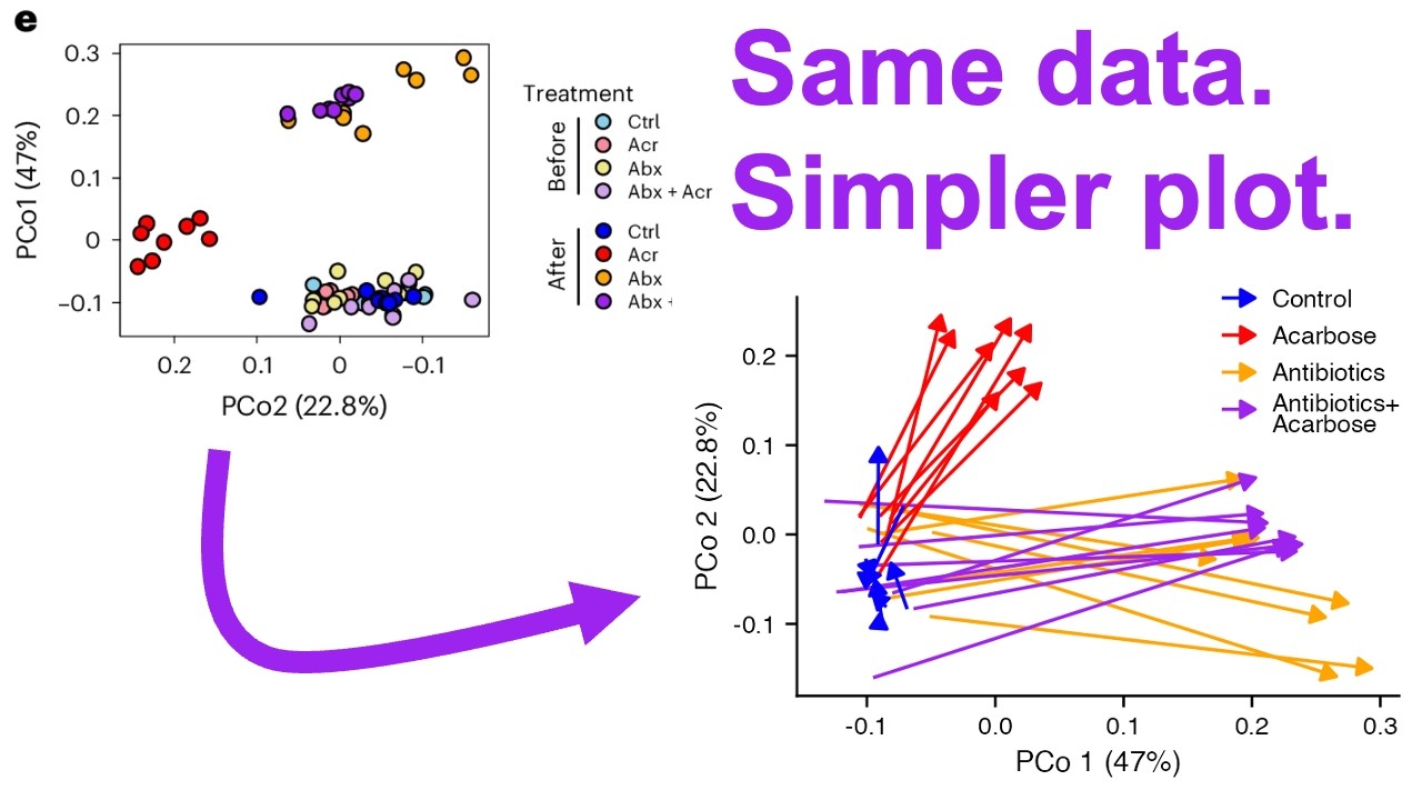
In this episode of Code Club, the host refactors a specific panel from a recent Nature Microbiology paper to better represent paired pre- and post-treatment data using R and ggplot2. The original figure displayed principal coordinate analysis results with structural issues, such as transposed axes where PCO1 was placed on the Y-axis instead of the X-axis, and an inverted scale for the second axis that ran from positive to negative values. Additionally, while the study utilized a paired experimental design involving fecal samples collected before and after treatment in mice, the original visualization failed to visually connect these related data points, making it difficult to track individual changes across time. The goal of this refactoring is to correct these conventions and explicitly illustrate the trajectory of microbial community shifts by drawing arrows that link each "before" sample directly to its corresponding "after" sample for every mouse in the study.
To achieve this visualization, the host begins by importing data from an Excel workbook provided with the open-access article and cleaning it within a tidyverse workflow. Since the original dataset merged the time points into single cells, significant preprocessing is required to separate the samples into distinct 'before' and 'after' categories while maintaining their paired relationship. The code creates new columns for treatment groups (such as control, Acarbose alone, antibiotics alone, or both) and generates a replicate identifier by assuming that the order of rows corresponds between time points. By converting the time variable into a factor with levels ordered chronologically, the host ensures that when plotting lines to connect the dots, the arrows flow correctly from the initial state to the final state without being disrupted by alphabetical sorting errors common in data frames.
The core visual enhancement involves replacing standard geometric shapes and simple lines with `geom_path` configured to draw thick arrows using the `arrow` aesthetic. This choice is critical because it immediately conveys directionality, showing exactly how each community moved through ordination space over time; for instance, antibiotic treatment drives communities sharply to one side of the plot, while adding Acarbose results in a different directional shift that might be less pronounced but still distinct from antibiotics alone. The host also refines the aesthetics by moving the legend inside the plot area to save space, adjusting font sizes and line widths for clarity, removing unnecessary grid lines, and ensuring transparency so arrowheads are not obscured by white backgrounds. These stylistic choices transform a cluttered, hard-to-read chart into a clean diagram where the magnitude and direction of ecological changes are instantly apparent without needing to decipher color saturation or axis orientation conventions.
Ultimately, this refactored visualization demonstrates that paired data should be treated as such in ordination plots rather than treating pre- and post-samples as independent groups scattered randomly on a graph. By using arrows to connect the temporal pairs, the plot effectively highlights which treatments caused significant community shifts and reveals subtle differences between combined therapies versus single interventions. The host concludes that this approach not only adheres to standard plotting conventions but also provides a much more intuitive interpretation of complex microbiome data, allowing viewers to quickly grasp the impact of antibiotics compared to Acarbose additions without having to mentally map colors or positions back and forth.
Read the full video transcript
Hey folks, welcome back for another
episode of Code Club. In today's
episode, I am going to be refactoring
panel E from this figure that was
published recently in the journal Nature
Microbiology. I did post a critique
video of this that I will link to up
here if you want to go back and see what
I had to say uh specifically about panel
F, but towards the end I did talk about
some of the other panels in here. This
figure comes from a paper titled
Acarbose redirects gut microbiome
utilization of dietary carbohydrates to
suppress anaphylaxis in mice. This is an
open access article, so down below in
the description I have a link to this
paper. Anybody should be able to get a
hold of it. If you watch to the end of
that critique video, you'll know there's
a few things that I talked about in
regards to this panel that I would like
to fix.
Uh and so there's some structural
problems, you might call it, that I
would uh turn my attention to first. So,
the first thing uh is that the axes are
transposed. They put principal
coordinate axis one on the Y axis and
principal coordinate axis two on the X
axis.
The convention is to flip that so that
the first axis goes on X and the second
goes on Y. They followed that convention
in another ordination later in the
paper. For some reason here, they
transposed those.
Also, um on their X axis for PCO2,
you'll notice that the positions are
flipped. They go from positive to
negative. That is weird. I don't know
why they did it that way, and so we'll
certainly want to clean that up.
Something I also talked about throughout
that critique is that the experimental
design in this study, it's not really
important for the refactoring what the
study was, but the experimental design
was a paired analysis. And so you'll see
here in the legend that they have
treatment before and after, where they
obtained fecal pellets from mice before
and after uh treatment, say on day 21
and day 28, where the treatment was
between days 21 and 28. You'll see the
same four treatments before and the same
four treatments after, but different
saturations of the color where the less
saturated color is the initial time
point and the more saturated color is
the final time point. And so, you'll
notice
in this lower white right quadrant,
again, as they've got things kind of
flipped around, is mostly things from
before the treatment. The saturated blue
in here is a control where basically
nothing was done to the mouse during
that 7-day window. And then the
communities move to these three other
points in the ordination space. What I
would like to do with this to refactor
it is because the points are paired. So,
for every light purple point down here,
there is a dark purple point up here
from the same animal. What I would like
to do is draw a line connecting the
before points to the after points.
And
this might be crazy,
but I would like to try
to make it an arrow. So, the arrow would
perhaps start in here and then have the
arrow head end at one of these points
out here. And that way then we could
have four different colored arrows, and
we would have in this case 32 arrows
because there's eight mice for each of
the groups.
And I think most of the controls would
kind of jitter around down here in the
lower corner, but then we'd have arrows
moving up and out giving a better sense
of the change in the community between
the before and after point due to these
different treatments. I will be
generating code to generate the
refactored version of that panel. And if
you want to get the code that I am
creating, again, go down below in the
description and you'll find a link to a
post that you can go to and see the code
that I am writing before you today. But
of course, I encourage you to code along
with me as we go through this. So, if
you've watched any of my live streams,
you've seen how you can go about getting
Excel workbooks from many of these open
source articles where they make the
source data available. I will go ahead
and download this Excel workbook into my
local directory as figure 3.xlsx.
I'll also load the tidyverse and the
readxl package. I now have tab fig3e
open from that workbook that I was able
to download from Nature Microbiology.
You can see it's tidy-ish. It has a
column for the treatment, the sample,
PCO1, PCO2. Unfortunately, the before
and the after are merged cells. So,
we'll have to do a little bit to get
that into shape, but let's go ahead and
read this in. It's going to start at
cell B3 and end at cell E67. So, to load
that, we'll do readxl.
We'll do fig3.xlsx
and then we'll do sheet equals fig3e,
following the title on that tab.
And then, range B3
to E67.
We can see that that loads as a tibble,
where we again have the columns
treatment, sample, PCO1, PCO2.
I'm going to have to do some work on
that treatment column to get before
repeated uh 32 times and then after
repeated 32 times. So, maybe instead of
starting at column B, I'll start at
column C. So, that gives us sample,
PCO1, and PCO2. I'm going to go ahead
and rename these. So, I will then do
rename all to lower. And we see that
those are now lower case. I also don't
like sample for which is effectively the
treatment. So, let's go ahead and do
rename and I will then do treatment
equals sample. And so, now we can see we
have a treatment column. We also need a
time point, which is what they called
treatment in their original workbook.
So, we'll go ahead and do mutate and
I'll say time equals and I'm going to
use the rep function. So, the first 32
were before and the second 32 were
after. And so I can give rep a before
and after vector, and then say I want to
repeat each of those 32 times. And so
now what you'll see is that the first 32
are before and the second 32 are after.
Okay?
So, now we can go ahead and plot this.
We'll do GG plot AES. On the X axis,
we'll do PCO1, Y PCO2.
And then let's also do color equals
treatment.
And we'll do geom point. I've also gone
ahead and written a GG save statement
where the width is 2 and 1/2 and the
height is 1.765. This is the same size,
my estimate at least, of what the
original panel was in the figure. And so
we now see something that kind of looks
like what they have, although it's again
turned and flipped. I suppose if we want
to see exactly what they did, again, I
could put PCO1 on the Y, PCO2 on the X.
We can also then do scale X continuous
transform equals reverse. There we go.
Hopefully you can see the similarity
even if the colors aren't the same,
where we have the antibiotics plus
a carbose as well as the antibiotic
treatment up in the upper right
quadrant. We have the a carbose over on
the left, and then we have a bunch of
the controls all in the lower right. But
of course, this isn't the way we want to
do it. We want to put the first
principal coordinate on the X axis, and
I don't want to flip the X axis. I have
a couple different ideas for how to
highlight the before and the after. One
thought would be to perhaps use a
different shape for the before and
after. And so we could perhaps do
shape equals time. On the left we now
see the before samples, and kind of on
the right we see the after samples. So
So works, but it doesn't leverage the
fact that the points are really
connected to each other, right? That
there's
eight befores over here for the
Acarbose, and there's eight afters for
the Acarbose up here. We'd like to know
perhaps what point up here goes with a
point down here.
To do that, what we could think about
doing would be geom_line.
And to do geom_line, we're going to want
to connect the points that go together,
right? And so
to group it, I want to group it by the
replicate, right? And so we have eight
replicates for each treatment group. So
if I come back up here and look at this
data frame that we have, we don't have
an indication of the replicates. I'm
going to assume that the first control
treatment before corresponds to the
first control treatment in the after.
Um I think that's a safe assumption, but
who knows. Um it would have been nice if
they could have indicated the
replicates. So I'm going to go ahead and
do replicate equals and again I'll do
another rep. So we're going to do one to
eight, and then times will be the
argument here. We're going to repeat
that eight times. And so if I look at
this output, I now get
one through eight for the first eight
controls, and then repeats, right? So
now what I can do is in my ggplot
statement within the AES, I can do group
equals replicate, but that's not exactly
the group I want. I want the replicate
by the treatment group. And so maybe
what I could do in here would be to do a
paste
with treatment
and the replicate number. So let's make
sure we know what this looks like. And
so now we have replicate control one and
so forth, right? So I still have that
group equals replicate within the AES
statement within ggplot. Now when we run
this, we can now see the connection of
the points between the before and the
after colored by the different treatment
groups. So, this works. Um I've thought
about maybe making the line black, but I
kind of like having the line colored
here. And one thing I'm thinking about
is that because we have like a
directionality, a progression of time,
could we perhaps lose the plotting
symbol? And instead of using geom_point
to plot the plotting symbol, why don't
we use geom_line to draw an arrow? So,
let's try that instead. So, I'm going to
go ahead and comment out the geom_point.
We get something like that. And maybe
for the time being, I'll go ahead and
lose the legend. So, we'll do
show.legend equals false. And so, I know
that everything starts over here, uh
right about 0 0, and then goes outwards
and upwards.
But we need that arrow head. So, to get
the arrow head within geom_line, we'll
do arrow equals arrow. So, let's start
there and see what it looks like. Very
good.
>> [laughter]
>> We have some big honking arrows.
Hopefully, you can see what we're doing
here, right? Like, the arrows start over
here on the left, and at least the green
and the red are moving to the right.
Maybe the red's a little bit further
down. And this teal is moving up. And
the purples for the controls are kind of
going back and forth, right? There's no
There's no obvious change. So, let's go
ahead and work on those arrows. So,
let's start by doing type equals closed.
And we'll do length equals unit. And
let's say like
uh 4 pt. And I think this is starting to
come together. So, something that occurs
to me is that I am using geom_line. And
what geom_line does before drawing a
line, or arrow in our case, is that it
sorts the data by the aesthetic being
mapped to the x-axis. And so, I think
for most of these treatment groups, that
doesn't really matter.
But for the purple, where we have the
controls, um
we see the arrow head kind of moving out
to the right for most things. I don't
know if that's correct or not. So, to be
safe, I'm going to replace geom_line
with geom_path. The difference is that
geom_path doesn't sort the data on that
x-axis first. It'll then use the data as
it appears in the data frame. If I look
over here at my plotting tab and toggle
back and forth between these two
versions, you can see that for some of
those purple lines, the arrowhead is
changing its position. So, again, I
think using geom_path is a good thing.
Something else we could do, just to be
safe, would be to add an arrange and we
can arrange by
time, uh but that is going to sort
things alphabetically, which is not what
we want, right? So, what we might want
to do instead is to make time a factor.
So, we'll do time equals factor
time levels
and then we'll do and then we'll do
before
and after. And so, that will make time a
factor. And again, if we then sort on
time, we will be sure that we have
before before after. And we know that's
the case because that's what I did up
here, right? Uh but just kind of
thinking about your own data and how you
might apply this, if the data frame
isn't in the order that you want to draw
the arrows,
make sure they are by using a factor or
some other thing that you can sort on to
make sure that your rows of your data
frame are in the correct temporal order.
So, the next thing I want to do is match
the color
and let's go ahead and perhaps bring
back the legend. We'll do a
scale_color_manual
and then I'll do values and we're going
to give it a named vector. So, we have
ctrl
equaling something.
We have acr
equaling something.
We have abx
equaling something and then we have abx
+ acr
equaling something. And that something
is going to be a hex code for the color.
I'm going to use my digital color meter
to get those colors. And so, we'll plop
that in for blue, the reddish color for
ACR, this orange color for ABX.
And then this purple color for the
combined antibiotic and Acarbose. And
maybe I'll put these on separate lines
so things don't run off the right side
of the screen. And there we go. We have
our colors matching their colors. Very
cool. All right. So, I'm pretty happy
with this and I'm going to
focus on my version of the plot now and
let's see if we can't make it look more
attractive. The size of the panel itself
is quite small, right? It's 2 and 1/2 in
wide. And so, the fonts are quite large
at this point. So, let's go ahead and
start playing with the theming to make
things look more attractive.
Let's start with theme classic. Okay.
So, that got rid of the background and
those grid lines.
Let's go ahead then and add theme and
we'll do axis.text
equals element_text. Let's do size
equals seven. So, those numbers are
readable um but not so large as they're
running into each other. While we're
messing with the axes, let's go ahead
and add the labs.
And we'll do x equals PC 0 1 and they
had a 47%.
That's the amount of variation explained
by that first axis.
And then y being PC 0
2 and that was 22.8%
explained. And so, now we've got those
titles. Again, it's quite large. Maybe I
will go ahead and make axis.title
equals element_text
size equals eight. So, that shrinks
those down a bit. Now, let's turn our
attention to the legend. We can go ahead
and get rid of this title treatment and
we can do that either up in
scale_color_manual or we can do it in
the
by doing color equals null. We see that
we've gotten rid of that title. Now,
let's go ahead and shrink the font of
the legend items. And again, we can come
in here. We can do legend.text
equals element.text
size equals 7. So again, that shrinks
that down. There's quite a bit of space
between each of the legend items that I
want to clean up and remove. And that
might be because the key, the arrow, is
tall or it also might be because of the
spacing between the legend items. So,
let's go ahead and in legend.text, I'm
going to go ahead and do margin equals
margin, which will remove the margin
around the legend text. So, that brought
the arrow closer to the text. Um maybe
what I'll do over here then is L equals
3 to get a bit of space between the
legend text and the arrow. So, let's try
to shrink the size of the key. We'll do
legend.key.height.
We'll do unit and let's give that a 9
pt. And so, that did bring those down
together rather nicely. Something I'm
thinking about is this legend is using
up a lot of space while compressing the
rest of the figure. And so, what we
could do is perhaps move it into the
left a little bit. Uh we could also get
rid of some of the margin around the
whole thing. So, let's maybe move it
into the plot. So, to do that, we'll do
legend.position
equals inside. And then we'll do
legend.position.inside
equals and then we're going to give it a
vector of two numbers. And so, the
legend is going to be centered at these
coordinates. And it's going to be
relative positioning in the plot. So,
let's do 0.8 and 0.8. So, that brought
that into the upper right corner of the
plot. We might fiddle with the
positioning before everything is said
and done, but let's go ahead and get the
order of these values to align with what
they had originally. In the original
paper, they went control, ACR, ABX, and
the ABX plus ACR.
We can actually do that back up here
in mutate by creating the treatment to
be a factor. And so, we'll come in here
and we'll do treatment equals factor
on treatment.
We'll do levels.
And we'll do CTRL
ACR
ABX
ABX plus ACR. Okay? And so, let's go
ahead and put this on a separate line so
it doesn't scroll off. Now we have
things in the same order that they had
in the original paper. One other thing I
want to do to the legend is to use the
full names. I don't like the
abbreviations. I don't think they're
necessary. So, let's go ahead and spell
that out. You could do that in factor,
but then that would make things like
scale color manual a bit more
challenging. And so, what I'm going to
do is I'm going to copy this values line
and I will use labels. And then in place
of the color, I'm going to put the full
name. So, we'll do control. So, let's
just test this out to see what it looks
like. And so, sure enough, we now see we
have control and we have the hex codes,
which is which is not what I want. But,
we're on our way, right? So, for ACR
we're going to put Acarbose. For ABX,
we'll put antibiotics.
And then for ABX plus ACR, we'll do
antibiotics plus Acarbose. That gets us
our spelled out names. One thought might
be to put a line break after that plus
for Acarbose. And we can do that with a
backslash n. So, that works. I'm
noticing that the legend has an opaque
white background because it's covering
some of those arrowheads. Again, in
theme, I can do legend.background
element_blank to make it a transparent
background. So, that got rid of the
white background and we can see the
arrowheads now on those two lines. Uh
I'm not totally in love with
um this two line antibiotics plus a
carbose. This arrow is coming right at
the middle.
There is an argument to change that
position. So, we could do
legend.key.justification.
I think I can write top. Now, we see
that the arrow goes to the top line of
antibiotics plus a carbose. I don't know
if I love that or not. Maybe something
we could do is fiddle with the line
height so that it doesn't appear that
there's five separate lines here.
We'll do line height.
Let's try 0. 7. I think that looks
pretty good. I feel like the width of
the key is perhaps a little bit too
wide. So, let's do legend.key.width
equals unit 7 pt. Okay, that's perhaps
too short.
So, let's go ahead and make it 10. And I
think that looks pretty good. Maybe we
could go ahead and move that legend up
and to the right a little bit more. We
currently have it at 0.8 0.8. Let's try
0.9 0.9.
Okay, that's too far. Let's split the
difference and do 0.85 and 0.85. So,
that's looking a lot better. Something
that occurs to me is that the lines in
this plot all seem really thick. I would
like the arrows to be a bit thicker than
the axes, but even the arrows I think
are too thick. Let's come into theme and
do axis.line
equals element line
line width equals 0. 3. And then let's
do axis.ticks equals element line line
width
equals 0.3. Give those a thinner
appearance. I think that's nice and like
I said, more thin. Now, let's maybe make
the arrows like a 0.4. So, we can come
back up to geom_path and I'll come in
here and do line width equals 0.4 and
that made those lines a bit thinner as
well. So again, we have my version in
the bottom right, there's in the upper
left. One major thing that I haven't
really talked about is the better use of
space, right? So panel E is part of A um
A through I panel figure and there's a
lot of white space around individual
panels that aren't being used. I hate
wasting white space because that's room
to give more air, so to speak, for your
data to breathe. And so again, by
putting like the legend I have here
inside of the plot, we then free up that
right space. We also are using this
bottom area
to show our data better. So again, these
two plots are the same size. I think
you'll notice that the fonts I'm using
are larger than what they have. We could
probably dial mine down a little bit
more. Um let's try that. So we could go
back to legend
text, maybe just take these down one
point, six and seven and then our legend
text size could go to say six. And I
don't think we really suffer any by
having that smaller font. But I think
the big change is again incorporating
the paired nature of the experimental
design in the study where they had a
pre- and post sample collected around
these four different treatment groups.
And so then by showing these arrows,
showing the direction of change, I think
highlights the paired nature. It also is
much more striking of the direction of
the change of these communities. You
don't have to think about, "Well, what
color is before? What color is after?"
You have to think about one color,
right? [laughter]
The the color for each of the four
treatment groups. And then by
convention, the end of the arrow is the
most recent and the back end of the
arrow was the time in past, the before
sample, right? So I think my version of
the plot is far easier to interpret than
the original and is a much more jarring
interpretation of the data. My takeaway
from this now that really pops out at me
is that the effect of the antibiotics is
really driving the community to the
right in this ordination space. There's
not a huge influence of adding Acarbose
on top of antibiotics. Perhaps it's not
going down as far as antibiotics alone.
Um and that we see that adding Acarbose
does change the communities not nearly
as radically as the antibiotics, but
it's perhaps moving the communities in a
different direction than the
antibiotics. And again, these things
really pop out and make it much easier
to interpret what's going on in this
version of the data visualization. Well,
that's all I've got for this
refactoring. Let me know what you think
of this version of this ordination
diagram.
Do you think it's easier to interpret
than the original or do you think it
maybe loses ground in interpretability?
As always, please tell your friends what
we're doing here and I will see you next
time for another episode of Code Club.