Video summary
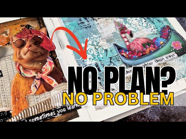
Bu videoda yazar, ilham aramadan ve önceden bir plan yapmadan sanat defteri sayfası oluşturmanın nasıl mümkün olduğunu adım adım anlatıyor. Süreç, nötr renkli bir desen kağıdının alınarak defterin içine sığacak şekilde kesilmesiyle başlıyor; bu işlem hem kenar boşluğu yaratıyor hem de geri kalan parçalar sayfaya yapıştırılarak bir mozaik veya karo efekti oluşturuluyor. Kağıt kenarlarının pürüzlendirilmesi, katmanlı bir görünüm kazandırırken, yazar aynı adımları iki farklı sayfada uygulayarak nasıl tamamen zıt sonuçlar elde edilebileceğini gösteriyor; biri ferah ve parlak, diğeri ise eski ve vintage tarzında olacak.
İki sayfanın estetiklerini ayırt etmek için renk seçimleri ve uygulama teknikleri farklılaştırılıyor. Vintage görünüm için turuncu tonları kullanılırken, daha sade sayfada mavi gölgeler tercih ediliyor. Akrilik boya uygulamasında fırça veya spatula gibi araçlarla rastgele lekeler oluşturuluyor ancak desen kağıdının altındaki tasarımın tamamen örtülmemesi sağlanıyor. Ayrıca sayfa kenarlarına kahverengi ve siyah mürekkep ile vignet efekti verilerek vintage sayfaya derinlik katılırken, diğer sayfada bu işlem atlanarak daha temiz bir görünüm korunuyor.
Son aşamada ise sayfaların üzerine rastgele damgalı metinler, geometrik şekiller veya yapıştırılmış ephemera (kesme kağıtlar) eklenerek detaylandırılıyor. Yazar, parlak yüzeyleri matlaştırmak için özel bir yapıştırıcı öneriyor ve sayfalara dikkat çekici kumaş dikişi imitasyonu veya gerçek dikiş makinesi işlemleri ekleyebiliyor. Bitiş dokunuşları arasında siyah mürekkep ile çizim, beyaz jel kalemi ile vurgular ve beyaz sprey boya ile püskürtme bulunuyor; tüm bu adımlar sonucunda aynı temel malzemelerden yola çıkılarak iki birbirinden tamamen farklı, kişisel ve özgün sanat sayfası ortaya çıkarılıyor.
Read the full video transcript
If you are starting at a blank page with
absolutely no idea what to create, this
video is for you. So, welcome back to my
channel. After a wonderful summer break,
I'm back in the studio sharing a
step-by-step no plan art journal page
that everyone can recreate just by
following the steps. No inspiration
needed. So, I'm a little bit rusty after
so much time away from my craft room.
And today I want to start slowly and
create something with no plan at all.
I'm going through some of my background
pages and I'm just going to grab a page
that looks kind of uh neutral in colors
so that I can have a starting point and
I can work on top of it without too much
effort.
I am going to cut this pattern paper
into size so that it fits inside my
journal. I will be working on this
pattern paper and then stick it uh on my
page. So, uh my journal is 6x6 in size.
I'm going to cut this at 5x5 to end up
having a lovely border. So, you can
recreate easily this step. Just grab any
pattern paper that is quite neutral in
color and uh cut it out to be slightly
smaller than your journal.
Now, I don't want to throw away the
leftovers. So, I'm just cutting out uh
rectangle squares, uh pieces that I
don't really measure, and I'm going to
to use them to stick them on top of my
page to create some kind of a tile
effect, uh without too much effort. Uh
so, I'm going to grab my scissors and
rough up the edges. This is going to
give some kind of dimension and interest
on the pattern paper before I stick it
down.
And I'm going to grab my glue to stick
that down. And as I turn the page
around, I absolutely love the look. So,
I'm just debating which side I want to
use. Do I want to use this busier and
more vintage looking background or the
other side which is more subtle? But
since I don't have a plan on what I'm
I'm going to stick on top, I decide to
grab that page and I'm going to make two
pages at once. For this video today, I
will be following the exact same steps
for both those pages, but the one will
end up looking fresh and bright. The
other one is going to look uh vintage
and uh old. So just by using the same
steps, you will see the difference. It
is super fun video and I think you will
enjoy it and hopefully it is going to
inspire you to create similar pages.
So I will create first my backgrounds
and then I will stick them on the
journal. I'm starting with a subtle one
and I'm just sticking all those uh
little squares and rectangles that I cut
out previously. Uh it doesn't look too
much uh of a difference, but trust me,
in real life it is because it adds all
those different layers. Although it
keeps everything quite subtle, just
randomly sticking everything down and
you can definitely bring those edges
more into life with many different
options. I will not be doing that for
this project.
So hopefully you can recreate something
similar with the pattern papers that you
have at home. Now for the other page,
there are lots of things going on in the
background. I could repeat the same um
technique, but um I think that it
already has enough rectangles. I don't
need to add any extra on top, so I'm
going to leave it as it is.
And now it's all about making those
pattern papers uh your own. I am going
to grab a couple of acrylic paints. And
I'm just going through my acrylic
paints. I'm trying to find something
that is similar. Picking colors from
underneath.
So, I'm going with those warm oranges
for uh the vintage one and with those
two blue shades for the uh subtle one.
And let's start with the first one. You
see, I'm uh following the exact same
steps for both the pages. Two colors
that um were inspired for from the
background. And then I'm going to apply
those two colors on top of my page
randomly with a brush. You can go with a
a stiff brush or with a a smooth brush,
a soft brush like I'm doing here. But
make sure that the brush is completely
dry. I'm doing dry brushing here, which
is going to uh give a completely
different look because if your brush is
wet, um it's going to kind of overwhelm
the page and it's going to go all over
the place. Now, I'm not trying to cover
up what is underneath. And since I do
have uh some extra paint, I'm just going
to add some splatters.
And I'm happy with how that looks. Let's
repeat the exact same process on the
other page.
And so that you don't get bored, I will
repeat the same steps but uh with uh
small differences. So here for example,
I'm applying again two colors of acrylic
paint but instead of using a brush I'm
using a spatula for a completely
different look. You see this is more
dramatic effect and uh the colors don't
blend as much.
But in any case, no matter what tool you
uh decide to use to apply your acrylic
paint, whether it is a spatula or a
brush, don't try to cover up completely
the whole uh pattern paper. We want to
still be able to see the design
underneath. Just go randomly in a few
areas here and there, and you will see
it's going to make a huge difference.
Before
I move on to the next step, it is very
important to make sure that this acrylic
paint is completely dry.
And then the next step is to do some
stamping. For the subtle background, I'm
going to go with a big font. And uh I am
going to stamp everything with a black
archival ink. Very important. I need to
make sure that this is permanent because
at this stage I have no idea what I'm
going to do next. to I better uh be
safe. Everything I apply on the page is
permanent. The acrylic paint and the
stamping. I am going to stamp on a few
areas completely randomly. I'm not using
an acrylic block because I don't want to
end up with perfect stamping. The more
imperfect, the better it's going to
look. Now for my orange background, I
already have lots of text stamped by
design in the background. So instead of
using another text stamp on top, I'm
just going to go with something
different. So here I just chose one
background stamp that gives you a
circle. And I'm just going to stamp
again with black permanent ink in a few
areas. This uh already has lots of
stamping, lots of um black lettering, so
I don't need to overdo it. I'm just
going to stop here. I'm going to bring
in another little small stamp that gives
me some numbers which are not um in the
pattern paper already. So, I'm just
going to stamp with that again. Mainly
staying where I stamped previously. Kind
of creating a cluster so that it doesn't
look too busy too busy all over the
place.
And I'm happy with the stamping. I'm
going to stop here now. And since I'm
going for a vintage look and feel for my
orange background, I am going to do some
inking on the edges. I'm using a brown
ink distress ink. And I'm going all
around the edges. This is going to
create kind of a darker border. It's
going to give the look of a vignette.
and it um instantly turns any background
into vintage looking. Now I want to have
a more a dramatic effect of a border. So
I'm going to uh use black suit as well.
And I'm going to ink up the edges. Not
uh going as far into the center of the
page as I did with the brown. Mainly
staying on the edges, but it really
makes a huge difference.
So all around the edges with this one.
And I'm not going to do any borders for
the other page, the blue one, because I
don't want to turn it into looking, uh,
vintage. So, uh, I'm going to skip this
technique for the other one. And let's
move on to the next step. Now, I want to
add some details on the border. One way
that you can do that is to grab your
sewing machine. I'm too lazy to do that.
And you can add somehal stitching around
the borders. And uh another way is to
use uh rabons like stitching uh designs
that I have here. Or if you do have a
stamp set, you can use any of those
stamps to go around your borders. Now,
I'm going to do something uh similar but
different on both my pages. So, for the
vintage one, I'm going to use a stamp
and I'm going to stamp that with black
ink around the borders. I'm not going to
go all over the border. I'm just going
to choose a few areas where I can do the
stamping.
And I have zoomed for you so you can
probably see better exactly the effect.
But trust me, if you do it with a sewing
machine, it is going to give a different
texture and dimension. Plus, you will
have those strings coming out here and
there. And uh it is really a great look.
Now, I'm really happy with how this
orange background is looking. Let's do
the same thing for the blue page, but
this time I'm going to switch from the
stamp into those rabons that I have. And
I'm going to use the white ones. If you
don't have rabons for the stitching, but
you do have a stamp, just go with a
white ink pad. Or you can definitely use
a white embossing powder and do some
embossing to get the white effect.
And of course, if you are actually using
a sewing machine, just switch threads.
Now, again, for this background, I'm not
going to create a border all over all
around. I'm just uh choosing a few areas
to uh transfer this design. And of
course, I'm mainly going where I have a
darker uh blue area at the background to
allow for this stitching to show.
Next step, I'm going to play with a
stencil and add some texture with paste.
And because I'm doing the same steps,
but slightly different. Uh, for these
pages, on the blue page, I'm going to
use white paste on the vintage orange
one. I'm going with black.
I chose a stencil that is very generic.
Just some shapes, geometric shapes or um
even patterns would work for that
because they are generic and they work
for pretty much anything no matter what
I choose later on to use as my focal
point because remember I have no idea
what the focal points are going to be
for both those pages.
Now the thicker the paste the better the
design is going to transfer. However, I
don't want to end up with um a complete
pattern all over the place. So, you see
again I'm going randomly mainly in three
different areas. And my black paste is a
little bit dry, but I'm going to make it
work. I don't want to waste any paste.
And it worked just fine. Now, I'm super
happy with how those two backgrounds are
looking. So, I'm just going to use some
glue and stick them inside my journal.
You can definitely use any glue that you
like. You can go with matte medium at
this stage. I just chose to go with my
Nova Deluxe because that's what I had on
my desk. And I'm being very careful
because the paste is not dry yet. I'm
going to stick the pages next to each
other so that you can easily see what
I'm doing on both pages and compare. Now
for the vintage one, if the border was
black, it would look even better, a more
dramatic effect. You can definitely h do
that if you wish. And as my paste is
drying on the background, I'm going to
go ahead and look into my stars for
focal points. I had so much fun creating
the backgrounds. I don't want to uh
cover them up completely. I don't want
to uh do anything crazy on top of them.
So I am going with uh these box of
ephima. These are by art by Mar. I have
them for months. I have used them in
many many art journal pages that I'm
sharing. This has so many inside. You
cannot really choose which one to go
with. So I'm just uh trying to decide
which ones I want to use. I place them
on top of the background to see how well
they stand out and if they fit with what
I have already because remember I didn't
have a plan in the beginning. Um you
will find here that you get frames as
well. So anyway, it's a fun little thing
that gives you lots of options and I
think it is on discount and I do have a
coupon code. Check down below in the
description. Uh I will add the coupon
code. I think you can get this at about
$5. It's super cheap and uh great value
for money. Anyway, you can use any focal
points that you have. You can go with
flowers, you can go with uh whatever you
have. You can use magazines and just cut
out images. You can definitely stamp an
image, color it, cut it out, and stick
it on top. Here is what I decided to
use. And I will show you a little trick.
Now, sometimes your ephemera might be a
little bit shiny. If you don't like that
shine, you can definitely use um matte
medium glue. I'm using rice paper glue
by Samaria, which is exactly the same
thing, a matte medium glue. And you can
go over your ephemera. This is going to
turn anything that is shiny into matte.
just apply your uh uh matte medium glue,
let it dry, and it is going to be
completely matte. So, I'm going to do
that for both my ephemera. And then I
want to create a little cluster for both
those uh focal points without
overwhelming the page. I don't want to
cover up everything. So, I'm just going
to grab a few tickets or some ledges,
whatever you have. You can definitely
use uh background pattern paper that you
cut out into size. And for the pieces I
will use on the vintage space, I'm doing
inking, roughing up the edges, adding
all those little details that I did add
on the background so that everything
kind of comes together. And I'm going to
use uh washi tape, a black washi tape
that I had in my stars. I'm going to use
corrugated card stock and just create a
little cluster. You see the cluster is
super easy. Just the cut on top of that
little uh piece that I have. And this is
going to help the cut stand out against
the background. I created a little
cluster on front of the cat by adding
corrugated card stock. And then for the
boat to represent uh the waves, I just
used some uh medical go and a couple of
tickets. Now, I didn't like how clean
the corrugated card stock was, so I'm
going over it with some white paint. And
then for the sentiments, I'm going with
H white for the light one and black for
the vintage one. This is a sticker
booklet that I have for ages. It is
definitely out of stock now, but I like
to collect them, and I have a big
collection of sticker uh quotes. So, I'm
using a couple of them here to finish
off my page. When the phrase is very
long, I like to cut it in smaller
pieces. And you can call this pages
done. You see, I use the same steps and
I got completely different results. I
always like to do some finishing
touches. However, some doodling with a
black fine marker and some white gel
pen. Sometimes I go and outline the
cutout pieces. Sometimes I add some
highlights here and there. Everything
however is not perfect and I always like
to do all those lines completely sketchy
and not all over the place. I don't
perfectly outline everything. So I am
going to finish off my both my pages
with my favorite thing that I always
like to do the white splattering. I like
to use white uh calligraphy ink for that
because it's just super handy. And this
finishes both my pages for today. I hope
that you had fun and that you got
inspired to follow this process with
what you have at home. Down below in the
description, you can find some of the
supplies that I used. Thank you all so
much for watching and I'll see you all
next time.