Video summary
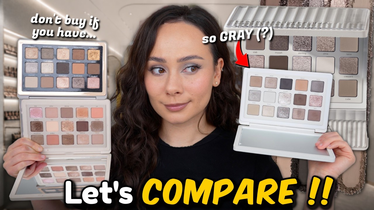
In this video, beauty influencer Natasha Denona reviews her brand new "I Need a Cool" eyeshadow palette, which features a collection of cool-toned shades including taupes, grays, and smoky browns available in matte, metallic, and sparkling foiled finishes. Although she initially expressed concern that the gray tones might not suit her skin tone as well as warmer palettes, she notes that the colors appear more beautiful and less gray in person than they do in online photos. The palette is priced at $72 and is described as a permanent edition containing classic formulas rather than new ones, making it distinct from the "I Need a Nude" palette despite superficial similarities; specifically, the cool palette lacks the peach tones found in its nude counterpart while offering a different color story entirely.
Denona provides a detailed look at the packaging, which includes a large standing mirror and customizable holes to pop out individual pans, highlighting that the product is made in Italy with a 24-month shelf life. During her swatching session, she praises the creamy texture of the matte formulas, noting that they perform exceptionally well compared to some of her recent launches, while also distinguishing between the lightweight "silky matte" and the buttery "creamy matte" finishes. She applies various shades to her eyelids to test their versatility, finding that even though the palette is monochromatic, each shade serves a specific purpose for creating looks ranging from natural transitions to full smokey eyes, ultimately concluding that the swatches are stunning and consistent despite the overall cool gray aesthetic.
The reviewer then tests two distinct eye looks: a warm-toned transition using the palette's warmest shade, "Chisel," followed by an icy silver look utilizing the metallics and foils. While she is impressed with most of the shimmer shades, she expresses significant disappointment with the shade "Glacier," describing it as chunky, inconsistent in its adhesion, and prone to flaking off the eyelid. To address this issue, she experiments with layering different silvers but ultimately decides that other shades like "Sterling" perform much better for achieving a clean silver look without the texture problems caused by Glacier. She also compares the new palette side-by-side with her existing "Xenon," "Glam," and "I Need a Nude" palettes, discovering that while it is distinct from Xenon, it shares many similar shades with the Glam palette, making them potentially redundant for collectors who already own both.
In her final conclusion, Denona acknowledges that while the palette is undeniably beautiful and high-quality, it may not become one of her most frequently used favorites because its very cool and gray tones do not align with her current preference for warmer colors. She advises viewers who already own the "I Need a Nude" or "Glam" palettes to carefully consider whether they truly need another similar cool-toned option before purchasing, as the shade ranges overlap significantly. Despite the redundancy concerns and the underperforming Glacier shade, she maintains that if a viewer loves this specific gray color story, they will enjoy the palette immensely, though she personally plans to reach for it less often than her warmer alternatives.
Read the full video transcript
[music]
A 15 pan cool toned eyes shadow palettes
of taes, grays, and smoky browns in
mattes, metallics, and sparkling foiled
finishes.
Yummy. Sign me up. Natasha Denona I need
a cool palette. Ladies and gentlemen,
are you ready? Are you ready? Are you
ready? Are you ready for this?
>> [singing]
[gasps and laughter]
>> Actually, when I first saw the reveal of
this, I wasn't that excited about it
because because I fear it might be too
gray on me. And lately, I'm not liking
gray toned cool toned colors on myself.
For my fair cool tone girls, I know
you're excited. But for me, I'm a little
I'm a little worried. Now, comparing it
to the photos I saw online, I do think
it looks more gray online than it does
in person. I do think it's more
beautiful in person. So, for today's
video, obviously, I'm going to be
reviewing the brand new Natasha Denona I
Need a Cool eyeshadow palette in the I
need a line of the I need a nude.
There's I need a warm, now there's I
need a cool. But not only will I be
testing this, I will also be swatching
it. I will also be swatch comparing to
some of the most requested palettes from
Natasha Denona because one of my first
thoughts about this palette, I was like,
do I need a cool palette? Because I feel
like I already have these shades. My
biggest point in the reveal, I was like,
is this not is this not the I need a
nude palette without the peach tones?
spoiler. Actually, these are quite
different, but I'll get into that as
well. But first, let's play, shall we?
This palette is officially out. You can
get this on the Natasha Denona website.
I love their shipping. I love their
packaging. I do recommend that. But if
you tend to return products or it's just
easier for you, you also can get get
this at Ulta and Sephora. This is $72.
The last couple of years, this has gone
up in price. It used to be $69 for this
style palette. No new shades, just
classic formulas in a cool format. I
don't see anything about this being
limited edition and the I need a line
has been out for a long time from
Natasha. So, I do think this will be a
permanent edition if I had to guess
unless a formula goes really south, but
I really don't think that's the case
with this based on the swatches. So,
without further ado, let's get a close
look at this beauty. so you can see the
swatches, the formulas, and then we will
get them on my eyelids. So, here's a
closer look at the packaging. It's
really simple, very cute. Something that
you couldn't see online is it has this
what I guess is supposed to be like a
wet texture. And what's unique about
this packaging is it also is running
along the back as well. So, it does feel
textured here. But as you can see, with
this being the midi size palette, there
are holes so that you can pop out the
colors that are inside the palette and
customize as you would like. The palette
is made in Italy with a 24-month shelf
life. Here is the inside of the palette.
Of course, you get a nice big mirror
that stands up on its own, but this is
what we're looking at. And it is quite
gray based. I think it's very, very
beautiful. Can't wait to see it on me to
see if it actually pulls very gray on
me. But we do have this pink tone here.
These are a little bit more taupey. Um,
and then here's where we have the more
gray side of the palette. But this has
no new formulas. These are all her
signatures. Sparkling foiled, metallic,
silky matte, and creamy matte. So in the
shimmers, here are the metallics. And
then there's these three sparkling
foiled. And then the mattes. I honestly
can't really tell too much of a
difference between the creamy matte and
silky matte. The silky matte is a little
bit more lightweight and soft focus,
whereas the creamy matte is really
buttery and soft pressed. Let's get to
swatching. I'm going to do each row at a
time. I mean, these are stunning.
This is slab.
Moosh, gorgeous. Oh my gosh. Sterling,
gorgeous.
Zema.
Ooh, these four just took my breath
away. Wow, they swatched even better
than I thought they would. Tatra
Chime.
Wow. Nimbus.
This one must be a silky matte cuz it's
not as fully pigmented. And then
Glacier. Oh my gosh, you guys. Her
shimmers today
are swatching unreal.
Cloud
Crescent
Shale.
And then here's Chisel. I'm interested
to see how this pulls on the skin cuz
this is other than the pink shade, this
is like the warmest shade. So for my
skin tone, that's what I would use as a
crease color. And final three, we have
Cove,
Zelda,
and Cube.
Oh my gosh, you guys, this palette is
stunning. And it's swatched absolutely
stunning as well.
I hope when I put this on the eye,
everything doesn't look too gray and
mush because the swatches of this are
gorgeous.
All right, let's get a couple looks on
the eyes. Really, what I'm going to be
testing, I'm not looking to create the
most beautiful looks. I want to see how
gray this palette is. I want to make
sure shades aren't too close to one
another because that is something with
these palettes with them being one tone
really in mine with these palettes. I
find it's difficult to create a
multitude of looks. They all kind of
look the same. So, that can be a good or
bad thing depending on if you like the
color story. So, I'm trying to see if we
have versatility here. But, I am happy
to report, as you saw, I mean, I was
very, very impressed with the swatches
in this palette. Very, very consistent,
very creamy. honestly has swatched a
little bit better than some of the more
recent palettes I've launched. So,
really happy about that. Now, when it
comes to creating looks when Natasha
Denona curates her palettes, you're
really supposed to be able to create a
look in any direction, horizontally,
vertically, diagonally. You can also do
it quad style if you so desire if you
aren't the best or want to think about
creating looks. So, I just think that
that's a fun little fact if you aren't
feeling inspired to create looks. All
right, let's just get this on the eye.
I'm so curious about a couple of these
shades. So, I'm just patting out my
concealer that I have on my eyelid. And
I actually am going to start off on this
side of the palette because I want to
see how gray these will pull on me. So,
I'm going to start off with Chisel,
which is by far the warmest color in
this palette. And it's not very warm,
but it actually creates a really
beautiful transition color for me. It
creates a nice natural shadow that, as
you can see, it will open up my eyes,
create a faux crease situation. The
shade is stunning. This is obviously not
like pretty to look at, but so
versatile, very essential, very much
necessary.
Am I making my point clear? Okay, that's
the perfect shade. This will be one of
my most used shades in this palette. I
will probably start off almost every
look with this shade. Love it. And it
definitely does chisel the eyelid here,
but that's as warm as it gets. So, let's
see. Not that I need warm. This is the I
need a cool palette, but I want cool
taupe, not gray is the goal here. So,
now I'm going to go in with slab, which
is kind of the perfect looking taupe
shade.
And I'm going to pop this in the crease.
Gorgeous.
Blending in like a typical Natasha
Denona palette. This is her creamy matte
formulation, by the way. Not silky
matte.
Blended that itself out. Really
beautiful. Let's take a little bit of
Nimbus.
This dark brown
Nimbus is another creamy matte formula.
If you like a smokey eye,
this palette is going to be quite
phenomenal for you. I would say there
even is a nice dark black color. Cove,
it's a little gray black, but still the
options there.
Beautiful blend. Each of those shades I
feel like had its own purpose on the
eyelid. Even though I blended them
together, they did their own thing. And
it is looking a little gray, but not too
bad. I'm comfortable with this. Now,
trying here's a little pinky.
They describe it as a light icy dusty
pink.
It does pull pretty icy on the eyelid.
This is her beautiful sparkling foiled
formulation.
It looks a little gray. I wish it looked
slightly more pink and less silver,
but pretty nonetheless.
I've used the brownest shades in this
palette, and I do feel like now that
it's all said and done, it is pretty
gray. Just going to take a little bit
more of Nimbus out here in the outer
corner.
Now, Moosh right here is a metallic
shade, and it's like a taupey shimmer
shade. I'm going to run this along the
lower lash line because I want to see if
it pulls more brown
or gray.
It's a true taupe, but I do think a
taupe leaning on the grayer side, which
is not personally what I want. But
again, this is the I need a cool
palette.
But I still am very comfortable with
this look. I do think it is very pretty.
And then I'm going to take some more of
Nimbus.
Then I'm just going to tighten this to
the lash line since I do have a shimmer
along the whole lower lash.
I mean, this is very, very pretty. I do
really like this look. I'm going to take
a little bit of Zema right here, and I'm
just going to brighten up the inner
corner here.
It's very pretty. And then cloud
go right here. And this will just
brighten up this area. But I can see it
the gray tone of it. It's very visible,
which is good because that's the color
that I see in the pan. And then finally,
I love that Cove is in here. I'm going
to use that as a liner.
And I'm just pressing this along my lash
line with a angled brush.
Then I'm blending out
it just a little bit to make it look
more smokey because I've decided this is
the ultimate smokey palette. I mean, a
really beautiful look that was very
simple to do. Let me put on some lashes.
The look is absolutely beautiful.
I love it. Up my alley, but for it being
like the warmest shades.
Yeah, it's very, very gray. So, it only
is going to go more gray, which is why
for this next look, I want to do an icy
look. I'm focusing on these six shades.
I'm just making sure my eyelid is nice
and clean. Now, I [snorts] like to put
shades that are close together that look
similar next to each other just to make
sure they're there for a reason and are
not duplicative. So, I'm taking Tatcha
right here. [snorts]
This is very cementy.
Okay.
But blends on in nicely.
has a good amount of pigment, but it's
not too much to where it's unflattering.
And then I'm taking Cube Below,
and I just want to make sure that these
look different enough. I think Cube
almost looks a little more green,
but they are similar. The tones are
different, but they're similar. Cube
also provides a hint more depth. I don't
know that having both of these in this
palette was necessary.
Yeah, they are close to each other, but
it's a nice background for this look.
I'm going to take some of Zelda,
which is kind of like a Peter
shade, and I'm going to put this on the
outer half of my eyelid. And this shade
is really nice. I love her metallics.
They go on without having to be wet.
That's how creamy they are. And it did
kind of blend into the skin. I really
like that actually. It's pretty. And
then I'm going to take some of Crescent,
which is more of a true bold silver
metallic. These are not sparkling
foileds,
so they don't have reflex in there, like
glittery reflex, but I think they're so
pretty. And those two are very different
from one another. And then I've seen
Zema. I'm just going to do it in the
inner part of the eyelid. But we're
testing all of these silvers next to
each other to see how they look. And
they do look different. I've kind of
blended them so you can't really tell,
but I do think they serve different
purposes. That said, it's redundant to
put them all in the same look like I
just did because they're similar enough
to one another.
But that actually is a really pretty
silvery eye look. I feel like you could
do something pretty if you put cloud all
over the eyelid, but of course I needed
to play with the shimmers. I'm going to
take some of Glacier. Just pressing my
finger in and getting those reflex. And
I'm just going to put it all over
because it's Natasha Denona.
The sparkling foils
is what it's all about.
I mean, now that I'm mushing them all
together, I don't really love this look
anymore. But again, in terms of testing,
there is a method to my madness. And as
always, I will definitely be wearing
this palette a lot more, sharing more
looks on Instagram, and I'll come back
and let you guys know my thoughts on
this palette.
I do like the simple silver look
actually. I kind of blended away gray
glacier. Honestly,
why did that blend away so easily? It's
a bit chunky, honestly, that glacier
shade. Anyways, I think let me see if I
massage it into the skin more.
See? Ooh, Glacier is chunky. Ew, that
looks terrible. [applause] Hold on. Now
I got to test Glacier.
I'm going to take this off and we're
going to do a different a different
look. Okay, so now that I saw how
horrible Glacier looked on my eyelid, I
am going to focus a look around it to
make sure it wasn't just because of all
that layering and that it is just fine.
Um, so I'll just do
some more of Tatcha. I actually like
this color a lot. Even though it does
give
and cement,
I like it. Okay. And then I'm going to
actually just use this fluffy brush
still. And I'm going to just lightly
dusting cloud all over the eyelid just
to brighten it all up. All right. So I'm
going to actually use sterling and
glacier together. So, I'm going to take
some of Sterling, which is
another one of the sparkling foils,
and I'm going to put this just in the
outer corner of the eyelid. Honestly, I
just want to test it. I want to get a
feel for it.
Really pretty.
I like that one. And that one is nice
and creamy. Okay, now I'm going to go
into Glacier. And I guess we're really
going to get an icy look with this. You
can really build this up to be quite
thick.
And I think that's why Yeah, Glacier is
chunky, you guys. Even in my swatch,
like gh. And it's actually not super
glittery. I think it might look dry on
the eyelid.
Hold on. Let's see. Glacier, which is
the focal point. Quite literally the
centerpiece of this palette. I don't
like it. It's chunky. It's not sticking
to the eyelid.
Okay, here we go. I'm finally getting it
to work.
There are so much prettier eyeshadows in
this palette. You won't really catch me
reaching for Glacier
because its performance is a little
unpredictable cuz sometimes flakes will
fall off. Sometimes it'll stick and look
chunky. Sometimes it won't. In just the
couple of places I've put it, it's been
inconsistent and it's not even really
translating. Honestly, the other shades
are so much prettier. Even Chime here
performs so much better. Good to know
that that's just not not it. Not a good
shadow. So, I think I'll just take some
of Sterling,
which it's funny. It's the same formula,
but it's just performing better. We're
just going to lightly pat that all over
the lid, and we'll just have a nice
simple
silver icy eye.
A little bit of glitter fall out, but
nothing crazy. Hey, I kind of like that
iciness. I'm debating if I wanted to
just do some black along the lower lash
line and get it smokey
or no, we'll just keep it nice and gray.
I'm going to take Cube,
run that along the lower lash,
and then cloud again.
And then I'm going to bring this in
about halfway on the lower.
Fun. Okay. And then when we put the
lashes on, that would be cool. So,
here's the final look. Just a simple
silver eye. Very, very pretty. Very
easy. like you didn't need to do all the
stuff that I did. You could literally
just use two eyeshadows and you will get
this look. Now, I created two looks
using the opposite ends of the palette
from one another. And you can see the
slightly different tones, but they're
not crazy different, which leads me to
believe once again with the I need a
line. This is nothing new. You're not
going to be able to get a ton of
different looks. So, you have to make
sure you really enjoy these colors in
order to enjoy this palette. And while
that is something I don't love about
these palettes, I will say when I do
love the color story, it doesn't even
matter because I just love every single
look that I get with the palette if I
like the colors. So, I do love so many
different palettes from her range
despite them not giving a ton of looks.
So, if this is your color story, I
really do think that you will enjoy it.
The only dot I ran ac across was
Glacier, and you can get that to work.
It's just for a $72 palette. you know,
I'm going to be really, really picky.
No, but I mean, I really do enjoy the
quality of this palette. I think it's
beautiful. As per usual, it's Natasha
Denona style, and it is absolutely the
opposite of I need a warm palette, and I
do think it's quite different from I
need a nude. I do think it's similar,
well, you'll see in the swatches, but I
do think it's similar to the Glam
palette, but the Glam palette has some
bronzy tones and whatnot. So, I like
this palette. These are the kind of
looks that you're going to get from this
palette. But the number one question,
how does this palette compare to her
other palettes in the range that kind of
look like they would be the same? Here
are the swatch comparisons. So, the
first palette that I wanted to compare
the cool palette to here on the right is
the Xenon palette. And I am so happy
that these don't look similar at all.
They barely had any shades that were
worth swatching next to each other. The
Xenon palette is just so much more
bluebased gray
versus it actually is making the cool
palette look taupey. I was worried that
if these two were too similar that that
would mean that I need a cool would just
be too gray for me. But seriously, they
aren't even close. Xenon's completely
different. Now, a bit of a different
story is going to be the palette to the
left here. glam palette, which when I
put them side by side, I was like, the
glam palette on the left looks much more
brown and warm. The glam palette is
cooler toned, but I know if you have a
cool tone to your skin tone, the glam
can look warm. And when I looked at them
side by side, I was like, "No, they're
different." But it's amazing what that
backdrop to the shades can do in the
palettes because once I actually got
them swatched on the arm, you guys, I
mean, these are [snorts] pretty [gasps]
like these are closer than I wanted them
to be. So, the top swatches, can you
tell which one they are? And can you
tell which one the bottom swatches are?
Okay, if you can't tell, that means the
palettes are going to be too close for
you. The answer is the top swatches is
the cool palette and the bottom swatches
is the glam palette. And almost every
shade from the cool palette had a
pairing with the glam palette. I'm not
saying they're they are the exact same
shades, but you can see a lot of them
are very very close. So, the layout of
depths like mattes, light shades, dark
shades are similar since most of these
had somewhat of a match. Uh, like you'll
see the pink here is warmer. The shades
a bit warmer. The shade is more brown.
The shade is more warm. So, there are
differences to the shades that are going
to make a difference on the eye maybe.
But, yeah, I have to say these are
pretty close. They're closer than I
thought they were going to be. So,
you're going to have to make a decision
if you need the I need a cool palette if
you already have the glam palette. All
right. Now, these have similar backdrops
to the shades. You can really compare
the two palettes and see what's
different. Now, what I want you to do,
the palette on the right is the I need a
nude. The palette on the left is the I
need a cool. And the sun just went away.
Hold on. Right. Better. So, Jose, black
out the two peach shades. We wit and
bobe. Okay. Bye, son. My point will
still get across. It's fine. So, if you
black out the two peach shades, the I
need a nude I thought was going to look
identical to I need a cool. And based on
just the photos of I need a cool, I
thought that I need a nude was going to
be super duper duper close. But boy, was
I wrong. I mean, definitely when you
cover the two peach shades. Yeah, they
look a lot closer, but I feel like these
two palettes did not swatch close. I
don't want to say at all, but I just
noticed the tone of I need a nude was
pulling almost pink, especially
comparing it to I need a cool. So, these
are the two outlier shades right here
from I need a cool. Wait, from I need a
nude. But with the glam palette, they
just looked a lot closer. They had more
matches. These the shades that I thought
were the equivalent in the I need nude
palette.
They just weren't. The tone was
completely different. So yeah, actually
these are not nearly as close as I
thought they were. Yeah, there are some
matching shades, but not really, you
guys. So I really think if you have I
needed and nude, you can definitely get
I need a cool
and that the most similar palettes are
definitely going to be Glam and Agnita.
Time will tell with this palette because
I do find when it comes to ND palettes,
it takes a couple of months for me to
really tell you how a palette ranks in
her range and how often I end up
reaching for it. But I don't think this
is going to be an all-time most used
favorite of mine just because these
colors are very gray and they are very
cool toned and that's just not what I'm
wearing nowadays. But it is a very, very
nice and beautiful palette. So, I hope
you guys enjoyed this video and found it
helpful. If you have any other questions
about this palette, let me know down
below. I'll have the link to purchase
this palette if you are interested. And
I'll see you guys in the next one. Bye,
guys. Have a good one. It's delicious.
>> [music]