Video summary
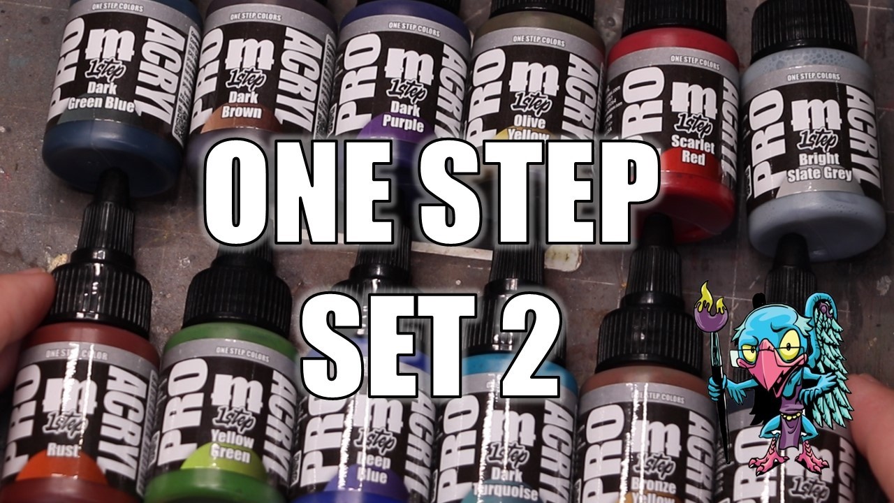
In this review of the Monument One Step Set 2, the creator returns to explore the second collection of contrast speed paints, building upon his strong positive impression of the first set. He begins by preparing a small goblin figure from Goblin Hobbies, utilizing a wet palette to manage the paints before applying a dry brush of bright ivory to establish highlights and details across the model. The artist then proceeds to apply the new colors directly as single coats over the zenithal wash base, demonstrating how the yellow-green provides an excellent natural skin tone for goblins while the olive yellow is used effectively to deepen shadows in areas like the ears and neck. He notes that while some colors are highly opaque, others like the scarlet red are more translucent and may require a second application to achieve full intensity, offering viewers insight into the varying opacity levels within the set.
The demonstration continues with the application of earth tones to the goblin's wooden staff, where the bronze yellow is applied first to preserve underlying wood texture before the darker brown is used for shading, creating a realistic two-tone effect without metallic finishes. The creator expresses particular enthusiasm for the dark turquoise, describing it as his favorite color in the set due to its high saturation and radiant quality, which stands out against the often muted nature of slap-chop style paints. He pairs this with a deep blue that serves as a perfect mid-tone and a dark green-blue for shadows on the cape and robe, establishing a vibrant three-color progression. Additionally, he highlights the dark purple as a rare and valuable addition to the market, noting its ability to form a strong highlight-and-shadow pair with purples from previous sets, while also testing the bright slate gray on book pages and ropes, which surprisingly proved to be an intense and effective non-metallic metal color.
To elevate the model beyond a basic one-step application, the artist demonstrates advanced techniques by mixing ivory into specific colors to create sketchy highlights on the hair, robes, and skin, then glazing over them with the original paint to blend the tones smoothly. He also tests the black paint for lining deep recesses and writing script on a book, finding it effective for creating hard shadows in mechanical details, though he still prefers the blue-black from the first set for visual complexity in general shading. The entire painting process, including camera setup and recording, took approximately 45 minutes, resulting in a figure that achieves tabletop-level quality with remarkable speed. The video concludes with the creator expressing satisfaction with the final result, encouraging viewers to experiment with the brighter tones and new colors to achieve fast yet eye-catching results for their own hobby projects.
Read the full video transcript
Hello everybody and welcome to another
hobby cheating video and today it's time
to return
to one step part two. Let's get into it.
>> The the strict technomancer that is
Vincey V. Let us get to the technique in
learned Vincey V style.
>> That's right. Monument was nice enough
to send me the part two
set two, whatever, of the one step
paint. Now, I'm on record saying I
really love the first one step paints. I
thought they were sort of the best
version I've used so far of the contrast
speed style paints. And if you've
watched videos, you're going to see them
in recent videos as well as many
upcoming videos. But with the new set
out, that means there's more colors to
play with. So, let's not waste any time.
We got a lot of colors. Let's get over
the desk and let's get painting. All
right. So, once again, we're going to
use this adorable little goblin. Uh this
is from Goblin Hobbies. Uh Casey and
Brent. Uh I love these little goblins
and they are just the perfect figures to
do fun stuff like this on.
Uh we start out of course uh by just
getting all these paints ready. Let's
see what we're dealing with here.
>> [music]
>> So, we've got uh a lot of paints in the
mix here.
Uh and you know, lay them all out. It
really is a nice addition of colors to
the first set. Fills a lot of holes that
weren't necessarily there. Gives you a
lot more options.
So, I get all the paints out of my wet
palette, no big deal. You can use them
on a dry palette. You can use them on a
wet palette.
Perfectly fine. They will, of course,
after some amount of time break down on
the wet palette, but for what we're
doing today, it's no issue.
I take my little goblin girl and I get
out my secret weapon, which is bright
ivory. Whenever you're working with
these sorts of contrast paints, having a
good white as both a reset, a way to
make things lighter or mix it in or, you
know, play with values is really a
pretty good place to start.
Uh so, I get that and I just give her a
nice all over dry brush. Just make sure
we bring in all the details, get a lot
of light in there, and that's going to
give us a place to go from. All right,
so she's all dry brushed. That lean That
means that our next step is going to be
to go ahead and get some colors on.
Uh what we're going to do here is we're
going to start with just some greens and
yellows. We got to start with the skin,
right? So, what we're going to do is go
ahead and grab our uh yellow green,
literally the perfect goblin color, and
we're going to apply that. Now, last
time I did this, I got some pushback
that I didn't use them in the more
traditional one-step way. So, this time
I decided to use them straight as one
steps, like one coat over everything,
and then you're going to see me at the
end start playing around with some
different techniques.
So, we just put coat of that yellow
green over her skin, and bing bang, look
at that. I mean, like
it looks really good. Like, this is
great goblin skin tone coloration.
Honestly, I'm not sure I needed to do
much more. So, fantastic start. I then
take some of the olive yellow, which is
this much darker greenish color, and I
use that to just like knock in some
shadows and some deeper colors like in
her ears, around the bottom of her
cheeks and neck, and so on and so forth.
Just using that to really kind of
reinforce some of those again as a
one-step.
In most of these cases, I'm going to try
to keep the color
uh just one step over the base so you
can see how it goes. Maybe then apply it
one or two more times, just so you can
also see what happens if you actually
apply multiple coats of the stuff.
All right, so her skin is looking great.
That leads me directly to her hair.
That's going to be the next thing we
tackle. So, I grab the scarlet red,
because why not? It seems like a
perfectly fun color to work with for her
hair.
And the scarlet red kind of surprised
me.
Looking at it in the bottle, it seemed
really, really intense.
But, in applying it, it was quite weak.
Like, it's quite It's not a very strong
application of color.
So, when it first goes on,
it really does leave a lot of the
underlying tone [music] present. Um I
went ahead and applied a second coat,
and you do get a much, much stronger red
on the second pass. [music] So, my
suspect is this one's just a little bit
more translucent than some of the other
ones. And that's always the thing when
you're learning these like sort of very
translucent, transparent speed contrast
one-step paints is which ones are really
intense and which ones might need a
couple applications. So, this red falls
into that latter camp. I do like the
color once I got the second one down. I
thought it was nice and intense.
Okay. Uh so, once that's on, then our
next step is going to be with some of
the playing with some of the like
brownie yellow tones. I actually really
like both of these. They're interesting
for playing with sort of quick
non-metallic colors. So, I start with
the bronze yellow. This one again is
incredibly translucent, but here I think
it's quite valuable
uh because what I want is to have the
wood still really show a lot of that
underlying texture. So, I put it all
over her staff. And as you can see, a
lot of the previous dry brush and that
wood texture does show through [music]
really, really nicely.
Um it has this, you know, yellowish tone
to it, makes for really nice natural
wood. So, I thought that looked pretty
good. I then go ahead and take the dark
brown, which is much more intense
and like much higher opacity and sort of
it's straight out of the bottle uh
application, and I run that down the
shadow side of the staff, use it to
create some value transitions. And the
two of these are really a great pair.
What's interesting about this set, too,
is I found there were lots of really
natural pairs in here, as you'll see.
So, it started with the yellow green and
then the olive yellow. Those worked
really well together where one was a
very natural shade tone for the other.
And then here again with the bronze
yellow and the dark brown. Both of these
being effectively sort of brownie tones
where one of them works as a pretty
natural highlight over bright under
shading and then the second one works as
a really naturalistic shadow.
Okay. So, once the staff is all good to
go, my next step is going to be we're
going to start playing with some of
these more fun colors and get on to her
robes. So, I start with the
dark turquoise.
Which I really love this color. So,
honest answer, this is my favorite color
in the set. Who's Vince loves the
turquoise. But it's really radiant. It's
very saturated. It went on really
nicely.
It has the sort of the perfect opacity
where it was letting a lot of the light
come through, but still had a really
saturated tone. One of the things you
often deal with with these kinds of like
slap chop style paint jobs
is that the colors don't feel very
saturated or intense. And you know, you
kind of get what you got with like what
I got with the scarlet red.
But that's not the case here. This was
super duper vivid and really nice. And I
just love how punchy that dress is with
it.
And as you'll see later it becomes
really easy to just like kick this up a
notch so so quickly.
I then go ahead and grab the deep blue.
I wasn't sure cuz there's actually two
colors I think you could very reasonably
use as a shadow for this. Either the
deep blue, which is also as you can see
here very very saturated, and so adds to
just kind of it's a good like half tone
mid tone color for that turquoise.
And that looks really nice. It's not as
dark as I was imagining. It's really
just more of an extremely radiant blue.
This deep blue would be your perfect
sort of ultramarine color if that's what
you're going for. So, if you're looking
to slap chop the Smurfs, well,
here you go. You're done. Like doing it
but kind of honestly with the turquoise
and then this blue from below, you'd be
done.
But at any rate,
so I like how that looks, but I didn't
quite get the shadow I wanted out of it.
So, what I went to next was to the dark
green blue, and that was the other one I
had been contemplating using for a
shadow, and I tried that on just the
cape first. [music] So, she has a cape
over her robe on the back, and that came
out perfectly fine. That one it seems
the closest to one of the colors in the
previous sets,
cuz there's another sort of off green
color that's not too far off of this.
Both of these would honestly be fine as
like a base start for a quick
non-metallic metal in steel or something
like that.
But, I also used this as
shadow for the blue, and that worked out
very very well. So, I did like that. And
there we have this really nice three
color progression over the robe, which
is sort of the biggest area of the
model,
and so you want a little more travel of
light and such. All in all came out
pretty good.
Uh, next up I went ahead and grabbed the
dark purple.
It is dark, as a matter of fact, which
again I actually like. One of my big
problems is that there are very few good
dark purples on the market. Like,
>> [music]
>> Army Painter's Terran Titan is one of
them, and now this, and end of list. Uh,
so but I was happy this was actually so
dark,
because the previous set had a much
brighter more intense purple in it, and
again this will form a perfect two
color, you know, sort of highlight and
shadow set with that previous purple.
Um, so here again I just, you know, you
can see I put it over a couple of small
elements, and we're good to go.
Uh, we'll talk about how you can kick it
up and make it a little more visually
compelling in a moment, other than just
using also the royal purple from the
last set.
The next question I had was this bright
slate gray. I'm not going to lie, I
saved this one for last cuz I didn't
know what to think of it.
Gray contrast paints and anything like
that have really never impressed me.
They've always been like either
basically super weak or just done
nothing of value.
This one's kind of spun my head around a
little.
So, as you can see, I put it over the
pages on the book.
And as well as like the rope around her
waist and stuff.
And it's actually really intense. Much
more uh like it's still a
a one-step paint. There's still a lot of
translucency there. But it's a lot less
translucent than I was imagining.
And I actually think you could use this
with you know, normally I'm using ivory
and stuff like that as my highlight tone
as you'll see in just a moment to
[music] to create highlights on uh the
models that I then you know, you can run
another uh one-step over. But I honestly
think this might be such that you could
just do this.
Uh it is strangely intense for what's
going on there.
So, I definitely need to I think that
bright slate gray again, especially
combined with like that dark green blue
from earlier could be some fast one-step
NMM. And so, I'm going to play with that
in a future video and see what we can do
um because it just it was very very
interesting to me how actually intense
and effective that color was. It really
surprised me. It was much more effective
than I was imagining. So, that's I think
might be the sleeper color of the of the
set. All right. So, now you've seen how
everything works, all the one-steps. You
can see I didn't cheat. I just put one
step of the paint over the zenithal
thing, so you got a good take of them.
Now, let's do some fun. I mean, this is
my channel. Come on. Of course, I'm
going to do some crazy things, right? Of
course. All right. So, now I get out my
ivory and I'm going to start playing
with different colors as the highlight.
And you'll see me work my way around the
figure here with several different
items. We're going to touch things like
the hair, the robes, the purple sleeves,
all of that kind of stuff. Because what
I wanted to do was see how they started
mixing with the ivory, making
highlighted versions of the color, and
then you usually just go back to the
original one step to smoothly blend them
in.
And I found yet again that this was a
very effective way to get out of fast
high-contrast paint job. Even when
you're you have a bright under shade,
the reality is is that with a lot of
these times with the slapchop thing,
your highlights do just get really
diminished. They're not really that
punchy. Now, that doesn't mean you need
to come in and re-highlight the whole
model. That means you take a few key
areas like her hair, her robes, and so
on, and you come back in with a slight
mix of the ivory and the color. You You
sort of draw in some sketchy highlights,
and then use the one step as a as a
little bit of a thin down glaze over the
top to bring them the two tones back
together, and bing boom, you've suddenly
got something smooth enough for army
painting, certainly,
while still actually
uh you know, being very fast and
effective at recreating that contrast
that you want to actually make the fig
build readable and eye-catching at a
tabletop uh level.
And so, yeah, that's what I did. You can
see move around, like I said, the hair,
the robes, all that kind of stuff. All
in all, I found it worked really, really
well. Um the one thing I didn't mention
in there uh was her was the black. There
is a black in here. Um so, I did do her
shoes in the black,
uh and that was easy enough. Sure, it it
works. Yep, it's black. It's very dark.
But I was more curious with the black
about black lining. Now, currently my
go-to is the uh blue black out of set
one. I use this for my black lining, my
dark lining uh in between volumes on
basically everything I paint, regardless
of the level I'm trying to go for in the
end. I just think it's so good [music]
at it.
But, I was curious as to how the black
in here worked for that as well, and
simple answer, it works very well. The
flow of these paints [music] is just
really nice for doing this kind of dark
lining. So, I I'm not sure if I would
use this black over the blue black. I
think the blue black's a little more
visually compelling, just because it's
got a little bit of a hue in it, but it
works fine in this regard as well, and I
have no ultimate problem with with, you
know, actually having dark black lines.
The reality was if I was doing probably
like steel or like a a machine where I
was doing recess lining, I would use
this base black as opposed to the blue
black because you do want that to be
just a little more like dark and more
hard shadows in those deep recesses in
between like panels and panel lining and
stuff like that.
Okay.
So, with that all done, that left me
just a couple of other small touch-ups.
Um I did grab some of the pink that I
had made for her hair, and just went
ahead and saw if I could put that onto
like her nose, her cheeks, her ears,
[music] stuff like that to push some of
the skin highlights up around, make her
skin a little more visually compelling.
I hit the eyes with some of the scarlet
as well as a little bit of that
highlight as well. Put a little white
dot in the eyes, you know, those kinds
of things. Just doing some final
touch-up around the model. All in all,
do it running through all these sets,
even with recording everything and doing
all of this, this fig was about 45
minutes to to do, to run through
everything. That's with all the, you
know, camera angles and setting things
up and recording and stuff like that.
So, this was a very fast paint job, but
honestly, I think she looks pretty fun
and cool for how fast it came out, and I
she it shows you really can accomplish,
you know, tabletop level quality with
these kinds of things or tabletop plus,
you know, that kind of stuff, really,
really quickly and effectively. I think
the combination of using those brighter
tones, you know, ivory, potentially
experimenting with that bright slate
gray, um, can actually get you pretty
far pretty fast.
Um, the other thing that I did, by the
way, was I went in and took the black,
uh, and also in addition to the lining,
I tested whether or not I could do the
script on the book. And so, I went ahead
and did that. And as you can see, it
worked really, really well for just
writing in, um,
yeah, like basically small script onto
like purity seals or books or anything
like that. Effectively just writing with
an ink when you've got a very sharp
brush, so it came out really well.
With those final little steps done,
here's how she came out. Uh, all in all,
I was pretty happy with with her her
sort of final look. Like I said, for 45
minutes, we'll call it a winner. Uh,
hey, if you like this, if you like how
she came out, give it a like. If you
want to pick up any of your hobby
supplies, including these new Monument
paints, you can find affiliate codes
down in the description to do so. They
save you money, and using them really
does help the channel. So, please pick
up all your stuff through that. It's a
great help. Down there, of course,
there's also our Patreon focused on
review and feedback and taking your next
step on your hobby journey. We'd love to
have you as part of the community.
There's also, of course, uh, all the
other things around the Vincey Cinematic
Universe, such as Fireball Gazebo, my
RPG podcast with Ninjon, and Snarl Cast,
my indie wargaming podcast with Uncle
Adam. You can also find the games I make
with Uncle Adam down there. Uh, so,
check all of those out. There's so many
fun things for you in the description.
Just go explore. It's so cool down
there. Check it out. Uh, but hey, I want
to thank you so much for watching this
one. I really do appreciate it. Uh, if
you've got any questions or comments,
don't forget to drop those down below. I
always read every comment and answer
every question. Thank you so much for
watching this one, and as always,
we'll see you next time.
>> [music]