Leverage the experimental design to improve your data visualizations (CC426)
Watch on YouTubeVideo summary
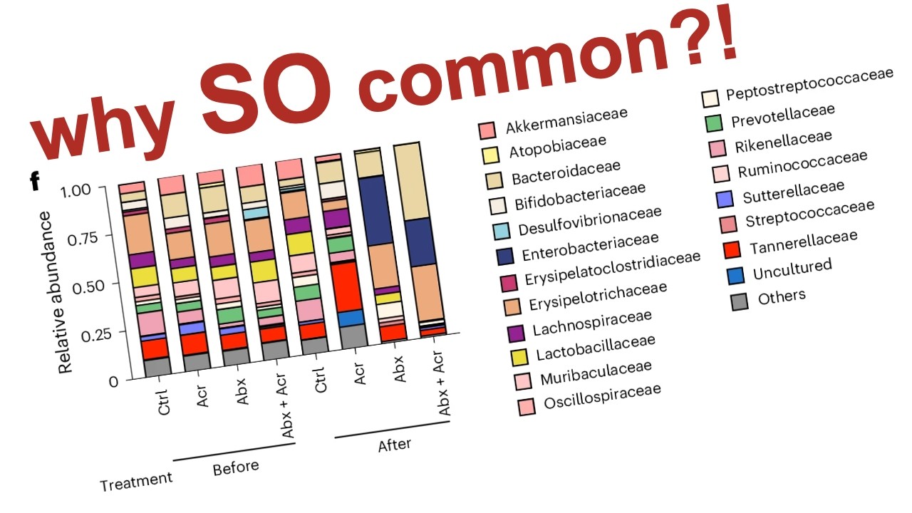
The video presents a constructive critique of Figure 3, Panel F from a recent paper published in Nature Microbiology regarding the effects of acarbose on gut microbiota and allergic responses in mice. The presenter outlines a four-part framework for evaluating scientific figures: description to understand context, analysis to break down components, interpretation to verify alignment with author intent, and judgment to identify improvements. While acknowledging that the study utilized an excellent paired experimental design where each mouse served as its own control before and after treatment—a method superior to between-subject comparisons—the presenter argues that this strong methodology was not effectively leveraged in the data visualization itself.
The central issue identified is the use of a stacked bar plot, which the author finds inherently difficult for comparing relative abundances across multiple taxa due to a lack of common anchor points and excessive color redundancy with twenty-one different categories. The figure fails to clearly communicate changes because it averages data from eight mice per group without showing variation or confidence intervals, making it hard to discern specific trends like the increase in Bacteroidaceae or decrease in Erysipelotrichaceae mentioned in the text. Furthermore, the layout groups all "before" samples together and all "after" samples separately rather than placing pre- and post-treatment bars side-by-side for each condition, which obscures direct comparisons between time points within specific treatment groups.
To address these shortcomings, the presenter suggests several concrete improvements starting with simplifying labels by writing out full names instead of using confusing abbreviations like ACR or CTRL. The most significant recommendation is to replace the stacked bar plot with slope plots for each bacterial family, which would connect individual data points from day 21 to day 28 within a single animal's trajectory. This approach would visually highlight downward or upward trends in diversity and abundance while reducing cognitive load by focusing only on taxa that show meaningful changes rather than displaying every minor fluctuation across all twenty-one families simultaneously.
Ultimately, the critique concludes that researchers must align their visualizations with their experimental design to maximize clarity and statistical power. When a paired design is used, figures should explicitly reflect this structure through side-by-side comparisons of pre- and post-treatment data points connected by lines or arrows, rather than aggregating them into separate columns. The presenter emphasizes that failing to visualize the pairing effectively wastes the inherent strength of the study's methodology and confuses the audience; therefore, scientists are encouraged to refactor their figures using tools like R to better represent how perturbations affect individual subjects over time, ensuring that the data presentation matches the rigorous standards of the underlying experiment.
Read the full video transcript
Hey folks, welcome back for another
episode of Code Club. In today's
episode, I will be doing a constructive
critique of this figure, specifically
panel F, that was recently published in
a paper in the journal Nature
Microbiology. I strive to do
constructive critiques so that we all
learn something from the experience.
What is a constructive critique, you
might ask? Well, in my way of doing it,
it has four parts, starting with the
description, trying to understand the
context of the figure. The second is the
analysis, where we take the figure and
we break it down into its constituent
parts. The third part is where we then
try to interpret the figure and see if
our interpretation agrees with what the
authors want me to take away from the
visualization. And then finally, is the
judgment, where we sit back and we say,
"What could have made the interpretation
and the analysis of this figure
all the easier?" What could have made it
easier for me? You know, perhaps there's
a hundred figures in a paper, a hundred
different panels.
Um,
how do I get what they want me to get
out of that as quickly as possible?
Heading into that descriptive phase of
the critique, again, this paper was
published in the journal Nature
Microbiology just a couple weeks ago on
May 12th. It is open access, so if you
want to get your own copy of this, go
down below in the description to this
video and I will have a link so that you
can get that and read it if you are so
interested. The title of the paper is "A
Carob Sweet Directs Gut Microbiome
Utilization of Dietary Carbohydrates to
Suppress Anaphylaxis in Mice." And so
this is a a gut microbiome paper using
mice. It has a little bit of human data
in there, but no human microbiome data.
The first author is Kayosuke Yakabe. I'm
sorry for the mispronunciation. They are
at the Research Center for Drug
Discovery, part of the Faculty of
Pharmacy and the Graduate School of
Pharmaceutical Sciences at Keio
University in Tokyo. There are 20
authors on this paper. As they tell us
down at the bottom, this paper was
submitted uh 21st of last year, 2025,
and was accepted April 8th of 2026. So,
it took about 9 months for it to be
accepted and then published. The general
idea of the paper is to try to
understand the interaction between
carbohydrate utilization, the
microbiome, and an allergic response.
So, as they say here in the abstract,
microbiota-accessible carbohydrates
modulate host immunity by shaping gut
microbial composition and metabolism.
However, their role in modulating the
microbiota to influence allergic
responses is unclear. So, we know that
the microbiome is important for immunity
and metabolism, but the response then
for allergic responses is unclear. In
this study then, they used an
antidiabetic drug, acarbose, which is an
alpha-glucosidase inhibitor. They found
that using acarbose redirected the
dietary carbohydrate utilization by gut
bacteria to suppress mast cell-dependent
anaphylaxis in mice, that's that
allergic response, independently of
adaptive immune responses. And so, they
go on to talk about some other things,
but the figure I'm interested in is part
of figure three. And so, this gets us as
far as we need for the background of
that figure. The first two figures of
the paper describe the metabolic and
immunological reaction of the mice to
acarbose before moving on to figure
three, which is largely talking about
the gut microbiome and its response to
acarbose in the context of this
immunological response. My critique,
again, is going to be of panel F here in
figure three. And so, to get a little
bit more context, let's go through panel
A, which is a schematic for the
experiments that were described in these
panels in this figure. They have mice.
And for the first 21 days, the mice are
receiving water. They receive an
injection at day 7 and 14 of OVA and
alum intraperitoneally
to kind of elicit some type of response
in these mice. So, though it's not
really well described in the schematic,
there really are four conditions here.
So, the first condition is where mice
received water throughout with no
Acarbose and received no antibiotics.
So, that's the control. The second would
be receiving water throughout with no
Acarbose, but they then also received
antibiotics.
The third condition we can think about
then is mice that received Acarbose in
their drinking water starting at day 21,
but did not have an antibiotic
perturbation.
And then finally, the fourth condition
is receiving the antibiotic perturbation
as well as Acarbose. In this study, they
tell us that they collected samples at
day 21 and day 28. And for each of those
four different conditions, they had
eight different mice. And so, there's a
total of 32 mice that they obtained
fecal samples from on days 21 and 28 for
64 total samples. This design is what's
called a paired design where they have a
pre and a post sample for each of the
experimental conditions. This is a great
design for microbiome studies. And so,
that's a really great thing to see that
they did in the study. And it's great
because it allows an experimenter to use
the animal or the person as their own
control. We know that there are all
sorts of batch effects or cage effects
or vendor effects when it comes to mice
that you can get uh a C57 black six
mouse from one breeding facility and
another breeding facility, even like in
the same facility,
and they will have a different
microbiome. And so, while they talk
about giving the animals the same chow
and kind of perhaps co-mixing them in
their methods,
nothing uh is a better substitute than
using each animal as their own control.
And so, this pre-post, before-after
experimental design is really great for
that. And this is a particularly
invaluable technique for humans, right?
So, if you take me, obtain my
microbiome, give me antibiotics, and
then take my microbiome again.
That comparison of me pre-post is far
better than taking say 100 people with
no antibiotics and 100 people post
antibiotics.
And it's better because it controls for
the initial variation in the microbiome.
So, this is a really strong part of the
experimental design that was used in
this study. Now, let's move on to the
analysis phase of the critique starting
with the title of the figure which is
Acarbose suppresses anaphylaxis in a
manner dependent on the gut microbiota.
I consider that to be a declarative
title. They are telling me what they
want me to see in the data. This figure
has nine panels going from A to I. So,
I'm going to be focusing in on panel F
for this critique in part because I'm
always drawn to stacked bar plots
because I admit I have a bias against
stacked bar plots. I think there's
always a better way. And so, whenever I
see a stacked bar plot like this one, I
see it as a challenge to think about how
I can make it better. And so, that's one
of my motivations in this critique is
again to think about if I were to talk
to the authors and say we could have
done better here, what would I have
proposed? We know that this panel was
made using GraphPad Prism because it
says so uh down in the methods section
of the paper. Breaking it down into its
constituent parts, it is of course a
stacked bar plot. On the x-axis we have
what I would describe as two tiers of
treatments. We have the four
experimental groups, the control where
they received all water, Acarbose where
they received Acarbose between days 21
and 28 but no antibiotics, the
antibiotic group where they received the
antibiotics between days 21 and 28 but
no Acarbose, and then the combined. And
so, they've got those four groups, but
they've then duplicated because they
have the samples from day 21 which is
the before and the samples from day 28
which is the after. So, I would think of
this as a discrete scale on the x-axis.
The y-axis then is the relative
abundance of the different taxa, where
the height of each of the tiles in the
stacked bar corresponds to the relative
abundance of each of the different
families of bacteria that are listed
over here on the right. And so then the
fill color that we see here corresponds
to one of these, I believe, 21 different
families that were in the analysis. One
of the groups was others, where they
pulled families together that weren't
more than 25% of all the data. I'm not
totally sure what that means because
none of these gray tiles are at 25% and
there are certainly other gray tiles
that are larger than 25%. I'm not going
to worry about that. They also have
another family here called uncultured,
which I don't know what that means
because there are many uncultured
bacteria or bacteria from groups that
have never been cultured before in here.
Um
I don't I don't know what that means
either, but
let's move on from that for now. In
terms of thinking about statistical
layers in this data visualization, I
would say that each of the tiles in the
stacked bars is actually a mean. Each of
these columns represents data from eight
mice. And so this rectangle that we
might see here, which I assume is from
the Bacteroidaceae, is a mean of the
relative abundance of the Bacteroidaceae
across eight mice after at day 28 from
those mice that received both the
antibiotics and the Acarbose. Aside from
that, I don't really see any annotation
other than perhaps these horizontal
lines above the before and after
treatment to indicate that these four
bars go together and those four bars go
together. That being the analysis phase
of the critique, now let's move on to
the interpretation phase of the
critique. To be completely honest with
you, when I look at this data
visualization, it is really challenging
for me to draw anything out of it. I
guess if I look at the befores,
I would say that they look pretty
similar to each other.
Um although this control uh I noticed
that this cream colored rectangle, which
I think might be this
Erysipelotrichaceae,
is a little bit taller than it is in the
other groups.
Um and this pink down here is also a
little bit taller, which I think might
be the Muribaculaceae.
But again, it's it's hard to see, right?
It's hard to make those comparisons. And
so now if I want to compare the control
to the control, those look vaguely
similar, although I see this yellow is
at a different position from that. And
again,
that Erysipelotrichaceae is a little bit
shorter than it is over here. Um and if
I think about like the the ACR, which
they are interested in, this bar
looks quite a bit different from this
bar. But again, because they're not next
to each other, it's hard to see exactly
what the differences are, right? Like
there's
this red bar is shorter than this red
bar. This blue is taller than it is over
here.
Um and we can kind of make more of those
types of comparisons as we go.
But it's it's really challenging, just
to be totally honest with you,
um
what I'm supposed to be seeing. Like
this red here is a pretty clearly, I
think, the Tannerellaceae,
um which is very pronounced in the
Acarbose condition relative to the
others. Um it also appears that like the
Enterobacteriaceae are more pronounced
in the mice after receiving antibiotics
regardless of if they had Acarbose. And
that also the Bacteroidaceae are more
pronounced in the mice that received
both the antibiotics and the Acarbose.
But again, it's just really challenging
for me to have some type of takeaway.
The title of the figure is that Acarbose
suppresses anaphylaxis in a manner
dependent on the gut microbiota. And so
that goes back to I think panel B, where
they're looking at the temperature
changes after receiving
that OVA IP injection. And so, I think
what they would want to be comparing the
Acarbose without antibiotics to the
Acarbose with antibiotics. To me, that
would be we're going to change the
microbiome and then we're going to see a
larger impact with Acarbose than with
Acarbose on its own. Alternatively,
we might also want to compare the
control to the Acarbose, right? So, if
we give Acarbose, does that change the
microbiome and then also change the
anaphylaxis. But if that's the case,
then why also include antibiotics? I'm
not totally sure, right? So, I'm left
with a little bit of a loss of what they
want me to take away
in part because of the design, I think,
and also because there's there's a lot
of variables here and it's kind of a
complicated experimental design. So,
let's go back to the paper and see what
they wanted me to take away. So, here in
the results section, there is a
subsection titled Acarbose suppresses
anaphylaxis via the gut microbiota. They
have this statement where they are
referencing figure 3F. Acarbose
treatment increased the relative
abundance of Bacteroidaceae,
Bifidobacteriaceae, Lachnospiraceae, and
Tannerellaceae and decreased
Erysipelotrichaceae,
Peptostreptococcaceae, and
Sutterellaceae. So, let's see if we can
see that in the data now that we know
what they want us to see.
So again, the ACR treatment increased
the relative abundance of
Bacteroidaceae.
So, Bacteroidaceae I'm going to assume
is this tanish color like we see here.
And so, if we look at the Acarbose,
that is this. I guess it is larger than
the control at day 28. I don't see it as
being any different in size than its own
control on day 21, right? So, I don't
see a change really.
I I mean, I don't have the statistical
eyes to see the the variation in the
data,
but this rectangle doesn't look any
different to me than that rectangle. It
is larger than that, but again, I think
the best control is the Acarbose mice,
those same eight mice, but on day 21.
Bifidobacteria are the white, and so
here the Bifidobacteria are in white.
Again, they're not present in the
control, but I don't know that that's
that much different than that white
rectangle
with the Acarbose mice, the same mice on
day 21. Lachnospiraceae are these
purple, and so again, this purple is the
Acarbose. It's a little bit larger than
the control, and it's a bit larger than
it is over here on the day 21 sample.
The Tannerellaceae we mentioned is this
red, and that is the largest rectangle
in this plot that is red. Um and so I
think that checks out. So now we want to
look at things that decrease, like the
Erysipelotrichaceae, which is this
brownish color, and so that's like this
larger rectangle, right? And so I see
that is the rectangle here in ACR. It is
a bit smaller than the control, as well
as the day 21 ACR mice. So that checks
out. The Peptostreptococcaceae
is also in white, but perhaps
further down. I guess it's the second
white down here, I'll assume. And so in
the ACR, I don't see it at all, but I do
see it in the control and the day 21.
Whether or not that's significant, I
can't say. Finally, the Sutterellaceae
is kind of a violet color that's going
to be above
the red, I think.
Right? So this blue wedge that you can
barely see there is the Sutterellaceae
in the ACR, and that's about the same
thickness as it is in the control, which
they've been using before as a control,
but also shorter than what they saw on
the day 21 for those Acarbose. So again,
based on my visual inspection, I think
it's a bit of a mixed bag whether or not
I think the data in panel F agrees with
their statement. I would want to see
more refined data to indicate, you know,
what is the variation in the data, what
do the actual eight mice look like, and
then also to understand what is the
statistical test they're doing to get to
this statement in 3F. Here they describe
using linear discriminant analysis
effect size or LefSe. And so LefSe is a
statistical test that is used in the
microbiome literature for comparing
relative abundances of different taxa.
It does a pairwise Wilcoxon test
followed by a linear discriminant
analysis on those effect sizes to
effectively sort these significant taxa
by the effect size between two different
treatment groups. So this test wouldn't
work out of the box to do a paired
analysis where you're using each animal
as its own control between days 21 and
28. It would allow you to take those
eight general groups of the four
treatment groups before and after, and
then to do pairwise comparisons between
those to see if there's a significant
difference for any of the taxa. But
that's not the test they would want to
have done to compare Acarbose-treated
mice at day 28 relative to day 21 before
they had taken Acarbose. So I'm going to
stop there because there's a lot I don't
know and that I can't get out of the
text. And so let's now move on to the
judgment phase of the critique. In terms
of positives, I really like this
pre-post experimental design where they
had the same eight mice before and after
the Acarbose and or the antibiotic
treatment. I think that's just a great
experimental design and is wonderful
when you perhaps can't fully control for
the initial state of the microbiota like
we would like. The negatives is that
they're not leveraging that paired
experimental design in panel F and as
I'll talk about later in any of the
other panels in this figure. As I
already indicated in the interpretation
phase of the critique, felt like there
was a lack of transparency in describing
how things were done, how comparisons
were made, what comparisons they wanted
me to see with this data visualization,
and how statistical tests were made.
That statement that I grabbed from the
results section had no reference to how
they identified those bacterial families
as being significantly different in
relative abundance between ACR and I
don't know what else actually. I don't
know what that comparison was back to.
Was it back to the after control or is
it back to the before Acarbose? It's not
clear. I would assume the before ACR,
but again, by comparing the bars as best
I could, it didn't always add up. And
so, that lack of transparency and
clarity in the description left a lot
wanting. Coming back to panel F, there
are way too many taxa here. There are 21
taxa, there are 21 colors. I don't care
about most of these. And at this many
colors, as we've already described,
there is a lot of redundancy in colors.
Right? Like the Bifidobacteriaceae and
the Peptostreptococcaceae. They talked
about both of these populations in the
results section. And so, it takes some
work and some assumptions to know that
this top white rectangle is the Bifido
and that this bottom white rectangle is
the Peptostreptococcaceae, right? That's
really hard and that's
me trusting a lot in what the authors
want me to see. Again, there's just too
many colors, there's too many groups.
The cognitive psychology literature
tells us that humans are really only
capable of keeping track of five plus or
minus two different groups. So, maybe if
you give me three to seven different
bacterial taxa, different colors, I can
keep track of that. Uh it's seven is
also kind of at the upper limit of the
number of distinct colors that you can
come up with to represent different
categories. This is one of the biggest
challenges with a stacked bar plot is
that there's just too many groups.
Another significant challenge with the
stacked bar plot approach is that it's
very difficult to compare rectangles
when they don't have the same anchor.
And so by anchor, I mean say like the
x-axis, right? Like I can compare those
others
across the eight different columns very
easily. I can compare the Akkermansia
very easily because they're anchored to
the bottom or the top of the chart. But
if you want me to look at say again the
Aerococcaceae, this bar here I think,
it's moving around and it's really hard
to see like are these two rectangles the
same size? Is this rectangle the same
size as that rectangle?
That is that bigger than these? It's
hard to see, right? Because again, they
don't have a common anchor point.
Another major problem with stacked bar
plots is that each of these columns
represents the average of eight mice.
There is no sense of the variation in
the data. And so again, this rectangle
here for the Aerococcaceae,
is an average of eight animals and I
don't know what's the confidence
interval on that, right? I don't know
how big or small that rectangle might be
for any given mouse. Beyond thinking
about the problems with stacked bar
plots is that again this data
visualization does not incorporate the
experimental design. It seems very
natural to me that the two control
columns should be right next to each
other. The two Acarbose columns should
be next to each other and so forth,
right? And and that I have to compare
this column over to this column
is just too much work to for your
audience to make that comparison. Put
the things you want me to compare right
next to each other. In this case,
because you have a paired design,
you need to put the treatments next to
each other. Not all the treatments
before and then all the treatments
after, but put the before and after for
each treatment right next to each other.
Another problem that I see in this
figure and the accompanying text is
there's just way too much jargon that I
think is just totally unnecessary and
just totally confusing and clouding what
they're trying to say. CTRL
You know, three more letters and you
have control.
And you have the same number of words.
ACR, Acarbose, Antibiotics, right? This
is not asking, I think, too much to
write out these names. Perhaps the
Antibiotics plus Acarbose would get too
long, but you could always put a line
break in after the plus sign to put that
label over two lines. Again, this jargon
only adds confusion for your audience
and it's totally unnecessary. They're
not saving anything in terms of like a
word count. I don't even know if there
is a word count limitation, but it
doesn't it doesn't help and adds
cognitive overhead that your audience
has to keep track of as they're trying
to interpret your data. So, where
possible, write out the jargon and don't
use abbreviations like they have here.
So, what would I do differently? If I
don't like this, what would I prefer to
do?
Well, what I would do would be a
colossal makeover, right? So, perhaps on
one level, you could put the columns
next to each other that you want people
to compare, right? And that overcomes
some of the problems, but you still have
the problems with a stacked bar plot.
So, I would still put the columns next
to each other that are before and after
for each of the four groups. But, what I
would do is then design a slope plot and
I would basically design a slope plot
for each of the bacterial families where
across the x-axis, I would have the four
treatment groups. Within each of those
treatment groups, you would have on the
left before, on the right after and
perhaps jittered points with a line
connecting the points from the same
animal on day 21 to the animal on day
28. And so, again, for each family of
bacteria, you would have that slope
plot, right? And so, it's going to be a
slope plot with four different
categories
and then potentially 21 different taxa.
And that is a lot of taxa. It's a lot of
facets.
Uh that's not what I would be looking
for. I would be looking for those
families that are interesting to me. And
so what are the things that are going to
be interesting to me? Well, it's going
to be the things that highlight what I
want my audience to see. In this case,
things that show Acarbose
has a impact on the microbiome. Maybe
I'd be interested in showing those taxa
that do have a change because of
Acarbose. Or things that change more
between the antibiotic condition and the
Acarbose plus the antibiotic condition.
Again, if they're trying to say that
there is a microbiome dependent effect
of Acarbose, then I would want to
highlight the things that are changing
under those conditions. What they've
done here is just give me everything and
made it really hard to interpret what
they're trying to say. Again, I've been
trying to focus on panel F, but I think
a lot of the challenges that I diagnosed
in panel F, you'll see across this
entire figure. None of the panels
leverage the paired design that they
have here. And in some cases, it
actually becomes quite confusing whether
or not they're using paired samples or
not because of how they've designed the
panels. So if we look up here at panel
D, we can I see a perhaps simpler
example of where they didn't use the
paired nature of the experimental
design. And again, what I am suggesting
is effectively reorganize these columns
to put the control next to each other,
the Acarbose, and so forth, and then to
draw lines between the eight different
mice. This would then allow you to
simplify the number of colors that you
need to use. It would make it easier to
see if there is a downward trajectory,
at least in this case, in Shannon
diversity.
And it would also allow you to more
easily represent what comparisons you're
making, right? I feel like if you're
drawing bars over many different groups
like they have here and skipping groups,
then you probably have things organized
poorly, right? And again, how they're
showing me the comparisons they made
tells me that there are problems here,
right? So, for example, they're
comparing the control to the Acarbose,
to the antibiotics, and the antibiotics
plus Acarbose among the after samples.
They're not using the paired sample. And
the only paired sample they're using, I
believe, is the Acarbose before and
Acarbose after, showing that there's no
change. Although, if I kind of pull back
and look at it, it sure looks like those
Acarbose
are lower in diversity than the before
samples. So, that's a little bit odd,
right? So, again, there's just a lot of
oddness that I think comes back to the
fact that they're not showing the data
in the way that the data were collected,
in the way that the experiment was
designed. If we look at panel E, this is
a ordination diagram. And again, they
are not helping me to see what points go
with each other. Not only just the mice,
but the treatment groups, the before and
the after. What I would love to see is
perhaps an arrow starting at each of the
before points going out with the
arrowhead pointing at the after point,
right? So, you might have something in
here and an arrow coming straight out.
An arrow here going from one of these
light purple to one of the dark purple,
the cream to the darker orange, right?
Something like that where it then
becomes much easier to see how these
communities are changing. In G, we see
the control and the Acarbose, again, the
same conditions that they seem to be
comparing up in panels B and C. This
time they have the full saturated blue
and red, but again, that isn't the
paired comparison. That's not the
Acarbose from day 21 and day 28. They're
comparing different sets of mice rather
than the mice themselves before and
after receiving the Acarbose. So, again,
in H, we have the same type of thing
where I'm pretty sure this is after
antibiotic, although it's not really
indicated here comparing the Acarbose to
the control. And confusing things
further is that the color from the
Acarbose that I can actually see is a
color that looks a lot like the pink
that was used up in B and C as well as
in the before treatments for the control
and the Acarbose. So again, is this
before or after antibiotics? The color
is confusing me. And again, that comes
back up to B and C speaking of color
where in B and C they are using the
colors for the control and the Acarbose
before antibiotics were applied. So this
is day 28 data, but they're using
coloring for day 21. Again, all this
mixing and matching of different colors
that are the same for one condition, but
then different in another condition is
very confusing when they could do a very
nice job of using a consistent color
scheme across all of their panels to
perhaps indicate before and after
perhaps different shapes even for the
four different treatment groups. But as
it is, they're kind of mixing and
matching and if we look at H, this is
not the same pink color as we have up
here for Acarbose. So that's even more
confusing is that they've added
additional colors that I don't know what
those are and what treatments those
relate to back to these other things.
I'm left again trying to come to my own
conclusion about what they are doing.
Finally, I'll come back to this
ordination and point out a couple
problems with it. First of all, they put
the first principal coordinate axis on
the Y axis rather than the X axis.
The convention and the convention they
actually use in other figures in this
paper is to put the first principal
coordinate axis on the X axis and PCO2
on the Y axis. The other thing that they
did is that this X axis for PCO2 they've
actually flipped. So they have positive
to the left and negative to the right. I
don't know why they did that. I don't
know why they transposed the axes. It
doesn't really matter because in some
regards, at least for this type of
visualization, the axes don't really
matter for a principal coordinates
analysis, but it's just weird that they
did it that way. Anyway, um I wish I
could be more positive about this set of
panels, but I really want to highlight
for you that if you are doing a paired
analysis, that is awesome. That is the
best experimental design, especially if
you're in the world of microbiome
research. So, if you're doing that, show
that in how you show your data, right?
Be sure you're leveraging that paired
analysis,
uh and and and then also be sure you're
using that in your statistical analysis.
They did not do that here. If you apply
a statistical test that makes use of a
paired analysis, again, where you have
the same animal or the same experimental
unit before and after some treatment
group, a paired analysis effectively
allows you to control for the variation
that you have in those pre-samples
to then have a more powerful,
statistically powerful test when you're
comparing the after back to the before.
Whenever I review papers and I come
across one where the scientists used a
paired experimental design, I am shocked
by the number of times people generate
figures just like these and do analyses
just like is described here, rather than
making use of the paired experimental
design. Don't be that guy. Don't be that
gal. Incorporate the paired design into
your analysis and into your
visualization.
Well, that's all I have for this
critique today.
On Wednesday, I will be doing a live
stream where I will try to refactor
panel F. I will probably also drop a
couple of other videos over the week
refactoring panel D as well as panel E
and showing you how I would do that. I
love playing with different techniques
of highlighting how things are changing
before and after a perturbation. And so,
refactoring these sets of panels will
give me a chance to share that with you
as well as uh to learn more about using
R. Well, that's all I have for today.
Thank you for watching. Please share
what we have done today and what we've
been discussing with your friends and I
will see you next time for another
episode of Code Club.