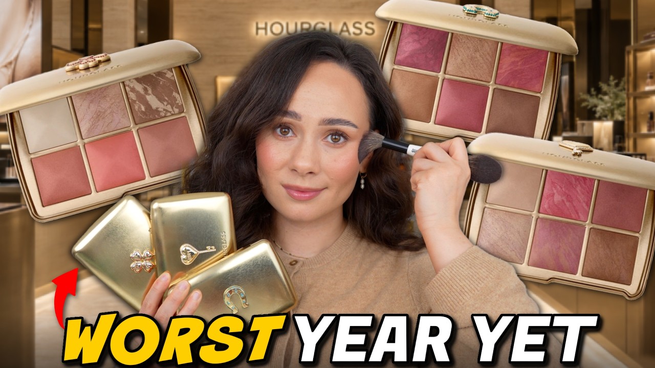
HOURGLASS AMBIENT LIGHTING EDIT UNLOCKED HOLIDAY PALETTES 2026!! Swatches, Comparisons & Demos
Watch on YouTubeVideo summary
The video provides an in-depth review of Hourglass's 2026 Ambient Lighting Edit collection, featuring three core palettes and a new Sephora-exclusive Love Palette launching tomorrow. The presenter notes that while the brand continues its tradition of reliable overnight shipping, these limited-edition products are expected to sell out quickly during Black Friday or Sephora's savings events. A key highlight of this year's release is the collaboration with French jewelry designer Lauren Rubinsky, which introduced customizable gold packaging where users can choose between different charms like Hope, Luck, or Wish. However, the reviewer warns viewers not to trust marketing photos, as the actual product colors often differ significantly from what is advertised online.
The review delves into a detailed comparison of the new shades against last year's collections, revealing mixed feelings about the color stories. The presenter finds that this year's palettes lean heavily into warm and coral tones, which feels less versatile compared to previous years' more curated selections. Specifically, the bronzer in the medium "Hope" palette is criticized for being too deep, while the blushes across all palettes are noted for having very similar undertones, reducing variety. Despite these concerns about color curation, the quality of the powders remains exceptional; the highlighters are praised for their new, wetter formula that offers a stunning finish, and the finishing powders continue to provide an unmatched "Hourglass Filter" effect that blurs and unifies makeup application seamlessly.
For collectors or those with specific skin tones, the video offers practical tips on how to adapt these products for personal use. The reviewer demonstrates techniques such as using the warmer finishing powder as a bronzer in the crease or mixing it with blushes to reduce pigmentation if needed. While the deepest "Luck" palette requires some creativity to work on lighter complexions, the medium "Hope" palette is identified as the most suitable for the presenter's skin tone. Ultimately, although this year's launch is considered the least exciting in years due to repetitive color themes and a lack of risk-taking, the undeniable quality and unique formulas ensure that these palettes remain undupable staples that will continue to be used and loved by fans of the brand.
Read the full video transcript
Your girl paid for overnight shipping
for these and Hourglasses they do every
year. They really deliver. Their
overnight shipping is always truly
overnight. So, I am so excited to share
with you swatches, comparisons, and
applications of the brand new Hourglass
Ambient Lighting Edit collection of
2026. You know, I am a collector of
these, so I had to purchase every single
one. Now, there is a fourth one, the
Love Palette. That one goes live
tomorrow at Sephora, so I'll have that
one linked down below. That is a Sephora
exclusive color story, which has three
brand new shades. The color story is not
even an option on the Hourglass website,
so definitely check that out at Sephora
if you're interested in that one. I will
be picking up that one as well. But
we're going to talk about the core three
palettes. You can get these right now on
Hourglass Cosmetics website, but you
will also be able to get them at
Sephora. Right now, I don't believe
there are any working Hourglass discount
codes to get these from the Hourglass
website. But I do believe if you place
your first order with a new email, they
will send you a personalized discount
code if you're wanting to look into it
that way. As far as these selling out,
these are truly limited edition. Every
single year when they sell out, they
sell out and they sell out every single
year. I don't think these are going to
sell out right away, but as soon as
sales start, these will sell out. So,
Hourglass will have these included in
the Black Friday sale, and that's
normally when they sell out. And then,
as far as Sephora, the second the
Sephora savings event starts, these will
sell out at midnight. So, if you are
looking to get a discount, you really do
have to run to get it because that is
when we these will sell out. And they
will. Even if this year's palettes
aren't favorable for me, they will sell
out. They always do during sale season.
So, you have time. You don't need to
rush. But if you're waiting for a
discount, you got to rush for that
discount and you might end up unlucky
and with nothing. Just my warning to you
as somebody who has reviewed these the
last seven years.
This year the price is $98. That is $4
more from last year and $8 more than 2
years ago. So, we've been upping these
prices every couple of years. This
year's artwork is done in collaboration
with French jewelry designer Lauren
Rubinsky. These are not charms. They've
done gold packaging like this before
with remov removable customizable
charms. These are these are on here.
However, you can customize which cover
you want. You can either get the hope
charm, you can either get the luck
charm, or you could even get the wish
charm, and you can get any of these
three color stories. For review's sake,
I am using the curated palettes that
they have. But if you want the luck
design with
the wish color story, you can absolutely
do that only on the Hourglass website.
But I do love that little aspect that
they do. Will we ever get customizable
holiday palettes? Probably not. I'm just
warning you. But the packaging, I do
like that it's now customizable. All you
have to do is when you go to the ambient
lighting edit page, there's going to be
a custom button and you just go there
and then you select your color story and
the packaging. One thing that I always
say about these palettes is to never
trust the artwork that you see in their
marketing photos. Hourglass palettes
look completely different in person. So,
I know you want to see the live videos,
the swatches. So, let's just get
straight into it. I have all of the
swatches for all of the palettes close
up in front of a window, natural
lighting, and I'm comparing them with
their counterpart from last year's
palette. So, if you've purchased any
from last year, and I know a lot of you
did, you'll be able to see how this
one's light palette compares to last
year's light palette. So, swatches
first, then application. Here is a close
look at the Wish palette. The charm
feels nice and sturdy. And in the back,
you got all of the shade names. But here
in front of the window, you can really
see the marbling of each of these
shades. And instantly, when I first
opened this palette, I was absolutely
entranced by this highlighter, Moonstone
Glow. In recent years, the highlighters
they put in, I felt like I've been a bit
subtle. This is wham bam gorgeous. It
looks like pink and gold. So, in this
palette, the only repeat shade is
diffuse light finishing powder, which is
nice and bright and can be concentrated
as a highlighter. It's so sheer though,
I don't mind that it's a repeat shade.
And the rest of the shades are new. So,
we have Moonstone Glow Highlighter,
Ethereal Bronze Bronzer. Are we sure
that's new? Um, mauve flush blush, pink
aura blush, and desert rose blush. Now,
upon first glance, I think that these
blushes look kind of close to one
another. So, I feel like once blended
out, they might look similar on the
cheeks, which I don't love that. I wish
there was more variety here in the
shades. And here are the swatches. One
thing I will say with Hourglass swatches
is they look different on the face, but
I think that this palette swatched
really well altogether. But you can see
the Moonstone Glow Highlighter is very
reflective. And on the left I have this
year's Wish palette and on the right is
last year's dear palette. Now last
year's dear palette had a different
layout with two finishing powders and
two blushes as opposed to this year's
one finishing powder and three blushes.
Top is this year's palette. The bottom
is the deer palette. I mean the
finishing powders are all going to shear
out pretty similar on the face. This is
what I mean. This was last year's
highlight, so it's a complete different
formula than this year's, which is quite
reflective. Last year's bronzer was
definitely more cool and pink. So, I
know the more fair people, just be aware
of that that this year's is warmer and
more deep. Honestly, it looks orange.
Last year's was so pink. I really liked
last year's bronzer. I think it's
different than what they've done before.
The blushes, there's one coral shade,
which is similar to pink aura this year.
And then this pink blush from last year
doesn't exist in this new palette. Here
is this year's Hope palette. The medium
skin tone friendly palette. Same layout
of three blushes, one highlight, one
bronzer, and one finishing powder. The
only existing shade is soft light
finishing powder. Then we have brand new
brilliant pink blush, brand new soft
rosewood blush, which warning, this has
glitters. For those who don't like
glitter, we have luminous opal
highlighter, rose quartz blush, and
sunlit bronzer bronze, which I worried
would be a bit too deep for me. And here
are the swatches. And you can see with
that soft rosewood blush, there is 100%
glitters in that one. I don't notice it
with any other shades. And luminous opal
is a little bit deeper than the
highlighter in the first palette, but
it's that same formula, which I'm really
happy about. Then we have hope on the
left and then the Swan palette on the
right. Same layout as last year. Top is
this year's palette. The bottom is last
year's palette. The bronzer last year
was cooler. I definitely prefer last
year's bronzer. The highlighter is more
gold. I think this year's is more
pretty. Um the finishing powder is
slightly more pink compared to soft
light, but they're so sheer it's not
that noticeable. And the blushes are
kind of similar in terms of level of
depth and pigment. If you liked the
blushes last year, I do think last
year's blushes are a little bit prettier
all around. I prefer last year's medium
palette, but I can't wait to see soft
rosewood on my face. And then finally,
we have the Luck palette this year,
which once again, Ethereal Light is the
only existing shade that's going to be
this year's finishing powder. Then we
have new radiant mauve blush, new topaz
glow highlighter, orchid flush blush,
soft dalia blush, and then velvet bronze
bronzer. And here's what the swatches
look like on my skin tone. Obviously,
I'm very light. This is not meant for my
skin tone at all. But you can see the
finishes nice up and close. And we have
this year's Luck palette on the left.
Last year's Fox palette here on the
right. I was really curious to see how
the bronzers and finishing powders
compared which the finishing powders
last year was definitely a little bit
more golden bronzers this year is
actually deeper and slightly more cool
which we love to see. Last year's
highlighter was a little bit brighter
and then the blushes last year I as you
can see they have more variety. this
year. They're all kind of swatching
similar, which I don't love that. Let me
know your thoughts, but I think this
year's bronzer is definitely better.
Now, let's get into application of these
palettes on my skin tone, each of the
palettes, so you can see if you're a
collector like me, how each of the
colors are going to work on my skin tone
or how I am able to make them work. I'm
going to start off with the deepest
palette, the Luck palette, actually, and
I'm going to show you how I get it to
work on my skin tone. if you're a
collector like me and if you're a little
confused as to how to apply the
Hourglass powders, hopefully this
portion will help you as well. Now, the
reason I'm starting off with the deepest
palette is because every year I tend to
use the deepest palette for eyeshadows
the most because it's the best way it
would work for me. These are not
supposed to work for me. These are
supposed to look crazy on me. So, I'm
going to show you how I use these in a
way that I get my money's worth and I
don't look quite as crazy. initial
glance at this palette, the blushes way
too similar to be allin-one palette. I
did like this bronzer better. Now, when
it comes to using these as eyehadows,
I'm going to start off by using the
finishing powder in my crease. This
year's is quite warm, almost orange,
honestly. But I'm going to blend that
into my crease. And then with whatever's
left over, I'm going to dust that onto
my eyelid.
I usually keep it pretty simple when it
comes to using these as eyehadows. And
these are fun for when I utilize the
blushes. You can get a monochromatic
look, but these shadows, well, powders
blend beautifully as eye shadows,
but are definitely warm when you get
into using face powders because bronzers
tend to bronze. So, I'm going to use the
bronzer in this palette, which which
actually is cooler than last year's. So,
I think it's going to make a beautiful
deepening shade in my crease. The
finishing powder is actually much more
warm,
but that is perfect for adding some
depth.
If you are okay with a more warm look,
you could absolutely use these blushes
all over the lid. But when it comes to
utilizing the deepest palettes from this
Hourglash collection, I most often am
using the highlighter all over my
eyelid, which this year's is a little
bit deeper than last year's. It looks
more copper on my eyelid. Last year's it
definitely looked more golden,
but I mean it is pigmented. It is
creamy.
and on my complexion, it creates a
stunning eyeshadow look. So, this is
just another way if you're a rabbi skin
tone that you can utilize this palette.
Now, for face application, I'm going to
use the finishing powder as my bronzer.
This is lighter than the bronzer in the
palette, so it will be better for my
skin tone. It also, with the nature of
it being a finishing powder, it's less
pigmented. So, it's working out very
well as a bronzer because of how easy
this formula is to blend. I mean, it's
not perfect
and a bronzer, my actual shade, would
work much better, but
we can make it work.
And it's not orange at all on my
complexion.
Now, if you're very cool, it it will be
too orange for you, but it's a good
bronzer tone on me. In fact, I actually
really like this as a bronzer tone. Just
for research purposes, I'm going to take
the bronzer, and it's actually cooler
in tone, so it can actually be used as a
little bit of a soft contour on me here.
It's not too pigmented, actually, and
that works for chiseling my cheekbone.
Hm. I really love this bronzer in this
palette. I'm happy that they did this.
And if I'm using a light hand, I can use
it as a little bit of a chisel shade
here under my cheekbone. And I got it to
work for me.
Now, blush. Honestly, I really don't
love the blushes in this palette. I'm
going to use this one right here. I'm
going to keep it towards the back of my
cheek. And I'm going to use this
technique for a lot of the blushes today
so you can see how they apply. But the
blushes in the palette this year are
pretty sheer. I think last year the
blushes were better for deeper
complexion because this is applying too
nicely on me. Like it looks good on me,
which would suggest because it shouldn't
that these are not pigmented enough. You
can build them up. And I'm going to
leave the amazing creators that actually
do have deeper complexions to show this
off on their complexion. I'm just
showing you how I make it work for me,
but in all reality, it should not work
for me. Then I'm using soft dalia on the
apple of my cheek. I do see the subtle
tone differences, but I need these
blushes to be further apart. I
definitely think last year's deep
palette was better than this year's,
but this year's works better on my
complexion.
The highlighter is not going to work as
a highlighter on me, but that is how I
would get a palette like Luck to work
for me. And it looks really nice and it
applied beautifully. Moving on to the
Hope palette. When I compared this to
the marketing photos, I was worried
about the bronzer right here. And it
definitely looks a lot lighter than in
the marketing photo with the names. This
shade looks more red in the photo. This
is actually more pink/ coral. Soft
rosewood. In the marketing photo, you
can't see the glitters, but there's some
gold glitters in here. Rose quartz
definitely looks a lot deeper in the
photo. Overall, this palette looks much
lighter in person, which is normally the
opposite, I feel like, for Hourglass.
So, that is something to note.
Typically, I do love the medium palettes
on my own complexion, and this one is
going to work for me. I do clean my
brushes in between each take, by the
way. But I'm going to start off with the
Sunlit Bronze, which I was worried would
be too deep on me, but seeing it in
person, I don't think it's going to be.
Nope, it's not.
I think if I use a heavy hand or a more
dense brush, this can be built up if you
need a little bit more pigment. So, this
could easily actually go a little too
deep for me if I'm not using the proper
brush, which is good since this is a
medium
skin friendly palette.
I did go a little bit heavy and then you
need to correct that which it's you ever
get in that position just use your used
foundation brush and clean it up,
brighten it up. It's the best tip you
could ever do for makeup is to always
keep your foundation and concealer brush
around cuz you never know when you need
to fix your own mistakes. Like you see
how I just cleaned that bronzer up. I
actually think I like the finishing
powder from the luck better as a bronzer
than the bronzer from this palette. I
can make it work, but it's not my
all-time favorite bronzer. I typically
prefer something lighter. Anyways, now
for blush, I definitely need to see how
these glitters sit on the skin from Soft
Rosewood.
And I think the blushes in this palette
are okay in terms of the differences
between them. The Luck palette
definitely had more similar blushes. So,
we have a bit more variety here in this
one. Soft rosewood is actually quite
pretty. And I'm using a light hand and
slowly building it up. See, do I see the
glitter?
I feel like it's kind of wiped away as
I've applied it. It was definitely much
more noticeable in the swatch, but I
don't see any visible glitter on my
skin. But, if you are very picky with
glitter and you can't even have a speck
of glitter on your face, you're probably
not going to love this shade. though I
do feel like it blended away and that
added a nice warm color to my cheek. I
think that this shade, Rose Quartz, is
absolutely gorgeous in person. It's more
cool than I thought it looked online. It
looked very warm online, but it's
actually quite warm on the face. It
packs more pigment than I thought. It's
not as pretty as I thought it was going
to be. I thought it was going to be a
bit brighter,
but it's definitely different from
Rosewood.
It's more of a true rosy blush. Very,
very pretty on its own. There's also
Brilliant Pink, which I think is going
to pull a little bit more coral on the
cheek. I do love the highlighters in
this year's palettes. I think they are
way better than last year's. Let's put
on Luminous Opal, which sometimes this
highlighter is too deep on me from the
medium palette, but this actually has a
very bright shift to it. It's a complete
different formula than last year.
It is very wet. It's not natural at all.
If you like the more natural Hourglass
highlighters, but they put the more
natural finish in a lot more of the
Hourglass palettes. So, I think this is
a nice change and I mean it's stunning.
The highlighter is the best part. And
then to finish off how I like to use the
finishing powders, these are the
Hourglass Filter. These are the powders
that cannot be duped if you ask me.
These work as a veil over the skin and
they're going to marry all of my cheek
colors together because between the
bronzer, the different blushes, and the
highlights, sometimes it doesn't look
well melted together. So, this is going
to add that veil over the skin to make
everything look soft focus. It might not
be something that you can see on camera,
but if you go out in the sun, you'll see
that Hourglass filter on the skin. And
this technique is what makes Hourglass
worth it for me. Do you see how that
instantly just melted everything
together? It's very bridal. If I still
did bridal makeup, you better believe
this powder would be in my kit.
But it's not matte. It has a very subtle
satin finish and it just kind of blurs
the skin. It's absolutely incredible.
This is not a setting powder. Do not set
with this, but absolutely finish with
that. And you see how it just melted
everything on the face together. This
one is very, very pretty. I don't think
I'm as obsessed with it as I was the
Swan palette last year, but I do like
this one and it works on my skin tone.
If you were kind of in between, if you
have a light complexion, you will still
be able to use this palette. If you have
like a true medium complexion,
you can still work this out as well, but
I think last year's was slightly deeper.
But that, my friends, is the Hope
palette. Lastly, we're going to finish
with the lightest palette, the Wish
palette. I did leave the Hope palette on
this side in case you were in between
those two so you can see how they would
compare side to side. Now, this one,
looking at the photos online, it looks
more neutral in person, definitely looks
more saturated online, and the photo of
Moonstone Glow just doesn't do it
justice how beautiful this is in person.
And I actually want to quickly compare
this with the Luminous Opal from the
Hope palette because they look very
similar in pan. So here's Moonstone Glow
on my index finger. Luminous Glow on my
middle finger. Moonstone Glow is
definitely more white and bright. It
actually has more of a pinky tone to it,
but they have subtle different
undertones, but they do look very
similar. They're the same formula, but
different tones. Let's see how bright
this one pulls on my face. I think I'm
going to vibe with this bronzer,
ethereal bronze. Lately, I've been just
liking a really light natural bronzer. I
would have lived for the bronzer in the
Hope palette a few years ago, but I like
a very subtle bronze now, but this
bronzer is pretty light. You can see in
the veining,
it's very little brown.
It is very light on me. Honestly, I feel
like I'm an in between between the two
bronzers. I don't love the bronzers for
the light and medium palette so much
this year on my skin tone. They're fine,
but I think a mix between the both is my
ideal, which is fine. In previous years,
they've come out with really beautiful
bronzers.
Just this year's not my favorite.
It works for me, but I did need to kind
of dig in there.
So, medium, I think, is set up the best
for my complexion. Okay, blush. I'm
actually really excited about this
desert rose shade because it looks like
a beautiful neutral shade. This is the
first blush I want to apply.
Oh, it is soft.
Really beautiful if you're if you have
fair complexion and it's warm leaning,
but it's not bad at all.
Very subtle, very soft. Hourglass, I
would love a new formula from you.
Listen, I talked to Hourglass like
they're watching this because I got all
the ideas for these palettes. I want a
blush lighter formulation, right? Like I
want a really shimmery blush color where
you're not sure if it's a highlighter or
a blush and you have the tools, you have
a beautiful formula. Like throw in a new
formula in here. That would be exciting.
Anyways, this blush is gorgeous. I
actually think I would have liked it to
have a lot more sheen. That's what I
want. I want this shade more shiny, that
kind of formula. But I love how this is
nice and toned down. These two blushes,
mauve flush, this doesn't look very
mauvey to me. This is definitely lighter
in person. And Pink Aura, they kind of
look similar. Pink Aura obviously is
going to have a bigger punch to it, but
this is Mau Flesh. I did not clean up my
brush, but you see it's quite warm. It
added an orange element to my face.
The blushes are playing so nice from
this palette. If you have a heavy hand,
these
are really great for you. My face just
looks so soft. This has a subtle golden
shift to it. Okay, desert rose I think
is gorgeous, but it is a bit soft on me.
So, I'm going to use the same brush. I
didn't clean it, so there is residue.
I'm going to take just a bit of pinkaura
and lightly dust that. Yeah. And you can
see that adds some brightness. So, if
you want the pop,
the blushes in here are good. I
definitely think this caters best for
even lighter complexions than myself.
Let's see how Moonstone Glow is.
I don't dislike the less glowy version
of their highlighters. I think they're
actually much more modern to what's
popular right now. But like
this takes me back.
Do these look different to you?
They kind of blend out to look the same,
but they're both beautiful. I just love
this formula. Then I'm going to do my
little trick. So diffuse light is one
that I could really build up if I wanted
to brighten in areas or even as a super
subtle highlight. But if you use a
fluffy brush, it don't matter.
Just
See how that melted everything together?
Just finishing off with this.
And just a tip, if any blush in your
palette you feel is too pigmented, just
take your finishing powder and mix it
and blend it in with your blush and that
will soften the application. Like
utilize that powder in there. It's
a tool for you to adjust the other
powders. I wanted my highlight more
subtle. I'm telling you, just mix these
and then it will give you an even softer
application. So, this is the final look
of the Wish palette on my complexion.
Definitely soft, very pretty, and side
by side with the Hope palette in case
you wanted to see. And we're in between
these two. You guys, I mean it when I
say I love Hourglass palettes. And a lot
of people think I'm overly dramatic or
I'm lying. I don't do that on my
channel, you guys. I just genuinely love
these palettes. But I am not going to
sugarcoat it. This year is my least
favorite launch of these in years. It
might even be my least favorite launch
of these ever because they are so the
same as they've been in previous years.
In fact, I definitely like these color
stories a lot less than color stories
that they've launched in previous years.
Doing the sideby-side comparisons with
last year's sealed the deal on that for
me because I liked all of the color
stories better. Last year, I feel like
the color stories were more thought out.
I felt like they were more versatile.
This year, I feel like it's just a lot
of coral, a lot of warm, and they're
definitely staying in their safe zone.
There were no chances taken with this
launch. Now, the pros of this year's
launch, five of the six shades in each
palette are brand new. So, that's
absolutely fantastic. I know a lot of
people are bored with this packaging and
they've launched the charm style gold
packaging before. I didn't purchase
those. So, for me, the gold packaging is
new, so I like it, but I did I did get
used to the actual artwork on one, so I
do like it, but the charms are so small
that it doesn't feel like as much of an
incentive to buy each for the packaging.
But that said, the quality is absolutely
still there with these. And that is why
I repurchase these palettes every single
year. Well, obviously so that I can
share them with you. But these are my
mostused powders because they are
undupable if you ask me. So even though
I don't love the color stories that much
this year, the quality is still there.
You still get the Hourglass filter with
these. These cannot be duped. It is the
color stories that I am disappointed in
this year. as someone who has them all.
If this is your first time buying an
Ever Hourglass palette, you will love
these. You will love the quality of
these. If there's a color story that
speaks to you and you're on the fence,
please pick it up. This will become your
most used powder. At least that's how I
feel for myself and what I wish you to
experience. I want you to experience the
love I have for these. But if you're a
collector like me, this is not an
exciting launch. do already have these
shades despite them being new. And I
just don't think the color stories feel
as well curated this year. So, that's my
that's my two cents on that. I mean,
they're still beautiful palettes and I
will continue to use them. I will
continue to love them. And I'll keep you
updated on which colors actually end up
standing out to me that I find myself
reaching for because, you know, time
tells all and I will be able to
eventually point out to you which
blushes I feel like I'm gravitating
towards and can tell you which palette
ends up being my favorite. As always, I
hope you guys found this video helpful,
found the swatches helpful, found the
application tips helpful. I will have
the link to these palettes down below
for you guys, as well as the Sephora
links and the new Love palette, which is
going to launch tomorrow. Hope you guys
enjoyed this video. If you have any
questions, let me know down below. Which
palette was your favorite? What are your
thoughts? Do you feel the same way about
me? I will see you guys in the next
video. Bye, guys. Have a good one.
>> It's delicious.