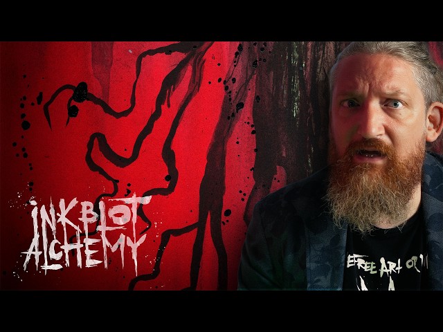
Video summary
In this episode of Inkblot Alchemy, artist Kim Diaz Holm explores the chaotic potential of a random inkblot dominated by vibrant green hues and a distinct horizon line. Initially uncertain about the subject matter, she playfully interprets the emerging shapes as a heart or a frog before her intuition guides her toward a Lovecraftian theme. The process is described as a blend of magic and play, where the artist surrenders control to the ink's natural flow, allowing the medium to dictate the direction of the artwork rather than relying on a pre-conceived plan. This approach embraces the possibility of the image becoming dark, silly, or personal, capturing the unpredictable nature of creating art from chaos.
As the drawing progresses, Kim identifies the form of Cthulhu, noting that abstract representations often work better for Lovecraftian entities than detailed cartoons. She struggles with balancing simplicity and complexity, particularly when trying to ensure the image remains readable both as a large-scale drawing and as a tiny thumbnail on YouTube. To achieve this, she manipulates the ink by adding dirty water, black ink, and various splatters to create texture and depth, while carefully managing the lighting effects through white gaps and shaded areas. The artistic journey involves constant decision-making regarding color saturation, edge definition, and the integration of tentacles that feel both root-like and living, ensuring the piece maintains an abstract yet iconic quality.
The final stages involve introducing bold reds and browns to add drama and a sense of dread, which Kim ironically finds reassuring as it signals she is onto something significant. She adds glowing eyes and star-like splatters using mixed white and yellow gouache to enhance the dream-like atmosphere inspired by the story "The Call of Cthulhu." Throughout the process, she navigates the tension between making the image too concrete or leaving it too abstract, ultimately settling on a composition that feels balanced and complete. The finished piece, titled "Dreaming of Cthulhu," stands as a testament to the alchemical transformation of random ink patterns into a recognizable and evocative mythological beast.
Kim concludes the video by reflecting on the time-consuming nature of the fluid medium, which took significantly longer than her initial fifteen-minute estimate, yet she remains satisfied with the result. She emphasizes that her work is created entirely by hand without AI assistance and offers the artwork for free use under a Creative Commons license, provided her name is credited. Viewers are encouraged to support her art through purchasing prints or originals from her website or via Patreon, helping to sustain the creation of such unique pieces. The episode ends with an invitation for audiences to join her in future sessions where creativity continues to emerge from chaos, blending personal expression with the timeless allure of cosmic horror.
Read the full video transcript
Hi there, I'm Kim Diaz Holm and this is
Inkblot Alchemy where we use our
creativity to draw something out of
chaos. Now, what will we find in today's
inkblot?
Ooh.
That's a lot of green.
Ooh.
I don't know
what this [snorts] is at all. I can see
a very clear eye here.
And I I also see maybe
there is
this is sort of a horizon line
indicated.
It could look like a heart.
It has a heart shape.
Almost.
I don't know.
I I I'm clueless.
But, we have to keep looking. And while
we keep looking and seeing the
possibilities, allow me to explain what
we're doing here
and what Inkblot Alchemy is. Two times
every week I draw something new out of a
random inkblot and release the full
video of the process, unedited and
unscripted except this intro script. I
may have ideas of what to draw, but the
ink always decides.
It [snorts] might get dark, it might get
silly, it might get personal, it might
get political. If you want to skip the
whole process, then you are free to do
so. The final image is marked in the
video.
But, if you want to come along, then
Random Ink Drawings is not just drawing,
it's play, it's magic, it's Inkblot
Alchemy.
Now,
the intention I have for today's ink
blot is
that
I don't want to use too much time
or too much energy on it. I want to do
something
simple
and silly.
What I I I I don't know.
But let's
start.
I still have no idea of what this is
going to be.
Let's start by
placing it somehow
on a horizon line, since that's what
indicated.
>> [snorts]
>> And
let's uh
start dragging this
green a little bit out. And I'm using
the water I'm using isn't particularly
clean. I've been using it for
for uh
black ink
earlier.
So
I don't know.
I absolutely love this color though.
That this shade of green
particularly when it's a little bit more
saturated.
So if I
use this
to
pull like that.
Yeah, I absolutely love that shade of
green. It's one of my favorite colors.
And now there is an eye indicated there.
I will indicate another eye there.
And
feel
what the ink
wants to be.
I I I'm starting to sort of see a
frog shape.
But maybe I shouldn't have
Now my brain is
completely
at a block.
I really want to stop this video
and say that no, no, no.
I didn't make it this time.
Because I I'm starting to draw something
that is [snorts]
there's still so much possibility.
But but it's not
it's not so easy anymore. And suddenly I
see it.
Suddenly
it appears.
And and and it's not necessarily
easy in the sense of uh
uh
of [clears throat] being a simple
cartoony thingamabob, but I see Cthulhu.
And then I can also
work with
these
lines
and hopefully create something
that is
while it is simple
and iconic
hopefully
Yeah, just
I can
The thing about Lovecraftian beasties
is
that
the more abstract
manage to make them
the better in some sense.
So
Okay, we have
Cthulhu here.
Okay.
And
we should
use some black
and spread that black
all around.
Will this work? I don't know.
Suddenly
>> [sighs]
>> this isn't as simple as I wanted it to
to be and it's a Sunday and I'm going to
go upstairs and make some dinner for the
kids.
But Cthulhu is
keeping me down, man.
Down in the cellar drawing.
Like this.
And maybe
Ooh, I'm seeing some possibility.
Uh I like what's happening when I'm
taking away.
Look at that texture.
It just popped off.
Okay, perfect.
So,
what we will do
is we will take
the
water here
and just wetten
the
paper
around
and uh
will allow
the water to sort of decide
where
how the edges will be.
Perfect.
And I'm
what I'm thinking
here is
thinking of
in the story of The Call of Cthulhu, how
the presence of Cthulhu is manifesting
in dreams.
I want to create
something dream-like
>> [snorts]
>> coming out of the darkness.
And I [clears throat] want it to be
very simple,
very
abstract.
So,
yeah.
And then,
work
tiny bit
just around the edges here.
So, I don't know if I like that part.
Suddenly, I went from oh, I want to keep
it simple to oh,
Jesus, this is difficult.
Okay.
I like that. I like
the
I like
the looseness of this. I like the edges
down here.
I like how
it sort of
disappears again
up
there.
And I want to
continue some of this
green.
>> [snorts]
>> And then, indicate more of that
texture
and have these shining
eyes.
So,
starting with this greenish hue,
and it more we work it, the more it goes
towards
some um
black and white, some gray. That's okay.
We want that all the way out.
Almost creating outlines.
But not quite.
Okay?
Now, one of the important things is to
create this sense of
three-dimensionality
in it.
Which is
try to indicate where
the white gaps are.
Simply
the light and where it's ice.
Okay?
And also to indicate
the texture.
I'm ruining some
of that
texture here.
The the texture we got through the
tissue paper.
Ruining some of that, but that's okay.
Some of it will stick.
Ruining some of
that
nice green.
And again, that's okay because some of
it will stick.
And
have me look.
It's a bit too abstract right now.
And a bit too cartoony.
God dammit, I wanted this to be simple.
>> [laughter]
>> Things I put myself through.
And it's fun. It is really fun too.
I want darken
a lot of this.
Here.
And maybe
I thought maybe
co- do the eyes in red, but no, I don't
want that.
But I do think
I want some other indication
of color.
I want
to
just make [snorts] the feelers
a little bit
more
concrete
but not too concrete.
And I
also looking in
the
I have a
a teleprompter
that isn't showing me any of the text
but that is showing me
a little preview window of what
what I'm recording and that allows me
both to see where my eyes are and where
I should look to look into the camera
and also to see
a little
preview version a thumbnail version of
what I'm drawing.
And I'm
seeing that
there is a lack of balance in the image
that is really hard to see at the size
that I'm drawing it.
That
it looks better at the
bigger size
instead of at the smaller size.
And I want it to
look equally
good
at both sizes.
Very
It's a very difficult task
to
have something
as abstract as what I'm drawing now
and then make sure
that it's
also
viewable
as a thumbnail
in a tiny size.
That it's readable.
Right now, it's not.
So
and that's also where the
damn balance comes in because
if I make it perfectly readable
in a thumbnail size
then uh
Ooh.
Yeah,
okay. Now something is happening that I
actually like.
But I I'm in danger of making it
way too
unabstract
and
too much like
a cartoon.
Which is This isn't saying anything
bad about
cartoons.
I'm a cartoonist in that as the sense
that I
my work is to my art is to
simplify and exaggerate.
That is the definition of
cartooning in some sense.
Okay.
I think one of
my problems
with the balance here
is because of these green feelers.
So, what I want to do
is I want to cover them
in
black ink, black water, dirty
water.
And then
I will
start painting them in
with
the
with
uh black ink from the bottom so that it
will hopefully drain
be dragged up.
And it will create this
cool
effect. And I will get much more of a
silhouette
down
here.
And I can
allow
that black
to be
a lot more
abstract.
Okay?
And I can also go out
and
make these feeler
feel
I like that they are root-like.
But
I want them to feel a little bit more
living.
Okay.
This didn't help the balance of the
piece.
Hmm.
Okay.
Relax, Kim.
Relax and
breathe.
And before I draw
anything more,
let's look a little.
Why isn't
this feeling
balanced enough?
What am I trying to express
when I say that this isn't balanced?
Okay.
What I'm trying to say here
is
that the shape that I want
to look
forward
isn't properly integrated.
And that has to do
a little bit with
the lighting here,
the white patches here,
more to do with the lack
of
consistent lighting here.
So,
I will go through here
and
create some outlines
on the
bottom part of
Cthulhu's head
from
shade like that
to
on each side of the tentacles as well.
And hopefully
that
will start shaping
the rest
of
thing as well.
Not quite, not quite.
There are so many of these
tiny
decisions to make
in order to find
something that just
isn't about
It's not about
technically what
should or should not
be or be done or be drawn. It's about
getting that feeling.
And why
I feel that feeling is
lacking.
I think it's starting to look
better.
Uh
Okay.
I think also
one of the problems
can be solved by adding another color.
So, I will try with this, which will be
way
too
will be way too
strong.
It has a little of
reddishness in it.
I will try up here and make a brown up
here, and that's
>> [snorts]
>> that works.
Okay.
And
Okay. Let's
go over here.
May
this
all of this
highlight on Cthulhu's head.
Make that in this
yellowish-brown color.
Okay.
Lightly [snorts]
removing
other highlights.
The white highlights are removed.
Then
we will go bold.
So,
I'm going to shock dry
the tentacles here.
Okay.
And we're going to shock dry this up
here.
Cover some of it afterwards with
some black.
Okay.
And then
I will go full red.
Oh, jeez. This can make the whole thing
into a Christmas
Cthulhu.
Okay, let's try it here.
Oh, no, no, no, no. This isn't good.
This isn't good.
>> [laughter]
>> This isn't good. This isn't good.
>> [gasps]
>> Oh, jeez.
This is
There's only been
like like maybe one or two
others where I felt
this kind of dread
while
making the Ink Blot Alchemy.
And and the sort of almost ironic thing
is that that means I'm probably onto
something.
If if you're not scared, then you're
probably doing something
wrong.
Okay.
>> [sighs]
>> And we'll start
filling in the thicker
more saturated red
blood red.
Maybe this works.
Touch give the emblem a little touch of
the red
inside as well.
This is starting to look like
one of my other Cthulhu pieces.
These Cthulhus are brothers in some
sense.
And again
want to keep
the
abstracted feel
not make it too concrete.
I'm liking it better now.
Okay, so
we'll go in with some of
random lines of
red
to
>> [clears throat]
>> unify
the colors a tiny bit.
Okay?
We have so little left on the of the
original ink blood.
Okay.
>> [snorts]
>> And the last time I drew a Cthulhu in
this color scheme, I completely messed
it up
by adding white lines.
I didn't completely messed it up, but I
I made
the drawing
significantly worse
by adding too many white lines.
So,
why not
bring out the white again?
And hopefully
not ruin it
this time.
>> [snorts]
>> Okay.
Let's mix that white
with a little bit of this yellow.
And
just do some splatters.
A little bit of the white, the gray,
and the yellow. Oh, I shouldn't
ruin my
liquid acrylics. Oh, this is lovely.
This is what I wanted.
That's what I wanted.
Okay.
That's good.
It's almost like the stars.
And we're getting to this
>> [snorts]
>> point that I want to reach where
you you
become
uncertain about how
it's made, like like what's what.
And
I'm definitely to reach that point.
And we can do that here as well. We can
get more of the red
in with the white gouache.
And
um
some red.
Like that.
Look how beautiful.
Now it it is very
abstract again.
I'm thinking
one of the things that are lacking
are some
eyes that are completely
in the black here.
This should be
an eye.
It's Godzilla
has
probably has pretty good vision.
Then
I will go in with some
black around
both new eyes again just to
indicate that their shapes were always
meant to be there.
Very simple.
>> [sighs]
>> Yeah.
>> [snorts]
>> I think
I think this is it. I I I
think
that
working this more
will
not
help it more.
Uh
I'm saying this as I'm working at more.
Stupid, stupid, stupid. Always doing
things like this. I need to stop and
then
No, I won't stop. That's
That's the struggle of
all of these
pieces.
Ooh, hoo, hoo.
Yeah.
And uh
yeah, that should be almost enough.
Almost enough.
Few more
ink splatters here.
Then I think I'm done.
Yeah, let's just Let's call it a day. I
wanted it be this to be finished in like
15 minutes and here I am.
The recording says 30
8 minutes.
Probably 37 if you
in
>> [snorts]
>> the version where I
cut away the very intro before I I I say
anything. There's some seconds there.
This is always scary when I use this
much
fluid. Will it go underneath the tape?
And that has
that will be on the tape.
Oh, but this
This was wonderful.
Jeez.
I think I like this.
I think I will call it
dreaming
of Cthulhu.
I thought dreaming of R'lyeh or dreaming
Cthulhu, but
we'll call it dreaming of
Cthulhu. Very simple title.
Cthulhu.
Cthulhu. Cthulhu. Something like that.
And that is
>> [sighs]
>> ink blot alchemy
number
019.
And we're signing it.
And there is the finished piece. Ink
blot alchemy number 19, dreaming of
Cthulhu. If you think that's cool, then
I have uploaded it onto my webstore,
thenungahjerholm.com,
where you can get prints, and you can
get the original, and you can also
download it for free use. If you think
that's cool, and you want to support uh
art being made with real hands without
AI and being put out in the world for
free use under creative commons license,
so you can use it personally,
commercially, whatever you want, as long
as you put my name on it,
then [snorts] please do support by
buying prints, buying originals, or
supporting on Patreon. You find all the
links at thenung
I should uh learn I should write a
script for this uh advertising part, for
the ending part.
And
I haven't.
So, please, just uh support uh or
support by liking and sharing the video
and doing all that. Yes. Go to the
ongaherholm.com
and uh
I, like Cthulhu,
will see you in your dream
or in a couple of days for the next
[snorts]
Inkblot Alchemy.