Data Visualisation: The Good, The Bad, The Ugly and the Beautiful - EMF 2026
Watch on YouTubeVideo summary
Data visualization serves as a powerful tool that transforms complex numerical problems into perceptual ones, leveraging the brain's ability for parallel processing and pattern detection to make information instantly understandable. The core principle discussed is that effective charts must map graphical size directly to data magnitude, ensuring an honest representation where linear changes in data correspond to linear changes in visual length or area. This rule is critical because violating it can severely mislead audiences; for instance, a political poll chart that exaggerates differences between bars creates a false narrative about the closeness of a race. While modern software like Excel or ggplot2 generally handles this mapping correctly automatically, emerging AI image generators often struggle with these basic linear relationships due to hallucination artifacts, highlighting that even simple rules require vigilance in the current technological landscape.
Beyond the fundamental rule of linear mapping, the choice of chart type significantly impacts accuracy based on human visual perception capabilities. Humans are highly accurate at comparing positions along a common scale, such as in bar charts or line graphs, but tend to underestimate larger values when comparing areas in treemaps or volumes in 3D charts. Consequently, for tasks requiring precise comparison, simple linear scales are preferred over complex ones like pie charts, which are better suited for showing a part-to-whole relationship without forcing the viewer to mentally stack segments. Furthermore, color perception is not linear; lightness varies non-linearly across the RGB spectrum, meaning yellow and cyan appear much more intense than dark blue or red. To maintain honesty in data representation, designers should use perceptually calibrated color maps that reflect these human limitations rather than assuming a uniform distribution of color intensity.
Making visualizations engaging without sacrificing integrity often involves adding contextual benchmarks or embracing the inherent complexity of the data rather than smoothing it over for aesthetic appeal. A compelling example is using a map of the United Kingdom to visualize land use statistics, where overlaying actual geographic areas helps viewers grasp the sheer scale of resources like beef pasture compared to urban areas. Similarly, when dealing with highly complex datasets, such as a national budget split into hundreds of billions, a messy pie chart with many slices can be more effective than a polished but oversimplified graphic because it invites interaction and reveals the true difficulty of the data. In extreme cases, visualizing wealth inequality by scrolling through a bar that stretches far beyond a single screen allows the sheer magnitude of disparity to speak for itself, turning what might seem like an "ugly" or unreadable chart into a profound statement on social reality.
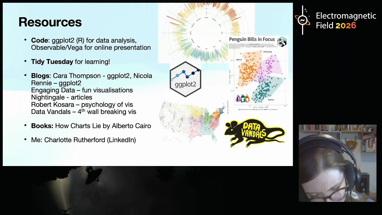
Ultimately, data visualization is an art form that balances strict adherence to perceptual rules with creative strategies to engage and educate the audience. The speaker emphasizes that while there are no one-size-fits-all policies, designers should always ask what specific information they want the reader to extract and choose the visual encoding that best supports that goal. Whether utilizing tools like Observable for online exploration or participating in community projects like Tidy Tuesday, the goal remains to create honest representations that respect human cognitive limits. By keeping designs linear where possible, adding relatable benchmarks, and occasionally embracing the complexity of the data, creators can produce visuals that are not only informative but also thought-provoking, ensuring that the audience gains a true understanding of the underlying facts rather than being misled by aesthetic choices.
Read the full video transcript
Uh I'm Charlotte and I'm presenting a
talk uh on data visualization, the good,
the bad, the ugly, and the beautiful. Um
so a little bit of background from me.
Um, I'm a PhD student uh at uh there I
am at the University of Manchester and
I'm studying this basically for a
living. Um, the psychology of what makes
data visualization good or bad. Um, so
I'm residing from home today uh thanks
to this little menace. I twisted my
ankle in a rabbit hole at a conference a
couple weeks ago. Uh, so stay safe out
there when you're coming back from null
sector. Um yeah they [laughter]
uh danger comes in many forms. Um so
what is data visualization?
Well, we're all geeks here. I think we
all know what data viz is. Um it's
representation of data in uh graphical
form. So whether that's line graphs or
bar charts or some of the more uh
unusual visualizations here. Um, I what
we're going to be talking about today is
what makes data visualization effective.
What makes a graph good or bad,
aesthetically pleasing, or just plain
ugly. Um, so data viz is effective
because it turns a numerical problem
into a perceptual one. It allows us to
use utilize different parts of our brain
for the same task. So we've got a say we
have a very simple representation of
data here in an array. Uh these are the
count selection results from May. Um if
we wanted to get an idea of what this
data
um of the relationships between these um
different parties how well they did
relative to another. It's quite hard to
do. Uh it takes a lot of serial
processing. However, if we encode this
data um visually by taking the size of
the data point as um the length of a bar
in a bar chart, suddenly we can uh
obtain a parallel um uh processing
capability. Instead, we can
instantaneously compare uh the results
of the different parties across the
visual spect uh the visual space. Um uh
data visualization also allows us to use
our pattern detection abilities. So we
could have a very boring overview of the
d a data set like this very um bog
standard not much interesting happening
here. However, if we instead represented
this data set in uh this by variant data
set in the xy plane sometimes unusual
patterns can emerge.
Uh so we can see that data viz is
inherently a perceptual process and this
is in fact related to why data
visualizations can go wrong for the same
reasons that they can be effective. Uh
there is a trade-off by
visualizing data we also render
ourselves vulnerable to visual spatial
bias. Uh so today I'm going to introduce
some rules that you can uh use within
your own data visualization um practice
to help people um understand the data
better and maybe even become more
engaged with it as well. However, I'm
going to call these rules of thumb
rather than strict hard rules because as
we'll see um there isn't really a
one-sizefits-all policy here. We have to
take a huge amount of different
considerations into account. Now the
first rule of thumb is actually very
straightforward. We need to uh simply
make sure whenever we create a
visualization we map the graphical size
to the data size. So going back to the
count selection results we need to make
sure that there is a linear mapping
between the magnitude of the data in
this case the number of party seats and
the um graphical representation of that
data. In this case the length slash area
of the bar.
Now, uh, this, uh, rule is the most
important because it can be used to do
the most harm. Um, I'm going to call
upon the, uh, king or should I say
president of bad visualization design
here, uh, Donald Trump. Um, who, uh, in
this particular chart has um, uh,
visualized a poll lead um, against
Hillary Clinton in 2016. Um, so this
chart on itself doesn't look too bad.
It's not even particularly ugly.
However, it is extremely misleading. Uh,
the uh difference um in the distance
between the bars here does not match up
to the data at all. As this post by the
Washington Post shows, um, if Trump
wanted to visualize this data correctly,
it actually looks something more like
this.
Keep going. Keep going. There we go.
Okay, so as you can see uh if you were
to visualize this data linearly or
honestly uh there really isn't that much
of a difference at all. So this this
point is the most important for
visualizing data honestly um for good
charts as it were. Uh but fortunately
it's also the easiest rule to follow
because with modern visualization
software whether using something out of
the box like L sorry like Excel or uh
something a little more complicated like
ggplot or um D3 uh the computer will
handle this for you. It's you have to
really try and break um the system uh to
go against this particular rule of
thumb. Now I would normally say uh
modern software has made this easy.
However, with the a rise of AI,
unfortunately, uh even something as
simple as this, it gets wrong. Um in the
particular case of AI image generators
because of uh hallucination artifacts,
it's easy to um
uh uh it's very easy to mess this simple
linear mapping rule up. um even in
dedicated uh scientific diagram um image
generators um the best of the best can't
get this right at the moment. Okay, so
we've got a good initial rule. Um but
obviously there's so much more to
visualization than that such as what
type of chart should I use? And this is
actually really important because
although um mapping data one to one is a
good start, it isn't the whole story.
Some visualizations are easier for our
visual system to compare than others
because uh we uh compare some visual
variables linearly and other variables
less than linearly. For example, we are
really good at comparing positions such
as line graphs or bar charts. The the
rate of error um for these comparisons
is pretty low. However, we are less
accurate when we compare areas.
[clears throat]
We tend to underestimate larger values
such as in the tree map at the bottom.
Um, similarly, we are usually better at
processing bar charts than pie charts,
and we're really bad at estimating
volumes. So, 3D charts aren't the best
bet. If you ever been felt like you've
been shortch changed at the bar, maybe
have a think about that um for next
time. Uh, so when accuracy is the most
important, it's best to choose a simple
comparison over a complex one. However,
um, of course, uh, there are times that
we might want to perhaps reconsider
this. Um, which brings us on, oh, I'm
sorry. Um, one final, um,
uh, consideration for this rule, um,
that can sometimes catch us out is to do
with color. Uh, we don't actually
perceive, uh, the lightness of color
linearly, um, across the RGB space.
Yellow and cyan looks a lot more intense
than dark blue or red. So if you're
using a continuous color map, try to use
a perceptually calibrated one instead um
like the ones shown here. Although try
to also make sure that it's colored line
friendly as well. Um
so um we know to map the data one to one
and we have a good rule of thumb for
what type of chart to use. However, some
discretion is advised here because it's
important when we're visualizing data to
ask yourself, what is the um values that
you want your readers to compare? What
specific um information do you want them
to get out of the chart? For example, if
you've got lots of different groups and
you simply want people to compare them
to one another, try a bar chart. Um,
however, if you actually want people to
compare the size of one group relative
to the whole, actually a pie chart is
just as good as and sometimes even
better for this task. Um, the reason
this is the case, um, imagine for the
bar chart, you want to compare the size
of, um, say the red bar at the left
there relative to the size of the whole
chart. Um, to do that, you'd have to
mentally stack up the size of all the
other charts. um and then compare that
mental comparison um with the group you
you're trying to compare, it's quite
difficult. Whereas with a pie chart, the
the proportions are instantly available
to you and it's much less um cognitively
taxing. Um similarly,
uh in election maps, this is also very
important. This is an honest election
map. It shows you where people voted. um
pretty pretty interesting, but um it
distorts our idea of which party did
better [laughter] because um as it turns
out, one uh voters of one party tend to
live in larger areas. Um but it's not
land that votes, [clears throat] it's
people. And so, um, if we want to make
if what we're actually trying to show is
the number of votes, we should make sure
that our mapping is actually honest to
that, um, uh, task at hand.
So, we've got some good rules of thumb
for generating honest charts, but it's a
bit boring, isn't it? It's not much
pizzazz. Uh, how do you make these
charts like interesting and engaging,
but at the same time not being
misleading either?
Well, there's a this is where um it
becomes a little bit more of an art, but
there are still some rules of fun that
can get can start to nudge you in the
right direction. One of my favorite for
these is um adding a benchmark. So, the
best way to illustrate this is with a
case study um that I found recently um
which uh was for uh on the topic of
looking at uh land use within the UK. Uh
where does our food come from
essentially? Um so this um uh paper
found that the overall area size of land
associated with UK diets is about 24 and
38 million hectares. And one way you
could visualize this at least across
time here um is with a um stacked chart
like this. And it's okay. It's not the
prettiest but it is honest. But it
doesn't really give us a good idea of
the scale of the situation. Um I mean I
don't know about you but I don't know
how big a hectare is let alone 24
million of them. And so the although I
have a good idea of the ratio that
grassland is used more than feed crops
and food crops. So that's sorry I should
say grassland is like beef pasture. I
don't really have a good idea of um how
important this is. So what the national
feud strategy um uh paper did was
concretize uh this finding by um
supplanting um these results directly on
top of the UK and suddenly I have a much
better idea of um uh the sheer scale of
the situation. I can see that it would
take me about eight hours to drive
through all the beef and lamb pasture
that we use within the UK and
comparatively uh builtup areas only uh
encompass about Wales roughly. Um this
chart actually caused me to um really um
reduce my beef consumption as a result
here. Uh this is actually how much we
use overall. uh quite sobering but very
very effective. So if you're unsure of
where to start with um making your
visualizations more engaging, adding a
visual benchmark like this, something
that people can relate to, um is a
really really good um strategy. And one
final rule of thumb here, I wouldn't
call it a rule, but just something to to
take away, I guess. Uh we've gone on
about bad and good and beautiful and
ugly charts here. But I think sometimes
ugly is kind of beautiful.
Um [snorts]
as a case in now this might sound a bit
strange but hopefully I can try and
explain. Um sometimes data visualization
in trying to be beautiful can obscure um
some of the underlying complexity uh
with a data set. Um and uh actually
embracing the complexity can produce
effective charts in their own right. One
example of this is from a really good uh
website called where doesit allgo.com
which summarizes the UK yearly budget um
splitting 1.37 trillion pounds into all
these different pots like welfare,
health, uh education all in their
various billions. And this is a
difficult and complex picture. So how do
we visualize this? Well,
we can make show how difficult and
complex it is um with a pie chart like
this. Now, on one hand, this chart
breaks so many rules visualization. A,
it's a pie chart, which some people
dislike. I don't really mind them so
much. But, you know, um but more
importantly, there's so many slices
that, you know, it is visually hard to
read. But I think that's um what makes
it also visually engaging. Um because
this plot also has interactivity. Um it
allows you to delve into um this all the
complexities of this chart and compare
different pots with one another in a
very effective way. Um, so I I think
personally if you try to make this more
beautiful, I think it would detract from
uh the message or at least the um the
object objectivity of the uh overall
chart as it were. And uh one final
little quirky example here that um I
personally uh quite like uh you might
have seen Elon Musk is in the news
recently. He's recently become a
trillionaire. um he now has $833
billion. And what this um uh chart does
is visualize the data um visualizes
wealth um relative to the size of this
tiny little pixel here, which represents
$1,000.
And from that, it is essentially
uh one big bar chart. Um but unlike an
average bar chart which usually fits
within the size of a page, uh this chart
instead
um just is stays incredibly objective
and just lets the sheer size of his
wealth speak for himself. Um so uh you
can see here um
uh by just simply scrolling along his
wealth. I've been talking for about you
know 30 seconds here. we're only at
0.40%
uh or Opra Win3's net worth and you know
you could compress his wealth down into
like you know an easily uh readable uh
nicely digested uh visualization but I
think doing it like this um is so
effective because of how ludicrous it
is. It's hard to compare all these
values definitely and in that sense it's
um perhaps not as useful but in but what
it gains is um just the sheer size of
the d um uh the sheer horror of um the
incredible inequality we live in right
now. Um so that's uh five little rules
of thumb um that I hope you can take
away um for your own visualization
projects. Um I think the what is
important to remember is that data
visualization is a perceptual process.
And so um when we're visualizing um
[clears throat]
data, we should try and keep things
linear and simple where possible, but
also try to keep the visual task in
mind. Uh we can try and visualize uh um
data with a benchmark where possible.
And if um the data is weird enough,
sometimes embrace the ugly. Um, I will
admit obviously there's uh a lot to um
take in and there's still lots of
research. That's why I'm doing um my PhD
in this area. Um but if you want um some
good resources for creating your own
visualizations, I have to recommend
ggplot 2 if you have uh local data sets.
Um, it's definitely, I'd say, the
easiest to jump into because it's got a
really nice syntax. Um, but also
observable and, um, is a good online
option as well. Um, and if you want to
get your teeth into this kind of thing,
uh, Tidy Tuesday is really good. Um,
basically it's a project where every
week um a shiny interesting new data set
is released and you can compare your um
results to uh other Tidy Tuesdayers
around the world. Um there's some good
um uh blogs out there as well which go
which drill down into some of the
principles I've talked about and um How
Charts Lie by Alberta Cairo is a really
um good book on the subject as well. Uh
finally I'm on LinkedIn if you want to
ask any questions. Obviously I can't
come to the Q&A tent. Um I know
LinkedIn's have that's you know I
ideally would like a blue sky. I should
probably get on that at some point. Um
uh but this is where I'm findable at the
moment. And uh yeah, uh thanks for
listening and thanks to everyone at EMF
for helping me organize this. Um I
wasn't sure if I was going to be able to
present it, but it was really nice uh to
be able to do so. Uh so thanks
[applause]