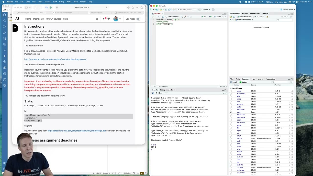
Video summary
This video provides a comprehensive guide to conducting a regression analysis in R using the `prestige` dataset from John Fox's work, while highlighting key distinctions between R and STATA environments. The instructor recommends starting with RStudio for beginners but notes that Positron offers a modern interface with advanced AI integration for troubleshooting and multi-session support. A critical aspect of the setup involves selecting well-maintained packages that align with the tidyverse philosophy, specifically utilizing tools like `car`, `marginalEffects`, `modelsummary`, and `skimr` to ensure consistency and avoid the syntax confusion often found in base R. The tutorial emphasizes adopting the tidyverse approach for data manipulation, which streamlines workflows by using functions like `select()` and pipes (`%>%`) to chain commands efficiently, a method that is further supported by consulting the "R for Data Science" book rather than relying solely on official documentation.
The analysis begins with an exploration of the Canadian census dataset from the 1970s, which contains variables such as education, income, women's share, and prestige score. Descriptive statistics reveal significant skewness in income and women's share distributions, while visualization techniques like stem-and-leaf plots are preferred for their ability to display specific values alongside histograms. Correlation analysis identifies strong linear relationships between education and prestige with income but highlights heteroscedasticity in the relationship involving women's share. A preliminary linear regression model is constructed to predict income based on these factors, showing that while prestige and women's share are significant predictors, education acts as a mediator through its influence on prestige, explaining 64% of the variance in the outcome variable.
To refine the model, the instructor performs rigorous diagnostic checks using QQ-plots, residual plots, and influence plots to address issues like non-normal residuals, outliers such as physicians and general managers, and nonlinearity. By applying a log transformation to the income variable and filtering out part-time occupations that violate full-time employment assumptions, the analysis improves model validity. The final results are presented using robust standard errors and customized tables generated by the `modelsummary` package, which include confidence intervals and F-statistics. Visualization of these refined models involves plotting predictions against observed data with appropriate exponential transformations to ensure accurate representation of log-transformed variables.
The video concludes by focusing on creating reproducible, publication-ready reports within the Positron environment using Quarto documents that integrate code chunks directly with narrative text. Advanced features such as Git version control and AI coding agents are leveraged to automate tedious tasks like adding variable labels via the `labeled` package, generating clean tables for Word export, and debugging complex syntax errors. While AI tools like Cloud Code and Positron Assistant effectively handle exploratory data analysis and code generation, the instructor stresses that students must understand the underlying statistical logic rather than relying entirely on automation. The session wraps up by showcasing the extensive ecosystem of extensions available in Positron, including support for Shiny apps, before summarizing the complete workflow from initial data loading to final report generation.
Read the full video transcript
In this screencast, I will explain how
to do data analysis assignment one using
R. And this is the first data analysment
course. You can see the uh description
of the assignment here. Uh before I talk
about the assignment, I'll talk a bit
about R. So R and STA are the two
statistical software that I use. And if
you think about the difference between R
and STA, one of the big differences is
that in STA there's typically one best
way or one correct way of doing things.
But in R you get lots of options. For
example, uh you need to first pick which
editor you use because R is kind of like
programming environment instead of uh
like an integrated software. So the
actual R is just um a program that runs
on a computer that doesn't have a user
interface. Uh I use two and R studio is
perhaps the most common and and then I'm
now switching to Positron which is uh a
more modern version of the same software
uh from the same company. So uh the
Positron is like the next generation
product and R Studio is the current
product. It's more like it's like 15
years old now. uh most people use R
studio because they are familiar with it
but positron is gaining gaining
prominence now I'll be using mostly R
studio because that's what is available
and then at the end I will show how
positron differs
uh another thing that you need to pick
when you use R is to pick which packages
you use whereas in STA you will have
[clears throat]
all the commands integrated did when you
install the software in R. The different
data analysis and data management
commands are come from packages and
which packages you pick uh greatly exper
affects how your R works and uh I'll
talk about some of those choices. All
right, let's [clears throat] go through
uh first the assignment and then let's
talk a bit about the differences between
these two editors and then uh I'll pick
R studio and then I'll explain the
decisions that you need to make when you
do R and then at the end I'll talk about
the positive editor after I show how to
do the data analysign.
So the [clears throat] assignment is
here and the instructions say that we
need to do a statistical analysis uh
particularly regression analysis and
explain income
of an occupation using other variables
in the data set. The data come from John
Fox's applied regression analysis and uh
the description of the data is is uh
available on the course website if you
want to see it's a PDF and um the idea
is that we we run a series of models we
try to understand what determines income
and then we document the thought process
and we write a report. [snorts]
So uh the instructions tell that we run
these uh three lines in in uh to get the
data and uh we're going to be using the
car package. CAR stands for companion
for applied regression analysis and then
uh we load the library and then we load
the data. So I'm just going to copy
paste that to to the editor. Now first
uh let's talk [clears throat] about
these editors first. So so uh they look
very similar to one another. So I'll
just I'll put them side by side. uh in
in one sense. So both of these editors
have this panel layout. So you have this
bottom panel here. [clears throat] There
is there's console. There's console and
then there are tabs and
positron has many more tabs than R
studio. The idea of of console is that
this is where the R works. So all the R
commands go here and all the output
appears here. So if we type 1 + one
here, it gives us two. And this is the
exact same r that we have here. So if we
type things here in positron, then uh we
will get the same uh same outcome. So
the r just lives in here. It's based on
text. And then we have editor here. So
the editor is your analysis file. And
how you work with uh with R is that you
type commands either here in the console
but more often you build an analysis
workflow here by typing commands into an
analysis file and then the analysis file
becomes your project which then becomes
your your research article. So both of
these have uh the editor there are some
buttons here they are a bit different.
You can see here is the uh the anthropic
logo. Here is the open AI logo. So uh
this uh positron editor you can
integrate various AI tools that help you
analyze data. I'll demonstrate those
tools at the end of the video. Our
studio also has some AI assistants but
they are not nearly as developed as in
positron and uh for that reason because
of the availability
and power of these AI tools or AI agents
I have switched to positron almost
exclusively. I use R Studio if I need to
demonstrate something to someone who is
afraid of the the the more modern user
interface of Positron. Then the
similarities are are here also that
there is a sidebar here. So we have we
have things here. This shows something
about our data and this shows uh
something about our results in Positron.
There is just a sidebar here that is
empty. But once we actually load some
data then we will start we will get
information about the data here. All the
plots come here. So so this part here is
uh pretty much very similar to this part
here in the overall layout. So if you
think about uh the differences that that
these editors have. Uh you can see here
that
this is exclusive focused on R but we
can here choose that uh to have for
example also Python and then uh you can
have multiple R sessions at the same
time. So we would have Python session
here and then
we would have we can have another R
session here. So so we can just uh
add here. So, so you could have multiple
versions, multiple sessions of R running
on parallel and then of course if you
accidentally have another session of R
and uh it's going to be super confusing
if you create a variable in one session
and then you accidentally switch to
another session and your variable of
course is not there because it's defined
also in in only in one session. So uh
the R studio doesn't have this this uh
for multi session support for example
which is one small thing less to confuse
you. So if you are an absolute beginner
then I would go with R studio because uh
there are there's less stuff to be
confused about. Uh there's al there's
plenty of stuff here. I'll talk about
all these these features that we have
here uh a bit later. But if you want to
be a power user, then I would go
straight with positron, if you know how
to use terminal. So terminal is uh this
is something that [clears throat]
yeah I created a folder already for this
project and and our and then I delete it
because I want to show show the create
folder creation and then positron is now
complaining about it. If uh you know how
to use terminal then um
uh you should be using positron. So if
you are like more computer savvy person
then positron is probably a better
choice. Anyone who wants to do data
analysis more seriously should try out
positron and AI features. Even though it
has a learning curve uh the using
generative AI to for example label data
do figures troubleshoot analysis is a
gamecher. So uh I just did a project. So
this is recorded in January 2026. I did
a project where I fully wrote all the R
code using genative AI and I was able to
for example
troubleshoot an analysis by giving a
weird result to claude code and then I
told claude code that figure out why
this result is so weird. I was expecting
something else and then cloud code went
to the background, wrote some R code,
run it, analyzed the data, inspected my
data and I was doing other things and
then 5 minutes later it explained to me
that there was a problem with my data
setup that caused the the weird problem
and it would probably take me a few
hours to figure it out myself. So, it's
it's really really useful for
troubleshooting. I also use Gemini CLI.
I'll show that later in the video to uh
trouble to produce figures and writing
doing figures is a pretty pretty tedious
thing because there are code for figures
tends to be fairly long because you have
to specify so many different things. And
I just told Gemini that I have this
research question, make me figures that
help me understand my data so that I can
answer my research question. and then it
went to the background and then it
produced me like 20 figures to
interbate. So it's it's a productivity
enhancer. So I would go for try out
positron but if you're an absolute
beginner then uh starting with R studio
might be better. So let's start with R
studio then. I will first make this full
screen and just a reminder the uh the
assignment was to describe the uh use
the prestige data and [clears throat]
before we go full screen and before I
saw the settings of our studio let's
talk a bit about packages. So R is built
on top of packages and you install the
packages either using the package
manager here in R studio or by typing
install packages. Uh the car package is
something that we should use. So it
gives us regression diagnostics and then
we should also think about the other
things that we need to do and we need to
use
have a package for doing tables.
We need to have a package for for
visualizing regression models and we
need to have a we need to use a
tidiverse package. I'll explain uh in a
moment what that is. And then we need to
have a package for data exploration. Um
let's talk about first the
tabulation and visualization packages.
So I'm going to start writing the R code
here. You uh load the libraries or the
packages by library doing using library
command. So uh I have these packages
installed. So R studio offers to
autocomplete. I'm going to use model
summary for for creating tables and
it's a a good practice to document why
you are loading certain packages. So I'm
going to document that this is for
creating tables and that's for
visualizations. Uh so so why these two
packages instead of others we need to
consider uh a few things. Uh first of
all if you already know how to use
something do something with a package
then you should use that package if that
works for you. So I wouldn't switch to a
new package unless there is a good
reason to do so. And uh I used to use uh
John Fox's effects package because uh
the the car package and the effects
package are written by the same author
and it's usually if you have packages
written by the same author then they're
used very similarly and this is
something that where R and STA differ.
So in STA most commands follow a similar
syntax how you use the command but in R
there are great variation between how
different commands work like how do you
specify the options for different
commands and if you can have somewhat
similar ways of using different packages
then that's it produces more use more
readable R code and it's also something
it's easy more easier to learn for you
and why do we use the marginal effect
package and what do you generally uh
think about when you pick a package and
uh I have a few things that I want to
want from a package. One is is it
actively maintained. The second one is
how well it is documented. The third one
is that what is the feature set and the
fourth one is uh how does it integrate
with other R packages that I might be
using. So the marginal effects if we
start about uh start about the uh
documentation [clears throat] this is uh
a really really well doumented package.
So there is a website that contains all
kinds of um uh uh examples and I can see
that now there is a book about the
package. So there's there's a lot of
examples about this package and and and
this is great. So we want to have a well
doumented package and
[clears throat and snorts]
the uh then another thing that we want
to know is whether this package is is uh
wellmaintained or not. So when is the
most recent version released for example
and uh is the maintainer still actively
working on it like if you find a bug how
likely is it that bug is going to be
fixed or if you encounter an error is
there some support available.
What we can do is that we can Google the
package and this is the the main
documentation the main website. Uh then
there are two other importer websites.
One is the package homepage. So this is
uh kind of like the official homepage.
It's a bit technical information but
what you need to look at here is the
date. So when is it uh last published
and this is published uh in in mid
November. So the latest release is uh
month two months old. So that is a very
new release and uh it also helps to have
many people here who are maintaining the
package. This is pretty decent. And then
we have uh this other report other uh
URL here is where do you do bug reports?
You can have it also um we can also see
in the Google results. So this is uh
updated on GitHub and that means this
package is open source. So you can read
the package open package source code
like you can read the source codes of of
all our packages. But this is also
published on the GitHub which means that
anyone can read the code edit it and
then uh submit patches. What we would
look at here is uh the list of issues
and we don't care about or the point
here is not to look at if these issues
have if there are lots of problems
already in the package but it's that uh
is it actively being being uh being
fixed. So there's like something was a
bug report was opened 4 days ago and we
can go go here and we can see that the
the maintainer is responding. So the
maintainer is actively working on making
this paper better. Another thing that we
can take a look at this is uh
code uh there is uh the latest uh change
to the code was 4 days ago. So this is
being actively developed and actively
fixed. So that's a good thing. So this
is number number one and number two. Uh
how is the documentation? This it's
great. We have um emotional effects. We
have a good website. We have a book. The
second one is that uh is there uh is the
package uh still actively maintained and
you can check it from the by checking if
the source code is available on GitHub
and if there's actually fixes and and
bug issues being reported. [snorts] Uh
the third is how well does it integrate
and
>> [clears throat]
>> um this is something that you need to
figure out from the documentation. But
uh the two main important things that I
think about integration is which
different statistical models does the
package support. Uh you can read about
the model support in the documentation
and I happen to note that marginal
effects uh it it supports a lot large
number of models. So pretty much any
model that I can think of uh except for
maybe latent variable structure because
models uh which are really kind of
tricky to visualize anyway can be
visualized with this package. So it's
very hard to think about a a model that
I might actually use that is not
supported by this package. Uh the second
one is that does it integrate with with
uh tidyiverse and I'll explain what
tidyiverse is in a minute or is it built
on on on base R and uh this marginal
effects is uh based on on on tidyiverse.
So, so it integrates with tidyiverse and
uh [clears throat]
that is the uh the final thing to
consider uh what does it integrate with
and uh the model summary is a package
for building tables uh it's written by
you can see here if you compare marginal
effects and model summary so these these
websites look very similar and this is
uh not a surprise because it's written
by the same author
So, so this this one guy has written
these two. Uh, of course there's like
more contributors too, but he is the
main author of these two great R
packages. Uh, so we're going to use
model summary. We're going to use use
marginal effects because they are
written by the same author. They're very
similar and [snorts] that means that our
R code will look consistent because
these packages are used in the same way
and it's also easier to learn. Both are
well documented. Then I already
discussed the tidyiverse package and uh
this relates to to how you use R and
there are various different ways of
doing data management and uh the the
base R data management looks like looks
like this. So, so if we want to uh let's
do a matrix. I'm just going to do a
matrix for just just a small matrix of
ones. And it's going to be 5x5 matrix.
And if we print it out and if we now
want to pick one column of this matrix,
what we need to do is do a comma
period one. And that will pick the first
column. If we pick a and then
double brackets then we pick the first
element of the matrix. If we do uh
a one comma that picks the first row. Uh
so there's a lot of learning and and
it's not intuitive. What is the
difference between uh a comma 1 uh a
double brackets one and a brackets one
comma. Uh what the tiny verse packages
uh package does for us that it allows us
to to
do away with any of these and instead we
we use uh commands like select which
selects rows and then
uh select select variables and a filter
which selects rows. So instead of using
this archic syntax which also has some
quirks uh we are going to be using these
these commands to to manipulate the
data. So the tidyiverse produces more
human readable code compared to the the
base R and uh it generally like it's
it's a more modern set of of data
management data wrangling commands.
All right. So if you want to learn how
to do this modern art style that I will
be using I'll I'll talk a bit more about
the differences in after all the data
and then uh you [clears throat] should
read this book at some point R for data
science this is an open-source book and
it's written by by Hadley Wickham and uh
who who he's the first author he also
works for Posit who is the company that
develops the editors that I'll be using.
So, this is a great resource for
learning R. You don't have to read any
of these books uh when you uh listen to
my my screencast. But after you are done
with the screencast, before you actually
start to work on with R on your own, I
would recommend spending a few days on
this book because it it explains the
differences between the the tidyiverse
and the base R and also many other
useful things to know and it introduces
you a set of packages that will get you
started. It's a fairly concise book in
the sense that uh it's it's fairly
fast to read if you understand what
you're reading. So it's not overly
verbose. And I I really think this is a
a great book. All right. So this is the
the websites and now we can actually go
and and uh do the data analysis
assignment and I will now
make R studio full screen but just going
to be focusing on R studio for now and
the first thing that [clears throat] we
need to do is that I'm going to start
focusing now a bit more on the R studio
and and the R code. [snorts] uh we want
to change some settings and I'll show
you what is available. So uh the first
I'm going to zoom in a bit. So command
plus allows you to uh change the font
size and I tend to have a font size of
maybe 10 when I work on my own. But if I
do a screencast, I recognize that
someone might be watching this
screencast on a laptop. And then it it
makes more sense to uh make the font
size a bit bigger. And [snorts]
if we look at this uh user interface uh
in more detail, there is uh the R file
here. If we have multiple, if we have
more R files, we have we can do we can
do new R script. Then we have different
tabs. So we can edit multiple uh R files
at the same time. Where I would use this
is for example if I have a project uh
that is uh uh non-trivial in size. It's
typically more than one R file. So I
might have one R file that loads the
data and prepares for analysis. Another
R file that does uh the exploratory data
analysis and figures and descriptive
statistics. and a third R file that does
my regressor models. The reason why I
have this in three models, three files
instead of one, is that quite often I
might use the same data set for
different projects. And it makes sense
to have like one file that prepares all
the data for all the projects and then
just separate the analysis files between
the projects so that there are files
shared within the project. The second
one reason is that it's just easier to
work with uh when you limit your
attention to only for example recussion
analouses and assume the data are
loaded.
All right. Then we have
here that's that's the editor where is
we can make it make it full screen. Uh
we can in make it in a new window. Uh
sometimes if you for example
are are running something that if you
have a small screen and it might make
sense to have uh the editor in one
desktop and then R running on another
desktop so that you can switch uh but we
have a big monitor here so we can have R
and the editor next to each other. Then
uh save uh source on save means that
when you save it's run running you have
the uh the search and then here you run
the file. So if we um we we either run
the f current file or or we we select
these packages and we run them. Uh
source is is the same thing. So source
means that you uh you can run the file
without uh printing the output. I I will
not talk about the exact difference
between running and sourcing. We'll just
be using the uh the run button for now.
Uh then you have your environment here.
Uh the environment means what are the
data that we have. So I'm going to load
the package.
And now we can see that there is uh
there is uh a because we created this
vector this matrix here and it's it's uh
numeric and that shows the content and
this prestige data is now available. And
if we type prestige then it actually
loads the data and we can see here in
the uh environment that the data
contains some variables. We can expand
and collapse the variable names. That's
the uh the type of the variable. So this
is numeric. Numeric means decimal
numbers. This is integer means whole
numbers. And then uh this is factor uh
which means that it is a a categorical
numeric. So we have numbers and the
numbers have labels and categorical
variables are something where they are
the differences between categories are
qualitative instead of quantitative. So
we can say that
blue color is is twice as large as
professional and white color is is three
times as large as professional for
example. It doesn't make any sense. So R
will by default just treat these as uh
different categories. It's going to be
dummy code Indian regression analysis by
default. If we want to show the data in
more detail, here is the data browser.
So this is useful for exploring the
data. I'm going to leave it open in in
the uh in the tab here. So we can
explore we can we can sort and we can
for example by education and we can
filter but important thing to understand
it that if you sort the data here this
is just a viewer it doesn't change the
data in your memory so this is just like
how you view the data and
[clears throat]
then we have here uh we can load data
sets here you can save data here I I
pretty much never use this I uh load
save all my data in code. That's your
memory use. And if we want to start
over, we can clear. And I'm going to
clear now because I have this matrix
that I created just to show things. So
I'm going to clear and include hidden
objects means that if there's something
uh some data sets that for example a
package has loaded, they will be cleared
as well. So I'm going to clear the
environment and then I will um I will
load the data again.
like so I'm I'm using the keyboard
shortcut so command enter runs the uh
runs the current file I'm just so used
to doing it but you can you can run it
from here uh [clears throat]
then um you have history tab so history
shows all the commands that I've done
and this is uh extends from the
different R sessions so this is when I
was planning and playing around for the
screencast I'm doing uh data summary
correlation For example, that's from
previous uh uh previous time I opened R.
If we want to move some of these these f
these commands to our uh command window,
then we do to source like so. If we want
to run something, for example,
[clears throat]
if we want to uh uh run uh this uh file
here, this is matrix. We click to
console and then we click enter and then
it runs it. So you can actually uh rerun
our previous commands. You can also
rerun previous commands by using the up
arrow. So you can cycle through previous
commands. Uh if we want to delete
something like we don't want to have
this in the history, we we delete it.
And that's I I never use that because I
think it's useful to document everything
that you do. But there's like this this
um feature. Then connections. This is uh
external database connections. I've
never used this but if you are working
in a corporation and you have a big
database where you need to access uh
some some in customer data something
then it will be here. And then tutorial
is uh for for if you have this package
then this is uh like an interactive
tutorial that you can you can run and
I've never done it before because this
was introduced after I got it on R but
it seems like a useful thing to do.
Okay. So, normally we have the
environment tab open. So, that just
shows the data that we have. And then
the other thing that we have here, so
this part of the panel, the files is uh
shows the files in our current working
directory. So, when you start a new R
project and and this is now something
that you should do is uh you you um you
set the working directory. So we do file
and then we do
actually it's in session. So we do
session and then
set working directory.
Quite often I have an already a project
open. So I open a file and then I set
the working directory to the location of
that file. What this does is that it
tells R that whenever it saves files or
tries to load something from disk, then
it tries to do that from the working
directory. So, it's kind of like the
home of your project. And we're going to
do that now. And um we do choose
directory and and what we do here is
that we do new folder and we're going to
call it data analysis assignment one.
You should store the project in some
place that's under your documents or
somewhere else if you want to keep it.
But because this is just a demo, I will
just put it on my desktop and I'll
delete it after I'm done. And then we're
going to open it. And now we can see
that our working directory. I'll run
this command to set the working
directory to our desktop. And the file
browser also shows the data on
assignment here. And
when we have the file open, we have an R
file here. It shows uh untitled because
we haven't named it yet. And it's in red
because we haven't saved it yet. We're
going to save this file now. And uh
we're going to save it as data analysis
assignment one.
>> [clears throat]
>> And it [clears throat] now shows here
a after we refresh. Okay. So So we go
back and then we we go here. So the all
the files appear here. It doesn't
refresh automatically. So So sometimes
if you go back and forth then you can
get it to res refresh.
[clears throat] You have basic file
management things here. You can delete
things, rename things. Uh I I often
don't use this. I use deletion because
sometimes I create a files. Uh for
example, I save some intermediary
results uh which shouldn't be stored in
my project. So I'll delete those as soon
as possible. It's a good analysis
practice
that you don't save unnecessary data
files. The reason for this is that
whenever you save a data file, the data
file never itself documents where it
comes from. So for example, if we have
the prestige data and we drop one
observation and then uh we save the
data, then we have a data set that lacks
one observation, but the data set
doesn't document when it was dropped by
whom and why. So it's I strongly
discourage you from saving any
intermediate
data files or sometimes you accidentally
uh produce lots of of figures for
example and that you save and and then I
would delete those. All right. So this
is the file panel and it shows you the
files
plots. If we do uh if [clears throat] do
do some graphics I'll just do a couple
of dummy graphics.
the the plots come here and you can
cycle between different plots using
these arrows. You can zoom and then if
you want to export the uh you can copy
or you can export as PDF or as a as an
image. I like to use PDF figures because
you can you can zoom in into them and
we clear and I usually clear all the
figures before I get started just to uh
not have any previous clutter and then I
will know that any figure that I have uh
available is from the most recent
session.
Then we have packages tab and this is uh
all the packages uh that we need uh for
the project and
I will show you next how to install a
package. What we will be using also is
uh this package called uh skimmer
and this is for for data exploration.
If we run all this
this packages, we're going to run it,
we get an error message. It says that
the package uh skimmer can be loaded
because it's not available. And um
it's not available because I haven't
installed it yet. So this is uh often
happens that when you run uh R files
written by somebody else then uh you
need to install the package. You install
the package either by typing this into
the uh into the command window. So we
can reinstall the car package by doing
that and then it it downloads the data
downloads the package and installs it.
And but what I did tend to do is that
there's user interface for installing
here. So, so we type the name of the
package and
then it asks where do we get it? So, we
just leave it to to default and uh where
do we install it? We leave it to
default. If you are working on a
computer where you don't have
administrative access, then uh this is
set to your user directory. I I never
have to change this but I could figure
that if there's like some kind of weird
configuration of then then you would you
would change that. Uh installing
dependencies is very uh important to
have checked because uh packages can
build on top of another. So uh for
example the the marginal effects
requires and the model summary requires
that you have many of the packages that
tidy versse brings in installed. So you
want to pull in those dependencies
because otherwise the package will not
work for you. So we're going to install
skimmer. And
now if you if you uh run this uh and you
you're missing something then you will
get an error message. We can run it and
now everything runs. And if we go here
we can see which packages are loaded. So
we have car loaded car data that is
actually where the data leaves. So this
is the restis data and the car package
has car data as a dependency. So
installs that and then uh a lot of this
stuff is installed like data sets is is
loaded by default. So that's been
bundled with R when you install it and
we can we can search for example model
summary.
We can see that model summary is
installed and it's loaded. If we want to
unload a package, then we uncheck and
then we we we we check it again. So you
can see that it unloads the package and
then it loads it back again. All right.
Uh then you have help and the help file
here. This is like uh the help browser.
You'll be using this a lot with R
because the the packages one one of the
the downsides in using R is that because
it's developed by thousands of different
people that contribute packages. I have
uh programmed at least one R package and
I have contributed bug fixes and feature
requests to many other packages. Um this
means that there are different ways that
packages might work. And uh for example,
one package might call your data X,
another package might call it data,
another package might call it something
else. Uh so the names of the arguments
to the R commands might differ. So I I
usually check things here. So if we want
to check for example uh what does the
skimmer package do, we can do it in two
ways. We can do it uh here. So we can we
can search skimmer
[snorts]
[clears throat]
and then uh these big nets these are
like more like user guides and uh
using skimmer sound like something that
we should read if we will start start uh
using this package a lot. And uh if you
want to read it here we can click here.
So, and this is the um this just shows
shows how to to use the packet with the
examples. So, there's uh we're not going
to go through this, but it's very useful
to to read. And you can see here that
I'm recording this on January 16th and
it was updated a week ago. So, this is
an actively maintained package. Another
way of uh reading this documentation is
to do a question mark. So, if we want to
do question mark and lm. lmist for
regression analysis then you get the
help page of a specific command and then
this tells you uh how we use the command
I'll explain this in detail when we
actually get to running the command if
you do two question marks then it does a
search of the help and u it looks for
any command or any package name with lm
in the title in the name and that gives
you lots of results because lm is is a
pretty common like linear model any
extensive linear model like GLM it
matches. So this is the help and you can
navigate this uh back and forth. So if
we go uh skimmer there are links to
other to to web links and some of these
links to take you to to to to uh other
commands and the other commands then um
appear here in the help browser. Then
you have a viewer and the viewer is like
a built-in uh web browser.
When we do things the the results can
appear if the results are text then they
will appear in console. But if the
results are something other than text
like if it's an HTML file uh like a
table then it appears here. So this
producer corer matrix comes here. If you
um if you produce a report using R
studio which I explained at the after
I've done the data analysis then the
report comes here. So this like renders
any output in a nice nice way and then
presentation
uh I've never used that. That's a new
feature. I have no idea what it does. Uh
so this is the uh the right hand side.
And then um finally we have the console
here. So the console prints all the R
commands, all the outputs. And then we
have uh background jobs. If you're for
example rendering a report
[clears throat] or doing some kind of
analysis that takes a long time, then
you can you can kick it in the
background. Uh I never use this start
background job explicitly, but you could
do this for example for long data
preparation tasks. Usually I have here
errors. uh I I I look at this when
there's uh a report that I'm compiling
and then if there's an error then the
message appears here.
All right,
I think that is uh covers the the user
interface mostly. Uh there's some stuff
here like you can have add-ins uh
there's uh generative AI tools come
here. I'm I've I have tried this out but
if you want to use external tools then
the positron editor is a lot better
alternative for for you than than these
addins. Then uh we can there there
menus. So there's quite a lot of things
um uh what you need to know is the
session setting the working directory
and uh you can set to the source file
location or you can set choosing a
directory the global options. So this is
uh where you have your settings. So the
R studio is a is a product that is
developing. So the menu locations are uh
sometimes different. I I don't use the
menus that much myself because R is more
about typing the commands. But setting
the options uh there are there's ton of
options. There's code diagnostics is
something that I like to have on. So it
it cautions me about bad R style. it it
gives me uh uh error messages like
potential errors already when I type and
I have this this mostly on not all of
this is enabled by default so uh
then there is uh there are other things
like our markdown is for building
reports if you want to use python that's
here is for uh another kind of reporting
tool uh git is for version control if
you're working with multiple different
people uh and if you're programming like
an R package then you would be using
this quite a lot. Publishing if you are
working uh with something that you would
publish online like a data scientist
then this would be something that you
would use. Copilot is the Microsoft
copilot. Uh it's kind of like an AI
powered autocomplete and you would u
change the settings here. But there's so
much stuff here that it makes no sense
to uh to go through all this. You can go
through the general and just see see
what's going on. All right.
Now, now we can [clears throat] actually
start doing the analysis and I have the
packages open here and um I will start
doing the project.
So what we do first is
have the packages. So that's a starting
point. We load the data and the data we
could load it also from a file. But this
uh comes from a package. So that's easy
because then we don't have to specify
file locations and you can just send
this R file to anyone and they can run
it. And I'm going to run it. And we're
going to run we're going to source. So
source runs the full package. And then I
I'll just switch that on. And now we
need to think about the different ways
of of using R. And if we want to view uh
what is in the data
which is the first thing that we do we
we need to export the data there were a
few ways. So so we can uh we can eyeball
it here and we can see the values. So
this shows us a few first values of each
of these these uh these um variables or
we can we can eyeball it here
or if we type the name of the data here
then it prints the data to the console
and there then
if we want to have just view view the
data like not have this use print out we
can do head
data that shows us the first
observations.
Now, if we want to if we want to select
uh a variable from this data, we have a
few options. Uh let's say that we want
to select education.
So, there are now seven different ways
to select uh the the education variable.
And I'll explain now why I want to bring
up these seven different ways. uh if you
if you think about how the data are
structured in RS memory there are we
what we call data types and the data
type if we look at the prestige we can
do class
prestige
it is data frame and u another so the
data frame is like like an exo sheet
it's like a data set with uh rows and
columns uh data frame allows you to have
columns
to have different data types. So you can
have a string which is text in one
column and then numbers in another
column and technically it means that uh
the data frame is actually something
what we call a list. So list is just a
collection an order collection of
elements. So the data file is actually
frame is actually a list of uh of
vectors which is equals to numbers or or
or or texts. So it's a it's a list of of
vectors and um [clears throat] this if
we access a member of a list we access
it like that. So we can access the
education. So this will give us the
education value. So it is the content of
the first uh first variable a first
element of a list which is the education
variable. Here we can also access data
frame as it was a matrix. So matrix is
this 2x two arrangement of of uh of data
and this gives us the I should do it
correctly. So this gives us the the
first column of the data and it does the
same thing. Uh if we do it
like this would give us the first row of
the data. So uh it's indexed
and
it's uh if we want to have the first
value then we would do uh do for example
one by one which gives us the first
value. If we do a head
prestige
we can see that that's the first value
in the data. So, so you can you can
access this uh this based on either as
as if it was a list or you can access it
as if it was a matrix. So, uh and this
prestige one this gives us the first
element of a list. So, that gives us the
prestige. But then again if if presses
if it was uh a different kind of of of
data like another way of storing data is
a matrix and uh matrix is uh kind of
like a data set but all the variables
have to be of the same type. So you
might have like all all numeric then it
might be a matrix then this would give
you if this was a matrix it would give
you the first number in that matrix
instead of the first uh column of the
data. So there is uh one one big
confusion about this uh this way of
doing doing R is that if you have a
different data type if it's a data frame
or a matrix then uh this will produce
you a different result. uh this gives
you the first element. So this gives you
a subset
and this gives you a first element. They
produce the same thing in this case, but
that's not always the case. You can do u
indexing based on row or column numbers.
So we can see here that this data set
has
column numbers. So that's the names of
the variables and it also has this this
uh row names
and that gives you the column names and
we can do row names
and that gives you row names. Uh so we
can index based on on these row and
column names. So uh prestige education.
Yeah, we need to it's not row education
but it's it's column education. You can
see that it's very easy to uh even if
you're experienced R user when you type
and talk at the same time uh to have the
comma in an incorrect place. So that's
the right place right way of checking
the education or we can access them as
if they were list elements that that
gives you the same thing. So this is
super confusing for uh uh a beginner and
all this referring to to variables based
on their index is also really errorprone
and with variables it's it's not as as
uh as bad practice as if it was if I
were selecting uh rows because variable
order rarely changes but when you work
with data it's quite often that you sort
your data and if you sort your data then
of course an a row index would then
refer to a different observation. Uh so
to to uh
to to not have to worry about any of
this stuff um we're going to be using
the the tidyiverse function. So the tidy
versus a collection of of more modern
way of using R
and instead of selecting things with
with square brackets we are going to use
the select function. So the select
function is uh
from from uh from the package and how it
works if we do a select is that we give
where do we select from and what do we
select and you can also see that here we
have to specify this education in quotes
because it's it's a string and then this
select package is a nice uh nice package
because it doesn't require the the uh
the quotes it works out. So, we're going
to be using this style of R throughout
the uh the the project. We will not do
do any of that stuff.
[clears throat] Another way that you
often see in uh or let's take a look at
the documentation of the select and
it's actually it comes from dlur package
which contains various data management
functions and it's included in the
tidyiverse package. So tidyiverse is
kind of like a package library that
brings you all kinds of of goodies. And
so there's there's lots of explanations
of how this selection works. We're just
going to use the basic stuff. So, we
don't need to read this. Uh, this is
this documentation here is more for
those who already know how to use this
command and it's kind of like a
reference. It's not a user guide in the
sense that it's not a tutorial. If you
want to read a tutorial about how to use
this select function and other data
management functions, then you should
read uh the the R for data science book
instead of reading the documentation. So
the documentation is not really a
learning resource in most of the time.
It's it's more like a resource for those
who already know what they're doing. All
right. [clears throat]
Uh this is another way of of doing uh uh
functions in the tidiverse style and
this is called uh a pipe and the idea is
that you take the prestige and then you
uh use a function to apply to the
prestige data and uh [snorts]
if we look at the the the
select function it takes data as the
first argument and and this is a way of
uh
of chaining together commands. So if you
want to see for example uh the the value
of education uh for for the the top
observations we could pipe and then we
do head and and that would give us the
top values of observations. So this is
for chaining data uh processing
commands. We will be mostly using this
style because the data management that
that we do in this project is is fairly
simple. But you will see this style
quite a lot in real projects like bigger
projects when you have to do for example
uh group data and then calculate means
based on groups. it makes a lot of sense
to to to uh to to chain the grouping and
then the um calculating means by group
commands into into one sequence like
that.
[clears throat] All right. So this is
the uh how we select observations and
let's now get started with actual
analysis and we have loaded the data. So
the first thing that we do with the
analysis is that we need to understand
what what these data are and um the we
can of course eyeball but eyeballing the
data is uh not not something that is the
the most productive way of of doing data
exploration.
Instead we are going to use the schem
function. So the scheme
and then
prestige
or we could do
we could do it with pipe
but that would be a fairly fair fairly
unusual way of doing it. So we just skim
the rest this data and this gives us a
descriptive statistics. So we need to
first understand [clears throat] what do
we have what are the data types. So we
have 102 observations. So this is uh 102
uh uh occupations. We have six
variables. One is factor factor is
categorical and then five numeric. We
have information about each variable.
And because categorical variables and
numeric variables are typically analyzed
and summarized differently. We have two
different sections here. [snorts] And
the type is the occupation type. We have
four uh missing obser missing four units
of missing data. So we can take a look
at what those are in a moment. And it's
not ordered. So we could have ordered
categories. Uh for example, if you think
about the rank like uh being first in in
the running competition being second and
being third. This is uh this is an
order. But it doesn't mean that the
difference between the first and second
and second and third is the same. So
ordered means that there is data that
has an order. But the differences
between the different categories are not
equal or are not known. So for example,
if you think about distances then then
uh 2 m is twice as much as 1 meter. Uh 3
m is uh three times as much as 1 meter.
But we can say that being a third is is
uh twice as much as being first for
example. So uh this ordering ordered
categorical variables we don't use those
in in this assignment. But if you would
use them then uh this would be true. We
have unique values and then we have
[clears throat] frequencies. We can uh
see the frequencies uh that we have blue
color professions 44
professional uh 31 and then white color
23. So this is um
we can from this we would infer that
these are approximately kind of like in
the same ballpark. So it's not that one
of these profession types is very rare
compared to others. There's of course
differences but the differences are in
the same ballpark. It's not like one
would be 10 times as frequent as
another. Uh
if you want to understand what is what
is what are these missing values uh we
could do do a a filter so filter uh
filter selects rows from your data op
select selects columns filter selects
rows so we can filter prestige
I just use sta and sta contains uh uses
the missing function from missing data.
uh if you want to check which
observations are missing then uh you use
is NA. So NA is a missing value in data
and uh we can see that this these four
observations have missing values for
type and athletes professional athletes
uh news boys baby sharers and farmers
are not covered by this occupational
classification. Um this is actually a
useful command. So so we could have it
here. So uh so sometimes when you
explore data uh you would just type
commands here and when you find
something that is useful for your report
like you need to make note of it for
future or you need to report it in your
uh article then you put it into the the
data analysis file and it's a good
practice to save this occasion. So I
just press command S as a matter of of
controlling windows as a matter of
routine. Then we can look at the u the
other other variables. We would
interpret this and let's focus on
education first. Uh
education is years of education. These
data come from Canadian census from
1970s. The education levels at that
point were lower than today. So the
average is 10 years, standard deviation
is 2.7. And then uh this gives you the
uh the percentiles. So P 0 is the
minimum. The minimum is 6.3 years. P 100
is the maximum. So this is
[clears throat] 16. So these data are
are from the histogram that they are
close to uniformly distributed. There's
this small bump here and you can see
that the median and the mean are the
same which which kind of indicates that
there's some degree of symmetry in the
data. The standard deviation then tells
us that uh most of the observations are
plus or minus one standard deviation of
the mean. So most means but if it's
normally distributed then it's around
2/3. Uh so this would mean that uh
minus 10.7 - 2.7 so that's 8. So so 1/3
would be below 8. And then uh when you
add these together that becomes 13.4. So
um above 1/3 is above uh 13.4. for uh
then we have income. [clears throat] The
income here is is skewed and skewed
means that there's a a lot less data on
one end of this of the variable and we
can see it from this
histogram. And this histogram shows you
that bulk of the observations here and
then there's this long tail here. The
maximum is 25,000. The minimum is 6,000.
So the maximum is is four times as much
as the minimum. Uh sorry, the minimum is
600 and then uh the maximum is like
quite a few times the minimum. Uh the
the mean is is 6,000. Uh
the average the maximum is four times
the mean. So there's some income
inequality. The share of women is um
highly skewed. There are few obser some
observations a lot of occupations with
no women and then other than that they
seem to be rather the distribution seem
to be rather flat. Uh 25% is the average
and that might indicate that women work
less in this data or it might indicate
that uh the women are concentrated in
some professions and then there are many
professions with no women. the prestige
score we can [snorts] see that um then
uh the the range is from 14 to to 87 and
that's the observed range. Uh I think
conceptually this variable is defined
between 0 and 100. So so 100 is the
theoretical maximum 0 is the theoretical
minimum but in in this case empirically
the range is about uh 70 units. So it's
from 14 to 87 and we need to keep this
this ranges of this data in in our mind
when we input the data. Then this census
code is something it's just just a
numerical code. It doesn't give us any
information.
So uh we can drop it. Uh but it doesn't
really if we want to drop it then we
would we would select it out but it
doesn't really hurt to have it there. we
can we can drop it in the final uh
tables that we do but just to have it
here as an identifier it doesn't hurt so
we will keep it in the data. The next
thing that we do is that we look at
these variables one variable at a time.
How we do this univariate analysis is
that
we can we have already inspected the
means and standard deviations but we
look at the distributions and uh how we
do that I like to use a command called
stem. So this produces stem and leaf
plot and uh we will first do education.
Uh so we do uh prestige
and then we do education
and then we we run it. You can either
just press command enter or control
enter in Windows to run the current line
or you could do go from here. Uh
what this shows us is kind of like uh a
distribution of of the the data and um
[clears throat] we can act we can have
the the the density plot or the
histogram. Let's do histogram. So if you
think about this this histogram so
everyone knows what a histogram is. So
this shows the relative frequency or the
actual frequency because this is
categorical actual frequency of uh of
observations in these bins and this is
like bin based on on year. Uh so this is
from 6 to 7 uh 7 to 8 and from 15 to 16
roughly. Uh this is the same thing but
it's sideways and in numerical form. So
it's kind of like a histogram of of the
data. And [snorts] how you read this is
[clears throat] that you you it tells
you where's the decimal point the so
this means 6.4 there's one observation
then we have here we have you can see
that this this kind of like shows you
the the height of the bar uh we have
here seven observations six observations
so we this uh this means that we have
here six observation is 6.6 6.7 6.7 6.7
6.8 8 and 6.9 and this is uh three
observations 7.1 7.3 7.4. So this uh
stem and leaf plot not only tells you
the shape of the distribution but it
tells you uh the values in in two digits
in in one digit precision here. Uh so so
we can see here that this is roughly
uniform in the sense that there there's
a little bit of of more observations in
the middle. Uh you can see here a little
bit more observation in the middle than
in the ends but there's like no no like
normal distribution shape or no no like
skewed shape that we have in other
variables.
uh when you analyze the data you would
do this for for all the observations and
u uh the before we start doing the other
observations is uh which which one of
these should you prefer. So you can have
this [clears throat] uh histogram or you
can have this density plot which is kind
of like a continuous uh way of of doing
a histogram. So this shows the relative
frequency of each observation. The area
under the curve is one. So this doesn't
tell you the absolute number but just
the relative frequency. It's a matter of
preference and I like to to have this
this density plot
just like for some reason I prefer it
over the histogram. Other people like
histogram because it's maybe uh because
these are the absolute frequencies
instead of the relative frequencies like
the density plot. Still others like the
stem and leaf plot. uh I tend to favor
when I do data analysis the stem and
lift plot. The reason for that is that
if I happen to work on laptop
[clears throat] for example then I would
work with this minimized and I just see
the the data here and this is also I
would I have this minimized also if I
have the my screen oriented uh in in uh
portrait mode and this allows me to
focus more so I don't have any of this
stuff shown so the less stuff I have
shown the more I can focus on the things
that I have here. So uh the second thing
the reason why I prefer this one is that
uh then I have one place to look at. So
there's one sequence of results that I
look at and I can also see the command
here whereas these plots are kind of
like on the side. Uh the third is that
in some cases this is a bit faster to
calculate. It doesn't make a huge huge
difference but but this is like my
preference. Some other people prefer the
graph. So whatever works for you, pick
one. You don't have to do do all of
these for every variable.
But it's useful to document the the
distributions of of the variables using
this one of these options. And I'm going
to use the uh use this uh stem and
histogram. So income, we can see that
it's it's skew. So So how do you
interpret this plot? Uh what do these
numbers mean in absolute terms? Uh we
need to first understand that the
decimal point is three digits to the
right. Uh so that means that this is
actually 2,000.
So three digits more. It's 2,00 4,000
24,000.
Except that now we we see a bit of a
problem here because the stem and leaf
plot is uh is also binning. So this is
everything below 2,000. So this is
actually 900 and this is uh 1,00 1,700
1,900. How do we know that it's 1,000?
These are these are 1,000 and and these
are are 0,000s. We know it because the
the numbering restarts here. So so this
is like in order. But here we wouldn't
have any way of knowing if this is uh
18,300 or 19,300. It's like the same
same bin problem that we have here. Uh
we can adjust the bin in both of the
these commands. And when you want to
adjust the uh [snorts] the
[clears throat] default settings, we do
you can the easiest way or the way to do
it is that you look at the
documentation. So we do question mark
and then name of the doc of of the uh
the comment the command. There's lots of
stuff here and
we we should look at uh
break points. So this sounds like
something that we we should have.
There's different ways to define the
brakes and we can either define them
manually. Uh if you go and um we we do
plots. So let's see that we have now 1 2
3 4 5 six. Uh if we do uh histogram,
let's do histogram and then we can do
breaks.
Let's do 12 and then we run it. [snorts]
That gives us uh something 12 bars.
But the problem now here is that it
still uh doesn't rake this into into uh
into five bars by 1,000. uh what we can
do uh instead is that we can do a
sequence. So there's there are two ways
of doing a sequence or many different
ways but two two that I like to use. So
we could do uh from from 0 to 25. So
that would be 0 to 25,000 and then we
multiply that by 1,000.
So that would give us a sequence. So we
could use that in the brakes
and we need to make sure that it covers
the data. So there's 25 5,000 something
is the top value. So now this is each of
these bars is 1,000. So this is more
more more useful for us to do. Another
way is is to use the works uh is to is
to use the command sequence. So sequence
uh command
gives us uh from to and by. So we would
do sequence
0 25,000
and then 1,000. That gives us a
sequence. Uh which which one of these is
better? uh
if you are very good at at R you would
know what this uh first line means
this one. But this is more readable. We
could make it even more readable by
saying from
to
and then by.
So we're naming these arguments. You can
see from to and by. Uh naming is not
needed because R will infer the
position. So [clears throat] it knows
that if if we don't name the first one
is from the second one is two and the
third one is by uh but
this is more readable like sequence from
zero to 25,000 by 1,000. So that would
be a way of doing the histogram. If we
want to do the same for the stem and
leaf plots, we can do check the
documentation
and this documentation uh uh scales
controls the plot length. Uh we would uh
adjust the scale and there are it's not
documented what it does. So we can just
just try different values. So if our
stem is not enough, it doesn't do what
we want to do, let's do scale equals
two. So one is the default default value
and then scale. And that gives us Yeah.
So this is what we wanted to have. So we
could do uh income and then scale equals
2. So that gives us um
uh a plot that allows us to say that
this is these are the observations
uh under 1,000 this is from 1,000 to
200,000
this is from 2,000 to 3,000 this is from
3,000 to 4,000 and so on. U so this is
uh how you do the distributions and then
we would do u the rest of the of the of
the data. So I would do stem and then uh
we do press these. The easiest way to to
repeat the command is just to uh copy
paste it and then change uh we do it for
women. [clears throat]
We would do it for for uh prestige. The
type variable is a factor. We don't do
the stem and lift plot. It doesn't make
any sense to inspect the distribution of
factor. Uh
so we would inspect and we would see
that there are the women is is skewed.
So there are lots of occupations with
very little women below 10%.
And then other than that it seems to be
roughly uniform so that there's no no
big pattern here.
uh the prestige looks like somewhat
normal. So most observations are most
occupations are here. It's it's a bit
skewed. So that there are less uh high
prestige occupations than there are
these with lot with with a bit lower
prestige, but it's not nothing
substantial. So this looks um looks
okay.
Uh
all right next uh this is the univer
analysis. Uh one more thing about the
univer analysis is that we would use uh
use table and uh press these and then uh
we can do type so inspect the relative
frequencies of these types. We already
had that in the scheme. But if you think
about uh a data analysis uh expert data
analysis pipeline or workflow there is
typically like one uh uh eyeballing
stage where you just eyeball the data.
This is what we would do uh with schem
and then we would have a more detailed
univer analysis. So uh you would eyeball
and then you would again look at every
variable individually that you're going
to be using. Next that we do is
pair-wise or multivariate. We need to
understand correlations. Uh and then we
need to discard the data. There are a
couple of ways of doing correlations.
And
the base R provides you core. So we can
do just core prestige.
And now we get an error. And the error
that we get tells us that we have a
variable that is not numeric. And uh
the non- numeric variable here is the
occupation type. So how do we deal with
this problem? Uh we can do
uh we can we can see where it happens
here in trace back. So it's it's correct
this that gives us the error. Uh this is
useful if you have bigger projects and
you run into an error deep in the R file
then you know where the error happens.
But here we know that it happens in the
correlation. So we need to select out
the type variable and how we select out
as we do select
and then press these and then we do
minus type and that selects out the
type. So minus selects out. If another
way would be to select uh the variables
from education
to uh read we don't actually need
sensors. So to press these
so that works
and then uh
this works. I would pref prefer the
second one because we want to tell what
we are focused on instead of saying what
we are not focused on. So the select
allows you to uh separate selection
criteria with a comma and then it tries
to uh to figure out what you what you
mean by that. Uh okay. But this is not
like very very nicely printed
correlation matrix because normally
we would like to have significance tests
for example uh and we would like to uh
have maybe lower diagonal maybe have
less digits
because this is this is symmetric uh
then it doesn't make any sense to print
out both. So, so what we would do is
that we can use the the model summary
package. The model summary package
contains uh lots of useful things for
summar tabulating data. And because the
correlation table is um is a table then
the model summary package will actually
have a function for for doing the
correlation table. So we can do mono
summary
to show the package documentation
and uh then we we scroll down here and
this is the the overall information. I
know the function that I'm looking for.
So we click on index that shows the list
of all functions and I want to see data
summary correlation. So the data summary
correlation uh it g gets the data. So
let's do
data summary
data summary correlation and then we
have select prestige education prestige
and we can see what it gives us
and now we have it it prints us the
correlation table here. This is a lot e
nicer to interbed because this is
something that you would have in uh in
your art in in uh a research article. If
you want to have it in the console then
you add the uh the output. So the output
here is uh it default it does HTML. So
that's like a website and it opens the
viewer. We can do output equals markdown
and that prints it into the console. So
this is like a matter of preference. I
prefer to have things in the console.
Other people prefer to have difference
in the viewer. Uh then if we want to
have uh the significant stars um
[clears throat]
there is an option uh
star stars
and
when we do this
stars
equals true is uh the default. So that
gives you uh the stars. If you want to
have non-standard star levels, you can
specify them here as well.
Okay. And
now we run into a problem that we have
to have an object produced by
correlation package. Now the uh the
documentation here shows us that if we
want to have stars then we need to have
the correlation package and uh what we
would do is now that we add that package
into our workflow and um
we [snorts] would all load the
correlation. So this is how like how you
you add the packages while you edit the
edit the project and we will run that
and I have it installed. If I didn't
have it installed then I would do
install packages here and then
correlation
correlation and uh install it from here
but I have it installed because I've
used it in the past and then we can take
a look at the documentation again. So,
so what we would do is that we have data
summary correlation
and then uh we would do correlation
select.
So that gives us the significant stars.
So, so let's take a look at what this
does in immort. So this is actually a
sequestation of commands. So we have
this correlation [clears throat]
here
and we can do correlation
analysis
and now we are storing the results of
this command. So we are creating a new
object. This far we just have the
prestige data and we can also do do this
uh correlation analysis separately. We
will do this a lot when we start running
regressions. So we will not just like
run a regression and and print it at the
same time but we typically uh run
regression store the results and then we
do stuff with the store results. So we
do the correlation analysis and then we
print uh we do it first and the
correlation analysis if we want to view
the results we can do print it here and
this gives us correlations but it's not
in matrix form. Uh so yeah this is very
detailed correlation analysis.
I like the the summary more than this
detailed analysis. We can also do
summary. So summary is another way of
printing our results and it prints
typically a bit more readable way
version of of the correlation. So this
is a a correlation but it looks pretty
weird because it's it's not like we
would normally normally view a
correlation. There are all these
variables present but it's it's like
usually you would have the lower
diagonal shown and this is like some
some weird arrangement. So these are not
even in the in the same order uh in in
the uh in the columns here. So this is
not very intuitive way of looking at
correlations. So the data summary gives
us uh a more useful uh more user
friendly way of of reading what the uh
the correlation matrix is about because
we are not doing anything else for this
correlation. We'll just uh just chain
the commands. So, and it's a good idea
to to not make uh to keep your line
length uh shorter than this 80 character
mark here. So, you might not have this
visible, but don't make your lines too
long because then you have to uh scroll
left and right on a small screen. So, we
we do a line break. R
has support for multi-line commands. So,
it will stop interpreting the command
when the command is complete. it will
not uh stop here. So, so this will be uh
a nice way of of printing the
significant stars and we have to mark
down to print it on on the console. If
we want to print it
in the uh in the viewer, we would do
this instead. So, uh then this is like
we could just just
basically screenshot this and put this
in into a paper. Uh there are better
ways of getting this into a paper. So
you can the data summary correlation
also exports word documents. So if you
want to get this into uh into a paper
then you export as word and then you
copy paste from the word. But if you
just want to like do a quick and dirty
analysis you screenshot it and then you
send the screenshot to a co-author. You
screenshot the copy to to a paper. All
right I'm just going to leave it there
in the console.
All right. So this is the correlations
and uh
the next thing that we want to do is uh
to do the same visually. So uh
correlation tells us the linear
associations between the data but it
doesn't tell us if the associations are
it it if they are actually linear. So if
you have a variable that is uh
associated in an exponential way,
they're still correlated but the
correlation doesn't tell us that they
are relationship is exponential in
nature and it also doesn't tell us if
there are any outliers. So we don't know
how systematic the difference is. To do
that we would do graphical diagnostics
and or graphical analysis of the
relationships and we can do a scatter
plot matrix. There are many many
different ways of doing scatterplot
matrix. Uh the the pairs is um something
uh that we can do and that's a built-in
command. So we would do pairs
and at this point because I know that I
will only be using these these variables
I will I don't have to want to type the
select at every stage of the analysis.
Uh I will take a subset of the data. So
subset of the variables. So um now if I
use the prestige subset which has four
variables then I don't have to type this
select in all my commands. This
simplifies the code. The downside is
that now I will need to remember what is
the difference between prestige and
prestige subset. So there is like a
balance uh that you shouldn't do a new
data for every possible subset that you
might use but you need to be a bit more
selective. So this is the uh
we're just going to change the commands
so that we're going to be using the
prestige subset. All right. So how do we
then uh do correlation matrix? We can
use pairs. That's a builtin.
That's a built-in. Uh, so this is from
the base R and it shows us something.
But there are other ways of doing the
same plot that [clears throat] gives us
even more more data, even more results
or more information. So we can do
scatter plot
matrix from the car package and we do
prestige subset.
So that shows us uh more information
because it shows us the distributions.
It shows us as fits and
we can have both here and then it's a
matter of preference which one you
prefer. uh I prefer this one. And then
there are there's like pretty much every
regression analysis toolkit package that
you can imagine in R contains this plot,
a different version of this plot. Uh so
this is the I'm going to copy this to
our R file. What I haven't mentioned
yet, which should be obvious by now,
that this hash marks a comment. It's uh
it's colored green by the R Studio
editor. uh these uh
warnings are here because uh R doesn't
recognize that we have uh it doesn't
really recognize that the the tidyiverse
packages actually see this type and
census. Uh so this is this not in global
scope means that when you have a
variable like this is the this is the
this this is the variables that we have
we have correlation analysis table which
we can actually uh we should actually
drop that because we're not we don't
need that and then we have prestige and
prestige subsets. So this warning is
just that there's no type or census
variable and and this is because they
exist inside the prestige and then uh
the the uh the select sees inside
prestige but the data editor is not
aware of that. So uh when you have these
warnings uh you can you can check what
they mean but then some of these
warnings are are are harmless. So so
this is a pretty harmless warning.
All right. uh we're going to run the uh
then start inspecting what this means
and when I inspect results I typically
like to make this a bit bigger the the
plot and [clears throat]
so so this this just show the density
plots that we already saw and this is
called a rug plot so it shows you where
the actual observations are and it's
useful to see uh how many outliers there
are so most of the data on income are
here and this is the range so they
cluster 5,000 and then we have one at
20,000 and and two at 25,000.
But what we would really be looking at
here is uh the shape of the distribution
or the shape of the bary distribution.
So how do variables related to each
other and this is uh uh symmetric in the
sense that that this is the same data.
It's just just flipped. So, so this
observation here is the same as this
observation uh uh here. And this
observation here is the same as this
observation here. It takes a bit of
training to see that they're the same.
Um the [snorts]
the plot the the lines that we have here
is that uh this is uh the linear fit. So
we can see that uh the line doesn't
really explain the relationship between
education and income that well because
all these uh midinome occupations are
above the regression uh line of
education and then these high income
occupations are below the regression
line of education. It's easier perhaps
to see it from or more interesting to
see from here where income is the
dependent variable in the regression. So
we can see that the recerson line fitted
to the data goes here. There's more
observations below the regression line
here and then uh more observations here
and and this is uh some kind of a
nonparametric line. So it's like it's
probably our lowest uh uh fit and it
shows us uh what is what is like uh the
best fitting line or best fitting curve
uh if we don't constrain ourselves to be
linear. And here we can see that it's
clearly a nonre relationship and here
some it's not as easy to see it here but
but it's clearly education income is
nonlinear. Uh income uh is the main
dependent variable. So we should be
concerned about the income's
relationship with other variables and um
so we would be looking at this line
which has income as the dependent
variable on the y-axis. So uh the next
thing we can see that with prestige it
tends to be uh associated very strongly.
So very strongly means that there is
these are points are tightly clustered
under a regression line and then it
breaks apart in the high income
occupation. So it seems that uh most of
the high high income occupations earn
more than what is linearly predicted by
uh prestige alone.
So you can see here this is the name of
the axis. So this is the name of the
x-axis and it's the name of the y-axis
for these. So this is the income is the
y-axis for these plots and it's the
x-axis for these plots.
the we can also see that there are only
few uh these high income occupations
that are not explained well by the line.
Uh the share of women has an interesting
relationship. So it varies between 0 and
100 to income in that when there are
when there is a large share of women in
the occupation then the occupation is uh
going to be low income. If there are no
not many women in the occupation then uh
there's a lot of variation in income. So
uh having a large share of women in an
occupation guarantees that it is a
lowinccome occupation but if it's a low
share of women occupation then it can be
a lowinccome occupation or it can be a
high income occupation and u this is
called heteroscasticity. So it means
that the variance of the data changes
along the regression line. So the
variance is not constant. If the
variance was constant then uh this this
band here would be uh u equally spread
out regardless of which part of the
regression line we look at. So uh then
we look at the other relationships.
There is no clear pattern between
education and women. the the fit here
says that yes there is but there's
always like if you fit a curve to uh
some data that's small it's hardly ever
exactly linear so I would say that
there's no pattern uh there in the area
of women and and prestige uh there's
also there's a slight pattern in the
regression line it goes down a bit but
if you just eyeball this figure this
could go down just because there's not
that many observations here Um so I
wouldn't I wouldn't make any definite
conclusions about there being any
relationship either. Uh then the final
thing so we looked at income, we looked
at women. The final thing that we need
to look at the education of prestige and
the education of prestige relationship
uh is is strong. It looks to be fairly
linear. Maybe some small degree of
nonlinearity. You can see the dashed
lines. But uh I would still say that the
uh just looking at this figure now I
would probably go with the linear
relationship that is homoscadastic
because the observations tend to be
approximately equally spread out around
regression line. Uh you can you can view
the same thing. Uh this is the base
pairs. So it's the same data but it
doesn't have this graphics overlaid that
show the uh show the the fits. So this
is exactly the same plot except that
this adds these these nice lines and
nice uh areas that you can use to help
to interpret the data. So I prefer the
scatter mix from R instead of the base
base pairs.
Now we're done with the data
exploration. And the next thing that we
do is regression analysis. But before we
start doing regressions, we're going to
do a bit of housekeeping with the R
file. And one useful thing to have in
the R file is to have headings. And um
the headings allow you to navigate the
file. So here you can see that there's
this uh this uh navigator, but we
haven't really we don't have any
functions and we don't have any headings
and uh it's not very useful because it
doesn't show us anything. So what we're
going to do here first is that we're
going to we we will uh
add a special kind of comment. So this
comment is going going to show in the
navigator and we'll write
the important thing is this four equal
marks. So that defines a heading and we
will define data expiration and then we
will define univariate analysis.
We will define [clears throat] bariate
analysis
and then we will do some regression
models and I know that I would be doing
three or four regressions. So let's just
do uh uh headings for these already.
So now we have the file structure here
and we can see from here we can navigate
the file easily to go to different
parts.
And if you want to have like different
levels of headings then you can do it by
adding adding more uh hashes here. So
it's always four equals marks and then
uh the hashes in the beginning of the
comment determine the the level. We can
also do the same with uh having four
hashes at the end
and that will also
show here as a heading. Uh I prefer the
uh equals the equals marks because I
think that's the the original style. Uh
all right. Now that we have the
headings, we are going to do the first
regression. And u the regression that
we're [clears throat] going to do is uh
we do lm which is the command for
regression analysis. And the
documentation here says there's a
formula. So so the formula is u [sighs]
something that typically has a left hand
side and a right hand side. So the left
hand side uh is is predicted by the
right hand side or something like that.
Uh the formula for in formos
[clears throat] in R always contain this
tilda. So the tilda splits the left hand
side and the right hand side. Uh we have
our data. So when we look at the data
we're going to work with uh with the
prestige.
We're going to work with the subset
or the or let's let's do the real data
because we might want to use the type
and uh the dependent variable is income.
So we type income
and then we have the independent
variables. They're going to be education
plus women plus prestige.
And that's going to be enough for now.
And this is not sufficient for R because
uh we also have to define which data we
we apply and
apply the regression to. So we do data
and uh precedes.
We could also leave out this data and
use positional arguments. So the first
uh first argument is the equa is the
formula and the second argument is the
data but I like to use data here because
it's more explicit that that this is our
data and then we run that recursion and
it just prints something to the console.
So this is [clears throat] not super uh
verbose. So we just get the regression
coefficients but we would like to have
also the standard errors and uh the co R
squares and that kind of stuff to really
interpret the results. So what we do is
that we store this regression as M1
and then we do summary
and the reason why I store it is that I
want to run diagnostics to this model. I
could just do a summary
like so. If this was just like a one of
regression and I don't use the results
for anything, then I could do that. So,
this prints the summary. But I like to
store the results for diagnostics. So,
let's take a look at what this this
output here means. And I'll I'll
increase it a bit so it's easier to see.
Uh
so we have first just the uh the
the the equation like that's a
regression command that we just ran.
Then we have some diagnostics on
residuals. I don't often use this but
it's useful for for kind of like
eyeballing if the residuals are normal.
The normality of residuals per se is
very unimportant for regression
analysis.
But if the residuals are highly non-n
normal that might indicate that there
are outliers or that might indicate that
we need a nonlinear model. Um this
residual distribution here doesn't
really tell us what what the problem is.
But we can see that uh the minimum
residual is -7,000.
The maximum is 14,000. So this means
that the uh the worst prediction by the
model is off by minus 7,000. So that
there are the occupation that is uh
predicted to have
the the worst prediction error to the
positive direction is 7,000 and the
worst pos prediction error to the
negative direction is 14,000. And I know
that this is general managers. They make
like 25,000 per per year and the model
predicts that they they make 11,000. So
it's off off by quite a lot. Then with
the regression coefficients. So this is
the the coefficient standard error
that's the t statistic and that's the p
value. And uh then we have
these [clears throat] uh regression this
p value is here and this notation tells
that it's it's 4.19
and this e means uh this is the ex
exponential or scientific notation. So
this means that there are eight zeros in
front of this this uh p value here.
So this is highly statistically
significant. There's six zeros here
before seven and that's also highly
statistically significant. So from these
results we would uh interpret that every
additional point of women decreases the
expected annual income of the occupation
by 50 Canadian dollars and the share of
women is coded
uh based on we can see it here for
example it's coded uh between 0 and 100
zero means no women 100 means all women
and we could interpret that uh compared
to if we compare all women and no women
occupations then that is 100 units. So
we multiply 100 and minus 50. So all
women and all men occupations all other
things being equal the annual salary
difference is $5,000 Canadian which is
quite substantial considering that the
most uh highest earning occupation
earned 25,000.
uh prestige is is a strong determinant.
So prestige score conceptually uh varies
between 0 and 100 but the actual range
is from 15 to 85. So that's 70 units. So
from the range of the data we would
multiply 70*
141. So we can do that in the console
and that will give us that the the least
prestigious and most prestigious
occupation the difference is about
$10,000 Canadian dollars assuming s
women and education are equal. Education
is non-significant which is interesting
because we would assume that uh
education actually makes a difference
for for earnings but it might be that uh
this would actually be uh a mediation
effect. So that education affects
prestige and uh how prestigious
occupation you get to and the occupation
of prestige determines your salary not
the education. So just getting more
education without going to more
prestigious occupations might actually
not pay off. So that would be the
interpretation. Then we have the R
square. So it is 64. So we explained the
income um very well and this is not
surprising because if if you think about
uh occupational prestige and education
uh education determines is highly
correlated with uh income and prestige
is also highly cored
is very close to R square and that means
that our model is not overfitting too
much. So if the adjusted R square and R
square are very different then that
means that that you have uh too many
variables compared to your data and in
that case you should report that just
did R square input R square instead of R
square but here they're so similar that
which one we use doesn't really make a
difference and this is the F test for
the R square being zero in the
population and it's strongly rejected
and that's pretty reasonable conclusion
because the R square value is actually
very high. The next thing that we want
to do with the model is to run some
diagnostics. And um I will start by just
showing what you could do. And this
comes from my clipboard. So I typed that
already uh in my notes. And if you
calculate if you want to calculate
predictions, you can calculate uh the
predictions by using the predict
function. And if you want to calculate
residuals, you can calculate the
residuals uh with this function. So uh
we can we can do that and if we want to
study uh how well the model performs
then uh we could add these to our data
frame or we can we can plot them. Uh but
there are better ways of doing actual
diagnostics. So if you want to
understand for example if if the hoses
are normally distributed we could do
plot density
residuals
R1
and we can see that the ratios are not
not normal. If we want to plot the
residuals versus fitted we can do uh
first and then then residual. So we can
see that the model um model predicts um
these this high income occupations much
more poorly than these low income
occupations and there's bit of a
negative trend. uh we would rarely
actually work with uh with the residuals
and predictive values like this
directly. But instead um what we can do
is uh do various diagnostic plots that
the um car package provides. And um
I have this set of diagnostics plots
that I often like to do. And um
QQplot uh tells you if your residual is
normally distributed. So it it plots the
quantiles of the actual observed
residuals and against the the
theoretical normal distribution. And if
the observations are on the line then it
means that they're normally distributed.
We can see here also outliers. So we can
see that these um highly positive
residuals uh physicians and general
managers uh the model predicts these
observations
to be a lot lower paying than what they
actually are. So the posit residuals
here and the useful thing about this
plot is that it shows you the the
outliers.
So these are student as residuals and it
means that there are residuals
calculated
without the the focal observation. So
this is uh the residual for general
managers from a model that doesn't
include general managers and or
conceptually it works like that. The
math doesn't actually the regress model
is not recalculated. There are ways of
calculating what the residual would be
without it observation. And why do we do
it that way? We do it that way because
if we want to understand
what is how how different one
observation is from others and how
different the observation is from a
regression line then it's better to
calculate the regression line without
that observation because every extreme
observation kind of pulls the regression
line toward itself. So this is like an
outlier observation here and it pulls
the regression line toward itself.
residual is is a bit biased because
every observation affects the regression
line and if we want to estimate less
biased residuals then studentization is
is one way of doing it and you'll see
student as residuals in in many
diagnostics plots. All right. So and it
also tells us um what the observations
are. So general managers obsession
number two and physicians in observation
number 24. If we wanted to calculate uh
uh show the residuals for these
observations, the best way to do it uh
would be to include the residuals in the
data. So we could do something like like
um like this. So we could do prestige
and let's call it uh analysis
equals
mutate. So the mutate is is for changing
uh changing
objects. The study verse command
creating variables. We need to define
that we mutate prestige data
like so. And now it's in the data set.
So we can see that there's seven
variables instead of six. And we have
the the R1 here. And if we want to
eyeball the data, we can do so here. And
uh we can sort based on on the the
residual and we can see here what are
the low residuals and what are the high
residuals in from the data. So the
physicists is here and the managers is
here. Uh this would be useful if you are
interested in uh in particle
observations. Generally in my data
analysis workflow I don't store the
residuals in the data frame but this is
the something that this is something
that uh a lot some researchers do and
particularly if you come from STAR SPSS
how you would analyze the residuals is
that you store it in your data and then
it's there but I just uh plot them
directly. So I will uh I will now drop
this uh this prestitch analysis here. We
don't actually need it. So we're going
to re delete it from the memory. Just
it's it's a good analysis practice to
keep your uh your scope scope um
clear so that you don't have extra
stuff. And I will also delete the
correlation analysis because I don't
need that.
All right. Uh then we have this.
Let's clean up a bit more.
We will keep the prestige subset because
I want to be using that um that later.
But let's just keep the data on the
model. uh getting rid of clutter is a
very good idea generally because if we
have let's say five different copies of
the data in the memory it's very hard to
remember at some at some point uh which
data you're actually working on. All
right [clears throat] the next thing
that we do is is um or let's let's
rather run that again. The next thing
that we do is register versus fitter
plot. And the residual versus fitted
plot tells us [clears throat] the the
fitted values. And this is just the
normal residuals. And if you want to
understand what it does, we can just
rerun these plot predictions over
residuals. And this is the same thing.
So you can see that um this is just a
fancier way of showing this this same
plot. So you're plotting a scatter plot
where you have the the predictions on
the x and residuals on the y and then we
are feeding uh we're drawing uh some
nice stuff over here. Importantly um we
have the curve here that um that fits.
It's like uh some kind of polomial line.
This plot tells us that if we look at
the reference line, if we had
exactly linear relationship then all the
observations would be spread out around
this line. But we can see that that's
not actually the case. There's some
curvy linearity. Uh the curvy linearity
can be seen here on the lower end of the
values. The ratios are all all positive.
Here in the middle of the data the
residuals are mostly negative and here
on the uh high end of the fitted values
the ratios are mostly positive. So we
can see that or they are they are more
positive than negative and this uh blue
line shows that the curvy linearity. We
can also see that we have
heteroscadasticity problem. So the
observations are a lot more spread out
over here than they are over here. And
if we were to use this linear model, we
would uh have to use uh robust standard
errors because this would certainly uh
be a violation of the homoskeastic
assumption that makes a difference.
All right. So we have evidence of
nonlinearity and we have evidence of of
heteroscadasticity
and the QQ plot show that we have
outliers these general management
managers and this is these physicians.
Uh
the next thing that we we do is is added
variable plots. And added variable plots
basically gives you [clears throat] the
what is the effect of of one variable uh
visually on another controlling for the
others. So uh [clears throat]
this is all the added variable plots. So
this is income
controlling for other variables except
education and this is education
controlling for other variables and this
allows us to first identify outliers. So
we can see general management physicists
there's news boys a lowerend outlier and
also it helps us to detect if there are
any any nonlinearities. We can see that
uh the effect of prestige uh there is uh
heteroscadasticity
but it's very difficult to say anything
about anything about nonlinearity. Same
with share of women there's
hoskeasticity. [clears throat]
When there are very little women in the
occupation then it means that there's
more variance.
So uh low women occupations can be high
income or low income. But when we have
uh a large number of women in the
occupation then it means that it's
always low income. Um these plots are
not as clear as the residual versus
fitted plot and but they basically like
this they allow you to inspect linearity
and intercedicity
one variable at a time.
If [clears throat] you really want to
understand what these added variable
plots do, we can do the added variable
plot by hand. And uh how we would do it
is that we let's do the first the
education and and income or or prestige
and income might be more interesting.
When this happens that there's a plus in
it means that there's something missing.
So R thinks that there's more input
coming to the command and I miss a
parenthesis. So if we compare the add
variable plot
uh this plot here and this plot here. So
this is basically the same plot. We just
need to have draw a regression line
here. Uh if we if we uh look at just
this plot we can see that maybe there is
some some nonlinearity here like this.
This might go a bit up here but it's
it's more difficult to see from here.
Residual versus theta plot. The final
diagnostics plot that I like to use is
the um the influence plot. And this
comes from the car package. Uh and this
is outliers. Uh
the residual tells you uh what is the uh
the residual. So this is the studentized
excluding the focal observation and then
hat value is is something that relates
to leverage and um it basically
quantifies
how far from the mass center of the data
the observation is. If you think about
uh a regression line would be something
like like this pen here then uh an
observation that is in the center here
doesn't have much leverage because if
you if you pull the pen from here you
need a lot of force to make it move and
if the observation is here like far on
the regression line if you pull the pen
here uh it moves uh a lot eas more
easily. So the hat value quantifies
basically uh how much strength the uh
the uh obser observation has and the
residual explains how how strongly it
pulls. So if you have uh an observation
with high residual and high leverage or
high hat value then that is an outlier
and uh then cooks distance is coded with
color. cooks distance uh quantifies
both of these these like like leverage
and residual at the same time. I don't
remember the exact formula what it does
but what you would do in this plot is
that you look at uh observations that
have a high residual and a high leverage
or either of these. So we can see that
general managers, physicians and news
boys are are potential outliers. And
[clears throat] uh then we need to think
about uh what to do about this data. And
if you see some observations that are
very different from others, then there
are a couple of things to consider. One
is that your your model might not be
correct. So um if we draw the residual
plot again so this shows that the
general manager is here physicists is
here and they're also shown in the uh in
the outlier plot. So you might have
outliers because the functional form is
is incorrect. So the model doesn't
explain this data well because this is
not the best model for the data. So that
is one possibility. The other
possibility is that um they are
observations that don't belong to the
sample. If we look at for example news
boys and we want to understand what
occupations
what determines the the salary of an
occupation then news boy is a part-time
occupation and we might consider that
our analysis
should focus only on full-time
occupation. So news is like the uh the
person who uh it's like a mailman who
who delivers mail and uh that's that's a
part-time occupation in the data and
part-time occupations of course earn a
lot less than full-time occupations. So
now we need to make a decision of of
what we want to do with the data. My uh
recommendation is to focus on the
biggest problem first and then fix one
problem at a time. And uh the the
potential problems that we have is
outliers uh heteroscalasticity and
nonlinearity. Uh why do we focus on one
problem at a time is that when we fix
one problem then that can also fix other
problems at the same time. And
if you fix
fix an let's say that we drop a general
manager as an outlier here. Uh it might
actually be the drum manager is not an
outlier. If we consider an nonlinear
model um the second thing is that if you
fix one problem then that can reveal
other problems and if we consider the
order of importance the getting the
functional form correct is the most
important important thing to get it
correctly. So we're going to do the
second regression analysis and uh we are
going to do the log of income and we can
first check what is the distribution
like if we log the income. So if we do
just the log of of income so we do plot
density
prestige
income then uh we can see that it is
good. If we do uh the plot of let's copy
that just to uh
have it there. If we do the
the log transformation then uh we can
see that the object the the distribution
is quite different. So now we have a few
negative outliers and then we have this
um this uh kind of like normal looking
shape a lot more than in the previous
plot. So this is like
lot more normal and this is closer to
closer to normality. [gasps]
The normal doesn't m matter per se but
it's useful to understand where the
observations are. Now there are two
different ways of of doing the log and
uh the way number one would be let's
let's do the um is to add a log to the
obser to the actual data set take a log
of income and add it to our data set the
second one is to specify the log as a
part of a model uh this is a better
alternative but I'll show the first
alternative alternative as well because
it's more common mute ate changes the
the data and then we say we call it ln
income equals log income
and the nice thing about these
tidyiverse functions is that you don't
need to specify that this is uh log of
income and if you did this with base r
uh you would do uh
you would do prestige
you would first copy prestige analysis
equals prestige so we make a copy and
Then then what we would do is to have uh
adjust this. So we would have prestige
analysis dollar ln income
equals log
prestige
analysis
income. So this is a lot more I think
confusing because you have to define the
data here and here compared to using the
tidyverse function which knows that uh
the income uh the log of income comes
from the same data where the log of
income goes or the income comes from the
same data where we put the log. So this
is the the base data base R version of
the same uh we are not going to not
going to use that we're going to use the
tidyiverse approach.
So this would create the log and the log
might be useful if you want to for
example u do a correlation table or
something like that. And then we can do
um we can do M2
and then we can do uh M2 B and the M2B
is going to be uh instead of doing the
the log of income we do al income and
the data are prestige analysis.
So this and this give us exactly the
same results. So if we do m2 and m2b
we can see that the results are
identical. So we can take the log as a
part of our model or we can take the log
when we we modify our data. And the
advantage of of this approach is is
twofold.
uh one it documents better what is your
intention because uh the the log changes
the relationship between the independent
variable and the dependent variable. So
it means that if we take a log of an
income log of income or log of the
dependent variable then the effects of
the independent variables are going to
be relative. So it means that the
relationships are exponential instead of
linear. So this documents that you are
modeling an exponential relationship and
this documents the exponential
relationship only if we know what the ln
income stands for. I tend to name all my
logarithm variables as ln but if a
person wouldn't doesn't know that then
they wouldn't know what this is about.
They wouldn't know that this is actually
a nonlinear relationship. The second
advantage is that when we start plotting
the data then uh this model
specification stores that it's actually
a logarithm and then the plotting
function that we will use is aware of
that logarithm and it can correctly uh
draw the exponential relationship
instead of a linear one. And I'll show
that I'll keep this both. So I'll keep
m2 and m2b in the in the memory just to
demonstrate the difference.
later. All right. Uh let's do a summary
model two. And if we compare this uh
summary
model 2 and model one. So model one is R
square 64.
Model 2 is
R square 74. So we can see that there's
a substantial improvement and um so it's
a better model in terms that it explains
the data better. But we are not only
interested in uh the R square. We're
interested in understanding is the model
correct for these data. Uh we had the
effect of we have a nonlinear effect in
in this um
I will make it a bit smaller so we can
see a bit more of the code. Uh we had
the nonlinear model effect here. So so
does this new plot new uh
regression fix this nonlinearity? So
that is the more important question than
whether it explains the data better. Uh
if this model is interpreted
uh and we should do the diagnostics
before we interpret it. But we can we
can see that uh the effect of women
actually here is uh is significant.
Education is again non-significant and
prestige is non-significant. And uh this
uh prestige coefficient of 0.24 24 9
[clears throat] means that for every
additional point of prestige
income increases by 2 and a half%. So uh
this means that the effects are not
absolute but they are relative. So
previously in a linear model each
additional point of prestige increased
the in expected income by constant
amount but here it ex plain it increases
2.5% compared to the current value. So
uh the interpretation of the logarithms
is this relative effects
interpreting this kind of nonlinear
effects is a lot easier with plotting
instead of reading the coefficients and
I'll do the plotting in a moment.
Then we do the same diagnostics for this
model. So how I do the diagnostics is
that I just um I just copy um the
copy the the diagnostics that I've done
before and just changing the uh
the
model to be something different. So this
is my standard set and then we run the
analysis again. gives us the plots and
we scroll back just to see what we have
and um this is the residuals. We can see
that we have two outliers. So
babysitters and news boys both part-time
occupations and then there's another
observation. Um so we have uh a negative
tail in the residuals. We can view that
by plotting the residuals as a density
plot. So we're going to do plot density
and then uh residuals
M2.
So this is the these are the outliers in
the data. So you can see that
this is uh news uh news boys
babysitters. Then there is uh there's
another one that is an outlier and then
the others are closer to that taxual
line. If we go and see the plot, this is
the the news boys and babysitters here.
That's the third outline that was not
named in the plot. And then [snorts]
this is the the rest of the data. But
that is not not super important. What is
more important is the linearity. So so
we go to the um residual versus fitted
plot. And we can see here that now there
is uh there is uh a lot more linear
relationship. There's still some maybe a
little nonlinearity, but not as much as
before. We have some outliers here that
pull this part of the regression line
down. So maybe if we take these out, I
think these are news boys and
babysitters. If we take this out, then
uh the effect will be closer to linear.
There's still some some outliers on the
positive end. So this is uh probably
general managers here but other than
that it's it doesn't look as bad as
before and the error term is pretty
homogeneous like we have some outliers
but uh the variance seems to be fairly
constant. So everything is between uh
minus.5
and plus.5 and there's no no clear
pattern. So that looks good. Then the
next thing that we look at is add plots.
We have some some potential outliers
here. Uh but things look pretty linear.
We have maybe a slight headasticity, but
it goes up with just these outliers
here. So this might slightly open up
like like that a bit, but maybe it's
nothing to be concerned about. Uh and
then we have the influence plot. We can
see that baby assitterers and news boys
are marked as outliers. And now we need
to think about
what is the the biggest problem that we
have in the data. And uh we don't have
clear evidence of of linearity of
nonlinearity. Things look pretty good.
uh heteroscalasticity looks okay like
there's no no severe problems but I'm a
bit concerned that maybe babysitters and
news boys shouldn't be in my sample and
the uh when you think about the the data
and and if you drop something as an
outlier then uh
what you need to do is think if there's
a conceptual reason for these
observations to not be included in the
data and um it's not only about an
observation being different empirical
ly, but you need to think about is there
a reason for that observation to be
different? And uh if you look if you
think about what kind of occupations
babysitters and news are, they're
actually part-time in in this data. And
uh because they're part-time and most
other observations as far as I know
full-time occupations, we could say that
we are not interested in these part-time
observations. We want to focus our
analysis to be on just full-time
employees. Uh so what we can do is is um
do a third model where we do uh we we
drop these outliers and see what
happens.
So the third model would be without
outliers. And how we drop the uh
outliers is that we do
we do filtering. And now the question is
that what exactly do we filter? Do we uh
filter in the regression command or do
we filter a data set? And and here one
here's one one potential uh potential
source of of confusion and error is that
if we filter the observations. So we do
we have prestige analysis here which is
the analysis the data that we use for
for analysis. So we do prestige and we
filter based on um on row names. This
basically selects all rows based on row
names if the row names are not
babysitters or news boys. So if we run
this in the console,
it prints us true and false. So uh it
checks if the row names are in this uh
vector. So vector is a sequence of
values. if their own names are in
newsboys or babysitters and uh and this
this negation takes the vector and then
inverts it. So or takes takes the uh
makes positives and negatives and
negatives positives. So if we have this
command here and we uh run it without
the exclamation mark, it finds us rows
where uh the row name is either a news
boy or babysitter. And we can see that
there is one of them is here and then
another one is here. And if we want to
know the the row indices, we can do uh
we can do which and it shows that they
are 53 and 63. And we could do press
these analysis
and then just uh C creates uh sets
vectors or sets of numbers or sets of
text. So this is going to be 53,
63 and that shows the data. Yeah, we
need to select on on
rows not on columns. So that shows us
the data and uh
now the
the exclamation mark simply
if we do this row names the exclamation
mark simply makes positives negatives
and negatives positives. So it's the um
the logical not operator and we are
excluding all observations that are
false. So this excludes uh the
observations. Now the the challenge here
is that if we run this line now and then
we go back and we run this line then uh
we will be running this regression
analysis with uh a different set of data
than we originally did. And I've seen
this problem occur quite a few times. So
uh if you have different versions of the
data uh it would be a good idea to name
them differently so that we don't we we
we if we use something in an analysis
then we no longer filter or modify that
data set in a way that adjusts the
analysis. So what we can do here is that
uh we do press this analysis no outliers
and uh we will run it
the
all right there is an extra parenthesis
in the end. Yeah.
Another way of doing this is uh with
with a pipe. So the pipe as as I
explained before is a way of kind of
like chaining together commands. So we
would do prestitch analysis and the pipe
command is this. So this is uh from the
tidyiverse. There's also a built-in pipe
in in R but I prefer the tidyiverse
version. And and the idea here is that
we take prestige analysis and then we we
feed that into the following command and
we would feed it into the filter. So, so
it uh
it becomes the first argument. So, uh
this would be uh saying that we take
prestige analysis then we filter and uh
we also don't need to have the prestige
analysis here but we can use period. So
the period means that whatever uh data
this command is is piped with and this
is in a way uh
cleaner
and and better because you don't repeat
the name of the data set and also this
is a slightly more errorprone because if
you happen to have for example prestige
analysis 2 in the data it's possible
that you uh take the filtering criterion
from one data set and apply it to
another data set. And this uh this um
syntax here uh with the period which
refers to the uh the data that the
command receives is less errorprone. So
I I prefer this approach myself and uh
we can just we can just have both
because they do the same thing. So,
we're going to run that and then uh
and I have the documentation here.
We we keep drop this because they're
part-time occupations that would be uh
we would need to uh document that. And
then we do the third uh third model. And
the third model is the exact same thing
as the second model. So we can just uh
copy that model from here
[clears throat] and the only thing that
we do differently is that we um use the
no analysis outlier. So now the row is
getting a bit bit long. So I'm going to
break it from here to keep it readable
if I ever work on this on a on a laptop
screen that is smaller. And this is
going to be our model number three. And
[clears throat] then uh we run it and we
can do an uh comparison against model 2.
And then uh the r square is 74
and then m3
it's 78. And of course if you drop
observations that are not well explained
by the by the model then the explanation
of the model goes up which is pretty
natural. So 78% and this is a very
impressive thing. [clears throat] And uh
then we would do the same diagnostics
for this model. And uh
I will not run them. I will leave it
leave some some of this uh for the
students to do. Uh so so you need to run
this and then interpret the results and
see if there are any problems. If there
are any problems then you can consider
fixing them. All right. [clears throat]
So this is the third model and what we
need to do next is uh to
to think about how do we go about
interpreting these results. Typically uh
regression results in a journal article
they are reported uh as a table. So we
need to do a table and then we need to
do uh figures. uh these are not normally
interpreted or reported in any journal
article but I'm personally a big fan of
plotting regression results because they
allow you to see how well the data
actually the model actually explain the
data and also they allow you to invert
the magnitude of the effect. So even if
you wouldn't put any plots in your
article for space constraints or other
reasons, uh you should always plot them
for yourself to understand what the data
look like. And then we're also going to
do a correlation table
because you always need to have the
correlation table to input the
regression table and uh doing this uh
completes the assignment and then I will
uh show later how to export this to W.
So exporting to Ward is uh is is pretty
simple once you have done the tables uh
using the pack using the right packages.
And now we have uh a few options and
there are maybe half a dozen different R
packages for doing tables of model
results and there are at least half a
dozen or maybe a dozen of different
packages for plotting regression
results.
We will use the model summary and the
marginal effects because they are
modern, they are wellmaintained, uh they
are compatible with a wide range of
models and uh they also work well with
tidyverse uh functions that we'll be
using in this exercise. Uh I'm going to
start with regression table because it's
the most straightforward thing to do and
[clears throat]
[snorts] the regression table command is
is model summary.
And the model summary, if we if we take
a look at the the help of the model
summary,
it takes [clears throat]
models and the models here is a list of
models. So it's either a single model or
a list of models. So it shows that it's
list model one, model two, model three,
three, and so on. And if we want to name
the models, we can use a named list. And
there's there's lots of examples here
and then then there's also examples u
examples
on the uh the website that supports this
package. So we can see model summary
there is this models it's a list and uh
then we will just do model summary and
and list the models and see what it
gives. Um so the regression table is
going to be mono summary and then list.
list is a R data object that can contain
various data of various different types.
So it doesn't have to be all numbers or
all text but in this this uh and and it
can be analysis results and it can be a
combination of anything. So it's
basically uh an ordered collection of of
just about anything and list can contain
other lists. So list is kind of like a
very general data type. So we have list
M1, M2, M3.
So we have three recursion models and uh
that gives us a nice recursion table and
uh this is almost something that we
could just copy paste and uh uh submit
to a journal and and u of course there's
there's lots of extra stuff here and we
can take a look at the the
[clears throat] model the the
documentation for example in the help we
can we can see here that there is um
go omit or go omit. So we can omit
various goodness of bit stuff. So if we
don't want to have all all this
information in the in the uh the figure
in the table then we can omit some
stuff. Another thing that we can do
[clears throat] is that or what [snorts]
I like to do is that I like to have my
my figure my analysis results to come to
the console instead of the viewer. So we
can we can uh print that as text and the
option would be um
we uh markdown and also
we [clears throat]
could do
we could do uh confidence intervals.
What I'm going to do here is that I will
uh report the results. I will print them
in the console instead of the viewer and
I will do model three twice
and I will do uh variance coariance
estimation which means the different
standard errors. So I will do three once
uh three models with normal standard
errors and then uh the third model with
robust standard errors that's data uses.
So you can you can take a look at the
options here. So this is um vall
and uh we can see what are the different
uh options. So uh sta here is uh the the
status heteroscadasticity consistent
standard errors. So this will be uh the
the robust standard errors that we often
often see in journals and uh
there there are many others. uh I would
maybe prefer HC3 now but uh but this is
the most common that people actually use
because that's what data does. Uh then
we will not want we don't want to have
all this stuff like AICB log likelihood
RMSCA uh these are typically not
interpreted in our field and reported so
we just want to have the R square
adjusted R square number of observations
and F.
[clears throat] So how [snorts] would we
know uh what is actually what what
goodness of fit indices are available?
Uh we can do this there's this uh get
goof
function in the model summary package
and we can just do m1 and that just
prints everything that is available and
uh these are the technical names and we
can see here that the viewer
[clears throat]
shows them all. So they are not in the
same order but this is basically the
statistics that we have here and we can
use these labels to to uh determine what
we want or these names. The R square
adjusted R square uh number of
observations and F statistic are the
ones that we want to have in the table.
And then the statistic we can go to the
help and then uh the the help tells us
that um
what we can do here statistic
uh we want to have confidence intervals
instead of standard errors and uh then
the output is markdown so that it will
be drawn into the the console and there
we have our regression table. If you
want to have it in the viewer, instead
you would leave out the markdown.
And uh I like to have these more complex
commands to be one option per line. So
it's easy to either either just comment
out things and run it without or or
leave some options out. So this would be
the uh the [clears throat] recursion
models. And we could of course customize
this table to uh uh endlessly. For
example, uh I think there are some
decimals like too many decimals here. We
could decrease that in the first model.
We could add a table note here
explaining what these are. We could
adjust this uh these model names and uh
we could say that this is robust uh ses
and that would be a good idea because
otherwise it's very difficult to see
what what is the difference. So, uh
we're going to say this is uh this is uh
M
list M1 [clears throat]
M2
M3 and then this will be M3
robust
SE
and I have to have it in in quotes
because it contains spaces and then R
wouldn't know that it's actually a a
name. [snorts] So now we have M3 with
robust SS and uh it looks very nice.
Okay, [snorts] so this is the table and
the model summary is basically it's a
very comprehensive uh uh if you if you
check take a look at the documentation,
there's like tons and tons of options.
The defaults are pretty good, but you
can [clears throat] you can customize
this endlessly and it supports a very
broad range of uh different R uh models.
So, this is a a good package because it
allows you to to get started very
easily, but then it doesn't run and and
the defaults are are reasonable and it
doesn't run out of options. So if you
want to do a a very exotic table uh you
can do it with this package in most of
the time without having to actually edit
your table in in word or whatever you
use for reporting.
Okay. Then the next thing that we want
to do is figures and [clears throat]
the the figures that um we we first want
to understand
the models like how do these models
differ and m1 and m3 are the interesting
models because we change the functional
form m2 and m m or m3 are very similar.
So I'm going to plot all of these uh
these models and the command is is plot
predictions.
We need to give the uh the the condition
which means that what is the x-axis. So
we're going to when you plot a model you
plot uh x-axis.
So we plot it and this shows what is the
effect of prestige on income holding
other variables constant. If we want to
plot the other variables then we can do
uh uh we can do education.
This plot has um has some some issues.
Uh the first issue is that if you think
about the range of the income this
particularly this plot is very
misleading because it shows that there's
a positive effect. So the confidence
band is very very wide. uh but it's it's
misleading because it doesn't tell us
that the range of income goes actually
25,000.
The second one is that we don't actually
know where the data are. So when you
plot uh there are different ways of of
actually showing the data and I talk
about these different ways of showing
the data in in my paper on on
transformations. So there's lots of
example R code in the appendix. uh what
we are going to add uh points equals 1
and uh this points adds the actual
observations.
So this allows us to see how well does
the line actually uh describe the
pattern in the data and we can do this
all with points.
And now this this gives us a better way
of of of looking at the data. So uh the
the problem without points is that this
is not scale like you you see this
figure and it shows that there's uh
there's an increase but when you
actually uh add the data then you you
see that okay because there's so much
variation in incomes this positive trend
is actually uh like something that you
wouldn't care about. It's too small. And
if we look at this uh it doesn't explain
this high income occupations. Well, uh
the ne what we can do now is then uh
plot the same thing and we're going to
plot model two and
model two is uh the the log transfer
dependent variable. And the the problem
now here is that uh the data are the it
doesn't look look good. And the reason
why it doesn't look good is that this is
uh on a different scale. So this is on
an exponential scale. And uh if we leave
out the points,
we just plot it. Uh we can see that the
the uh the log income here is is plotted
on the original like this is the
exponential scale and we need to make it
actually on the original scale and we do
that by applying a transformation. So we
do transform exponential
and you can
read about these different
transformations in the documentation. So
if we go to the plot predictions then
there is a transform and um transform
here tells that it is a function that we
apply and we apply the function called x
which is the exponential function in R.
uh you could apply any other function
but it would be uh pretty silly to do
anything else because we log transformed
and then exponential is the back
transform. Uh so what we do do is that
we uh we run that and that's a nice nice
exponential plot and uh points
equals one
and we can see that it explains the data
really well. Well, there is um a bit of
like it doesn't really explain this
high-end and we could we could tweak
this to be a bit better, but it's it's
good enough. Uh we can do do model 3 and
maybe it's it's slightly slightly better
because of no outliers.
Yeah, it's actually quite a lot
different because of of these these
outliers being dropped. Uh
all right so this is the the model 3 and
now uh we can we can compare that why
did I log transform the dependent
variable in the model instead in the
data. So we had here earlier the model
2B and the model 2B included uh the len
income and that will be the income log
transport before analysis. So we're
going to do do uh the model B and when
we run it we can see that all the
observations are here. So if you want to
plot the observations now the
observations actually are log
transformed and uh uh the the the pling
plotting function doesn't understand
that it should uh also exponented
observations. So for that reason it's
better to keep the observations as they
are and then apply the log
transformation in the model
specification instead of applying it to
the data.
Then you would do uh do all this. You
would do both of this uh to uh pick pick
the model that you interpret. You can
compare for example M1 and M2 M3 uh and
then decide that M3 is better and then
you do uh it for prestige and uh
women which are significant and then you
interpret what do the results mean. If
we start to for example interpret this
plot here, we could uh say that low
income the least prestigious occupations
uh they make about 3,000 according to
the model keeping everything else
constant and then the highest occup
income occupations make about 12,000 uh
holding everything constant. So going
from the least prestige
level to the highest prestige level
increases your expected income
four-fold. That's a very substantial
increase.
Okay. Then we have um the final thing
the correlation table. And the
correlation table is uh something that
we would we can we need to do and it's
important to do it with the final data.
We can do the correlation table uh by
using the model summary. So the model
summary has the correlations. We have
the data summary correlation. So we
would do this for prestige analysis no
outlier. This is our final data and um
that's a correlation matrix. Now if you
think about the correlation matrix in uh
like any any published paper they also
have the standard deviation and they
have the mean. Uh so how do we get the
mean and the standard deviation? uh we
can we can get them
by uh doing using uh this uh this data
summary function. So we do data summary
and data summary we do press this
analysis no outlier
and now uh even though I use this quite
often I sometimes forget how things
work. So I need to go back to the
documentation
and the data summary here gives us uh it
tells us the the syntax is that we have
have a formula. So the formula is what
comes to the rows and what comes to the
columns and then there's the data. So um
let's do data equals that and then we
have the formula. We have all variables.
So we're going to do all and then I'll
press these are no outliers
and then we have the right hand side is
is the columns. So the columns are mean
and standard deviation and
that brings us the mean and standard
deviation of the data. Um now we have
the len income. We can keep it there if
we want. So it doesn't um most most uh
researchers wouldn't have it there but
let's keep it there for completeness.
And the census code is something that we
don't really care about. So we could
leave it out and but it doesn't really
really make a difference. We could we
could filter it out but but yeah let's
let's not do it do it here yet. Now the
next challenge is that how do we then uh
merge these these side by side because
uh this is a correlation and then the
next this one is the the descriptive
statistics and we need to have them
first uh have them side by side and the
the way we do it by side by side is that
we can see that the data summary the
documentation
the documentation of the data summary uh
has this uh add columns so we can add
more columns to to the table and
we can we can add it here.
And we just add columns. We add the
correlation table. And now that we are
we are adding it uh we need to output it
as uh so so the output here is um
data frame. So we need to provide a data
set. So it's going to be data
because otherwise it's going to be
printing text. So we need to uh uh have
the data summary correlation to uh to
print us data. So um we can do do it
like that. So that's data now. So that's
a data set that can be manipulated and
then uh the data summary
prints
that's the correlations. Now we have one
problem here that we need to address and
it is that we have the the variable
labels twice and what we can do is that
instead of of doing this we will do uh
drop the first column and here I'm using
base r because it's just uh a lot more
convenient. This one doesn't have uh a
column name so it's it's kind of awkward
to refer to. So I'm going to say that
drop the first column. So minus one
drops and I'm going to drop based on
index. I'm going to drop based on the
first column. And that gives us a nice
regression table. But now this is a a
bit uh still uh not perfect. There are
there's one one tweak that we can do uh
in in terms of how the R code looks and
then we can add labels to the data. Uh
there's the the problem here. One
problem is that we we uh repeat this one
all the time. So uh we would like to
just say that we are working with one
data frame and then uh apply this uh
these functions always to the same data
frame without explicitly naming the data
frame and this also overflows a bit. So
I will uh show an another way that we
can do. So we can do uh use pipe. So the
pipe is that we're going to use
this data and then we're going to
apply take
all variables.
Then uh
this is the um
and that works. Uh we can still make it
a bit nicer by taking the correlation
here and then uh indenting this
so that it is uh everything is kind of
like nice and doesn't overflow to the to
the margin. So that is number one and
number two is that uh we can we should
add labels to the data like education,
income, women these are the technical
names of variables when we do u uh nice
tables uh they should have labels
instead of technical names of variables
and we can do the labeling in the R and
to to label the data we need to use uh a
new package which we haven't used before
and the package is is called labeled
So we do library
labeled and what we do is that we go to
the um
reporting and uh we will just start by
adding these labels to the data. So this
just adds uh labels and then when we do
we label it. Yeah, we need to rerun the
the label package
and then uh we we label the data
and then we have the uh
the labels available for this and you
can see that it's it's it's pretty nice.
Now the challenge is that these are
[clears throat] still not labeled and uh
how do we we deal with that problem?
Well uh
it's they are not labeled because the
correlation function here doesn't
respect the labels. And if we just run
the correlation then we can see that it
prints the technical names. Uh we can
just uh change the the row the column
names. So we will we will rename the
variables and they are going to be
renamed uh from from 1 to seven because
we have seven variables in the data and
uh then uh you might ask like how how
can I figure this out? Well it I I did
this on my own and uh it's just like you
read the documentation and you think
about uh where like you run this a
little while by little. also run the
correlation you see that it doesn't
respect the uh the variable names and uh
then because it doesn't respect the
variable names and I know that the data
summary just takes the the column names
from whatever the correlation provides
then uh then I know that I have to
rename them in the correlation command.
So that gives you a very nice uh
regression table. If we want to make it
even nicer, we could add a note. And the
uh how we add a note is that we do uh we
do uh look at the documentation
[clears throat] and the documentation
says that notes okay uh we are going to
add a note and the note is uh
we put it here because it's more about
the content note notes and it allows us
to have multiple nodes. We'll just have
one and uh we're going to have the n. So
we're going to do paste and then n. So
paste joins text together and then we
have n row uh period. So that's the
number of rows in in the um in the data
and then there's a missing column a
comma. So this gives us a very nice um
nice recursion table. If we wanted to
make it even nicer we could add uh the
legend for the stars. But if I if I do
this tables then it's um there's like
because you can't really uh fully uh
format the the table in R like all all
the borders and that kind of things you
have to do in word. So I might just add
the legend for the p values in the in
word because it's just like decoration.
It doesn't contain any data. So uh what
I typically format in R is the variable
names and uh all the data and then if
there's like decorative elements like
saying that these are correlations then
I would add the the super heading
correlations in word.
Uh the len income is not uh not labeled.
So uh we will we will label it. We rerun
that. Here we have the final table. So
that's our correlation table. Uh we can
now uh take a look at the regression
table again because we uh we modeled the
we we added the labels then this
regression table uh should be made to
respect
the uh the labels. So this uh model
summary doesn't respect the variable
labels and it kind of makes sense
because the the data test that I have
could be different. So uh this data for
M1 and M2 is different from M3 because
we dropped outliers and it's possible
that they would have different labels.
So we need to uh rename the coefficients
explicitly here in the command and then
there is um there is co rename option
here and if we search for that it shows
that the co rename uh is uh
so let's let's this searches the
documentation and this searches the
current page. So we search for call a
free name and then uh [snorts]
it can get a named character vector and
uh then uh it it refers to the variable
names that will appear in the table. So
this changes what appears in the table.
And what we can do is uh
have here
we can have it uh
make this uh
uh labels.
Let's say let's say uh
prestige
analysis
labels. We're going to store this so
that we only have to define it once and
uh we will assign the labels like so.
Then we add it here. So I'm going to add
it after the uh
before the uh the goodness of fit
indices because logically they come
before in the table. So that's a logical
order and it has to be so so the problem
now here is that this is if we do class
uh this is a list and then it expects to
have um a vector so vector is a sequence
of commands we can do unlist and that
makes it a vector and we can do like so
and that will give you a nice table. All
right. So this is bit of like a bonus of
how you make it look very nice. Uh but
this is something that you should uh
learn uh because this is important for
reproducibility. You want to do minimal
processing of your table in word because
uh that causes errors. Okay. So, so this
is now uh the the final thing and then I
will show how to export to W in after I
show how to make a report and when
you're done with any analysis uh then
it's a good idea to always run
everything again and uh to see that uh
everything works.
So that works. We have to fix it. I
fixed this before, but but I forgot to
say. Uh, so we're going to run it again
just to make sure that everything works.
And now that everything works, we are
ready to uh export make a report out of
this. And in our studio, there are two
ways of making a report uh that I I
recommend on my course. And in the past
what I've recommended students to do is
to do a file and then compile report and
this requires some packages and then you
pick a word as the output and this
creates your word file uh and then you
can edit the report in word file before
you submit write your interpretations
and add add headings and that kind of
things. So uh we have the um let's go to
the main desktop. Here is the data
analysis assignment one. And what we do
first is that we can see that the uh the
font size a bit large because this
overflow. So we're going to decrease the
font size a bit and
so that uh
so that everything fits fits nicely. And
uh then uh we have all this this output
here. Uh what we will do is we will add
headings and we can delete this part. So
we could add a heading and we clear
formatting.
So this is going to be the heading one.
I'm going to reassign the style. So this
is normal. And we reassign to to heading
one.
And then uh we we type
explain
what the assignment
is about
and um then then we could add um
here. So we are going to uh do
an empty paragraph. We're going to
assign it heading one. Sorry the normal
because we are just explaining the the
analysis. So uh explain
we will do
clear formatting then we do explain
packages
and this output.
Yeah, I can just uh then uh this is the
the scheme and we would explain the
scheme results. Uh we would uh explain
results here
and then we would add maybe a heading
here. So I'm just going to add that one
there. And this is univariat
univariate analysis. And this this is
how you would you would start building
the report. So the idea is to uh to
document the workflow, explain what we
did and explain how you understand the
results. All right. So this is the the
uh the way that I've instructed this in
the past. And uh the downside of this
approach is that uh once you export the
the word document then it's very
difficult to to change any of this R
code. So you would have to uh copy paste
between documents of different versions
and that is general idea. But if you
like typing in word then this would be a
way to go. Another way is is to you use
uh the builtin
uh reporting functions of R studio. So
our studio uh includes u a system called
quartto which is for writing reports
and if you work with quarto you would
start by new file and a quartto document
and the quartto document uh we are going
to uh first make it HTML because this
allows us to preview and then at the end
we'll um make it make it a word document
or PDF that we can submit on the course
website. Maybe PDF is a bit better. Uh
but if you can't get it to Word, then
you can go to Word and then submit as
Word. Uh we're going to do
uh we're going to call it assignment
data sent one
and make go.
Yes. And
now this is nice because it it has um
it has a visual editor and then it has a
source editor. So the idea of visual
editor is that this is a bit like like
what you see is what you get like word.
So you can actually see what it looks
like and then there are chunks of our
code. And then uh if we go to the uh the
source this shows that this is uh uh
this kind of dash hashes. This is a
level one heading and if you want to
have another level of headings then you
would have uh have more hashes. So this
would be uh a level three heading. If
you want to see what it looks like we
can go to visual editor and now you can
see that this is a smaller smaller um
smaller heading. So how how you would
actually go about doing this is that uh
you would do uh copy the data and
assignment here. So, we copy all this R
code to the quartto document and and
then uh
this is going to be I'm just going to
delete this all and I will add a new
code block. And how do I add a new code
block is that
it's here. So, I'm going to add a new R
block and I will just copy paste all
that code here. And um if uh I then want
to
explain the packages
then I would uh we could do for example
so that I will add an an a code block
here and I would move this
here and then I would add my interation
here. Explain the packages
here.
Uh we would have the the heading would
be you
explain the assignment here.
Uh then the data exploration we probably
want to have the um the part where we do
the schem
be one part and uh we would interpret
that block separately. So uh we would do
that part would go here and
interpretation comes here.
If we go to the visual editor, then we
could add headings more easily. So this
could be introduction
and uh this would be
heading one. And then um
this would be then uh maybe we add the
univariate analysis. Maybe this would be
uh
maybe the univariate analysis
would be another block. So, so we could
add add a block. So, we can add a block
our block here. So, this would be uh
missing data and then this would be we
would add a heading. So, this would be
invitation here
and then we would have heading uh
univariate analysis as a heading
and then uh we add it as a heading. Uh
now the question is that how do you then
actually see the analysis results and
and the report that you have written
with the intervations.
Uh you you do it by clicking on this
this render and the the render uh we're
going to have data analysis assignment
one
it's going to be
saved as a quartto document. We're going
to render it and the rendering uh runs
all the R code and it produces the
report and it comes to the uh comes to
the viewer and we can we can adjust the
uh uh in the viewer pane is it just open
into a new new um browser. So I'm going
to put it on the viewer pane instead.
And then you can see it uh it it runs a
small while and uh then you can see all
the R code all the output here. All the
figures come here and then uh your
iteration comes here. Uh so this is a
very nice way of writing the report and
uh then uh then here you would uh you
can you can publish this uh you can then
then change this to uh format to PDF and
then it renders as PDF and then you can
or word and then you can uh you can
submit it to the course website. So uh
this is the uh the second way of
producing a report. You can either uh
export the log to word and write it
there or use this quartto document uh
and then uh render as uh PDF
and this the advantage of this approach
is that uh you can actually edit the R
code while you interpret the analysis.
So we can edit the R code here and this
is kind of like an R analysis and a
report all put together in one document.
So we can render it as a PDF and that
gives us the PDF and it goes to the uh
the assignment folder and um
if you don't have the software installed
to render PDFs on your computer it
requires the the latex uh latex compiler
uh then you can export to word and then
just print to PDF or just submit the
word. Uh if you go to the files then we
can see that it produced the PDF and the
viewer this is the PDF. If you pre
prefer to view PDFs then you can also
just uh export this as a PDF and then uh
it looks looks very very nice but I I
like HTML a bit more because it's a bit
faster to do. Okay. So, so uh what other
reasons uh would you want to learn how
to use these quartto documents? Uh the
quartto documents are actually used for
for real and uh many books about R for
example the R for data science are
written with quartto. So it's uh it's
code explanation then you can uh render
it as a PDF. Uh another uh maybe we just
still write our articles using word
because that's what people are used to
instead of writing in quarto. uh but
I've used this for writing uh mass
customized reports. For example, if you
do a do a survey uh of companies, then
it it might be it would be very nice to
produce a reports to those companies
where you analyze each company's
response against the other companies in
the sample. And uh this could be uh this
can be used for mass producing reports
quite easily. And if I'm making teaching
notes like I want to explain something
how you do it in R then I might do that
using quarto because that allows me to
have the R code and explanation in the
same document just like a self-contained
thing. So this is useful for for real
work.
All right, this uh concludes the part
about the assignment and then I will
continue the screencast by explaining a
few more things that you might want to
know. And uh the thing number one is how
do you how do you get these tables to to
word documents uh because uh you can you
can run the model summary the command
here and
then let's let's do um let's take the
markdown out from there for a while and
then you have this nice recursion table.
So how do you get this to to a word
document? Uh a n way would be to take a
screenshot and I've actually done that
in the past. So I've done tables using
uh you using latex and then compile to
PDF and take a screenshot and put in my
word document. But uh these uh commands
actually uh allow you to export
to word. So we would do output equals
table one docs
and that produces us the uh
that produces us a word table the
correlation table and it it wants us to
install the pandock package. So we'll do
that.
you might need to install the pandock
software on your computer. I'm not sure
if this package installs it
automatically. Uh so this is table one
and now we can see the files and now
there is the table one. We can open it
and let's go to the main desktop. You
can see here that this is your table and
you could just export this to uh copy
paste this to word and then we could
start editing it there. for example,
centering these headings and that kind
of things. Uh if you want to uh export
the regression table to word, then uh
what you would do uh uh sorry, this is
the uh this is the the regression table
uh table one and then this would be
table two because this is the
regressions
and
we are going to run that and that
produce is the um the tables. we can go
to the files and then there's table two
which is the regressions
table one which is the the correlations.
So let's let's close it so that we can
we can uh reopen it. So table one is the
correlations table and that's what it
looks like. So this is uh how I do
tables in my papers is exactly like
this. It's either state or R. But by
export the table uh in as as with as
much formatting as possible, each table
goes into a separate word document and
then I copy paste the full full document
into my my article file. The reason for
doing it that way instead just copy
pasting the numbers is that when you
start copy pasting or even worse typing
the numbers to word then it's possible
that there are copy paste errors. So you
can see actual published papers where uh
the correlations are off by one. So for
example, you would have something like
someone past this data data for example
here and then everything would be off by
one and that's very hard to notice in in
the output. Like in a correlation table,
you would notice it because you have uh
the diagonals will be ones. But if you
have a regression table where the
coefficients are off by one, that might
be very hard to notice particularly if
your uh different models contain
different variables.
Okay, so this is how you get to get to
to uh to to W. And um I'm just going to
copy paste all that stuff to to export
to board. And
then I will restore this one to a
markdown
and that will be markdown
and this is the file that that I will
give to the students.
>> [snorts]
>> Now, uh, R Studio is, uh, the editor
that most people use and it's pretty
much installed in most computer labs
where I've been teaching. Uh, but
there's also another editor and the
other editor is called Posyetron. And,
uh, the Positron, as I said, is is more
like it's a next generation product from
the company that makes our studio. And
um I will now show positron and I will
explain why you should consider using
this editor instead of R studio. So I
use R studio for teaching because it's
simple compared to positron and because
it's available and uh the in in 2026
when I
I'm recording this uh positron is not
installed in in computer labs and it's
maybe just takes time for the IT people
to uh figure out what software people
actually need. So how the positron
differs from from our studio? Let's
increase the form size a bit. Is that we
have pretty much the same stuff here
that we had in in R. So we have uh this
is the uh this is the let let's just
open the the file that we did. So data
assignment one and we can we can run it
from here
and
uh to just have some data. So the the
posetron is uh differs in in in
important ways but let's talk about the
similarities first. The similarities are
that we have the console here and uh
then the console here is just the R and
then you have plots here like you had in
R studio. Uh this is a bit nicer because
we have a history of the plots here. Uh
there's some some um some like we can we
can experiment with different labels,
different layouts for the figure. If we
don't if we think that the figure needs
to be square in our paper, we can
experiment with it. So this is a bit
more featurerich than the plot viewer in
our studio. Then we have the data here
like in R studio we can open the data
here. So uh the data explorer is here
and the data explorer is a bit bit uh
more featured than the R studio. The R
studio just list the data but here we
have this uh uh nice uh graphic that
shows uh how the data are are
distributed and there's the the
missingness here and if we want to look
at this uh in more detail we can take a
look at summary statistics. So it shows
us the frequencies because this is a
categorical variable source frequencies.
This is a continuous variable. It shows
us summary statistics. So you can
already here explore the data. U you can
also also filter the data. So if we want
to filter the data um for example uh
let's take a look at only only those uh
uh that are greater than let's say
greater than
uh 12 years and then then we can just
look at that data and all this updates.
So the data exploration is is more
featured and I I still recommend that
you do the data expiration in our code
just to document what you did. But this
would be a very useful way of kind of
like doing an initial exploration of
your data when you have it. And um chose
that we have one filter enabled. Let's
let's close it. Uh then uh other
difference is we have the session here
like you have in R studio. So this is
the variables uh uh the data that we
have in the memory we would have uh
it shows other objects if if we get them
uh
then we have connections. So this is
database connections if you work uh in a
company. Help is similar to R. So so we
can just do question mark lm for example
and it shows us the the help history is
the command history. So I've done quite
a lot of stuff in this session already
or it actually persists between sessions
which our studio doesn't and then the
viewer is the same that that you have in
in R studio. Uh now the um the
differences are that we can have
multiple sessions open and we can have
uh multiple statistical software. This
supports uh Python and it supports uh
R out of the box. So we can have uh open
here. We can look uh look what we have.
So I have a Python here going on. I'm
going to close it because we don't need
it. And I have two R sessions. So this
is like a bit room for confusion that uh
if you have two sessions. So we're just
going to going to close it. And now now
we will start a new R session. And
that we're going to run this again in R.
So
then we have the terminal which allows
you to pipe commands to your operating
system uh problems uh lists any any
problems like if it notices code that
doesn't work output contain logs uh if
you are uh experimenting with different
uh extensions to positron then then
developers might want to have things
here and then then ports is data
connections I've never used that and
debug is uh something if you want to
develop like an art package then this
would be useful if you want to
troubleshoot but most people will not
use that. So so you will be using
console and problems mostly and uh then
uh another difference uh is that we have
uh this the layout is a lot more
configurable. So you can configure the
layouts here. So these are default. So
we can have for example notebook just
gives you the R and then what you have
here on the side and then you have the
stacked which is like R studio and you
can pop this out. So you can for example
move this to a new window if you want um
or you can move it to u to uh to a
panel. So panel would be like here we
can move it to the sidebar.
So primary sidebar is on the left and
then uh we can move it to uh to to also
to the right. So move to the uh the
secondary sidebar. So the primary
sidebar contains these these icons here.
And so this is your your um your files.
So that's your your open folder. When
you start uh a project repository, you
do file and then open folder. And I have
already opened the folder the data
analysis one. So we will be opening it
here. [clears throat]
And uh then when you create a new file
you create a new new text file here. You
can do new from here file and then uh it
asks you what kind of file and we're
going to do an R file or we can do a
quartto notebook. Um we don't need to
have new files. Now the uh this then
there's a uh there's a very uh robust
search feature because this is built on
a programmer's editor. The search
feature uh and replace feature is a lot
more uh advanced than what you have in
R. Then you have here a version control.
If you are working with with a bigger
project, you can have uh a git
repository which allows you to do
version control so that uh all changes
are tracked and then uh if two people
edit the same file at the same time the
version control manages conflicts. Then
there is debugger. So this is for
programmers and then we have um
I have no if you want to connect to
remote computers
uh that's possible and this is the uh
the interesting thing and the reason why
I use positron as my main editor and uh
the the reason is that you can install
all kinds of extensions here and um I
have uh quite a few extensions uh that
relate to AI here. So I have uh for
example claude extension, I have open
AAI extension, I have Google Gemini
extension and these extensions allow you
to uh to to use various AI tools. So for
example, we would have um we have here
um this is the uh let's let's say that
this is um
let's try clin. So client is is one of
these extensions and this is an uh AI
bot or AI coding agent that that does
our code for you. This is not the one
one that I I use primarily
now and but this is just to show an
example. So I can tell this agent to do
stuff for me and
then I have a open AI codeex. I'm not
this you have to pay for this and I'm
not paying for it. So uh because I have
Gemini and and Claude subscriptions
uh you we could ask it to do something.
So what we can now do is for example uh
we could uh open the data analysis uh
assignment one and then uh we could for
example
now open one of these extensions and I
will open uh the claw code extension
because this is something that I I use
the most and it opens as a new tab and I
can ask this AI agent to do coding for
me. I could for example ask that uh uh
give me uh feedback on this
uh educational example
and
then it reads the code, it sends it to
Claude and it analyzes it. So, so you
can see that it's reading and um
it finds strength and weaknesses
redundant code. same outline more twice.
And
all right, the
interesting thing here is that we can we
could basically outsource the full
assignment to this AI coding bot. And um
we could let let's let's do that. So, so
I can just uh go to the assignment
description and I will have
I will just copy paste
this and I will clear my session
and then I will tell it that it needs to
implement this data analysis assignment
and I will create a new folder here and
it's going to be uh we I'm going to call
it clude
and I will tell it to to work in
work in claw
we're going to let work in
claw folder
do not look at the other files
And just to make sure that it doesn't
see like like now we are looking at this
data on assignment one. It knows that we
are looking at at this file. And uh I'm
just going to make sure that there is a
new file and uh let's call it clean
slate.
We're going to create an R file and
we're going to save it.
Yeah. Um then
this data analysis as assignment
write an R file and a quartto document
explaining
R file containing the code
and quartto document that can be
submitted as a PDF.
And what we do is that we we put it in
plan mode. And uh the planning mode
first [clears throat]
uh allows the the AI to to in ex in
inspect the uh or think about the
problem first and then it proposes how
it would uh approach the problem and uh
then uh we can approve the plan and then
uh once we have approved the plan and
then it will code it for us And this is
something that I've actually been using
uh in in one project. There is uh
there's one one uh paper that I've wrote
that uh I have not written a single line
of R code. I did it fully with Claude
and Gemini. I just told what analysis I
need and then the AI wrote it for me.
And I'll show you kind of like practical
examples of of how I would use this in
writing the uh the example for this this
course. So uh then it asks us questions.
So what do we want to have? Uh we want
to have a quartto. It recommends it. Uh
and we want to have quartto and rcript
file because I want you to uh report
both the analysis file and the report
and uh comprehensive exploratory data
analysis. Yes. And uh uh
uh
let's do system stepwise. Let's see what
it does. And um let's let's see. I'm
pretty sure that it will first do a
linear model. then it will detect that
uh uh the effect is actually nonlinear
and then it will uh uh plot it uh do an
log transfer dependent variable.
So while we are we are waiting for for
this tool to process let me talk about
the other tools. So I'm um I'm a monthly
subscriber to claude so I pay it's like
$20 except that I have a yearly
subscription so it's a bit less. Uh so I
can use this and uh it it runs out of of
of quota uh if you do heavy use and then
you have to wait a couple of hours for
your quota to reset. Uh so let's see
what it's planning. uh so it's analysis
and report like I want to have in the
assignment
that looks good. Uh so uh it it wants to
have DTLI. I've used that sometimes.
And uh then uh
okay
[snorts]
univariat by variat uh exactly how I do
it.
Okay. Scatterplot matrix. This is what I
do.
So the AI is well trained because it
does what I would do. Uh
okay. It uses the categorical variable
which I didn't use because I leave it to
the second uh assignment of my course.
Uh then there's the report model
building uh initial model.
Okay. Uh
that these plots that I didn't use scale
location because uh uh I think uh the
residual fitted the same and uh variance
inflation factor. This is bad practice.
A lot of lot of people do this but it's
useless.
uh and it does doesn't do added variable
plots which I really like for some
reason. And then uh document trial
model. Okay. Uh
okay. Log linear model.
Okay.
Uh let's see what it does.
I'll provide this this to uh as a part
of this screencast so you can you can
see what the um yeah and uh now there is
um if you are working with an existing
code it's a good idea to approve what
the AI does and this is for for
basically two or three reasons one is
that uh
uh you don't want to have AI to control
a computer and uh it's uh the second one
is that if uh the AI does some changes
to your analysis file, uh you should
understand the file yourself. So just
kind of like uh letting it run and going
for coffee is is not a good idea if you
want to ever be able to maintain your
analys by yourself. And the third one is
that when the an AI does something, it
might do it in a different way than what
you would do. And when you you follow
what the AI is doing, then you actually
learn things. So I' I've used this for
for doing R and um then uh I've learned
quite a few things like new functions
that I didn't know because the uh the AI
has seen a lot more R code and a lot
more R packages that I could possibly
see during my life. So we're going to
auto accept now because just to to make
this this fast [snorts] and
it'll it'll run it and it'll take a
couple of minutes for it to code. So it
basically codes runs the code, reads the
results. If there is any need to change
the code, then it changes the code and
it kind of like troubleshoots it also
for you. Uh
it's probably going just going to write
it once and then it's going to be done
because this is a fairly simple thing
for the to do. So so this is one thing
that you can do. Uh then you can also uh
also use other AI assistants. Uh there
is positron uh uh assistant. So the
positron assistant is is a builtin AI
assistant and I have that configured uh
to use claude and this requires an API
key which means that you're paying for
use. So I I pay for €20 and I get
certain amount of tokens and when uh I I
I talk with this agent then this
consumes my tokens and when I run out
then I have to pay more. So whereas
cloud code is a monthly fee, this would
be pay-per-views. Uh one nice thing
about this positron assistant is that it
integrates really really well to the
positron editor. I show the integrations
after we got the cloud code completed.
Then there is client. So the client is
um very similar to cloud code but you
can use it with any model and um so so
we can go here and we can click and I
have their provider here moonshot AI
which is a Chinese company and I have
their Kimik2 model. I I bought 20 euros
worth of of uh tokens from them and this
is a use it's a very capable coding
model and it's about 15 of the price of
claude and there's there's quite a lot
of u a lot of different uh providers
that you could use uh to configure
but I have I have the moat all these uh
robots a robots work the same uh if you
just want to try out then maybe uh
getting monthly [clears throat]
subscription to cloud for one month and
then use cloud code is the best because
I think the cloud code is the best
coding assistant then if you're already
using open AAI if you're paying for the
monthly fee for for uh chat GPT then you
can uh you can use this but if we ask
something uh we can say hi then it tells
that um I need to upgrade because I'm
not paying for open AAI and uh I've
logged in but I don't have an active
subscription then we have uh we use
Gemini. So the Gemini doesn't have a a
button here, but how we would start
Gemini is is just type Gemini and u
then it runs and um we can ask Gemini
what this is about and um it can see
here because we have uh that we have the
data assignment one. This is our working
directory and we can do IDE to uh
check if if it's integration is on and
uh it can see that I have this file open
and we could for example say that tell
Gemini here uh ask it to describe what's
going on in this data analysis file
explain
this file to me. All right. So now uh
Gemini is running and it's it's
explained. I I don't want it to edit
anything. So it's just uh it's just
reading what's going on in the project.
And now uh cloud code wants to uh run an
operating system command. So it's a good
idea to to to [clears throat] read it.
So it tells that it wants to go to the
the folder and then run analysis and
just to see if this works. So this is
what cloud uh code works. And uh we are
going to allow it to run our script. So
we're allowing it to run R in this
project.
So it's using
No, this is my my own. This is not the
uh this is that I wanted to have the uh
the claw. So uh it created an analysis
file and uh then it captures the output
and it created the uh the quarter
document and it it's fixing some
problem. So I'm not going to read it
fully here because this is just like a a
demo project. I don't really care if
there are lots of errors. Uh but if this
was a real data analysis project, I
would be reading this, but I don't want
to spend your time uh looking at me
reading what what Claude is doing. Um
so, uh it's it detected a missing data
problem and then uh it it's fixing it.
So, let's see what it does. uh ggli
better scatter metric is okay we could
do that but I think the one that we used
is good enough uh uh it's important to
to pick a package if you want to publish
something so if we wanted to publish
something then uh scatter matrices then
I would probably uh get something more
modern compared to the uh the the
[clears throat]
car because the car is pretty dated
And so it loads things. Uh
it copies the file. Okay. So this is a a
good idea. You shouldn't uh edit uh the
data set that you load from a package
because we assume that the data are kind
of constant. They don't change. So uh it
[clears throat]
omits
missing data. Exploratory analysis. it
does this. I would just do skim. Uh so
you can see that there are uh the the
bot because it's it's very fast at
producing code. It tends to produce a
lot of code. Then there is uh some kind
of of density plots and uh
it scatter plots and then a linear fit
correlations
scatter plot matrix. This is uh with the
with the built-in pairs I assume which
is pretty weird because it loaded the
ggi package and then uh we have a box
plot. So this would be a good for for
categorical uh variables. And now it's
writing uh a quick start for how how we
use this project. And uh then it does
linear model. Okay, looks good.
Assumption checking. Uh then it's um it
tells what to look for. Uh
and
then it's log linear. So it does the
same what I do. Uh it does tests. And
this is kind of like a matter of of of
of preference. I don't like using
statistical test for regression
assumptions because I think uh it's it's
easier to use the plots because then you
see the problem and the test tells you
if the problem is is not zero and it
also detects trivally small problems. So
I just uh make like a judgment call
based on on uh the um
based on the
what it looks like. And
then there is this final model and
there's a lot of code. One thing that
these these AI bots do is that they they
like programming. So that's a that's a
programming thing like ifs and fors. I
don't use this in or I try to avoid
using this because if you just use
commands without any of these
programming structures, it's it's more
readable for uh a beginner user. And
then there is a summary output. And and
then we have the quartto document and uh
the uh the report is here and um did it
let let's ask
uh it asks us to render it like that.
Okay, I will I will need to post this to
the course forum and tell how I will
grade it. Uh and then uh we can we can
uh render it. So in terminal we can run
operating system commands. Uh, I'm just
going to quit the Gemini. We don't need
that. Uh, but we can we can render and
uh that will create a PDF for us and
then we can take a look at the um the
report. If you run into problems uh we
can just copy paste this and copy paste
the report code and then cloud code will
will fix it for us.
And then it uh it fixes it
[clears throat]
and it asks us to try rendering again
and we're going to we are now already in
the cloud folder. So we just do a
quartto render report to PDF.
If any of the students do the assignment
like this, I'm going to fail you from
the course. So, you have to do it
yourself. Uh, but it's just to
demonstrate that uh for real data
analys.
So, how do I use this these AI coding
agents? uh I would
not use it for this kind of project uh
for most of the things. I would rather
just just like I would perhaps ask it to
do uh the exploit data analysis because
that's a lot of R code to write and uh
but I would do the regressions by hand
and then I might do visualizations
myself because uh or visualizations
with uh with the codebot because this
they are actually pretty tedious to do
like labeling the data. Let's let's do
do once more and then I'll show a couple
of more more AI features using the uh
using this
and now it created a report for us. So
we can open it here and it's 29 pages
long. So uh I'm not going to read it uh
but but uh I will post it to the uh the
course forum so the students can can
take a look at it and and and study it
in detail. All right. So this is like
you can have it to do analysis for you
and data exploration really great for
that and then troubleshooting. Uh now
let let's go and and let's let's clean
and just to show a
clear conversation and
if we have like a specific problem then
this is a useful thing for the specific
problem. So let's open the data analysis
summit one and I'll just put this to uh
let's
split right
So it goes here and so we organize it a
bit and we don't need to see any of that
for now. And
let's say that um
I had I'm going to make a copy of this
because I don't want to mess up the the
original file. Let's let's say that um I
did not have these labels and
[clears throat]
I run everything up to that point. I
tried to run this again and there's some
weird problem that I can figure it out.
And uh this is another uh good place to
show an AI tool. So sometimes you have a
weird problem and uh if you click on the
trace back which shows where it happens
there is like something going on in
model summary correlation and I don't
know what that is and I'll decrease the
font size a bit so we can actually see a
bit more of the of the output and this
is uh a features that I I now like to
demonstrate. So I have this uh this
positron assist and this is configured
and I'm uh using claude manage configure
model providers. The anthropic is I have
the anthropic key uh stored on my
computer and it it finds it and it's
using anthropics uh cloud API and if I
have a problem I can I can ask it to
explain the problem to me and um
well this turned out to be a nice nice
teaching example because my code doesn't
work and uh uh what we can do with cloud
code is more powerful than the positron
agent is that uh we can we can say that
tell it to to run this code
and then fix the error. Run this code
and fix the error.
So when you have a problem it it might
be it might take like easily an hours of
troubleshooting in the traditional way
and u
the traditional way it takes a long time
for for one one particular reason and
it's that these uh these packages that
you uh you load uh you might not fully
know every option there. I'm just going
to completely restart R. So let's let's
do that and then we'll run it.
Yeah, it works. So the the challenge I
don't know what the problem was. So
sometimes R behaves in a weird way. Um
so when you troubleshoot some things,
you have to know like how the packages
work and there you can easily work with
like like 20 packages in a project and
do you know all the documentation from
heart? The the answer is no. And the AI
is trained with this documentation. So
we can [clears throat] we can ask the AI
questions. So we can do uh for example
here we had the uh [clears throat]
the correlation table and u the
correlation table would be
here and um I want to have that
correlation table and the correlation
table when I run it it doesn't have
labels and now we can tell a cloud code
that
we move it to plan mode we tell it that
add nice labels to this table
and then it proposes how it would do it.
And this is something like I I didn't
immediately know uh how to add labels
and I I kind of knew that the data
summary probably supports some kind of
labeling but I didn't know how it works.
So the options are either to read the
documentation I've read it but not today
so I don't remember it and I can just
ask the AI like how would you do it and
uh it says v lab label from the label
package and then it writes uh writes uh
a plan and uh
here it it uh makes these uh labels and
we can just auto accept
Actually, I'm going to ask before edits.
So, if we have asked before edits, then
it shows that this is the edit that it
wants to do and we can approve it here.
So, uh it wants to add these labels and
then
this is basically what I did by hand and
it's just automating by AI. So labeling
data is something that uh that I would
really really uh use this technique
these tools for. Another thing that uh
uh we might do is that if we uh have
this let's say uh plot predictions. So
uh we have M3 here and uh
[clears throat]
let's do do prestige and this is a nice
plot but it would be useful to label
some of these these uh points and
labeling data like like adding
adding uh things to to to the graph is
is something that is tedious. So I would
like to style this to be um journal
publication ready. Style this so that it
that it is ready for AMJ journal. Ready
for
label interesting
points.
So, we're going to add it to uh to do
things, ask it to add something. And if
you want to learn what it's doing, like
why it does something, [clears throat]
you can switch it to plan mode and it's
shift tab. Uh otherwise, you can just
allow it to do it and then approve it. I
would uh if I am analyzing my existing
uh existing uh or improve my existing
file, then I always ask the AI to
present something which say approve. But
if it's just like uh asking to export
the data then I run it uh with auto
approve and now it's it's running uh
first an R code itself to to uh to
explore the data. So it can run our code
like in the background without writing
it into the file and reads the results
and based on that it writes the uh the
file.
[clears throat]
Yeah. AMJ typically requires clean
professional figures that's okay but but
points labeled it wouldn't do that and
one of the the challenges with this AI
code editors is that they tend to
produce you very varos code so it adds
adds stuff I I'm not going to explain
what this this all all does uh but it it
adds uh a lot of styling I would
probably do this with uh at least
one/ird less the code but it works and
labeling and styling figures is uh
something that is uh tedious. So I'll
have AI do it. And now it's checking
that I don't have a package. So it
installed the package for me. And now
it's trying to to update the code again.
And it's verifying
and I allow it to run it.
>> [snorts]
>> And I need to load the package in the
beginning
and then it updates the code. So it uh
it first like wrote a small thing uh to
to uh to
to test it and then it it fixes the
code. And
so when you work with this AI agent,
it's kind of like uh working uh on like
working with the agent. It's most of the
time it is. Now it wants to uh to save
it which which makes sense because it's
going to be uh publication quality and
we can see uh what the plot looks like
in a moment.
Uh with Gemini or with open codeex or
with clin they all work the same way. I
think load code is the best of these
tools at the moment. But there's like
there is substantial development these
tools and I'm just going to uh it checks
that the file exists. Yes, we allow it
to do that and then it writes a summary
of what it did. Uh then we can we can
see okay so what does the plot look
like? The plot is um
data assignment one dot figure prestige
uh
wonder where it put it figure. So that
would bej style with interesting points
labeled. Uh so so you can do this kind
of like tedious stuff that would require
a lot of reading of the documentation of
how you actually style a figure and and
you can ask uh ask it to uh to make it
nicer. We could also ask it to make make
a unicorn te it or whatever and it'll do
that. Uh okay. So this is cloud code and
it's useful for for doing tedious things
like like fig like like adding labels uh
working with figures uh in inspecting
errors like when your code doesn't run
you can just ask uh copy paste it to
cloud code and um ask uh put it in plan
mode and uh tell it to uh to develop a
fix. And third uh you can uh do clean
slate things like you can ex uh tell it
to explore your data. Uh I think this um
multiplies my research productivity in
in doing our code by
[clears throat] I don't know how much
five times for certain tasks uh 10 times
for certain tasks and and in certain
task it's not that useful but for for
tedious task it's it's like um super
useful. All right, let's take a look at
then the um I mentioned a bit the uh the
positron assistant which is a built-in
AI assistant in the positron editor and
I have it configured here and we could
for example highlight this here and uh
let's let's do another one. Let's do uh
rather
let's do that one and um
we can bring up the posetron assistant
by command and I and we can ask the
assistant that uh [snorts]
how how would I improve how can I
improve this this uh this table? How how
could I improve this table?
And uh then uh it's doing it in line.
You can you can ask questions like what
does this this code do and then it will
tell it to you. Uh
we could for example
if we have have never used uh ggplot
we can say that okay command I we're
going to bring it up. This looks very
complex. I have not used
ggplot. Can you explain
why it needs to be so much code? And
then um it uses claude to explain the
code for you
[clears throat]
and then we can we can ask uh ask uh
what are the what are the different
elements?
What does g
mean in this context?
So we can do uh do with with code and uh
then it tells what it means. So so you
can chat about the specific line and
then we can do u do new things like we
can do file. We're going to do a a new R
file
and it's going to be R file and let's
let's save that and close it and we will
do just like an error. So let's do uh
let's just do a sequence of numbers that
that produces an error. So this is
another thing that that positron
assistant does and it it brings you this
fixed and explain and uh the explain
tells what is the problem incorrect
number of dimensions
uh you are trying to use 2D indexing row
column on a 1D vector your code uh a is
a vector with one dimensions syntax a1
is a 2D indexing used for matrices and
frames which doesn't work on vectors and
then we can ask
uh that explains the problem and then we
can ask it to to fix the problem and
fixing gives us the uh the code that
would fix it. And here we can we can
either run it or we can uh insert it at
the console. So we can insert the fixed
code here and uh this is the correct
indexing and we we insert it here
and then we can we can just uh take the
uh the working working code instead. So
if you if you think about like like
you're just learning uh R and you're
working with something that is not
confidential uh which means that like
with my projects my my assignments uh I
I strongly recommend that you you
configure the positron assistant for you
because this uh is going to save you a
lot of time by having it explain your
problems to you.
So this is the the positron assist uh
positron. I just uh kind of skimmed the
surface of what is possible and I
focused on on the AI tools but this is
uh really a programmer's editor and
there's a lot to discover and some
things that uh I I have done in our
studio and I wondered like why can't I
do this and that then uh I never run it
with into that problem with positron
because this is like uh a big ecosystem
of things this builds this has if you go
to the extensions
Uh there's like
search extensions in marketplace. You
can go to the there's a marketplace and
there's like thousands of extensions to
this. So there's it doesn't uh you can
even run sta within positron if you
want. All right. So this concludes um
the video I show the data assignment and
then uh how to get to tables which is
fairly simple and then uh I demo the
positron a