Video summary
The video introduces Stata as an essential tool for empirical research, guiding viewers through the workflow of the first data analysis assignment using the Canadian "prestige" census dataset. The instructor highlights key interface components such as the command window for efficient execution, the do file editor for storing sequential commands, and various panels for managing variables and viewing logs. Best practices are emphasized throughout, including avoiding direct data editing to maintain audit trails, utilizing variable labels for clarity, and configuring preferences like `set more off` to ensure complete output visibility. The initial exploration phase involves generating univariate statistics, codebooks, and visualizations like stem-and-leaf plots and kernel density graphs to assess data distribution, normality, and potential skewness before moving into multivariate analysis using correlation and scatterplot matrices to identify linear relationships, non-linear patterns, and outliers.
A regression model is constructed with income as the dependent variable and factors such as education, percentage of women, prestige, and occupation type as independent variables. The results indicate a statistically significant negative impact of the percentage of women on income, while the direct effect of education is found to be non-significant, suggesting its influence is mediated through prestige. To refine the model, diagnostic plots are utilized to detect issues like nonlinearity and heteroscedasticity in residual versus fitted graphs, as well as influential outliers identified via leverage plots. The instructor demonstrates labeling specific points, such as "news voice" or "physicians," to understand their context before removing them based on substantive reasoning rather than statistics alone. Additionally, normality checks using QQ plots are performed, noting that minor deviations do not necessarily invalidate the regression analysis.
To address nonlinearity, the dependent variable is log-transformed into a new variable called "ln_income," allowing coefficients to be interpreted as relative percentage changes. After dropping an outlier labeled "minister" based on its occupation title, the instructor compares the original and transformed models using side-by-side tables generated via quick console output and the `esttab` command for Word-ready formatting. Marginal effects plots are created to visualize regression lines overlaid with scatter data, with predictions exponentiated to restore the original scale for log-transformed models. Throughout this process, the importance of documenting analysis logic within comments in do files is stressed to prevent errors and ensure reproducibility before generating a formal report using the `docx` package.
The final stage of the assignment focuses on compiling a comprehensive report that integrates results, diagnostics, and visualizations for submission. The instructor demonstrates clearing existing logs, installing necessary packages like `docx`, and capturing output with commands such as `capture log close`. Figures are inserted into the document using the `insert graph` command, accompanied by text explanations to provide context for the findings. This structured approach ensures that the final Word document contains a complete narrative of the analysis, from initial data exploration and model specification to diagnostic checks and refined results, effectively showcasing the rigorous statistical workflow required for the course assignment.
Read the full video transcript
in this video I'll explain how to do the
First Data analys assignment of my
quantitative analysis course or
quantitive research method scores using
STA and uh sta is one of the two
statistical software that I use for my
empirical work I also use R but sta is a
bit more user friendly compared to R so
if I have to do an analysis then sta is
typically my default Choice the
assignment here on the course website
you can access it using uh guest access
so if you know the course code you can
just type into the my courses alter fi
search and view the assignment uh it is
to use the prestige data set so this
data set is uh data on occupations and
their incomes and education levels from
the Canadian census from the 1970s it's
from John Fox's applied regression
analysis book and uh this is the uh the
command for loading the data so I'm
going to load the data first and just to
get some some data into STA and then
I'll I'll show what the STA user
interface is about so the overall plan
is the first uh walk you through what
data looks like and then uh go through
and and show how you actually do the
analysis we'll first explore the data a
bit then we run some regressions we do
some Diagnostics and then we export the
results and finally produce a report
using exported results so I'm going to
paste the command here and it loads the
data if you find it problematic to load
the data for example if you get an error
then uh something that has happened over
the past is that uh the UCL website will
reload the data they change the location
of the data so if they change the uh the
structure then this link might be broken
if you are looking at this or watching
the screencast later and uh it doesn't
work for you please check the correct
link on the course website all right now
uh what is US sta about and uh this is
data with with factory settings so so
this is just just three STA and uh we
can see here that we have three panels
so panel one here main panel and panel
um three here uh your sta might look
different so if you're using sta on a
laptop screen then uh that might be
showing on sidebar layout which means
that you only get this um this one side
barar instead of two side bars but most
people who analyze their data are
probably using the wide screen so I'm
going to use the wide screen because
that's what you would use on a big
monitor but if you are on a laptop then
uh you can use the the one panel layout
instead of the wide screen so what do we
have here this is the uh the results
window so you can see the name of the
window here and uh everything that we do
all the analysis results everything that
data uh produces comes here so
regression tables correlations error
messages uh messages that data we
modified comes here and then we have the
command window here the command window
is something that the professional
researcher uses a lot so we can just
type something here types data commands
and then data will execute them for us
so for example we can ask sta to display
1 +
one so it's going to be too so you can
use data as a
calculator why professional researchers
uh use the command is that the window to
type is that it's lot faster to type
commands like regress and Analysis that
type type the variables instead of using
State through the other way which is the
menu so we can use our statistics menu
here linear M related linear regression
and then uh we have this D this dialogue
we we click through all the tabs that we
want and then we run the analysis so
just typing the name of the command is
often a lot faster if you know the names
of the commands but if you don't know
the names of the commands if you're just
getting started then using the menus is
probably a better option for you I'll be
using the menus throughout this
screencast to show how sta
works then a third way to use sta is uh
to do something called a do file so we
can open a do file editor here and the
do file editor would contain a sequence
of commands and then sta will execute
those commands
sequentially getting to talking about
commands brings us to
something that differentiates
statistical software from Excel so if
you analyze data with Excel you are
usually uh looking at something like
like this so you have the data shown on
on a a sheet with rows and columns we
can see that in sta as well and then you
would uh do your analysis here you could
for example click on a cell and then
just type something here and calculate
an average for example so you your
analysis and your data live in the same
file in an Excel statistical software
doesn't work that way so stat in
statistical software the data are what
they are they are in a file and the data
file should never be edited for example
we can't even edit this here so it's
it's all read only how we uh manipulate
the data how we analyze the data is that
we execute a series of commands for
example we might first execute a command
for calculating means of the variables
we might look at the means then we might
notify that there's a data entry error
we might execute a command to fix that
error then we can we could run a command
for regon analysis and then a command
for ex exporting the regron results to a
Word document so instead of thinking
about the data and Analysis as cells you
have an analysis file that contains all
the commands that produce the analysis
result that you want and then you have
the data file that is the starting point
all right now let's take a look at uh
once we know how to use data so there's
the command there is the uh the
statistics and then there is the uh the
do file editor we can where we can type
many different
commands uh on the left we have history
so the history tab shows us all the
commands that we have run this far so if
you want to know how to uh produce the
results that you just got the history
shows you that these were the commands
that you run uh we can also
uh see uh how the history reacts when we
do errors so let's let's type display
and let's do a typo that produces an
error and uh we can see red here it
shows that this was an error so whenever
we want to uh when if we ever want to
rerun this analysis again we would know
that we should not run this line in red
which is uh an error then on the right
hand side we have um the variables panel
and then there's a project browser if
you are working in a bigger project
project manager I don't use project
manager but some people like it uh we
have variables so the variables are here
so if we want to calculate the uh the
mean of the variable we would do for
example sum sum which is sort for
summarize and then we we can type the
name of the variable of the best and
title it gives us uh uh the the mean but
that's that's uh that's a bad example
because that's a string variable so we
can do we can calculate the mean of the
variable uh income so sum income and uh
so we we refer to the variables by name
and then this label is a more
descriptive name it tells us what that
variable is about and if you ex do
figures or if you export tables they
always uh use the label so if you are
someone who reads an analysis result
from an art from a a journal article for
example you want to see uh the variables
explained like a type of occupation
instead of _ type which doesn't really
tell anyone who is not working with this
data what that is about so the variable
name is something that we use to refer
to the variable and then the label is a
more like a descriptive name of the
variable and we have properties of the
variable so when we pick a variable here
we can see that this is a string
variable so uh the string variable means
that it is text and a text variables can
be analyzed statistically like uh I
tried to create a summary calculate mean
standard deviation minimum or maximum of
that variable um you can do that mean
doesn't exist for text um then uh we
have education here so it's it's float
float means that it's decimal number and
then we have occupation type here bite
bite means that it's a small whole
number so small integer and it also has
a label here so occupation tab is a
labeled numerical
variable then up here we have a log file
viewer I don't normally use the log
files because um when I run an analysis
I always store the commands into a do
file and if I want to recreate what I
see here I'll just rerun the do file
but if you want to for some reason save
your your log like you would do in this
assignment at the end then uh you can do
it from the user interface here so
there's um this big append view various
logging options viewer is to help youer
you can also uh type here for search
that will give you help and uh graph if
we have Graphics open we can we can look
at the graphics Windows here the doile
editor opens the doile editor where we
can specify sequence of commands I'll
show that at the end of the video and
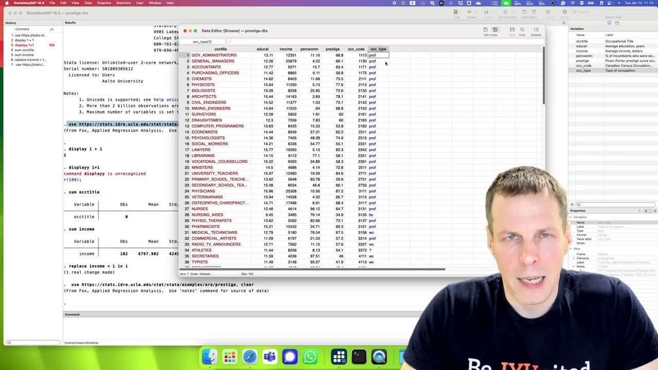
then we have data editor and data
browser you should pretty much never use
the data editor unless you are
generating like a small example data for
yourself or or typing in a data set that
you have gotten in a non- electronic
format which is uh which you might get
for example if you have uh paper based
surveys then you might type them in uh
data should never be edited directly
because if we uh change something here
so for example if we change the uh the
income of the government administrators
administrators to be one then uh it
doesn't really document what was done so
it just test that uh income was replaced
to be one in observation number one
that's not very descriptive so it
doesn't tell us like why did we choose
that variable and why did we pick a
value num one it's much better to to do
any changes using commands so I'm just
going to reload the
data generally uh you shouldn't use the
data editor if you want to eyeball the
data then you can use the the data
browser so the data browser is the same
as data editor except that this is read
only so we can't edit anything we try it
doesn't allow us to
edit the data browser shows us that we
have uh three different kinds of
variables we have red we have black and
we have blue so the red indicates that
it is a text variable so we can see the
this is a value it's government
administrators and it's text black is
normal numerical variable and then this
blue is uh labeled categorical variable
so it's it's a numerical variable with
labels so uh it's it's this professional
for example has a value of three but
it's going to be shown with the label in
the in the output the reason for that is
that in categorical variables the actual
numbers so we have numbers from 1 to
four corresponding professional blue
color white color and unknown occupation
types it doesn't really matter so we can
say that if unknown is is uh one and
uh blue color is four then blue color
color is is four times unknown it
doesn't make any sense so these are just
codes and and the numbers don't make any
any uh make a difference we could recode
them with with different numbers and the
analysis for the conclusions it wouldn't
wouldn't matter so uh for that reason we
are always printing these uh categorical
variables with the label instead of the
the numerical value because the value
again is arbitrary all right then we
have a couple of buttons we have the
more button here and uh the more button
what it does I'm just going to use I'm
going to switch the menus in a minute
but I'm going to show a few few features
one annoying feature of sta is that when
you start the first time with the
default settings it only prints you uh
one screen's worth of of output and then
it says more is coming and uh it stops
and we can click there or we can click
on the more
button and then you can view the rest of
the output I don't like that feature and
I don't know any uh professional
researcher who would use that feature
maybe someone does and it's a lot easier
to just uh scroll back back if I want to
see the output little by little instead
of uh of typing more the only use where
you might have for more is that your
your output is is uh so large that it
doesn't fit into the uh this data
results window then uh you might find
some some usefulness from the more
option but uh you can just increase uh
how many lines of results this uh
results window shows and and it can be
pretty large so it's uh if you change
the settings then that eliminates a need
for more so whenever I start analyzing
anything with sta what I do uh is change
a few settings and I recommend that you
do this uh setting changes yourself as
well so we do set more of comma
permanently and the permanently means
that it's going to be stored in our
preferences
and uh when we restart sta then we don't
need to do set more of anymore if we do
without the per without the permanently
option then the preference is stored
only for this session and the more
option is going to be on again when we
restart data so uh we do that another uh
feature that sta has is variable
abbreviations so for example if we type
some I then uh
it shows us the Val the summary of
income you so you can uh you can uh do
these abbreviations if we do uh let's do
describe O then it says that o could
mean two different things so it's either
a occupation code or occupation type so
uh I turn this off and the reason why I
turn this abbreviations of is that is is
twofold first of all I think uh if you
always typee the full variable name then
it produces more readable uh statea code
for someone else to interpret and it
also avoids errors so uh before I when I
used to have this abbreviation feature
on then uh I might have inadvertently
analyzed an incorrect variable because I
had uh just type a few letters from the
beginning of the variable and when I
have variable names that are very
similar it it's very easy to analyze
incorrectly analyze an incorrect
variable so we're going to turn that off
as well so the set setting name is set
bar up
R of comma
permanently and um now you can probably
start to see a pattern that statea
commands is always a
command then there is a main
specification and then there is an
option so the options are something that
kind of like uh make give additional
information for sta on what this sta
should be doing all right and now if we
can do some I it tells that the variable
I is not found because it doesn't do
abbreviation anymore so when I get do
something uh then uh with a new set of
sta or new install of sta I always set
the more off and VAR abbreviations off
because I think it makes it working with
data bit less error prone and more
pleasant all right then another
preference that you might want to change
is changing the font size so if I
present in a class then uh I I you just
right click somewhere preferences and uh
you can increase the phone size I tend
to have 10 when I analyze data on my
computer but this is set to 15 for the
screencast and then uh uh the command
window is set to 15 and I think that's
good for the screencast but if I analyze
data myself I would have 10 just to have
more information shown on the
screen all right now let's get to the
analysis and uh what we need to do first
is to explore the data and
um the data exploration typically starts
by by doing univariate statistics so
uh we have here the statistics menu and
data menu these are contain various
different uh expression commands and I
don't use this very often so I might
need to look for a command a bit but
describ data we can do a describ data in
memory or in a file all right so that
tells us something and uh when you do a
command from the menus then you get this
kind of dialogue and the dialogue
um asks us what to do so uh we want to
describe data in memory
we leave it empty so we want to have
description of all the variables and not
just the subset and uh then various
options and typically the defaults at
least on a very basic level are going to
be uh useful for you so so you don't
need to change any of these unless you
are specifically need to in which case
you would know the need so we're going
to describe and that shows us a
description of uh the data so this
description is pretty much the same
thing that you would have uh have here
in the properties and in the labels here
so we can see uh we have one text
variable we have one decimal number one
whole number decimal number decimal
number whole number and then a small
whole number with a valuable label value
label which tells us that this is a
categorical
variable so whenever you start with a
new data set I I typically print the
this describing just to show what these
data are about it's lot faster for me to
uh to show look at this then it's to
look at the
um the the right panel and in fact when
I use use data I typically don't have
these panels open so uh the command
history I can open if if I need it I
really do need it because I work with a
do file and the do file shows all the
sequence of commands that I've done and
then I tend to remember my data so I
don't need to have the variable's name
here if we want to um then uh do
something for for uh individual
variables like we can see the command is
described if we want to com describe an
individual variable we can either type
the command or we could uh redo the
menus and then we can we can type this
click on these variables here and then
uh press enter so we can construct the
command by by typing the name of the
command or and then clicking on the
variables if we want to redo the command
rerun the command again we can use a
page up and page up Scrolls through or
goes to the the command history so we
can go uh page up and page up now we can
kind of revisit what we done in the past
or if you want to redo something then
you can just uh rerun the
command all right another useful command
in the uh in this data in the data
window or data menu is inspect variables
so um inspect variables uh empty for all
we're going to inspect them so this
gives us something about like more
descriptive statistics and uh you can U
use wild cards here so if we want to uh
only uh do everything that starts with
OC we could do
OC star and uh that's actually a useful
because it it shows how the descriptive
or the inspection works
for uh a a string variable see there's
like uh no no observations here no
numerical observations so everything is
missing it's just text no numbers and
then we have the occupation code here
and then we have uh occupation type so
this is the categorical occupation code
it's just a code it doesn't really uh
plus
anything then we have uh a third way of
describing the data so uh something that
professional researchers sometimes use
is that if we have many people who work
using the same data set or the data set
is something that you've collected uh
for someone else to use then you produce
something called a code book and the
code book explains what the data are it
tells the variable names it tells the
the labels it tells the uh the data
types like is it text or is it uh
numbers is it uh whole numbers is
decimal numbers and then provide some
descriptive statistics so we can do our
data and uh then there is the
uh the code book and I will have to look
for
it it's in uh describe data yeah
describe data contents codebook so this
is another way of showing the data and
it's a bit more more uh like verbos way
so it shows us uh
statistics uh for string variables it
shows us examples so we can see examples
of what kind of things this variable has
so we can see that these are all all
caps there no spaces but
underscores and the longest one is 25
characters uh then we have this
education we can see that it uh
has 96 unique values mean standard
deviation then this tells us about the
distribution so it's 10% is 7.52 so 10%
are less than that and then uh 90% are
less than 14.17 so uh the number of
Education uh the years of education is
pretty small compared to current
standards then there's the income uh
percentage Prestige and
uh occupation type now we can see this
is useful information because uh this is
a categorical variable it it shows us a
bit different it doesn't show us means
because a mean of a categoric variable
doesn't really tell us anything rather
it shows that we have we have four uh
unknown equations with unknown category
and this is uh the VA the value for
unknown is one the label is question
mark then we have 45 blue colors that
are CED at two are 30 professional
occupations or 23 are white color
occupations so and there's no missing
data so everything um all 102
observations always have data for every
variable so that is the uh the Third
Way of or fourth way of of uh of looking
at the the data and um or third way then
the fourth way is through the statistics
so we have summaries and summary Des
statistics summary statistics so this is
the uh this is kind the thing that I use
the most and uh
summary statistics uh let's let's do
additional statistics just to show what
it looks like it tells us basic
descriptive statistics of each variable
so um we can see that it added the
option detail if we run without that
option then we just get means standard
deviations minimums and maximums so I
use both of these and uh when you do
univariate analysis you want to
understand what is the range of the
variable like what is the minimum
maximum what what is the mean we can see
here that the uh for income the mean is
uh
6,700 maximum is
25,000 and minimum is 600 so it tells us
that the data are skewed because the
distance from the minimum to the mean is
6,000 and the distance from the minimum
uh from the mean to the maximum is is
about close to 20,000 so the data are
skewed so that there are very few
patients with very high incomes but a
lot more occupation with lower levels of
incomes then standard deviation tells us
about the variation of the r data and
then uh this generally tells you about
what is the unit and U it's useful for
regression
interpretation occupation type mean and
standard division doesn't make any sense
because it's a category but we can see
that there's there are four four
elements of four different uh distinct
values or we can guess that there are
four distinct values Val in this
category all right that is uh the basic
uh description of the data and then
another thing that we would often want
to do is to do uh look at the
distribution slow so uh if you think
about a distribution you might think
about a normal distribution which looks
like a bell curve so it goes up and then
there is kind of peak and then it goes
and then it it flattens like that so
that shows where the observations are
located that's a useful display and we
can use do that with sta so there are a
couple different ways of of um doing um
distributions we can do our statistics
and then there is uh distribution plots
and tests and uh these are various ways
of characterizing or describing the
distribution of a
variable uh stem LIF display is is one
of um my my favorite ones and the reason
is that it's it's uh it doesn't produce
a graph but it produces uh the graphic
as text so it doesn't open a new
graphics window but it just puts the
results into the results window and we
pick one variable so we pick income in
practice uh when you analyze your data
you would look at the distribution of
every variable and you might use the
plots or some other plots for that so
I'm just going to
um do that and it shows us the
distribution so if you look at
this it's kind of like a normal
distribution flipped 90° so
uh this shows us the first two
numbers so let's it's easier to uh the
first two digits so it's EAS to look at
this uh instead of the small ones so the
largest value in the data is
25,000 and then these stars are filled
in with whatever value value is here so
the largest value is is
2,879 so everything uh separated by
comma means that it's a separate
observations so we have two observations
in the 25,000 range and they are
25,38
2,879 here we have two observations with
0, thousands so 6111 and 918 those are
the smallest observations and you can
see that the peak of the data is roughly
around 5,000 so that might the median
might be somewhere here 5,000 or 4,000
somewhere here and um so this is the
stemma LIF plot then and another useful
way of looking at the data is to look at
uh the the kernel density plots yeah we
can find Graphics distributional graphs
and uh then there is uh
density C density estimation so this is
uh what I would I would often use and
we're going to take a look at income and
uh just leave everything as default and
uh that statea Graphics is a bit slow
but that shows us the um the
distribution graphically so the height
of the line tells how many observations
we have have here so we have two
observation with 25,000 here and most
are here so it kind of like looks like a
normal distribution with a long tail so
it's it's skewed to the right and um we
can also uh do the same graphic with um
with options so if we want to analyze if
the variable is normally distributed
then uh we
can go and look at these different
options so I'm going to so if in this
would be for selecting observations we
can choose based on on a a condition or
we can use a range of
observations uh we could use survey
weights if we want to weight some data
more than others I never use it myself
but this is the
uh this is how we plot it and then we
have our additional density plots we add
normal density plot and uh that gives us
a reference so it gives us the the
normal distribution that best describes
this data and we can see that the data
are not normal they are they are more
skewed than what the normal distribution
would exist so if you want to analyze if
something is normally distributed uh
this graphical way of using kernel
density is the way to go and um so you
can you can do that also type in K
density let's do uh
education tab autocompletes the variable
name and then that shows us the other
the current density of Education when
you analyze a data data set then uh you
would use these uh two commands you can
pick either the cority plot or the stem
and leave plot or you can do both um but
that's they they tell you the same
information in different ways uh you
would do this for for every numerical
variable except those that are
categorical so every continuous and
every U every variable that has a
numerical interpretation instead of a
categorical interpretation
you would do this and then look at the
distributions just to understand like do
I have any extreme values and and how
the data look like it's very important
that you understand your data when you
start
analyzing so that is the
um the
um distribution and uh of the University
analysis then uh what we need to do next
is to to look at uh multi varat analysis
so so and we start by looking at by
variat analysis and because the the
point here is to do a a regression
analysis uh regression is a linear model
so we want to understand the linear
dependencies in the data and uh
correlation Matrix is the uh the way to
understand linear dependency so we want
to do correlations next moving to to
byar relationsships so we do statistics
and uh then um you can you can guess
where it is but I'll just type the name
of the correlation so there is
a it is summary and descriptive
statistics so statistics summary and
descriptive
statistics and then
uh statistics summary this is
the statistics and then are correlations
and Co variances
we we click all variables and we click
okay and
uhu now we have a a warning from sta
that occupation title is ignored because
string
variable in some older versions of sta
if you uh try to correlate a text
variable it produces an error and
sometimes uh if you try to do a for
example a a ression analysis with a
string variable it might produce an
error but now sta is Mark and it drops
the occupation type from uh from the
data the occupation code is just a
categorical code and it doesn't really
tell us anything uh if you really want
to understand what it is it's like a
sensus code you can find the
documentation of the Canadian sensus and
see what the different codes actually
how they're defined but it's not going
to be a useful exercise for you I
guarantee all right so this is a way and
of looking at the data in a byari way
and if you think about a a published
paper this would be the table one
descriptive statistics and correlations
this would be the correlations
part then we have uh correlations here
how we would interpret we would say
check if the correlations make sense
like if there's a large correlation this
0.57 is pretty large so in social
sciences correlation of 0.3 is something
that we would consider meaningful
definitely 0.5 0.6 definitely very large
correlation so there be a large
correlation between education and income
and even larger between education and
Prestige and um then there is a large
between presti and uh income makes a lot
of sense if you have prestigious
occupation is probably uh earning you
more money and then uh we have share of
women women might be are discriminated
against so the income here is uh
negatively correlated with Z of women
and uh that's also understandable at in
in
1970s so that is the correlation you
would go through uh all the correlations
and and look at what are the large ones
do they make sense are there some
correlations that are small like
non-existent do they make sense for
example uh we might take a look at
education and it doesn't uh seem to be
correlated with share women that kind of
resonates with our everyday
understanding that both men and women
tend to get education at about the same
same rate so there's a small positive
correlation but that's very small and
the data are pretty small one
observations only so this is one way to
understand the by variate our
relationships another way is to is to
look at scatterplot Matrix so we do
scatter and uh then it's in graphics and
uh
two-way scatter block Matrix yeah
Graphics scatter Matrix so um I'm not
going to talk about all these Graphics
I'll just show the ones that are you are
needed for for this assignment and um we
have um we start with all the variables
okay and uh okay we have to specify them
we click education we click income we
click percentage Movement we click uh
Prestige and uh occupation code is just
the sensus code it doesn't tell us
anything and then occupation type uh
that's categorical it doesn't really
tell us much but let's still include it
just to show what it looks like and
um we click
okay and that shows us a graphical way
of uh graphical representation of the
correlation
matrics let's make it a bit
bigger now we can see that uh this is
always the the the um the x-axis on the
top and then on the right or left hand
side is the income so we can see that
education is the x-axis here uh income
is the y- AIS here and uh the
relationship seems to be increasing so
we can take a look at the shape of the
relationship correlation test tell us
that there is a Rel relationship so this
correlation but
0.5 income and education
0.56 and this plot shows us what is the
shape of the relationship so this is not
a linear relationship so the income
doesn't increase linearly with our
education but rather it looks more like
an exponential so first there is very
little increase in income and then U at
about 10 years or something like that it
starts to go up quite rapidly and that
also um makes a lot of sense because uh
if you think about how Education Works
is that for the basic education which is
now 9 years mandatory in Finland and
then you have either high school or
occupational
um vocational school then the first nine
years basically give you just uh the
understanding of how to be a citizen and
then uh but it doesn't give you any
professional qualifications so only
after the basic education you start to
get some professional qualifications and
if you really want to get uh to a high
paying occupation then typically it
requires a University degree so you get
a lot more uh additional income from a
University degree than you would get for
a high school degree so that's why it's
it's nonlinear then we have one outlier
here so this I know the data so this is
general
managers and um we can print the uh the
observation names here but it doesn't
really make sense for for this plot
because there is so much going on uh we
can see that uh education here and and
share of women it doesn't correlate
there's like no no clear pattern here
there is uh a clear linear relationship
between a prestige of an occupation and
income uh we can see a bit of uh we
would call it
heteroscedasticity so these are more
spread out over here than they are over
here so these are some of the things
that you can take a look at in this
figure then we can see from the
occupation type so um the occupation
types are here one that's the unknown
two three and four we can see that there
are the category number three is clearly
distinct from the others this is not an
ideal uh plot for inspecting the
difference between the category
variables but you can do so so you would
be looking at this plot and and looking
for patterns in the data and uh these
are just the mirror images of each other
so this is uh that's the journal
managers they and that's general
managers and uh these are the low um
occupation low education occupations
these are the low income low education
occupations so uh this is just depending
on which one you you want to think of as
the the dependent variable if we want to
think of the income as the dependent
variable then uh like we do in this
assignment then we will be looking at
this row and uh then the Y AIS is always
the income and then whatever is the
other variable like occupation press uh
share of women and education is this the
x-axis so this is the second um byari
descriptive statistics plot that I want
that I a by variate descriptive analysis
tool that I like to use the next thing
after data exploration is to do the
regression analysis so the task was to
explain the income variable with the
other variables and we're going to start
by running one regress model the overall
workflow here is to go and run the first
regural model then do diagnostics for
that model fix the biggest problem then
run the second model do diagnostics for
that fix the biggest problem and so on
so what the problems are I'll get to
that but the point is that you uh do a
few different models where your model
evolves and then you explain your
thinking in that and your interpretation
of results in that assignment so we do
our regression by look taking statistics
linear mod related linear regression
analysis and there's quite a lot of U
there's a few tabs here I'll explain a
bit what these do in a moment but first
we need to pick the dependent variable
for regression analysis and we'll pick
income and then we pick the independent
variables we'll have education we have
percentage woman we have Prestige and
then um occupation code is something
it's like a sensus code it doesn't
matter an occupation type is a
categorical variable we are not going to
use the categorical variable in this
assignment if you want to use it then uh
you need to put i period in front of it
to tell this sta that uh it's a
categorical variable that needs to be
dcoded but I'll take it out for now uh
then there is uh
additional features about the model and
this is typically you don't need any of
this then the other tabs here is by if
and in by means that you're repeating
the analysis by subgroups if you want to
for example analyze the regression for
each occupation group you can do so then
if allows you to constrain which
observations you apply for uh the
regression to so for example you can
apply regression only to those
observations with at least 1,000 income
and observation range is useful if you
want to turn like quick analysis but
your data is very large so you can limit
the number of observations that you use
weights this is for uh survey weights so
if you have uh a survey design that is
stratified which means that uh
individuals don't have equal chances of
being included but for example some uh
smaller cities are overweighted compared
to for example helsink if you do a
survey of finish population just that we
have enough uh informance from those
cities then we would use these weights
to accommodate that kind of sampling
scheme uh this is an important one
standard errors you can pick various
different kinds of standard errors uh
robust and cluster robots robust are
something that you would uh you would
use robust is for dealing with h
elasticity and cluster robust is for
dealing with non-independence of
observation so these are very commonly
used and uh then
reporting there's all kinds of uh
additional reporting options that you
can use use uh you can pick which
confidence interval you choose
standardized coefficient you pretty much
never use this and uh then uh in some
models uh exponen in the coefficients
Mak sense but it doesn't really make
sense in regression analysis and then um
you can you can choose what to
report then there's some additional
options so there's lots of options in
each of these commands but typically
just filling the first tab is sufficient
for most purposes then then uh submit
runs it right away so if we want to run
multiple models we can submit and then
if we want to run another model for
example take one of those Parables out
we submit again so submit runs the
analysis without closing the tab and
um okay runs the analysis and closing
the closes the window like so all right
now we have regr and results here and
I'll cover the interpretation of these
results more in on the course but we can
see here that one unit increase of
Education leads to uh approximately uh
177 U dollar increase in annual salary
uh but it's not statistically
significant so here's the P value this
is the confence interval and this is the
T statistic uh that is used to calculate
this P value and you might wonder why
educ education doesn't pay off and uh
maybe it's uh
a a mediation effect so that education
unlocks access to more more prestigious
occupations and uh then Prestige is
actually what makes the difference so
that you would interpret this to mean
that if you take get more education but
you go don't go for more prestigious
occupations then uh education doesn't
really pay
off and personent woman is uh has a
fairly strong effect so for each
percentage point this variable is coded
from 0 to
100 they are amount of income decreases
by minus 50 so if we have an occupation
with 0% women an occupation with 100%
women the difference is $5,000 Canadian
dollars that's a very substantial
difference if you consider that the
average income is like 6,000 some so
these are statistically significant and
this is not then we have other
statistics here you should take a look
at the R
square and the R square tells how much
the model explains the data in in
management 20% 30% is very high number
but because this is um sociology and the
weight formation depends fairly
straightforwardly on The Prestige and
occupation this is a very large R square
this P value is the P value of the F
test so the F test test and I'll thesis
that uh the R square is zero and then we
have adjusted R square which is a bit
better for interpretation the actual R
square if your sample size is small so R
square is always biased positively and
adjusted R square adjust for that bias
it's not fully unbiased but it tends to
be less biased than the R
square okay now that we have a regron
analysis uh run we can do Post
estimation and uh in the statistics
menu there's this post estimation
dialogue so post estimation refers to it
means uh all the tasks that one could do
after estimating model so when we click
post estimation there are various
different options so it's a pretty small
window here or the font size is small
and it can be
increased uh manage estimation results
this is useful for for
tabulating the results so uh we but
first we need to store estimates in
memory so whenever you run estimates
then uh those estimates will be in
memory and you can apply for example
various Diagnostics plots but if we want
to return to the estimates later for
example if you want to tabulate two sets
of estimates side by side we need to
save them so sta by default when you uh
run a regress on any other estimation
command it stores the most recent
estimat in memory so unless we save the
estimates then if we can only tabulate
the most recent ones so whenever we run
a regression analysis when we run it the
next time the always the latest results
override the current results unless we
save them so we're going to store the
estimates so we're going to estimate
store we're going to call this M1 and
okay once we know that uh these results
are something that we we will be using
then I recommend always storing the
estimates but if it's just explor the
data then storing the estimates is not
necessary uh you can see list estimates
stored in memory and um you can launch
it and list all stored estimation
results it shows that we have uh one
stored there's income is dependent
variable four independent variables or
three independent variables and the
intercept and then it's it's a linear
regression analysis all right let's go
back can do Post estimations so we need
to understand uh do diagnostics after
estimation always to understand whether
the model explains the data well or not
and if there's something that we can we
can do about the results so let's go to
post estimation again and uh then uh we
have Diagnostics and analytics plots and
there are a few important interesting
plots residual versus fit the plot
addable plot and then I also use
leverage ver res squared plot to
identify outliers these others can be
used as well but this is the combination
that I use res versus fited are add a
variable plot and then leverage versus
residual so uh let's do uh resid versus
fit BL and
um it runs it produce the plot in a
different window and um this plot shows
us that this is the Val value that the
model predicts so it's the it's the
prediction based on the rec equation the
fitted value and this is the residual
it's the difference between the fitted
value and the predicted value ideally
this would be a band so that there are
they would all be on average at
zero irrespectively of which part of the
data we look at and then uh they should
be distributed approximately equally
around the the zero line which is the
the homos cadas assumption we can see at
least a couple of problems here first of
all we can see that uh this is not
exactly linear so if this was linear
then we would have all the observations
uh at uh around the zero line on average
but for small observations here they
tend to be above zero and for large
values of fitted value they tend to be
also about
this uh zero line and that tells us that
the effect might be curv linear so it
might be that it's not linear but it's
rather kind of like curving up a bit
like the relationship in comparison to
regression line another thing that we
can see is that they are the variance of
the residuals is a lot greater here than
it's on the left hand side and this is
evidence of het
heteroscedasticity or non constant
variance of the error to so these are
the two things that we can take a look
at in this plot we can of course
identify individual observations that
are distin like that is uh the general
managers and it's an outlier but this is
not the idea plot for for looking at
that kind of
things if we want to save the plot then
we need to rename it and uh we can call
it
rvf for
example r F residual versus fitted and
then it's going to be saved and uh
unless if we don't save a plot or name a
plot then uh redoing the plot or doing
the next plot will overwrite the
previous plot so um I'm just going to
close it because we don't we don't need
this plot the second plot that we I want
to show is the added variable plot and
um particularly all added variable plots
in one graph and the ad develop plot is
useful for look for identifying
nonlinearity and
heteroscedasticity one independent
variable at a time so I'm going to take
all variables click okay and it runs it
produces a matrix of
plots and what these plots tell us uh
they tell us what is the unique effect
of education on income what is the
unique defect of prestige on income what
is the unique defect of prestige
on income and this would be useful for
identifying if one of the independent
variables specifically has a nonlinear
relationship with the dependent variable
and also identifying
heteroskedasticity so this this plots
don't show a nonlinear problem as well
as the previous plot but this is an
additional set of Diagnostics that you
can
do then we have the um leverage versus
res squared plot and this is U useful
for identifying outliers so Leverage is
a measure of influence so how much an
observation influences the regression
results and then uh if an observation
has a large residual and large influence
then it's an influence of observation
and potential outlier so uh we can see
that here's a potential outlier this is
a potential outlier and this is a
potential outlier but outliers are not
something that we dropped based on just
statistics we need to understand what
these observations are and if they are
clearly distinct and uh to know what
these observations are I'm going to
close the plot and then I'm going to
launch it again and then there are plot
options and we can choose marker
properties and uh add labels to markers
so we we Mark label and we have the
occupation Title Here we we accept and
we click okay and that shows us that we
have an outlier news voice which has a
large influence small residual
Physicians bit of both and then general
manager with a large
residual all right so these are the
plots that you will you should use for
Diagnostics then there is a another kind
of plot that researchers sometimes
report and or inspect but it's not very
useful which is inspecting the
distribution of the
residuals predictions and um predictions
and the standard leverage statistics
distance statistics ITC we're going to
launch and prediction means that it's
something calculated based on the model
and we are going to calculate the linear
predictions gives you the fitted values
we are going to calculate the residuals
and um we're going to call it
R1 or rest one because it's from the
first model so residual from model one
and if we want to inspect the
distribution of the residual we can do a
uh Graphics distributional graphs and we
can do for example normal quantal
plot which is useful
for inspecting normality so uh if the
data are normally distributed then they
should be on this line but because these
are about the line it tells us that uh
these there's a tail some observations
some residual are larger than what
normal distribution predicts and then
there's this observation here that is a
lot smaller than what the normal
distribution predicts if you want to see
it uh in another way you can have
smoothing and densities current density
estimation pick um residual then we have
density plot add normal plot okay and
that shows us the red is uh the normal
distribution that best fits this data
and then uh blue is the empirical
distribution of the dat dat so we can
see that the data are a lot more peaked
there are more observations on zero and
longer tales on both ends though more on
the negative end than what normal
distribution would predict so this shows
that the residuals are not normally
distributed that's not a problem in
recursion analysis even though a lot of
researchers think that it's a problem so
what do we do we had uh evidence of of
nonlinearity we had potential outliers
then we had uh hter
scity we need to fix the biggest problem
first and uh the biggest problem would
be the nonlinearity and we can model
exponential relationships which are very
common in nonlinear models very common
way of modeling nonlinearity by taking a
log of the dependent variable and that
would make a lot of sense because then
it converts the regression coefficients
to relative quantities so instead of
thinking about
increasing your income by uh a certain
amount of Canadian dollars you increase
the income as a percentage relative to
the current income so we're going to do
log transformation of the dependent
variable and create a new variable and
then run the regression again so we're
going to do data and then we're going to
do
uh create
variables create new
variable and the variable name name is
going to be Ln income so I'm going to
call it Ln let's have
it underscore because that is the
convention that we use in this data and
then we can either create the expression
or we can just type log income so log is
the natural logarithm you can you can
create here and then there's all kinds
of functions if you don't remember the
functions so we can have for example our
mathematical functions here and this is
the list of functions so so we can find
the uh the log natural logarithm log and
then uh x with type income there so that
would be a way of using the the
expression editor but it's easier to
just type log income and then we're just
going to okay and now you can see that
it doesn't have a a label and we could
label the data but yeah we're not going
to do it for this assignment the next
thing uh we do is we run a new recordon
analysis there are a couple different
ways to do it we can either uh just go
here go to linear motion related linear
recron analysis and then we can pick the
um the Len income as the dependent
varable click okay another option would
be to just go back to the regression
scrolling back the
commands and then just changing the name
of the dependent variable by editing it
so both are pretty easy so yeah Len
under
score now we can see that
um the effects are fairly different so
um this is relative effect it means that
for every uh
additional percentage point of women the
income decreases by about minus 1% so
it's a relative effect compared to it's
not no longer absolute effect and U then
your task and the assignment would
continue from here with the
Diagnostics I will not do the
Diagnostics I'll leave some for you to
do so you need to go through the
Diagnostics interpret the results and
then choose which observations are
potential
outliers I will now show how you drop a
potential outlier from the data so let's
assume that um that we we go to the data
editor data browser and we can look at
observations with uh with larger
residuals so we're going to sort the
data data
sort and then we're going to sort by res
so let's assume that minister is an
outlier because it has a large residual
and the substantive reason for dropping
mins would be that minister in this case
priest is something that you don't do
for money and it might also be a part CL
occupation if you only work for weekend
so how uh Church works in the Americas
is quite different from how it works in
for example Finland where I'm from so we
might say that this is not a full-time
profession so we'll drop it and um now
we sorted the data so we could just say
drop in one but it's much better to drop
based on the occupation title so we can
um we can copy that value from there and
uh then we go to data we can can do a
Creator change data and drop or keep
observations so we drop and then the
uh expression we can use the Expression
Builder by using the create here but
it's just easier to type so o
tile equals so equals is two equal signs
one equal sign is assignment two equal
signs is comparison and then uh because
it is um a string it must be in double
quotes and then I'm going to drop it and
then I can I can rerun the regress
analysis as see what the results
are like so and then I will store the
estimates I can either go to the menus
or I can see here that the command for
storing the estimates is estimat store
so we can just type estimates store M2
and now we can go go and and view here
all the estimates we can either go and
and see the post estimation menu here
post estimation manage estimation
results list estimates stored in
memory and all estimates or I can just
do
estimates here now I dropped one
observation and I transform the
dependent variable to be log and the
reason for doing this in one one one
step is just to show show these things
that you need to do in the assignment
but in the assignment you need to do the
sequences so if you decide that
nonlinearity is the biggest problem then
you need to run the model again with the
log transfer dependent variable du to
Diagnostics and then determine if any of
the observations are outliers for
example when you log transform the
dependent variable then uh which
observations or outliers differ so it's
not a good idea to drop based on the
original model but you drop from the
subsequent models but just not to give
you the the full answer to the
assignment I didn't want AG go then we
have a few things that we can we can do
we might want to uh tabulate these
models so there are a couple different
ways post estimation gives you uh then
uh table of estimation results so this
is a Weck and dirty table and I'm going
to say M1 M2 so this uh gives us two
model side by side and if we want to add
things there we can do
statistics uh post estimation menus post
estimation table of estimation results
other statistics to be displayed and uh
other statistics from E how do you know
what this from E stands for well it it
stands for um the whatever are the
estimation results and we can do help
regress so that's the help for
regression analysis and you can go to
the PDF menu here a PDF documentation it
explains you uh
the in detail what reron anal does in
data this is kind of like a quick
reference this is the detailed
explanation it's a very comprehensive
documentation and uh but now we just
want to know what other statistics
beyond the estimates the recursion
command returns and we can scroll down
here and
regress stor following e and this is the
PDF document so it's like tens and tens
of pages of regress and Analysis and
examples it's it's worth reading but I'm
not going to read it in this
screencast all right so we want to do
a table and we do uh statistics then we
do
are post
estimation table of estim results and
then other statistics displayed in E so
we need to figure out what those other
statistics are I'm going to make this
data window a bit smaller so we can see
the documentation and
um here then uh other statistics we can
see that n is the number of obervations
sounds useful then we have R square
sounds
useful r
Square adjusted some also useful and
then there are other other statistics
but these are the ones that you would
normally report maybe also F statistic
because that's a test statistic and uh
sometimes you might have a p statistics
for the
statistic so that shows the estimat side
by side and we can see that our n drops
by one because we drop one outlier R
square goes up so the model with
the Lo transfer dependent variable fits
substantially better so that is evidence
for for for nonlinearity uh having been
an issue and then if we do our resid
versus F the plot again a wef
plot we can see that it looks pretty
good so there's no no evidence of
nonlinearity or or
heteroscedasticity if you want to um
then analyze this data further you can
for example turn on the robust standard
errors but I don't see any need for it
with this data
the next thing uh that we need to do is
uh to be able to visualize the results
but before I go there I'll show you
another way of of doing the table so
this is like a quick and dirty table
that is printed to a console but you
might also want to produce a table that
you can put in your article so we need
to have a table that we can embed in a
Word document we can do use St status uh
customizable tables and collections
framework for that so the collections is
kind of like a general framework for
constructing tables so you can collect
all kinds of Statistics during analysis
and then you lay them out in a table
then you style the table with a
different command and then that produces
you very nice PL uh tables that you can
then export in various different
formats let's take a look at
um tables and uh we have customized
table of estimation results this is the
uh the the better looking table we do
launch and then uh M1 M2 and
uh the default settings work pretty well
so we can just try and one of the
problems here is that the dependent
variable is different so we need to
adjust the settings for this
table we do again statistics post
estimation
and then
launch we we recode equations because
these are considered different equations
because they have different dependent
variables so we create so we have old
equation name Ln income is going to be
income like so so Ln income m income and
then we submit and that produces us a
nice table so uh as you can see this
requires a bit more work and you can
customize it this this in many different
ways you can for example put a different
model or you can put correlation here to
the side or you can add whatever
statistics so this is a very flexible
system if we want to export this we can
do a statistics I had to look at the
documentations because I did not
remember where to collect export command
is so we go to uh data and then so
statistics summary tables and related uh
and then there's summary in Des uh there
is uh table of tables and collection
build and style table so this is a a
table Builder and you can build all
kinds of tables here so so we can
actually um I'm not going to go through
how this works but it's very flexible
and we can add add more stuff to the
table uh but we have a table here we can
just export it and uh we're going to
save it as docs and then export it it
goes to desktop because that is our
working directory so we're going to just
call it test
table and um
okay and then we can click on it and
it'll be it will open in word so this is
the way that you can get uh tables to
Word document and this is how I export
every table that I ever do with state if
it needs to be in a in a a paper so that
is the second way of making uh tables uh
for this assignment are doing this quick
and dirty table is okay but if you want
to be more fancy you can do this table
here and then this is exportable to
board this one can't be exported just
for printing in this data console all
right then we need to be able to
visualize the results so we have two
regressor models and uh let's restore
the model one and visualize it so we can
do um
estimates
restore you can also do this from the
post estimat menu and then we do
Graphics uh statistics post estimation
and then um we
have marginal effects estimated means
interaction
so these are basically uh all the very
similar commands or these these all run
the same command but they they have
provid you different options for
different use cases and uh I'm more used
to this custom and high dimensional
analysis this is provides you the most
options so I'll just um I'll just run
that so uh we want to uh have a factor
to compete the margins over for uh we
don't need that so that is if we want to
C calculate things or
plots over different groups so our
objective here is to calculate a plot
where we have the regression line and
uh we can do at so we're going to
calculate for example at different
levels of income sorry education and uh
then we have at
specified specification we create
and we
pick fixed value coari so we pick uh
education and that gets from from six to
16 with increments of one
year so 16 is about maximum six is about
minimum and um then we click
okay and that plots us the regression
line so what does the line actually look
like we click on okay then we can plot
it and there is profile plots after
margin so we we just run the plot and
there are all kinds of options we just
do the default so this shows us the
regress line and to make this regress
line a bit better to show like how well
does this regression line explain the
data what we can do is is to underly the
actual observations here so we can
actually show the data underneath this
regression line and how you would do it
is that you do profile plot and then
there is ADD plot we add plot below we
create a plot and then the plot is
scatter the Y variable is income the X
variable is education and then we are we
accept and now we have the reron line
that explains the data and we can see
here that the first model the linear
model the line doesn't explain the data
well because these data will clearly
curve up but the line is straight so
that doesn't really
work we can visualize the second model
which has the log transform dependent
variable we will first uh estimates
restore the second
model so we're going to estimate M2 and
now we're going to do statistics uh post
estimation and marginal effects
estimated means custom and high
dimensional Lawns and we're going to
specify it as before so this is the same
as before yes and now we need to
uh specify an expression so uh we can
specify a prediction we can create or
specify an an expression so
um we can do here
x predict
like so the idea here is that we we
exponentiate the predictions because if
we log transform the dependent variable
then the inverse function of log is the
exponential if we don't do that then we
get the uh the regression
analysis on the original on the log
scale so we're just going to do default
click okay and then we can do margin
spot this is not very useful so because
this is now log of salary log of income
it doesn't make any sense to take a look
at the log of
income and
um what we need to do instead is to do
statistics post estimation and then
we're going to
predict the exponentiated predictions
and then we click okay and then we do
our profile plots after marginal
analysis
and it's it's still flat because the we
control for Prestige and this was non
significant but we can for example go
for for percentage woman and that gives
us a more useful plot so we do
statistics uh post estimation then uh
custom and high dimension analysis let's
let's rather have
um add so we edit and instead of
Education we go from
Prestige which is
from 20 uh with increments of let's say
10 to 80 so this is the range of the
variable that we get from the summary
command and we click
okay and then we do a margin splot where
we change the dependent variable then we
need to change also what we plot so we
edit the plot and uh instead of plotting
income
education we plot
Prestige
and now you can see that this line
actually fits the data pretty well so
there's still some occupations like this
is general managers that are more
prestiges that what the model have more
income than what the model predicts but
you can see here that the are the curve
actually fits the data pretty well now
when you do these plots you need to pick
which variables to plot and I would pick
the ones that are statistically
significant over those that are not
because if there's no no significant
results then we can conclude that there
is an effect and typically if we can
conclude that there's an effect then the
estimate the effect is very small and
the fly line is pretty flat so I would
perhaps go with this Prestige plot and
then I would go with our pres woman plot
and just show and and then make make a
call if it's uh going from the least
prestigious occupation that makes about
uh 3,000 to the most prestigious ones
that are expected to make about close to
15,000 holding education constant and
holding share of women constant then uh
that's a pretty big effect so interpret
you can interpret these extremes or you
can directly interet the regression
coefficients uh that give you the
relative relative effects so
um that is uh the mechanics of how you
use data to produce uh regression
results the various Diagnostics plots
two ways of tabulating and then
uh how you visualize linear and
exponential relationships using the
margins the next thing that we need to
do is to make uh after do file that we
submit as a part of an assignment and
also that we convert into a report and
how that works is that we open the do
file editor and I'm going to put this uh
window side by side and now when you
start documenting your analysis if you
do this kind ad hoc analysis that I just
did then the documentation task is is
something you do after but in reality
how uh researchers tend to work is that
you build the do file all the time
instead of and you just run it from here
and um we start by by taking all the
commands here so we're going to copy and
paste here so that is our log and if we
run this we will get all the results
that we got this far that will produce
an error so we're going to eliminate
everything that we don't need and write
some comments and that's what I'm going
to do next so I'm going to Lo the
data and two slashes is a
comment and then um these options you
would set them once so there is no need
to uh set them again and
then we do our
univariate you VAR distributions
by
variat these commands don't change how
statea Works they're just there for you
to understand what is going on and
they're also there for for someone else
to understand what your sta code does or
what your anal does um documenting your
analysis well is super important it is
super important for for three reasons
and uh one is that you are not
documenting it also for for others but
also for future you so often time like
there's an analysis that you do and then
there might be some time that you don't
work on it and it might be like you work
on it a year later when the paper come
back comes back from a a review process
and then the reviewers want to see some
changes in the analysis then if you have
this kind of like completely undoc M
analysis it's very difficult to remember
what you did and why the second is that
if there is more than one person working
with the data understanding what the
other person is doing is a good idea the
third one is the documenting your your
code helps you avoid errors so how I
actually specify an analysis myself is
that I typically write the comments
first so I I I plan the analysis in the
comments and then I just write the STA
commands under the comments so that I I
think about the logic of the analysis
first and the mechanics later if you
think about the logic and the mechanics
at the same time but just typing state
of commands here then uh it's more error
prone than thinking about the logic
first by writing the comments
documenting what you plan to do and then
thinking about the
mechanics okay then we have a first
regression
and Diagnostics
then here we would need to have a really
good
explanation of why we think
ministers are outliers because you need
to document this kind of decisions but I
will just save time not write it here
while I'm doing the screencast and um so
let's
see that's the second regession we store
it and then
tabulate and then we can do
a we will just use the second table and
then we can use that table if we want
and we're not going to export
it then we do Graphics estimat store
margin plot we're going to add the the
data underneath the plot because that is
something that you should do and uh
we're going to
plot just The Prestige
so if we Vis if you visualize the reg
models it would makes more sense to
visualize the same independent variable
in both but this is just to show you how
the mechanics work also if you want to
do diagnostics then uh a good idea good
way to do the Diagnostics is just to
copy all this stuff
here under regression so you don't need
to C
uh click on the commands again you can
just copy paste the commands here in the
doile editor all right so let's say that
this is our assignment one this is of
course not the full assignment but all
these commands that I just demonstrated
should be enough for you to complete the
assignment and we're going to call it
assignment one and then we need to make
a report out of it and this is the kind
of the hard part in that if you're using
an old version of sta or if you have a
very exotic uh installation of sta for
example if your profile is solely on
network drive then this can cause some
problems
so let's do uh producing the report and
we're going to install this package here
I have it already installed but I'm
going to redo it just that you show it
so I'm going to copy paste this and this
is a uh something it's a sta package
written by this uh this guy called
hogish and uh it allows us to
make various reports from from sta
documents sta doils so what we need to
add is to add its installing here in the
background and what we need to add here
is uh start a
log and we're just going to call call it
assignment
one and then
um replace is important because
otherwise the uh the log if it's open
already if if the log already exists
then
uh this will cause a failure and another
thing that I sometimes do is that I do a
capture log close and what this does is
that it forces any existing logs to
close so if you have a a log open then
if you try to open another log it causes
an error so before we open a log we need
to close an existing log but if you
don't have a log open then uh closing a
log will causes an cause an error so
this capture command here before log
close will cause data to ignore any
errors that this might cause so what
this does is that it uh creates a start
a new log or it closes an existing log
if it exists and starts a new one and
then um we uh log close the log at the
end and then finally after each command
we need to do this IMG so sorry each
figure so um let's see uh these are
images and this is just just a kind of
like a clunkiness that is a part of the
uh the command
these are all figures or
Graphics this is a graphic and this is a
graphic and
uh then we do
um this is the final lines and now we
run this and and it just works it
produces a Word document for us before
you start adding the log and IMG it's a
good idea to check that your data code
runs and produces the result that you
want it to do but I just did it in one
go because
uh yeah
because yeah there there shouldn't be
any errors but there is there is an
error because I forgot to change the log
name here so it's going to be assignment
one instead of report and I'm just going
to rerun that line like so and then it
gives us a Word document and we can go
here and this word document contains a
log of everything that we just
did and uh then there's all the figures
here and how we would start writing a
report for the for the assignment the
final report we would uh have add some
some text here so we would have a style
no heading so uh
assignment
one regression let's call it
that
then
description the
assignment and so on and then you can
add add line spacing change it to make
it look a bit nicer and so on uh then we
would for example here when we have the
describe we would
have let's do here clear
formatting
explain these results
here so you would basically uh just
explain what the results are and then
you uh interpret everything explain your
logic while writing comments in in the
word file you submit the word file you
submit the do file and then you're done
with assign