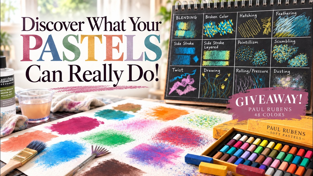
24 Soft Pastel Mark-Making Techniques You NEED to Try! + PASTEL GIVEAWAY 🎨
Watch on YouTubeVideo summary
This video serves as the second installment in a comprehensive four-part mini-course dedicated to mastering soft pastels, with a specific focus on diverse mark-making techniques and an exciting giveaway opportunity. The instructor begins by demonstrating twelve dry methods using Canson XL black drawing paper and affordable Prismacolor New Pastels, covering essential skills such as blending with fingers or tools like shammy cloths and packing peanuts, creating optical mixing through broken color, and adding texture via scumbling or hatching. Additional dry techniques include feathering for organic elements like fur and grass, side strokes for blocking in large areas, pointalism for accents, and various pressure applications to create unique line qualities ranging from twisting to rolling motions.
To expand the creative possibilities further, the tutorial transitions into twelve wet techniques achieved by liquefying pastels with mediums such as water, rubbing alcohol, airbrush sprays, or matte medium on Canson Velvet paper. These wet methods allow artists to utilize a wide array of tools including soft and stiff brushes, fan brushes, toothbrushes, palette knives, skewers, sponges, and stencils to produce sophisticated effects like underpaintings, drips, splatters, and layered textures. By combining these approaches, viewers gain access to a vast repertoire of styles that can transform simple pastel sticks into dynamic, mixed-media artworks suitable for both beginners and experienced artists looking to refine their craft.
The video concludes with details about an exclusive giveaway for a set of Paul Rubin's 48 pastels, open specifically to US residents who like, subscribe, and comment on the video. One winner will be randomly selected from the comments on September 30th and notified via a pinned reply, with a new winner chosen if the initial recipient does not respond within twenty-four hours. Additionally, patrons have the chance to enter for a Paul Ribbons set, while a separate giveaway featuring an Earthberry Fields of Sunshine pastel set is scheduled to be announced next week, alongside the release of the third part of the mini-course focusing on pastel surfaces.
Read the full video transcript
Welcome back, pastel artist, to my
four-part miniourse called The Magic of
Soft Pastels. And I say welcome back
because I've already made part one to
this, which was called Discovering Your
Soft Pastels, going into so many of the
different pastel brands, unlocking some
of the mysteries and questions about the
hardness to softness scale, and so much
more. So, check that video out. I'll
have a link to that in the description
of this video or post. And in this
lesson, part two, it's called making
your mark. We'll be discovering many of
the different mark making techniques
that will bring life and beauty to your
pastel paintings. And if you're seeing
this on the public Monae Cafe Studio
YouTube channel, be sure to stay tuned
to the end where I'm going to share with
you how you could win this 48 set of
Paul Rubin's pastels. You do have to be
subscribed to this YouTube channel to be
eligible to win. So, go ahead and click
that subscribe button now. And don't
worry, patrons, I'm going to have a
giveaway over on my Patreon page, too.
One of my patrons could win my curated
Earthberry pastel set called the Fields
of Sunshine. Yes, it's available again.
They've sold out twice. So, if you want
to purchase it, you can get a coupon
code Susan 10 art all caps to get 10%
off. So, patrons, keep an eye out for
that post. It will be coming soon. All
right, let's dive into this lesson. In
the first part of this lesson, I'll be
demonstrating 12 different mark making
techniques. And in this first portion of
the lesson, I'll be making dry mark
making techniques. So, be sure to stay
tuned for the next section where we're
going to play and liquefy these pastels
for some wet mark making techniques.
These techniques are great for
beginners, but really artists of every
level because sometimes we get in habits
with our mark making techniques, and
it's good to break out of those habits
and try new things. And in this part,
I've actually repurposed a lesson that
I've had on my channel for a while. I
have better audio in this version, and
I'm also inserting examples from many of
my painting tutorials demonstrating
these techniques. I think you're going
to learn a lot. Here we go. The surface
I'll be using for our mark making grid
is Canson XL black drawing paper. This
is a 9 by12 pad and I chose black
because I thought the colors would show
up nicely on it. The pastels I'm using
are called Prismacolor New Pastels.
These are great for beginner artists.
They're very affordable and they're
great for sketching. I have so many
videos, this is one of them on my
YouTube channel where I use them
exclusively for paintings. This was an
example of doing some cloud studies
using very affordable paper and some
very affordable Prismacolor new pastels.
These are great when working on an
unsanded pastel surface like the one you
see with these cloud studies and thus
why I chose them for creating these mark
making techniques on the black drawing
paper. To create my grid, I'm using a
Pusca acrylic marker in white. And I'm
going to speed this up, but you're
basically going to create a grid with 12
sections. So, your measurements will
depend on whatever size paper you're
using. And if you're a patron of mine on
my Patreon page, I'm going to give you a
graphic for this. All right. I'm just
filling in all of the different mark
techniques. And now we're going to get
started. Our first markmaking technique
is called blending. Soft pastels is a
dry medium, but the colors can still be
mixed and blended right on the surface.
Here I'm starting with blue and yellow,
the two colors we need to make green. I
can place one color over the other and
gently work them together, creating a
new color directly on the paper. The
order of the layers makes a difference.
If I begin with blue and add yellow on
top, the mixture may lean one way. Here,
I'm just repeating pretty much what I've
already done. I started with blue and
now I'm going to gently layer some of
the yellow on top. And now I'm going to
reverse that order. Let's start with
yellow. The differences are subtle, but
typically the top color layer is the one
that will be more dominant. For this
particular blending technique, what's
doing the blending? Well, it's actually
the pastel itself. As I sketch over the
initial layer, this pastel stick is
pushing the pigments together while also
adding its own color. Now, let me show
you some other ways to blend. I'm going
to recreate my yellow and blue mixture.
And this time, I'm going to use a
blending tool to soften these two layers
and take the blending even a little bit
further. These are some of the blending
tools that I like to use. Can you use
your finger? Yes, you can, and I
sometimes do, but my favorite tools are
like this little piece of pipe foam
insulation, literally what you use to
insulate your pipes, and a shammy cloth.
I cut them in little squares like this
to blend. First, I'll demonstrate using
my finger. And like I said, I do this
sparingly, but it's not taboo for me to
use my finger to blend sometimes. Next,
I will use the shammy cloth. And keep in
mind, some of these blending tools
behave differently on different
surfaces. That's going to be part three
to this course. And now I'm going to use
the shammy cloth. This is one of my
favorite blending tools, especially if
my soft pastel surface is not too
coarse. Now I would like to show you
another blending tool that I often like
using. This is from one of my tutorials.
These are packing peanuts. Yes, what you
find in packages when they're trying to
protect the contents. And obviously this
is sped up, but I like to use them
during the block in stage to blend
things in. All right, the next
markmaking technique is called broken
color. And broken color gives us a
completely different effect. I'm using
the same two colors, but instead of
smoothing the colors together, I'm going
to be placing small irregular strokes
beside and over one another. The blue
will remain visible and the yellow will
remain visible. But from a little
distance, our eyes begin to combine
these two colors together and suggest
them as green. This is called optical
mixing. The colors mingle in the
viewer's eyes rather than being
physically blended on the paper. Because
the individual pieces of color stay
intact for the most part, the surface
feels brighter, livelier, and more
painterly. And don't worry, the strokes
don't need to be evenly spaced or
carefully arranged. In fact, a little
variation keeps the painting from
looking mechanical. I can change the
size of the marks, turn my hand, overlap
some areas, and leave more of the lower
color showing in others. Broken color is
especially lovely when the colors are
fairly close in value. And value just
means where the color falls in its range
or scale from dark to light. So, it's
best to use colors that are similar in
value that way. This is an example of a
tutorial where I shared creating broken
color to represent some of the distant
grasses and flowers in the path of the
sun. This technique can also be used to
create beautiful skies in your artwork.
In a sky, for example, several blues,
violets, pinks, or warm neutrals can sit
together without becoming busy because
they're similar in value. And the marks
create movement and atmosphere while the
values hold the area together. When you
try this, resist the urge to rub it
smooth or over blend. Let the pieces of
color remain visible. Those separate
marks are what gives the painting its
sparkle. This technique of using colors
of the same value is often called
fractured color. Here's a clip from a
tutorial where I used a bit of fractured
color in the sky. I use a blue. This is
an earthberry pastel. Be sure to see
part one where I talk about many
different pastel brands. And I'm using
this just to kind of scumble some of
this blue. That's another technique you
will learn. And I'm going to add another
color to the sky that is of a similar
value. This is a little darker in value,
but very close to the first blue that I
put in. And when I layer colors of a
similar value into a sky, it brings a
sense of interest in color and yet still
remains harmonious.
Hatching is simply a series of lines
moving in the same general direction.
The lines can be straight, curved, long,
short, close together, or widely spaced.
Their direction helps describe the form
of what you're painting, while their
spacing controls how light or dark the
area feels. I can use one color or allow
several colors to weave through the same
area.
It's a simple mark, but it's wonderfully
useful for shading, texture, and
movement. And now, let's talk about
cross-hatching.
Cross-hatching begins with hatching,
then adds another set of lines at a
different angle. I can cross the first
layer with the same color or introduce a
new color for more visual interest. And
the marks don't have to form a perfect
grid. Varying the angle, spacing, and
pressure keeps the texture loose and
natural while gradually building depth.
And now let's discuss feathering. It's a
favorite technique of mine. And
feathering is built from repeated
strokes that move in a related
direction. Unlike a rigid row of lines,
as in hatching, these marks can fan
outward. They can overlap. They can bend
and change length. That shared sense of
direction creates flow. You're going to
see this come to life as I add some more
colors. Now, when would we use
feathering? I find it's very helpful to
suggest fur, hair, grass, pine needles,
or any surface made of slender forms.
The same technique can build the
branches of a tree. Then, smaller marks
can add twigs or grasses. Here's an
example from a tutorial where I painted
a sweet little mouse on a mushroom and I
used a bit of a feathering technique to
represent the fur. When painting animals
with fur, I typically block in some of
the general colors and values onto the
main form of the animal. And then I will
use pastels with a feathering technique
that emulates the direction of the fur
forming itself over the body of the
animal. It's a gradual process and
you'll be able to see more here where
it's zoomed in. And I just make little
marks once again forming over the
animals body. I can also use a bit of a
feathering technique to create some fun
texture and motion in subject matter
such as straw. The next example is
called the side stroke. We often forget
that we've got a nice broad surface to
paint with and often I will break my
pastels in half so they're not such a
long stick. And this technique is great
because you can often cover a large area
pretty quickly. Keep in mind you can
make shorter side strokes with just kind
of the tip of the pastel or longer side
strokes by laying it more flat. I often
use this type of stroke when I'm doing
what's called the block in stage of the
painting. It's where you lay down the
majority of values and colors before you
get started. And now for the side stroke
layered, which is pretty much what it
sounds like. It is the same side stroke,
but I'll be demonstrating just layering
color gently on top. And it's almost
always recommended with soft pastel
painting until you get to the final
marks to keep a light touch. Here I'm
laying the opposite colors over each
other. And you can once again see how
when you don't press too hard, you can
see the blended color. Pointalism uses
dots or small taps of color. The idea is
similar to broken color. Rather than
mixing pigments into one flat color, I
place separate little color marks close
enough for the eye to connect them. I
apologize that sometimes my
left-handedness keeps you from seeing my
mark making, but you will as soon as I
pull my hand away. And adding a second
color begins to create an optical
mixture. Just like with broken color,
the colors mingle together visually. and
a third color can make things even more
exciting. And as I've stated, remember
to play and experiment with these
techniques. Pointalist marks are useful
for pebbles, flowers, distant foliage,
sparkling light, and small accents.
Really, anywhere I want color to shimmer
without losing its identity. Now, let's
talk about scumbling. Scumbling is
another one of my favorite techniques.
It's a loose, irregular movement, almost
like scribbling, but with intention. I
let the pastel wander across the surface
while turning my hand, changing
direction, and the marks will overlap,
skip, and sometimes even catch the
texture of the paper depending on what
surface you're working on. And I'm not
trying to create a tidy pattern. The
randomness is part of the effect.
Scumbling is especially useful for
foliage, rough ground, clouds, or any
area that needs lively, broken texture.
Layering more than one color makes it
even more interesting. Scumbling marks
can be seen once again in this tutorial
I've shared before where I'm creating
just some of the shape of these flowers.
I'm not necessarily creating every
single part of this flower exactly. I'm
kind of making little squiggly marks
with different colors and values on top
of each other. And I find this is a
great way to create a sense of
impressionism rather than realism and
keep a painting feeling loose, flowing,
and painterly. Here's another example of
some scumbling marks. This is in one of
my tutorials painting some autumn trees.
And you'll see here how I first block in
with some side strokes using the broad
side of the pastel just to get some of
the general color and value in. And then
I will use some scumbling type of marks
to represent the leaves and the little
leaf shapes. Just as with the flowers,
I'm not trying to create individual
leaves or parts of this tree. I'm trying
to give an impression and often little
scumbling marks like this really do the
trick and keep things feeling fresh and
painterly. The next technique is called
twisting. And this is one I often forget
to use, but it's oh so fun. For this
mark, I place the broad side of the
pastel against the paper and twist my
wrist as I move. And that turning motion
creates a stroke that widens, narrows,
uh, breaks, and changes direction all at
once. The next technique is simply
called drawing, and it's when we are
using more of the point of the pastel
and making linear marks to represent
whatever subject we're trying to create.
And here I'm demonstrating these linear
marks with a more fluid and smooth
technique. But if you want more life and
pizzazz, keep it quick and full of
motion. This type of mark making is
often great for final marks on a
painting when you're trying to capture
little tidbits of elements or focal
point attention or trying to capture
some wispiness or gesture in a grassy
field. Keep in mind when painting
anything organic, it's good to keep a
randomness and a varied quality to your
marks and your spaces between the marks.
Here is the lesson where I'm
demonstrating some basic little drawing
techniques. I'm actually using the same
pastels, Prismacolor new pastels that
I'm using to show you these mark making
techniques. These marks in this cowl
painting have a more quick and gestural
style, which is actually something I
prefer. It's great for eyelashes, too.
The next is rolling pressure. Another
favorite of mine. I love it when I can
use a round pastel as with I believe
this is a rimbrand pastel and I can
literally just roll uh the circumference
of the pastel onto the surface. And I
believe this really creates a gestural
and broken uh very fractured type of
line. And to me it feels more natural
and more painterly than the drawing
technique. With this method, try
combining two actions. Roll the pastel
while moving from firm pressure to light
pressure or the other way around. The
resulting marks are difficult to repeat
exactly, and that's part of their
beauty. They're especially effective for
tree trunks, grasses, rocks,
reflections, and other natural forms
where perfectly even edges would feel
stiff and rigid. And here's an example
of how that press and release type of
sketchy mark can be used to create
random and flowing grass shapes. And
notice how even though this isn't a
round pastel, I'm still rolling it and
twisting it and changing the pressure to
give that organic feel and sense of
randomness. I find this technique is
really fun and really effective. And
talking about fun, this dusting
technique is probably the most fun of
all. The result is a delicate scatter of
pastel particles. I'm rubbing the stick
over a small grater. It's just a cheese
grater. So, the color falls onto the
surface in tiny little specks. This
technique is lovely for stars, snow,
pollen, fireflies,
uh sea spray. It's wonderful for sea
spray or any place where I want fine,
irregular points of light or texture. I
can keep the dust concentrated in one
area or allow it to drift outward more
gradually. Once the particles are in
place, I mean these have to stick to the
surface, right? What you want to do is
place a sheet of glassine wax paper or
tracing paper over the surface. Then
what I do is I press with a smooth
rounded tool. This could be I just
grabbed whatever I had. This could be a
rolling pin or in my case um a glass.
And I'm pressing rather than rubbing
because I want to secure the pastel
particles without smearing them into one
cloudy shape. Now, this technique works
best if you are working on a sanded
pastel surface because you're literally
pressing the particles into the texture
of the paper and it really holds great.
In my case, it didn't work as well
because I was just working on regular
drawing paper. Let me show you a few
dusting techniques from some of my
tutorials. This is where I wanted to add
some stars to the sky. I literally cut
out some tracing paper around the shapes
of my trees because I didn't want it to
get on the trees. And I used a
toothbrush and I wet the toothbrush,
brushed it across the pastel to liquefy
it. And then I used my finger to rub
across the bristles. And I hope you can
see that it's making some very delicate
impressions of stars. I find this
technique is a little more subtle and
represents stars that feel further away
uh without so much brilliance and
brightness. Here on my same painting, I
want to have some stars that really
twinkle and show up a bit more. So
rather than my cheese grater, I decided
to use an Xacto blade and just uh carve
away a little bit at one of my pastel
sticks. I believe this is a Mount Vision
pastel just to get some larger chunks.
And I'm literally placing them on the
painting with my fingers. I will once
again need to press these into the paper
so that they don't just fall off when I
pick the paper up. This time I'm using a
jar of beans. So, as you can see, I
always use whatever is handy. I put a
full piece of tracing paper on the top,
rolled it with some firm pressure, and
because I believe this surface was
perhaps pastel matte, the stars really
did stay in place. Now, you can
physically make marks um to add a few
more stars if you like. And one thing I
love about this technique is it creates
a sense of randomness that you often
can't achieve if you're making all of
the marks with your hand. Well, that was
a lot of fun. And I've made a graphic
clearly demonstrating these 12 different
mark techniques. Also, if you're a
patron of mine, you'll get that graphic.
Plus, I've provided a PDF for you to
participate in sharing your markmaking
graph in our shared homework album. All
right, now it's time where I want to
share with you some wet mark making
techniques. So, let's get started. I now
have 12 ways that we can do wet mark
making techniques using soft pastels. I
always like to say you can liquefy soft
pastels and turn them into paint. And I
have 12 techniques to play and maneuver
and manipulate the pastels in a more
liquid state. I'm going to be using
Canson velvet. It's a great surface.
It's water friendly, that's why I'm
using it, but it's also a really great
surface. It's not too textural, so the
pastels move around really nicely on it.
I'm going to be featuring the Paul
Rubin's 48 set, which is a fantastic
set, and they actually uh apply very
smoothly to the Canson velvet. And
remember, part one of this series or
miniourse has uh all about pastels,
discovering your pastels with all kinds
of information. And I do feature Paul
Rubin's in that as well because they're
so affordable. They're very budget
friendly. The color is great and I'd say
they're an awesome starter set for any
beginner pastel artist. All right, let's
play with 12 wet mark making techniques.
This is the Canson velvet. It's called
Canson mants. It's a French word velvet.
Now, Canson also makes an unsanded
pastel surface. Um, and that is going to
be something that I cover in part three
of this lesson. It's going to be
learning all about different surfaces,
but I love Canson velvet. It is water
friendly. It takes lots of layers even
though it's not very textural. So, it's
an excellent soft pastel surface. And
I'm using the cream color because often
when I liquefy pastels, you can do it on
a dark surface or a colored surface, but
it really shows up best when you use a
cream or white surface. And I think it's
really gonna make the pastels pop. So
this is one full approximately 16 by 12
inch sheet. And rather than dividing
this one into the little sections, the
12 sections, some of these uh really
blend and move around a lot. So I'm just
going to do it without the lines and uh
maybe add it as a graphic later. Now,
let me share with you about some of the
different blending mediums I'm going to
be using along with some of the
different tools for moving the pastel
around. The first is super simple. It's
just water. I just have a little dish of
water here. The next is rubbing alcohol.
I use this a lot when I'm liquefying
pastels. And I typically use a 70%
alcohol, but use whatever you have. I
have even had people ask me if you can
use liquor, like white uh liquor. I
recommend white, but um I've never tried
it. I've heard other artists say they've
used it and it works, but don't ask me
about the longevity of that kind of a
painting or whether it would smell or
not. Airbrush medium is another medium I
like to use often. Matte medium. This
one's by Liquitex. This is a stiff
bristle brush. I'll be starting with a
smooth brush. Then a fan brush, a
toothbrush, a pallet knife, a little
wooden skewer, and I love to also put
alcohol in a spritzer bottle, like a
fine mist spritzer bottle. No, that's
not a Body Ecology um cologne or
anything. And the second one is just a
water spritzer bottle. I'll also be
using a sponge for some fun effects. And
oh goody, what is this? Yes, we're even
going to play with some stencils. Okay,
let's get started. This should be a lot
of fun. The first way to liquefy pastels
is the easiest and the most affordable.
Again, we're using just plain water. I
have a soft bristle brush I'll be using
and I'm going to apply. Let's start with
kind of an earthy color because often I
will use this technique for something
called blocking in or just sometimes
toning my surface one color. And often I
like to use a complimentary color. That
just means opposite on the color wheel.
And since landscapes, I paint a lot of
landscapes, have a lot of greens and
blues, it's a great idea to tone your
surface more of a golden color, oranges,
uh leaning uh warmer on the color wheel.
So, I'm going to start with uh just this
pretty earthy color here. It's a little
dark. Maybe I should go a little
lighter. Let's see here. Yeah, let me go
a little bit lighter here. I'm going to
go with this orange here. And I'm just
going to Oh my goodness. Look how
smoothly these Paul Rubin's pastels
layer on here. That's just gorgeous. So,
so pretty. I think I'm going to uh
brighten it up a little bit. Uh, and
yes, you can go ahead and mix different
colors of pastels before you liquefy.
Uh, but be careful. You don't want to
create muddied colors. Uh, I'll talk
about making a neutral color in a minute
when we move on. It's so nice that you
actually can do a little color mixing.
Oh, yeah. Look how pretty that is. So,
we got a nice warm color here. And all
I'm going to do is get my soft brush.
We'll talk about a stiff bristle brush
in a little while for a different
technique, but for now, I'm just using a
soft brush. Again, I might be just
toning a surface to create a nice
complimentary underpainting
uh or whatever technique you're trying
to achieve. So, let's just do this. Now,
they're a dry medium, but when you add
liquid or water in this case, they do
turn into paint. It's cool. I love it.
And uh the water control is something
that uh you can use to your own
discretion. Uh often I have my um my
surface up on an easel and uh it allows
for some nice dripage. Uh and we're
going to talk about that in a second,
too. So, that's just a beautiful way to
turn your soft pastels into paint. Super
easy, super affordable. Next, we'll
basically be doing the same thing with a
brush, but this time using the rubbing
alcohol. One of the advantages about
rubbing alcohol, and I would say I I
typically use rubbing alcohol uh more
than I do water when I'm liquefying
pastels, but that's because it dries
fast and I'm often making a video and I
just kind of need things to move along.
But the advantage of water is it doesn't
dry fast. So it gives you a little bit
more time to maneuver things around if
that's kind of what your aim is. So now
let's use a different color this time.
And I'm just going to use the alcohol
instead of the water. I need to clean it
off a little bit. By the way, if your
pastels get dirty, you can just clean it
off. Often I will use a uh a tissue. I
keep a box of tissues. I just ran out. A
paper towel works fine, too, though. So,
let's use this beautiful uh kind of pink
uh magenta color. And we're gonna And
these uh Paul Rubin's pastels. Oh my
goodness, they layer beautifully on this
Canson velvet. So, we're going to use
the same brush. I already washed it out.
And a little bit of the alcohol.
And make sure you have good ventilation
um when you're using alcohol. Now, one
thing I've noticed with the alcohol,
too, not only does it dry faster, it
tends to have a different effect. I
think it makes
thins it out a little more, I think, if
I had to try to nail that down with a
description. So, as you can see, that
works great, too. And if you want to
know more about this or see more, pull
up some of my videos where I do an
underpainting because I use this
technique all the time. Look at those
gorgeous colors. Now, they are going to
dry a little more opaque looking uh like
the nature of soft pastels. So, that's
just two different methods, water and
alcohol. And next, I'm going to use
airbrush medium. I have a video that's
not too far back from this one that I
used this to create a sunflower field
painting, and I did a beautiful uh kind
of pink underpainting, I believe it was.
And uh this just blends the pastels a
little differently. I kind of like it. I
I like all of these really, but uh it
has a a bit of a different feel to it. I
think it makes the pastels feel more
like paint. So, let me get some color
down here. I think I'll do for this one,
I'll do kind of like two. Oh my
goodness. I can't get over how soft
these Paul Rubin's pastels are on this
uh Canson velvet. It's like buttery.
Wow. I'm going to give two colors here
just to mix them together. What I'm
going to do, I don't have my dishes for
everything here, so I'm just going to
put a little dollop down here and rub it
in with the brush. All right, let's grab
this. I might have to actually get a
little more than that, but it it feels
like paint. I wish you could feel how
this is blending. Um, and I also like
how it gives a little bit of a a color
mixing that works well. So, let me mix
up this blue and I'll kind of blend them
together a little bit. All right, I'm
going to add a little bit more actually
just right on top of here to get most of
the water out of here. So, I'm going to
blend this blue. I really This blends so
nicely like paint. And I'm going to mix
these together. So, what I love about
this, I wish I had done that with these
so you could compare is you actually can
mix more like you would with acrylic or
watercolor or oil and get more colors.
You know how you can mix, you know,
yellow and blue together and get green?
Um, it kind of works that way with
airbrush medium. So, that's one thing I
like about this technique. And now,
let's do the same with the matte medium.
And this time, I'm going to put three
colors down. We're going to use this
matte medium to blend them all together
just to make a new color. Um, rather
than keeping them separate like this.
All right. What colors do I want to use?
Let's do I really like this pretty green
here. One, two, three, four. Yeah, I got
plenty of room over here. This pretty
green.
Going to scumble a little color down
here. I like this little brown color.
You know what? Let me show you how to
make a a neutral. Um neutrals are just
compliments on the color wheel. So, that
is something really neat when you're
doing this wet technique um is that you
can actually make your own neutrals. And
a compliment is just opposites on the
color wheel. So, I'm going to go with
this green
uh green. It's kind of a green like
this. And right across from it, it's red
and oranges. So, I'm going to add a
pretty orange here.
I think I will just do the two colors.
I'll add a little more green. So, you
can see in the dry medium that you've
already seen, we already talked about
blending like pastel on top like that.
And if you keep it dry, yes, you do get
a little um different color when you
combine them with the dry blending, but
you really get a different color when
you liquefy them. So, I'm going to apply
the matte medium.
And let's mix that all up. I can never
remember how much I need of these
things. So, this I'm going to mix just
like paint.
You see how we got a nice kind of
neutral orange instead of that bright
orange. And I think if I added more
green, I would have had even more of a
neutral color. And by the way, if you
need to lighten up a neutral, all you do
is add a little white. If you need to
darken up a neutral, all you do is add a
little black or dark color. Now, so far,
I've been working with a very smooth
brush. And I often will use a smooth
brush if I'm doing an underpainting
where I'm keeping a lot of the local
color, but I will use a stiff bristle
brush if I'm just having some fun and
creating an underpainting where I want a
lot of texture. So, I'm going to use
this. I'm just going to use water for
the this example here, but let me get
another fun color. I don't have any
blues in here. Let's get a pretty well
kind of a blue in here. Let's get And
this set, by the way, doesn't have
really any purples except for um this
little lavender right here. So, let me
let me do I need some bright yellows,
too. Um let me go ahead and do this blue
here.
And let's see what can I add to that.
I'll add a little bit of this pretty
green blue to it.
And a little bit of water. almost did
the alcohol. And what happens is I have
too much um water on my brush. I
probably should have used the alcohol.
Um what happens is you get more of a a
textural feel to that. Can you see the
marks?
And if you want more of a scratchy
textural feel, I always recommend using
a brush that's a stiff bristle brush.
If I had a larger surface, I could
demonstrate this better. Another
technique that works great is by using a
fan brush. And often with this
technique, the rattier and more tattered
the better. We like those uh variations.
We don't want too much consistency. This
actually has a little pastel on it. So,
with this one, let's get a pretty green
like uh we have some some trees. I'm
going to put it here. And I don't really
have any dark darks in here other than
black. So, I think I'll pass on that.
All right. So, what I'm going to do here
is I'm going to use I think I'll use the
alcohol for this one. And I'm just going
to dip my fan brush, just the tips of
it, into the alcohol. This time I'm
going to push. And this is a great
technique for just getting some random
kind of distant tree line. Alcohol dries
so fast sometimes you have to add a
little bit more to it. Um, you see how
that's almost feeling like uh organic
foliage?
So, that's a really fun technique. Often
I'll do this and quite a few other
artists do it to um darker values to get
an underpainting of like a distant tree
line and just some really organic
shapes. That's what I always feel like
with this one. And you can vary the uh
the value of it based on how much liquid
you add. But this technique, you don't
want to add too much liquid or it's just
going to all blend into the paper. The
next one is pretty fun and I've pretty
much already demonstrated it. It is the
toothbrush and it's a pretty simple
technique. We're really just going to
dip the toothbrush in a little bit of
water. This is I demonstrated it on the
uh the dusting technique where we made
some stars. So, this does work good if
you've got your painting already laid
down and you need to create some seafoam
or some stars. Let me do a few colors
with this one just because this is so
fun. I'm going to do a little bit of
this lavender on here. Hopefully, you
can see it. I'm trying not to get this
all over the paper. And I'm just going
to make some little splattery marks.
Isn't that fun? Oh my gosh, that's so
fun. And the more water you add, the
same with this one, the more it's just
going to blend together. It has a little
less water on it now. And uh instead of
um instead of cleaning it off, I'm just
going to go ahead and add the pink. So
now it might be a little thicker. Yes,
these marks are a little bit thicker.
But that is just so fun. Just
splattering some of this this color on
here. This is great if you've got some
rocks and you need just a little
splatter of dirt or texture. Um, all
kinds of various things you can do with
this technique. Sometimes, if you're
familiar with watercolor painting, a lot
of artists will just use this technique
or tapping their brush. I bet we could
do that with pastels. I haven't even
tried that. Where you just wet your
brush and um add some pastels to it and
tap tap tap it. And it just adds some
fun and life to your painting. Another
technique, let's see what color do I
need here. Is let's get some bright
yellowy orange is um to
get some linear marks. Let's see if we
can get this uh with a color that'll
show up
is
to use an element that you might can get
some linear marks. Either a pallet knife
or even these little skewers here. So,
what I do with that is I'm going to wet
the
um pastels, liquefy them just a bit. I'm
using just my stiff bristle brush here
and I'm going to wet it a bit. You kind
of have to work fast with this one.
That's why I use the water. And we can
just move things around. And again, you
want to keep things organic. You could
even roll it. Um roll it around. I'm
having to pull across the water for this
one.
Let's see how that works with the with
the pallet knife. I need to add a little
more water.
And again, this technique, if you don't
have enough water with this one, you
don't want to overdo it, but you're not
going to get the paint to move. So now
I'm just going to take this pallet knife
and kind of blend it up. You could get
broader strokes with the pallet knife.
Lots of fun.
So just play. That's what I recommend.
Just play with these techniques and you
will learn as you go. That's been the
whole uh journey for my pastel painting
career. The next one I wanted to keep
some of these at the end because I need
some drips. This is a favorite technique
of mine. What I'm going to do is make
some Let me see. I need something kind
of dark. Not a lot of darks in this set.
I am going to paint some trees upside
down. I'm going to give a bit of pastel
here.
Like this.
And let's see here. Maybe I'll put even
a little bit of this dark right here.
And I'm going to spray. I'm going to try
to First one I'm going to do is with
alcohol. Actually, I could do Yeah, I
could do either or, you know. I'm going
to do just one of these. So, what I'm
going to do is I'm just going to spray
this. I'm going to spray good dose of
this. And then I'm just going to let it
drip. And you can kind of guide the
drips if you want a little bit. Just
kind of pull it down. And what happens
is you end up getting shapes that are
kind of like organic tree shapes. I
think I overdid the alcohol,
but you get the idea. So, it's a really
nice way to create almost like an upside
down drippy texture. Plus, I love things
that have just a a real uh natural flow
versus man-made. For the next one, I am
going to use just the water spritzer
bottle. I'm going to combine Let's go
ahead and use this like purple here.
And I'll get in a little bit of this
pretty pink.
And maybe just a little bit of this
light blue. These are pretty sky colors,
right?
They just But look how pretty they look
even blended dry. I like both wet and
dry methods. So now I'm just going to
use my spritzer bottle instead of
letting it drip. Um I really wish these
pages were separate so I could make the
the display a little bit better. I'm
just going to spray it and give just a
little bit of a a feel of the drips of
water. If I zoom it in here, you can see
it just gives a little bit of texture to
the uh to the pastels. And we'll wait
and see what it looks like when it
dries, too. The next one is really fun.
We're going to be using a sponge. And I
I think I came up with this one my own
one day. I was like, what would happen
if I put some water on a sponge
and much like our toothbrush example and
just added some pastels to it. Look at
that. Look how that applies. Isn't that
fantastic? And you can get some really
fun texture using a sponge technique.
Isn't that neat? Let me see if I can get
another color
kind of blend with it. What should I use
here? H I wonder if we could get kind of
the feeling of purple if I added some
blue to it.
Maybe like an illusion of purple. Almost
like the broken color in the dry medium
example. So, that's a lot of fun and a
great way to get some texture in a
painting. All right, the next one is my
favorite. kind of like the dusting one
in the dry blending or mark making
techniques and it is stencils. I have a
couple of videos on my channel where I
have used a stencil technique. I wanted
to pop a little clip from this lesson
that's on my YouTube channel for you to
see a method of using the stencils with
a dry technique. You're going to see me
in just a second use it similar to the
way I did the sponge before, but you can
use pan pastels if you want to use
stencils on your pastel painting with a
dry technique. If you're familiar with
pan pastels, I just use these little
sponge tools. And this way I can
literally just um apply it on top of the
stencil and it has a great effect. And I
did add another product to this lesson
where I got some actual sparkle to the
pastels. Now, let me show you how to use
stencils with a wet technique. But these
are a few little stencils that I have
that are just fun. This is just a fun
way to paint. So, I'm going to do a
combo of these. And I'm just going to
lay my stencil down. And I'm going to
use the sponge similar to how I did with
this technique here. Let me get the
brush. And I'm just going to paint on a
little water.
My brush is a little dirty, but I don't
mind. Let's get some pretty green here.
We'll start with this one. Look how good
that just applies. And you got to work a
little fast here because you want to
make sure you uh your sponge doesn't dry
before your pastels won't apply then.
And also hold your stencil in place
because you don't want it jumping around
while you're doing this. And so we're
just going to give a little fun with
that. Pull it up. Look at that. Isn't
that so fun? I mean, who knew? I am the
queen of experimenting. I just love it.
It's just like, you know, art is
supposed to be fun. We don't have to,
you know, be all stuffy and always
follow the rules, right? Well, there's
some rules you have to follow, but in
art, you know, have some fun. So,
another thing you can do is uh layer the
stencils. I'm going to put another one
on top of this one. Kind of go outside
the edges a little bit. So, just a
little more water on the sponge. And you
can repurpose these. You can wash them
and reuse them. So, we got enough water
on here. And there's that green. Let's
see. What did I want? I'm going to try
this color here. A little bit of this
pretty turquoise. Oh my goodness. This
is fun, isn't it? I love it. All right.
I'm going to take this again just in
some random spots. All right. Now, let's
lift that up.
You see why that's my favorite? Isn't
that so fun? Here's the aftermath of all
of our fun and exploration in liquefying
soft pastels and making textures and
linear marks and blending and just
having fun. This is such a beautiful
medium. The sky's is the limit. I have
yet to discover all of the different
things we can do with soft pastels. And
now, are you ready to find out how you
can win the 48th set of the Paul Rubin's
pastels? Well, hold on to your horses
for just a bit because I want to give
you a little more information. This
lesson that you're seeing here is the
public version of my part two in my
miniourse. And if you would like the
full version, which is pretty similar in
content, but it has all of the extra
goodies, which includes my companion
guide, within that PDF document, my
patrons receive the markmaking challenge
and practice grid, featured video links
and timestamps, and even more. and I'd
love to have you as part of my Patreon
family. You can find a link to join in
the description of this video. All
right, drum roll, please. If you want to
win this set of Paul Rubin's 48 pastels,
first go ahead and like this video,
click that thumbs up, subscribe to this
channel if you haven't already, and then
leave me a comment. That's all you have
to do, letting me know why you would
like to win this set. And I apologize,
but this contest is for US residents
only. I'll be randomly selecting one
lucky winner from the comments and
announcing the winner on September 30th.
If you're selected, I'll reply directly
to your original comment from this video
and I will pin the winning comment at
the top of the comment section. Once the
winner is announced, you'll have 24
hours to respond. If I don't hear from
you within that time, I'll have to
randomly select another winner. So,
please keep an eye out for my reply to
your comment. Also, keep an eye out next
week for part three of this miniourse
called the magic of soft pastels. We'll
be exploring pastel surfaces. Oh, and if
you already are a patron of mine, you
can of course participate in this
contest for the 48th set of Paul Ribbons
pastels. But it will be next week that
I'm going to be sharing a post with you
guys to offer a giveaway for my Fields
of Sunshine set through Earthberry
Pastels. So, keep an eye out for that.
All right, artists. We're halfway
through this miniourse. I hope you're
learning lots and I'll be back next week
with part three. As always, God bless
and happy painting.