Video summary
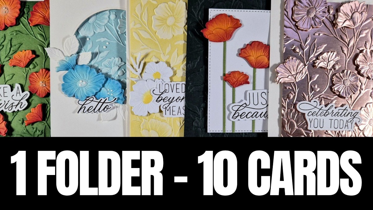
The video introduces a creative challenge centered around maximizing the utility of a single 3D embossing folder from the September Card Kit by Simon Says Stamp, demonstrating ten distinct ways to utilize it beyond its standard function. The host begins by showcasing the comprehensive contents of the kit, which include matching dies for the floral designs found within the folder, coordinating stencils for coloring, vibrant ink cubes, a blending brush, and additional stamp sets with sentiments. By utilizing these tools alongside gray and white cardstock, the creator emphasizes that any existing 3D embossing folder can be used to replicate these techniques, encouraging viewers to explore their own collections with fresh perspectives.
The first few demonstrations focus on layering color and texture to enhance the embossed design. One method involves using stencils to apply ink blending directly onto the raised flowers, creating depth by varying saturation levels or mixing colors like red and yellow for a dimensional effect. Another approach uses colored cardstock as a base, where the creator runs the paper through the die-cutting machine with the folder inside, then adds darker shades of ink to the edges or centers of the flowers to highlight the relief. The video also suggests adding white pigment ink over colored backgrounds to make the embossed details pop, or using an ink pad on the debossed side before cutting for a vintage aesthetic, proving that the folder can serve as both a stamping surface and a coloring guide.
Further techniques presented include constructing window cards where die-cut flowers are placed inside the folder's recessed areas to create a 3D effect without shifting during the machine run. The host also demonstrates how to cut a single embossed panel into two different sizes to create contrasting cards quickly, or how to split a panel to add metallic accents like silver strips for shine. Additionally, the video explores using specialty papers such as rose gold or foil cardstock, showing that even without cutting out individual flowers, simply running these textured sheets through the folder yields stunning results. The final example combines specialty paper with die-cut elements and foam squares to add height, illustrating how mixing materials like lace, ribbon, or gems can transform a simple embossed design into a complex, eye-catching project.
In conclusion, the video serves as an inspiring guide for crafters looking to get more value from their supplies by thinking outside the box with embossing folders. The creator stresses that there is no single "correct" way to use these tools and encourages experimentation with color combinations, paper types, and layering techniques to suit personal style. By sharing close-up photos of all ten finished cards, the host provides visual proof that even simple ideas can be elevated into beautiful projects. Viewers are invited to try these methods with their own folders, share their favorite card in the comments, and remember that building a stash of versatile tools like inks and dies allows for endless creativity in future crafting sessions.
Read the full video transcript
Hi everyone and welcome to another one
kit 10 cards video and today I'm having
a lot of fun with the embossing folder
that is included in the September card
kit by Simon Says Stamp and I'm going to
share 10 different ways on how you can
use this embossing folder. So it is a
really fun video because you can
recreate these ideas with any 3D
embossing folder that you already have.
This is the beautiful design. It is a
lovely flower composition.
I'm going to show you what else you get
in the kit and first of all you do get
matching dies. These flowers are the
ones that you find in the embossing
folder. So you can use them separately
if you like to create your own flower
compositions or in combination. You do
get matching stencils as well to color
the flowers. The separate flowers or the
ones on top of the embossing folder.
Four different colors of ink cubes.
And these are a really juicy. I will be
using them and they are great for ink
blending as well as stamping your
sentiments.
And you get one more ink. This is
distress oxide and the color is pumice
stone which is a warm gray color perfect
for backgrounds. You do get a blending
brush.
And I absolutely love when we get tools
and inks on our kits because you get to
use them a lot and they actually build
up your stash.
Now let's take a look at the stamp set.
This is a big stamp set that gives you a
lovely beautiful background and lots of
sentiments in a beautiful font.
Absolutely love it. And in your kit you
will also get dies that you get to cut
out the sentiments as well. I don't have
them in my kit but
they are included.
On top of that you do get a second stamp
set again with loads of sentiments in
this beautiful font. Absolutely love
this one. And I will be using it on all
my cards today. And of course, you do
get cardstock in gray and white.
So as promised, for today I'm going to
focus on the 3D embossing folder that
you get in the kit, and I'm going to
share 10 different ways on how you can
use it. I'm starting by stamping the
sentiments I want to have a bunch of
those ready for my cards, and I use the
matching dies to cut them out.
So let's start with the first card. All
I did was to use the embossing folder as
it is intended.
And then I'm going to use the matching
stencils to add some color. So I'm
starting with the first one. I'm using
one of those sticky mats, but I do have
to use some tape as well because um I
cut out my paper the same size as the
stencil, so it didn't have anything to
grab onto. Anyway, I'm going to do my uh
ink blending, and you see I'm using the
brush from the kit and one of the ink
pads from the kit. Uh they are very
juicy, and the color is really intense.
You don't have to work at all to add a
high saturation of color, but just
because I didn't want to overwhelm the
paper with ink, I'm
uh tapping a few times on a paper towel
before I go ahead and add the ink on the
paper. Just to make sure that it's not
oversaturated and I can control the
color uh easier [clears throat] because
it's always easier to build up the color
if you start lightly rather than apply
too much in the beginning, and uh you
cannot remove any color. Now for the
second uh stencil, I'm going to go more
intense. So although I'm using the same
ink cube, I can uh end up with different
shades of the same color and it is going
to look more dimensional.
Now, for the third stencil and I made
sure as I was applying the red color
that it didn't touch the center.
So, I do have an empty space there for
my yellow. I did mix a little bit of,
uh, the red as well to create a touch of
orange so that it looks more
dimensional. And here are my flowers
ready to go. I am going to stick that on
top of a red cardstock to match the
color of my flowers and just to create a
little, uh, border. But since it is very
simple, I'm just going to tie, uh, the
thread a couple of times around the, um,
base of my card just to add something
interesting. Otherwise, it is a very
simple card but super pretty. I'm just
going to tie a bow, stick that with foam
tape on top of my card base and add one
of the sentiments that I created in the
beginning. And you can see here some
close-up photos on the first card for
today.
Now, for the second card, I'm going to
start with colored cardstock. I decided
to go with green. And, uh, I made sure
that this is smaller than the standard
card. I'm going to place it in my
embossing folder, run it through the
die-cutting machine.
And then when you are starting with
colored cardstock, the best way to bring
all the dimension more into life is to
do some ink blending on top of it. Here
I'm using a darker shade of green over
the green background. I'm not
overwhelming the center. I just inked up
mainly the edges and you can see the
beautiful result that it gives. Now, I
want to have some dimension and I did
cut out the flowers.
Uh, Uh, for the flowers I went again
with colored cardstock, orange in this
case, but again, you can use whatever
color combination you like. Once you cut
out the flowers, you can, uh, actually
put them inside the embossing folder,
and you will see that if you wiggle them
a little bit, they are going to fall
inside those, um,
uh, holes, let's say, and uh, they are
going to stay put. If you want, you can
use some, uh, masking tape to keep them
in place, but I had no issue at all
running them through. They didn't move
at all.
So, now I have all those flowers which
will match the design of my background.
I want to make it, uh, more dimensional
looking and more interesting, so I'm
doing a little bit of ink blending only
on one side of the flowers.
Just like so. It is going to give, uh,
that orangey look and feel with darker
shading on, uh, one side, and it is
going to bring the embossed, uh, detail
even more into life.
Another thing that you can do is to add
a little bit of ink blending at the
center of the flowers. I am using a very
tiny brush, and I'm adding white pigment
ink, but you can definitely go with
other colors if you want. Now, these are
going to match perfectly with the design
that I have underneath, and hopefully
you can see that in the close-up, uh,
details here.
And, uh, I'm using a little foam square
at the back, trying to find where this
flower is going to go, and I match it
exactly with what is underneath. I love
the fact that the background is smaller,
so I get, uh, some flowers coming
outside of the border. I think this is a
lovely detail that makes the card more
interesting. For the center of the
flowers, you can go with gems, you You
go with pearls, you can add sequins. I
went with a white contour liner.
And I think this is my favorite card
from all the 10 that I'm sharing today.
Uh just because of the color
combination. Let me know in the comments
below which one of the 10 is your
favorite. Don't forget I love reading
those comments. So, let's move on to
card number three. And again, I created
uh three flowers with the exact same
technique as I did in the previous card.
For this one, I'm going with a more uh
clean and simple look. So, I'm just
using uh the green cardstock to cut out
a couple of stems. What I'm going to do
is to just uh stick these three flowers
on top of a white small panel and then
add those green um
strips as the stem underneath.
So, just audition a little bit. Try to
find what is pleasing to your eyes and
how you want to create that uh flower
composition. You can go with even more
flowers. There are many dies for the
flowers included. Uh just go ahead and
create a little scene with flowers. I'm
just going to uh draw lines with my
glue, stick the stem on top. I make sure
that um none of these uh flowers that
I'm using are the same size or the same
design just to make it look more
interesting. But again, think of
different color combinations for your
flowers, number of flowers that you can
add. You can make it way more busier
than mine. I just went with three.
So, here I'm just going to use my
scissors to chop off the excess.
All we need to do is to add a sentiment
and then I can stick this panel on top
of a dark green cardstock. It can be
plain or just use your embossing folder
on the background as well.
Now, I'm going to show you the easiest
way to create super stunning card. Just
run a colored cardstock through your
die-cutting machine with a 3D embossing
folder, and then uh cut it out just a
little bit just a quarter of an inch
from each side. This is going to allow
for a border when you stick it on top of
your card base. And then to bring uh
the beautiful design into life, just
wipe over the design very lightly with
white pigment ink. Don't be afraid to do
that. It really is going to uh touch all
those mountains of the design. It's
going to create a beautiful uh
background, and you can do it on any
color cardstock that you want. All you
need to do then is to add a sentiment.
Another way to use your embossing folder
is to use an ink pad on the debossed
side of the embossing folder. You can
very lightly mist if you want, or you
can completely omit that step. Run it
through your die-cutting machine, and
you will get the most gorgeous effect.
You can do it with any color ink that
you have, even with um inks that are
included in the kit. I'm going for a
vintage look and feel, that's why I went
with uh brown ink pad over ivory
cardstock. I'm using the edge of my
scissors to rough up the edges just to
distress them a little bit, and I have a
lovely panel which can be the focal
point of my vintage card.
And uh to match the theme, I can always
tie a ribbon just to make it look more
interesting, to add a different element
on top of my card. Or you can definitely
use uh seam binding that you can color
with inks, or even lace. It would uh
match perfectly with the look and feel.
I didn't emboss my sentiment on
chocolate brown cardstock and you can
see the finished result. Absolutely
gorgeous card as well.
And as promised, I continue using the
embossing folder for 10 different cards
today. Again, I'm using uh the previous
technique where I'm wiping the white
pigment ink over colored cardstock to
bring that design into life and I went
with a pale yellow this time.
I did cut out the flowers. I did emboss
them just like I did in one of the
previous cards. And now I'm just going
to add some color at the center of the
flowers. I'm planning to keep the color
theme of this card white and yellow. So,
that's what I'm adding at the center.
Just a little bit of yellow.
I'm going to place this panel on top of
my card base and then I will uh kind of
embellish my sentiment with the flowers
that [clears throat] I have cut out.
Just a little uh flower composition.
Just by switching the colors and uh
adding some flowers on top, you can
completely uh create something
different. Now, I'm sure you all have a
die for leaves, which you can definitely
use here to create a more interesting
flower composition.
For the next card, I'm going for a
window card and uh I'm planning to use
the die-cut flowers to decorate my
window. So, this time I'm going with
blue flowers and I'm using again some
ink blending around the perimeter of the
flowers to make them look more
interesting. Again, tone on tone. Uh you
can use any color of flowers that you
like. I'm also going to cut out the same
colored cardstock and this is going to
be the backing for my window. I'm going
to run it through the die-cutting
machine and end up with a beautiful
embossed detail. Again, to bring it more
to life, I'm using my white pigment ink,
and I'm going to do that with the
flowers that I created as well.
Now, I'm going to use foam tape at the
back of my window panel and just stick
it on top of my background, but you can
definitely turn this card into a shaker
card this stage if you want. I decided
to go plain, and all I'm going to do is
to just decorate that beautiful window
with my flowers.
And again, this card design can be a
shaker card. You can go instead of
monochromatic with the flowers and the
background, you can go completely
colorful, and you can add gems at the
center or pearls. I'm using again my
white contour liner, and you can
definitely grab your leaf dies to make
your flower composition more
interesting.
Now, for a really quick and fun way to
create two cards just with one panel.
So, I embossed and added my pigment ink
on top of this panel, and now I'm going
to cut it into two separate pieces.
So, I'm going to cut at 3 and 3
quarters, but really you can make it any
size that you want. I'm going to use
both those panels for the next two
cards. So, for the larger panel that I
have, I'm just going to use some silver
cardstock, and I'm going to cut out a
strip. I will stick the strip at the
bottom of this panel just to add some
shine, really. And then this is the
panel that I'm going to stick on top of
my card base. Very simple cards, but
when you are in need of really quick
cards that look beautiful, then you can
definitely go with this design.
And also keep in mind that you can
switch the colors of the cardstock. I
went with blue for example here, but you
can use any color that you like.
Now for the other part of that panel,
[clears throat]
I'm just going to add some foam tape at
the back and I do have a panel that I
embossed with the same embossing folder
again. Uh it is just white, so I end up
with a lovely contrast. But again, you
can go tone on tone with a lighter blue
color as a base. Stick a sentiment on
top, add some gems here and there, and
you have a really quick card, but it
looks beautiful just because you have
that beautiful embossing folder.
And for the last card for today, don't
forget that you can use specialty
cardstock with your embossing folders.
It makes every card a really stunning
just by using gold, silver.
I went with a rose gold that I had in my
stash for this one. You can definitely
stop here, add a sentiment on top, and
you are good to go. Or if you want to
take it a step further, die cut some of
the flowers,
pop them inside the embossing folder,
and just run them through to get that
beautiful design. And then I did use
some foam squares, and I'm sticking them
on top.
This is going to add some dimension,
makes the card more interesting, and you
can definitely use a different color for
the flowers. You can go with gold for
example, and combine specialty papers.
So, I'm going to finally stick a
sentiment on top, and you can definitely
emboss it if you like to match the color
of the background.
And here are some close-up photos on all
the 10 cards that I made for today.
Down below the description, you can find
the links to everything I used for
today's video, as a kit as well as
separately.
I hope that you had fun, that you got
inspired to make the most out of your
embossing folders. Thank you all so much
for watching, and I'll see you all next
time.